

Abstract Wall Art Your Mates Will Actually Rate
Let's be honest, abstract wall art often gets a bad rap. You hear "abstract" and you picture something your mate's kid made with potato stamps, now on sale for a grand in some snooty gallery. But here's the secret: it's not that deep. It’s all about vibes, colour, and making a statement without saying a word. Think of it as the ultimate power move for your walls – pure, unadulterated cool that makes people go, "Yeah, this person gets it."
What Is Abstract Wall Art And Why Should I Care
Right, let’s cut through the jargon. Abstract wall art isn't about deciphering what the artist had for breakfast. Think of it as the visual equivalent of a killer bassline in your favourite track – you don't need to analyse it to death, you just feel it. It ditches the idea of painting a perfect picture of a bowl of fruit or a serene landscape, and instead uses shapes, colours, and textures to create a mood.
Here's another way to look at it: a portrait of your favourite striker is brilliant because it’s a direct representation. You see the player, you feel the pride. An abstract piece, however, is more like the roar of the crowd after a 90th-minute winner. It isn’t a picture of that specific moment, but it bottles the pure, unfiltered energy of it. That’s the real magic of abstract wall art.
It's All About Personality
Your walls are prime real estate for showing off who you are. And while a great photo or a classic film poster is fantastic, an abstract print adds a completely different layer to your space. It's less about showcasing a specific interest and more about expressing your personal style and the atmosphere you want to create. It’s the difference between telling someone you’ve got good taste and just showing them.
An abstract piece can be the difference between a room that’s just a room, and a space that feels completely, uniquely yours. It’s a conversation starter, a mood-setter, and a reflection of your own creative streak.
It’s the perfect way to inject some life into that boring magnolia wall you've been meaning to tackle for ages. An abstract print can be the final piece that ties a whole room together or provide a much-needed pop of rebellious colour. For more ideas on transforming your space, have a look at our guide to choosing wall art for homes.
Finding Your Visual Anthem
You wouldn’t listen to music you hate, so why would you put art on your wall that doesn't make you feel something? The best thing about abstract art is that it's completely subjective. What one person sees as chaotic, another might see as energetic and exciting.
Think about it in terms of music:
- Bold geometric shapes and primary colours? That’s the crisp, driving rhythm of an early Arctic Monkeys track. It’s confident, sharp, and makes a real statement.
- Soft, flowing lines and pastel shades? Think of the dreamy, atmospheric sound of a band like The xx. It’s calming, thoughtful, and perfect for creating a relaxed vibe.
- Chaotic splatters and clashing colours? Pure punk rock. It’s loud, unapologetic, and absolutely refuses to be ignored.
Ultimately, choosing abstract wall art comes down to trusting your gut. If a piece catches your eye and makes you smile, that’s all the justification you’ll ever need. Forget the dusty art history lessons; this is about finding something that looks ace and welcomes you home.
Finding Your Flavour: A Guide to Abstract Styles
Right, you’ve decided to dip your toe into the world of abstract wall art. Good on you. But let's be honest, it can feel a bit like trying to pick a new band to follow – there are loads of them, they all sound a bit different, and you’re not sure which one will actually be any good.
Don’t sweat it. Think of this as your no-nonsense spotter's guide to the main styles, without any of the pretentious art-speak. Your choice in art is a lot like your taste in music or the football team you back; it says something about who you are and the kind of vibe you want to create. You just need to figure out which style is playing your tune.
This diagram breaks down how the core elements of abstract art—mood, music, colour, and personality—all connect.
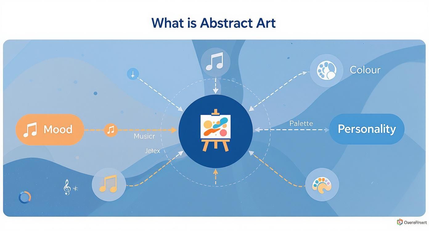
As you can see, choosing a piece is really a mix of gut feeling and personal taste. It’s about linking the colours and shapes you’re drawn to with the atmosphere you want for your room.
Geometric Abstraction: The Tactical Genius
First up, Geometric Abstraction. This is the Pep Guardiola of the art world. It’s all about precision, clean lines, sharp angles, and bold blocks of colour. Imagine triangles, squares, and circles all organised with pure tactical genius. It’s controlled, deliberate, and seriously cool.
If you’re the kind of person who appreciates a perfectly executed set piece, the slick production on a Daft Punk album, or just a well-organised desk, then this might just be your jam. It’s minimalist without being boring and makes a strong, confident statement that screams order and modernity.
Lyrical Abstraction: The Improvised Solo
At the other end of the spectrum, we have Lyrical Abstraction. If Geometric is Pep, this is Jürgen Klopp's gegenpressing—pure, unadulterated passion and emotion. This style is less about rigid shapes and much more about fluid, expressive lines and a harmonious use of colour. It’s poetic, almost musical.
Think of it as the visual equivalent of an epic guitar solo from David Gilmour or a soulful Oasis ballad. It’s less about a plan and more about capturing a feeling, a moment of pure, unscripted brilliance that just feels right.
This style is perfect for creating a relaxed, thoughtful atmosphere. It’s the kind of art that’s easy on the eye but still gives you something to get lost in after a long day. It’s emotional, but in a chilled-out, sophisticated way.
Action Painting: The Mosh Pit
Now for the properly fun stuff. Action Painting is the pure, unfiltered chaos of a Keith Moon drum solo translated onto a canvas. Artists like Jackson Pollock made this famous by dripping, splattering, and literally throwing paint around. The whole point is to capture raw energy and movement.
This is the art for the adrenaline junkies, the punk rockers, and anyone who loves the beautiful mayhem of a last-minute derby winner. It’s loud, unapologetic, and bursting with life. A piece of action painting on your wall is a guaranteed conversation starter and injects a massive dose of rebellious energy into any room.
Which Abstract Style Matches Your Vibe?
Still wondering which style is for you? This quick-fire guide connects the art to the things you already love, whether that's football, music, or just a certain way of doing things.
| Abstract Style | The Vibe | Think... | Perfect For... |
|---|---|---|---|
| Geometric | Controlled, sharp, modern | A perfectly weighted pass by De Bruyne, the clean synths on a Kraftwerk track | The minimalist who loves order and a strong, clean aesthetic. |
| Lyrical | Emotional, fluid, harmonious | The sweeping chorus of a classic Stone Roses anthem | Creating a calm, creative space with a touch of soul. |
| Action | Energetic, chaotic, rebellious | Vinnie Jones in his prime, a Ramones gig in '77 | Making a bold statement and injecting pure energy into your room. |
Ultimately, finding your flavour is about trusting your gut. As you browse different prints, pay attention to what makes you stop and stare. Whether it’s the disciplined beauty of geometric shapes or the wild freedom of a paint splatter, the right piece of abstract art will feel like it was made just for you.
What Makes a Great Print? Materials and Quality Matter
Alright, let's get into the nitty-gritty. You’ve found a design you love, but here’s where the magic really happens: the printing. This is the bit that separates a proper work of art from something that just, you know, fills a space.
Think of it like this: you wouldn't buy a knock-off shirt for the Cup Final that falls apart after one wash. So why settle for a dodgy print that looks like it came out of a 90s fax machine? The quality of the paper and the inks are just as crucial as the design itself. This is what gives a piece its soul, making the colours pop and ensuring it lasts for years, not just one season.
The appetite for high-quality, unique art is massive and growing. In fact, the global wall art market is predicted to jump from $67.84 billion in 2025 to an incredible $120.37 billion by 2035. A huge driver of this, especially here in the UK, is the desire for art that genuinely reflects our personalities, not just generic stuff from a big-box store. You can read more about the booming wall art market trends on marketresearchfuture.com.
Giclée Printing: The Headliner Act
You’ll probably see the term Giclée printing pop up. It sounds a bit fancy, but it’s basically the difference between seeing a headliner at Glastonbury and watching a tribute act in a local pub. Both are music, but one is in a completely different league.
Standard inkjet printers are fine for printing out your gig tickets, but Giclée is the professional standard for art. It uses top-of-the-line, archival-quality inks and a much finer, more precise spray to produce incredibly rich and detailed prints. This process ensures the colours are as deep and vibrant as the artist intended, capturing every subtle shade and texture.
Paper and Inks: It’s All in the Details
Ever felt the difference between a flimsy flyer and a proper, thick wedding invitation? That's all down to paper weight, measured in GSM (Grams per Square Metre). A higher GSM number means thicker, more durable paper that feels premium and hangs beautifully. For a top-tier print, you should be looking for something substantial, usually 200 GSM or higher.
Then you have the inks. Archival inks are the secret ingredient. They’re pigment-based, not dye-based, which means they’re built to resist fading from sunlight for decades—sometimes even over 100 years. This is what stops your artwork from looking washed-out after a few years in a bright room. We’re passionate about this stuff, and you can get the full story on our commitment to print quality.
Think of it this way: high GSM paper is the legendary stadium, and archival inks are the world-class team playing on it. You need both to be top-tier for an unforgettable result.
Finishing Touches: Matte vs. Gloss
The final touch is the paper's finish, which can totally change the mood of the artwork. It’s like choosing between an acoustic set and a full-on electric show—both are brilliant, but they create a completely different vibe.
- Matte Finish: This is the classic, non-reflective choice. It’s perfect for detailed abstract pieces because it prevents glare, letting you appreciate the art from any angle. It has a sophisticated, modern feel that works well in almost any space.
- Gloss Finish: A gloss or semi-gloss finish makes colours look incredibly punchy and vibrant. It’s a fantastic option for prints that are all about bold, dynamic colour. Just be mindful of reflections if you plan to hang it directly opposite a bright window.
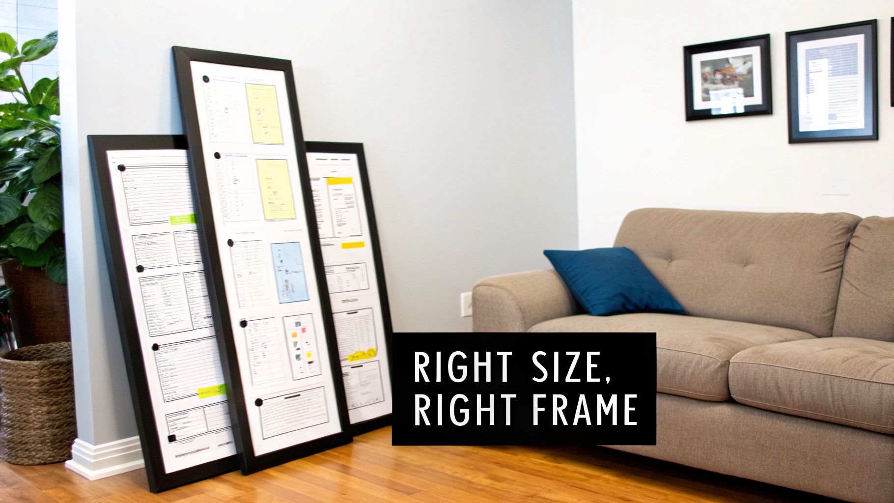
Choosing The Right Size And Frame
Right, this is where most people get the fear. You’ve found the perfect abstract print, it’s speaking your language, and you’re ready to get it on the wall. But then the dreaded question hits you: what size?
Go too small, and your art ends up looking like a lonely postage stamp on a massive envelope. Go too big, and it can completely overwhelm the room, looking like you’re trying to compensate for something.
Don't worry; we're here to demystify the process. Sizing your abstract wall art isn't some dark art known only to interior designers. It’s all about creating balance, making your print look like it was always meant to be there.
Nailing The Perfect Print Size
Before you even think about adding a print to your basket, grab a tape measure and some old newspaper or masking tape. This is the oldest trick in the book for a reason: it works every single time. Map out the dimensions of the print you’re considering directly onto your wall.
This simple step lets you see exactly how much visual real estate the art will occupy. Stand back, have a look from the doorway, and see how it feels. Does it command attention without being a bully? Or does it look a bit lost?
Here are a few golden rules depending on where you’re hanging it:
- Above the Sofa: Your art should be roughly two-thirds the width of your sofa. This creates a really pleasing visual anchor and stops the print from looking like it’s floating aimlessly.
- Over a Desk or Turntable: Aim for a piece that's about half to two-thirds the width of the furniture underneath it. This keeps things in proportion and creates a focused, intentional look for your workspace or music corner.
- On a Big, Empty Wall: This is your chance to make a proper statement. Go for a large format piece that can hold its own. A small print here will just get swallowed up by the space.
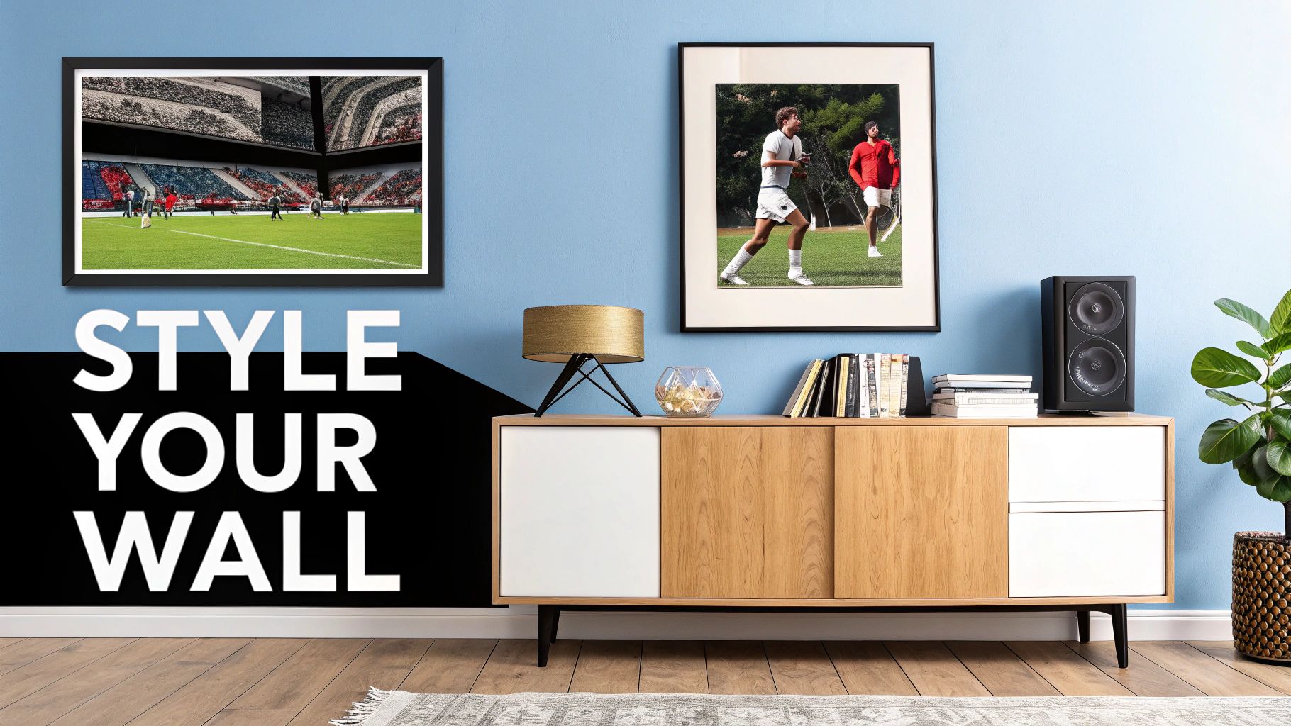
Picking The Right Tracksuit For Your Print
Once you’ve sorted the size, it’s time to think about the frame. A frame is to your print what a stylish tracksuit is to a top athlete—it completes the look, adds a touch of class, and shows it means business. The colour of your frame can completely change the vibe of the artwork and how it connects with your room.
Choosing a frame isn't just a finishing touch; it’s a critical decision that can either elevate your abstract art or make it fall flat. The right frame harmonises the print with your room, making everything look deliberate and seriously cool.
It’s all about creating a cohesive feel. You want the frame to complement both the print and your existing decor, not fight with them for attention.
Frame Colours And What They Say
Think of your frame colour as the final EQ setting on a classic album—small adjustments can make a massive difference to the overall sound. Here's a quick rundown on what each one brings to the party.
Black Frames: The Classic Leather Jacket A black frame is timeless, sharp, and confident. It works with almost any style of abstract art, providing a crisp border that makes the colours within the print pop.
- Best for: Bold, graphic prints or pieces with a lot of white space.
- The Vibe: Modern, sophisticated, and a bit rock and roll. It provides a strong contrast that draws the eye directly to the artwork.
White Frames: The Minimalist Trainer Clean, fresh, and contemporary, a white frame is perfect for letting the artwork do all the talking. It’s brilliant for colourful or busy abstract pieces, as it gives them space to breathe without adding any extra visual noise.
- Best for: Vibrant, colourful abstracts or creating a light, airy Scandinavian feel.
- The Vibe: Understated, cool, and modern. It seamlessly blends the art into your wall, making the piece itself the undisputed hero.
Natural Wood Frames: The Vintage Denim A natural wood frame adds warmth, texture, and a touch of organic, retro cool. It’s perfect for softening the edges of a particularly bold abstract piece or for tying the art in with other wooden furniture in your room.
- Best for: Abstract art with earthy tones, or for adding a bit of warmth to a minimalist space.
- The Vibe: Relaxed, authentic, and a little bit bohemian. It’s like putting on your favourite, perfectly worn-in denim jacket.
Ultimately, the goal is to make your new abstract wall art look like it truly belongs. By getting the size right and picking a frame that complements both the art and your space, you’ll have a piece that doesn't just hang on your wall—it brings it to life.
Styling Your Space: The Art of The Hang
Right then. You’ve got the print, you’ve nailed the frame, and it’s looking sharp. Brilliant. Now for the main event – getting the thing on the wall and making it look like it belongs there, not like a temporary guest. This is the art of the hang, where your new abstract piece goes from being a cool print to a core part of your home’s personality.
This isn’t just about banging a nail in the wall and hoping for the best. It’s about creating a space that feels curated, intentional, and uniquely yours. Your walls should tell your story, showcasing all the different sides of your personality. This is where your home stops looking like a generic catalogue and starts looking, well, like yours.
The Golden Rule: Hang It At Eye Level
The single biggest mistake people make is hanging art too high, leaving it floating awkwardly near the ceiling like a lost balloon. The golden rule is to hang your art at eye level. For most people, this means the centre of the print should be around 57-60 inches (about 145-152 cm) from the floor.
Of course, this isn't a one-size-fits-all command. If you're hanging it above a sofa or a sideboard, a good rule of thumb is to position the bottom of the frame about 6-8 inches above the furniture. This creates a visual connection, making the art and the furniture feel like a single, cohesive unit rather than two separate items awkwardly sharing a wall.
Creating A Gallery Wall That Doesn't Look A Mess
A gallery wall is a top-tier way to show off your personality. It's your chance to create a visual playlist of everything you love. The secret is finding a balance between your new abstract wall art and your other passions, whether that’s a print of your team’s stadium, a classic album cover, or a photo from a legendary gig.
Your abstract piece can act as the anchor or the headline act of your gallery wall. Its colours and shapes can tie everything else together, creating a visual flow that makes the whole collection feel deliberate, not chaotic.
To avoid a jumbled mess, try these tips:
- Create Templates: Before you start hammering, lay all your prints on the floor and play around with the arrangement. You can even trace each frame onto paper, cut them out, and tape them to the wall to perfect your layout.
- Find a Common Thread: Your prints don't all need to match, but a common element helps. This could be a consistent frame colour (all black, for example), a shared colour in the artwork, or a similar theme.
- Balance is Key: Mix up the sizes and orientations. Place a large abstract piece off-centre and build smaller prints around it. This creates a more dynamic and interesting display than a rigid grid.
Mixing Your Abstract Art With Your Passions
The best walls are the ones that reflect all sides of you. Don't be afraid to hang a sophisticated abstract piece next to a gritty photo of your favourite midfield general or a psychedelic Hendrix poster. The contrast is what makes it interesting. The abstract print brings the style, while the music and football prints bring the soul.
This approach is becoming more popular, not just at home but in professional settings too. The abstract wall art market has seen huge growth within the broader wall art sector, which was valued at around $50.80 billion globally in 2024. Offices are increasingly using abstract pieces to spark creativity, and you can see similar trends in modern display options. For a contemporary look that makes your abstract piece truly stand out, consider modern mounting methods like acrylic standoff mounting.
Why Abstract Art Makes The Perfect Gift
Right, let’s talk gift-giving. A mate’s birthday is on the horizon, or they’ve just moved into a new gaff, and the familiar panic starts to creep in. You could fall back on the usual suspects—a bottle of something, a generic gift card—but where’s the heart in that? This is where abstract wall art comes in. It’s the top-tier present that says, “I’ve actually put some thought into this, you know.”
Forget the stress of trying to remember their favourite band’s most obscure B-side or picking a football shirt from a season they’d rather forget. An abstract print is a seriously smart move. It feels personal without being too on the nose, stylish without being pretentious, and it’s something they’ll look at every day and think, “Yeah, my mate gets it.” It's the kind of gift that gets hung up immediately and earns you some serious brownie points.
Playing Detective to Find the Perfect Print
So, how do you choose a piece for someone else without getting it horribly wrong? It’s time for a bit of low-key snooping. You don’t need to go full Sherlock Holmes, just pay a bit more attention the next time you’re round theirs.
Choosing abstract art for someone else is less about knowing their deepest artistic secrets and more about observing the little clues. It’s about finding a piece that complements their world, rather than trying to define it for them.
Take a look at their existing decor. What colours do they gravitate towards? Are they a minimalist who loves clean lines, or is their place more of a chaotic shrine to music and football memorabilia? These are your cues. You could even use their team’s colours as a launchpad—a print with subtle hints of red and white for a Gooner or claret and blue for a West Ham fan is a brilliant, subtle nod they'll appreciate.
Why Abstract Art Is a Safer Bet
Gifting art can be a minefield. Buy someone a portrait of a stranger, and it’s just plain weird. A landscape of a place they've never visited? A bit random. This is where abstract art absolutely wins. Because it’s open to interpretation, it doesn’t come with any awkward baggage. The person you’re giving it to gets to decide what it means to them.
This appreciation for quality over literal meaning is a big deal in the art world. Even as UK art sales volumes saw a slight dip in early 2025, the market’s hunger for high-quality pieces was clear. In one major auction, a staggering 96% of lots sold within or above their high estimates, with a 1958 abstract sculpture by Dame Barbara Hepworth more than doubling its expected price. You can read more about the value of quality abstract art on portlandgallery.com.
What this shows is that a well-chosen piece has real, lasting appeal. You’re not just giving a decoration; you’re giving a conversation starter, a mood-setter, and a piece of high-quality design that elevates their space. It’s a thoughtful, sophisticated gift that shows you really care. And let’s be honest, it’s a lot cooler than a novelty mug.
Got Questions About Abstract Art? We've Got Answers
Still have a few questions bouncing around? No problem at all. We've pulled together the most common queries we get about diving into the world of abstract wall art.
Think of this as your quick and easy guide—no fluff, just straight-up answers to get you on your way to creating a space that feels completely you.
What If I Don’t “Get” It?
Here’s a secret: there’s nothing to "get." Abstract art isn't a test or some cryptic puzzle you're supposed to solve. It's all about the feeling. Does a piece catch your eye? Does it make you feel something—anything? If the answer is yes, then that’s all that matters. You don't need a degree in art history to appreciate what you like, just like you don't need to be a music critic to know a certified banger when it comes on.
Can Abstract Art Really Go With My Football Prints?
One hundred percent. In fact, it's a fantastic pairing. Think of it as creating a perfectly balanced team on your wall. Your football or music prints bring the raw passion and story, while the abstract art adds a layer of style and visual flair. It’s that very contrast that creates a dynamic, interesting space that feels curated and personal, not just one-note.
Is Abstract Art Just A Fad?
Not even close. Artists have been bending the rules and exploring colour and form for well over a century. From the very first pioneers of the movement to the modern artists pushing boundaries today, abstract art has proven it has more staying power than a legendary rock anthem. It’s a timeless way to inject a shot of creative energy into a room, and that’s a look that will never go out of style. It’s less of a one-hit-wonder and more of a Stone Roses classic.
What’s The Main Rule For Choosing Abstract Art?
There's really only one rule that counts: if you like it, it’s good art. It’s that simple. Forget what you think you should like or what some "expert" might tell you is in vogue. The entire point is to find something that connects with you on a personal level. At the end of the day, they're your walls. Trust your gut—it's usually right.
Ready to find that perfect piece that reflects your style? Dive into the collection at Striped Circle and discover unique, high-quality abstract wall art that’s made to stand out. Take a look at our prints and find your match.
