
Album Art Printing: Your Backstage Pass to Iconic Music Wall Art
Let's be honest, streaming is convenient, but a tiny thumbnail on your phone just doesn't do justice to the iconic cover of 'Definitely Maybe' or the stark genius of 'Unknown Pleasures'. This is where album art printing comes into its own. It’s all about rescuing these masterpieces from the digital graveyard and giving them a physical presence in your home or office. It's time to get that art off your screen and onto your wall, where it belongs.
Turn Your Music Obsession Into Wall Art
We're talking about transforming a piece of music history into a tangible statement piece. One that sparks conversations ("Best Oasis B-side, go!") and makes you grin every time you walk past it. Think of it as the ultimate encore for your favourite albums—a way to celebrate the visual side of music that often gets overlooked in the age of the skip button.
This is your chance to give The Stone Roses' chaotic paint-splatter or The Smiths' moody monochrome the gallery treatment they've always deserved. This guide is your backstage pass to creating prints that look boss, not bargain-bin. Forget flimsy posters that tear if you so much as look at them funny; we’re diving deep into proper, high-quality album art printing that’ll make your walls sing better than a Gallagher brother on a good day.
Why Bother with Physical Prints Anyway?
In a world dominated by playlists and algorithms, having a physical print of an album cover feels like a small act of rebellion. It's a tangible connection to an era when artwork was an integral part of the listening experience. You’d spend ages poring over liner notes and cryptic images, trying to decode the band’s message. A print brings that feeling right back into the room.
- It's a Conversation Starter: Your mates will spot that Parklife print from across the room, and before you know it, you're debating the best Britpop album of all time. (It's Different Class, by the way. No arguments.)
- It Shows Off Your Personality: The art you choose says a lot about you. Displaying your musical heroes is a brilliant way to stamp your identity on your space, way better than a 'Live, Laugh, Love' sign.
- It Supports the Culture: Buying from places that celebrate music helps keep the spirit alive, ensuring these iconic designs aren't lost to time.
Having a classic album on your wall is like having a bit of your favourite band's soul right there with you. It’s more than just a picture; it’s a tribute to the tunes that shaped your life.
We'll walk through everything from nailing the technical bits to choosing the perfect frame, ensuring your favourite tunes look every bit as good as they sound. Whether you're a seasoned collector or just starting to explore the world of prints, consider this your roadmap.
If you're keen to see what's possible, checking out a curated selection of music prints can give you some serious inspiration for your own walls.
Prepping Your Files for a Flawless Print
Right, let's get our hands dirty with the technical stuff. I promise to keep it simple, but this part is absolutely crucial. Think of it as the soundcheck before a big gig; getting this right now is the difference between a roaring crowd and a room full of disappointed punters throwing plastic pint glasses.
Nailing your digital file preparation is the single most important part of printing album art. If you get this bit wrong, even the best printer in the world can't save your artwork from looking like a dodgy bootleg. Get it right, and you’ll have a print that’s a stone-cold classic—a true chart-topper for your wall.
We're essentially turning digital music notes into physical wall art. That process needs a little bit of care at the start to guarantee a brilliant finish.
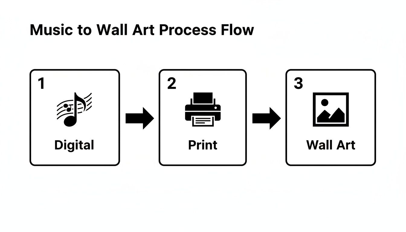
As you can see, the journey from a digital idea to a framed piece on your wall hinges on getting that print process right in the middle.
Demystifying The Techy Bits
Let’s tackle the two big beasts first: resolution and colour profiles. Don't worry, there won't be a test.
Resolution (DPI): Your Sharpness Secret Weapon First up is DPI, which stands for 'Dots Per Inch'. Imagine you're making a mosaic. A low DPI image is like using a handful of big, chunky tiles—from a distance, it might look okay, but up close, it’s just a blocky mess. Like watching football on a dodgy stream from the 90s.
A high DPI image, however, is like using thousands of tiny, detailed tiles. The result is a crisp, sharp picture that looks stunning even when you’re standing right in front of it. For printing album art, 300 DPI is the magic number. It's the industry standard for a reason. That image you saved from a quick Google search? It's probably only 72 DPI. Fine for your screen, but it will look fuzzy and sad in a frame.
Colour Profiles (CMYK vs RGB): Don’t Get The Blues Next up, colour profiles. Your phone and computer screen use RGB (Red, Green, Blue) light to create colours, which is why they look so vibrant.
Printers, on the other hand, don't use light; they use ink. They mix CMYK (Cyan, Magenta, Yellow, Black) inks to physically create colours on paper. Sending an RGB file straight to a printer is like asking a roadie to play a guitar solo—the results will be unpredictable and probably a bit disappointing. Colours can look dull, muddy, or just plain wrong. Converting your file to CMYK first ensures what you see on screen is what you get on paper.
Why Your Printer Loves a Good Bleed
Now for a term that sounds way more dramatic than it is: the bleed area. When you want your artwork to go right to the very edge of the paper, you can't just stop the image there. Printers and the big guillotines that trim the paper have tiny margins of error, and without a bleed, you might end up with a frustrating thin white sliver along one edge. It's the printing equivalent of a defender letting a shot slip through their legs.
To prevent this, you need to extend your artwork slightly beyond the final trim line, usually by about 3mm on all sides. This extra bit of image is the bleed. It gets trimmed off after printing, guaranteeing your colour goes perfectly from edge to edge without any fuss.
Think of the bleed area as your safety net. It’s that little bit of extra track at the end of an album that ensures the music doesn't cut off abruptly. It gives the production process room to work its magic flawlessly.
For businesses looking to create consistent branding with their artwork, having a solid file setup is crucial. If you're looking for a great starting point, exploring a professional company artwork template can save you a world of headaches by ensuring these technical details are sorted from the get-go.
By getting your head around these simple concepts—300 DPI, CMYK colour, and a 3mm bleed—you're giving your album art the best possible chance to shine. You’re no longer just hoping for the best; you’re setting the stage for a flawless performance, every single time. It's the difference between a one-hit-wonder and a timeless classic.
Choosing Your Paper and Print Style
Right, you've prepped your digital file like a seasoned roadie, and now it’s time for the headline act. This is the fun part, where you decide how your masterpiece will actually look and feel on paper. The world of album art printing is way more than just grabbing some bog-standard poster paper; it’s about choosing a style that makes the artwork sing.
Forget everything you think you know about printing. This isn't about running off a few copies at the local library. We're talking about creating a proper piece of art that does justice to the music that inspired it. The choice of paper and print method is the difference between a print that looks decent and one that stops people in their tracks.
Giclée vs Digital Printing: The Main Event
When it comes to high-quality album art printing, you'll often hear two terms thrown around: Giclée and digital. They both produce brilliant results, but they’re suited for slightly different gigs.
Giclée Printing: Your Archival A-Lister
Let's clear this up first: it’s pronounced “zhee-clay”. It sounds fancy because, well, it is. A Giclée print is the gold standard for art reproduction. It uses specialist pigment-based inks and archival, acid-free paper, which basically means your print is built to last.
The colour vibrancy and accuracy are off the charts, capturing every subtle nuance of the original artwork. The result is a print that won’t fade for over 100 years, making it perfect for that special piece you want to pass down. It’s the Liam Gallagher of prints—premium, iconic, and absolutely worth it.
High-Quality Digital Printing: The Reliable Headliner
Modern digital printing is a world away from your home office inkjet. Professional digital printers use sophisticated technology to produce sharp, vibrant, and consistent prints.
While not quite reaching the archival heights of Giclée, a top-tier digital print is still a fantastic option that delivers a punchy, professional finish. It’s more accessible and quicker to produce, making it a brilliant choice for building out a gallery wall of your favourite album covers without breaking the bank. It's the Dave Grohl of the printing world—versatile, reliable, and always delivers a killer performance.
The demand for these high-quality custom prints is growing. In the UK, the digital printing industry, which powers much of today's album art printing for businesses like ours, has shown steady growth. It's on track to reach an estimated £1.4 billion in revenue by 2025, reflecting the rising demand for music-inspired posters that capture the essence of iconic UK bands. With over 1,800 businesses in this space, it’s a competitive field, but one where passion for music and football memorabilia really stands out. You can learn more about the UK's thriving digital printing market trends and statistics.
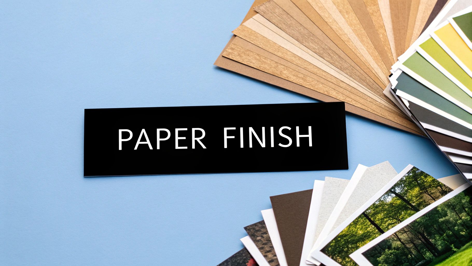
Matching The Paper Finish To The Music
Once you've picked your print style, the final piece of the puzzle is the paper finish. This is all about texture and sheen, and it can dramatically change the mood of your artwork.
Here’s a quick rundown of the main players:
- Matte Finish: This has a non-reflective, flat surface that’s brilliant for black-and-white photography or moody, atmospheric covers. Think Joy Division's Unknown Pleasures or The National's melancholic artwork. Matte paper soaks up the ink beautifully, giving a deep, rich feel without any distracting glare.
- Satin Finish: Often called lustre or semi-gloss, this is the perfect middle ground. It has a subtle sheen that makes colours pop without the full-on reflection of high gloss. It’s incredibly versatile and works for almost any album art, from the vibrant colours of a Blur cover to the detailed artwork of a Pink Floyd classic.
- Gloss Finish: This is your high-impact, super-shiny option. A gloss finish makes colours look incredibly punchy and saturated. It’s ideal for bold, graphic designs or vibrant, colourful artwork that needs to grab attention from across the room—imagine The Stone Roses' debut album looking like the paint is still wet.
To make things a bit easier, here’s a straightforward comparison to help you choose the right combination for your album art.
| Print Type | Best For | The Vibe | Typical Paper Finish |
|---|---|---|---|
| Giclée | Special, single pieces; fine art reproduction; gifts. | Premium, archival, gallery-quality. | Matte or Satin/Lustre |
| Digital | Gallery walls; multiple prints; budget-friendly projects. | Sharp, vibrant, professional. | Satin, Matte, or Gloss |
This table is just a guide, of course. The real fun is in experimenting to see what works for your specific piece.
Choosing the right paper is like picking the right guitar amp. A matte finish gives you that warm, vintage tone, while a high-gloss finish is like cranking the distortion up to eleven. It’s all about what best serves the song—or in this case, the art.
Ultimately, there’s no right or wrong answer. It’s about matching the method to the music. A dark, textured matte print can enhance the brooding atmosphere of a post-punk classic, while a glossy, sharp Giclée can bring a psychedelic '60s cover to life with breathtaking clarity. Consider the vibe of the album and your room, and you'll create something truly special.
Framing and Finishing Your Masterpiece
You've got the perfect print, hot off the press and looking absolutely mint. But hold your horses—the job's not quite done. Leaving your stunning new print rolled up in a tube is like getting Oasis back together and only letting them play the B-sides. A great frame is what elevates your album art from a simple poster to proper, gallery-worthy decor.
Think of the frame as the final band member, the one that pulls the whole sound together. It can make or break the final look. Get it right, and you've got a masterpiece that will have your mates nodding in appreciation. Get it wrong, and it’s a bit like a dodgy cover version—it just doesn’t hit the same.
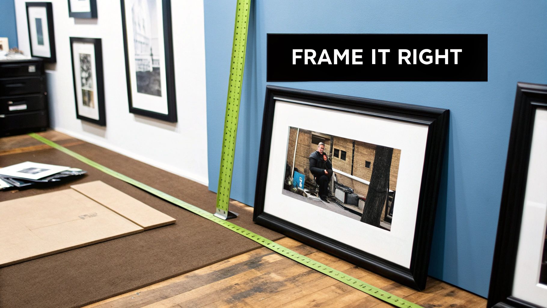
Getting The Size Right
First things first, let's talk size. Choosing the right dimensions is crucial for making sure your print commands attention without looking like it's bullying all the other furniture in the room. You don't want a tiny A5 print lost on a massive wall, nor do you want a giant A1 piece making your cosy living room feel like a broom cupboard.
- For that classic vinyl look, a 12x12 inch (30x30cm) print is the obvious choice. It’s a direct nod to the LP format and looks brilliant on its own or as part of a grid.
- For a standard poster vibe, A3 is a solid all-rounder. It's big enough to make an impact but won't dominate a smaller space.
- To make a real statement, go for A2 or even A1. A massive print of Sgt. Pepper's Lonely Hearts Club Band could become the undisputed centrepiece of your room.
Think of your wall like a festival line-up. You need a headliner (your big statement piece) and some great supporting acts (smaller prints) to create balance. Don't just throw everything on stage at once.
Choosing a Frame That Complements The Art
Now for the main event—the frame itself. This is where your personality really comes into play. The colour and style you pick should complement both the album art and the room it's going to live in.
A classic, thin black frame is the Swiss Army knife of framing; it works with almost anything. It gives that iconic Oasis cover a sharp, timeless look and lets the artwork do all the talking.
But don't be afraid to experiment. A rustic, natural wood frame could be perfect for a folky, acoustic album from someone like Nick Drake, adding a bit of warmth. For something really vibrant, like a Happy Mondays cover, a simple white frame can make those wild colours pop even more. You can explore more ideas in our guide on how to get the most out of your framed album covers.
To Mount or Not To Mount
Finally, let's talk about the passe-partout—that white cardboard border thingy between the print and the frame, also known as a mount. Including a mount is a pro move that gives your artwork some breathing room. It creates a bit of space, drawing the eye towards the image and making it look more professional and less cluttered. Honestly, it just adds a touch of class and stops the print from feeling squashed against the glass.
The world of album art printing is constantly evolving. The rise of digital printing is reshaping UK production, with shorter, on-demand runs becoming the norm for both efficiency and sustainability—perfect for our music and football prints. This shift allows for targeted printing over massive litho runs, cutting waste and aligning with the eco-conscious values of many music fans.
Once your album art print is beautifully framed, you'll want to display it perfectly. For the final touch, check out these great tips for properly hanging your finished artwork. It’s that last step that ensures your print looks polished, professional, and ready to make everyone who sees it just a little bit jealous.
Getting to Grips with Copyright for Album Art
Right, let's talk about the legal side of printing album art. I get it – the word 'copyright' isn't exactly a crowd-pleaser and can feel a bit like homework. But trust me, getting your head around this is crucial. It’s the difference between proudly hanging your new print and receiving a rather unpleasant letter from a lawyer who, funnily enough, doesn’t care much for your favourite band.
Here's the long and short of it: you can't just grab an image from the internet and print it. That iconic album cover you’ve loved for years? It's a piece of art protected by copyright. This means the photographer, the illustrator, the designer, and often the record label all have legal rights to that image. Printing it without their say-so is, well, just not on.
To keep things straightforward and avoid any drama, it's worth getting familiar with the basics. A quick read-up on understanding intellectual property violations can save you a world of hassle and ensures you can enjoy your art without any nagging worries.
Why Buying From a Legitimate Source Matters
This goes beyond simply staying on the right side of the law; it's about showing respect for the art itself. When you buy from a legitimate seller (like us here at Striped Circle), you’re doing more than just getting a fantastic piece for your wall. You're actively supporting the creative people who brought that artwork to life.
Think about the designers and artists who spent countless hours creating that visual masterpiece. They deserve to be paid for their work. Buying official or properly licensed prints makes sure the original creators get their fair share. It's your way of saying "thanks" and helping to keep the culture we all love alive and well.
How to Spot a Dodgy Dealer
So, how do you know if you're buying from a genuine fan or just someone churning out cheap knock-offs in their garage? With so many online marketplaces, it can be tough to tell.
Here are a few red flags to watch for:
- Pixelated Previews: If the images on the seller's site look blurry or low-quality, steer clear. Reputable sellers will always use high-resolution images to show off their products.
- Vague Descriptions: A legitimate print shop will be proud to tell you about their paper stock, printing methods, and ink quality. If the details are fuzzy, so is the business.
- No Artist Credit: A seller who truly values the art will almost always credit the original artist or designer. A lack of credit is a big warning sign.
- Prices That Look Too Good to Be True: If you see a massive, high-quality giclée print for the price of a pint, something's up. Quality materials and official licensing don't come cheap.
Choosing an authentic seller isn’t just about the quality of the print. It's about investing in a piece of our shared culture and ensuring the art you love is celebrated properly, not just copied for a quick quid.
While the wider UK printing industry has seen its challenges, specialised areas like album art printing are booming, thanks in part to a resurgence in music merchandise. The demand for high-quality prints celebrating UK music icons allows businesses like Striped Circle to thrive. By focusing on niche markets and using modern digital technology, we can create stunning art for true music lovers. When you choose wisely, you're not just decorating your home; you're supporting genuine passion and creativity.
Frequently Asked Questions About Printing Album Art
Right then, you've made it through the technical soundcheck, the main stage performance, and the framing encore. But maybe you've still got a couple of questions rattling around, like that one bassline you just can't get out of your head. No worries, we've got you covered.
Think of this as the post-gig Q&A session. We’re tackling the most common queries we get about turning digital tunes into physical treasures for your wall. Let's get these last few mysteries cleared up so you can press on with your album art printing journey and create a certified platinum success.
What's the Best Resolution for Printing Album Art?
For a print that’s sharp enough to cut glass, not a blurry, pixelated mess, you should always aim for 300 DPI (dots per inch) at the final print size. This is the undisputed champion of print quality, the industry standard for a very good reason.
If you’re printing a classic 12x12 inch album cover to replicate that proper vinyl feel, your image file needs to be at least 3600 x 3600 pixels. Anything less and you're venturing into dodgy bootleg territory where things start looking fuzzy. Just remember the golden rule: it’s always better to have a file that's too big than one that's too small. You can always scale down, but you can't magically invent detail that isn't there.
Can I Just Use an Image I Found Online?
In theory, yes. In reality, you absolutely shouldn't. There are two massive reasons why this is a terrible idea, and knowing them will save you a world of pain.
First, there's the small matter of copyright, which we've already touched on. Most images you find online are protected, and printing them without permission is a legal minefield you do not want to wander into. It's just not cool, and it disrespects the original artists.
Second, the quality will be rubbish. Images on the web are almost always optimised for screens, meaning they're a low-resolution 72 DPI. This looks fine on your phone but will look utterly dreadful when blown up on paper. You’re far better off buying from a legitimate print shop (ahem, like us) that has licensed the artwork properly and has the high-quality files to do it justice.
What Is the Difference Between CMYK and RGB?
This one's dead simple once you get your head around it. RGB (Red, Green, Blue) is for screens, and CMYK (Cyan, Magenta, Yellow, Black) is for print. Think of it like this: your monitor mixes light to create colours, which is why they can look so bright and zingy.
A printer, however, mixes physical ink to create colours on paper. If you send an RGB file to a printer, it has to guess how to translate those light-based colours into ink, and the results can be dull, muddy, or just plain weird. For the best results in your album art printing, always make sure your file is converted to a CMYK colour profile first.
Is Giclée Printing Really Worth the Extra Cost?
In a word: yes. That is, if you're after top-tier, archival quality that will outlast us all. Giclée printing is the gold standard for a reason.
It uses special pigment-based inks on acid-free paper, which means the colours will be incredibly vibrant and won't fade for over 100 years. For a standard poster to fill a gap on a gallery wall, a quality digital print is a fantastic and cost-effective choice.
But for that one special piece—the album that defined your youth, the artwork that still gives you goosebumps—Giclée is worth every penny. It’s an investment in a piece of art that you'll want to keep forever.
It’s the difference between seeing a decent tribute band and getting front-row tickets to see the real legends. Both are a good night out, but one is an unforgettable experience.
At Striped Circle, we live and breathe this stuff. We pour our passion for music and football into every single print we create, ensuring you get something you'll be proud to hang on your wall. Check out our collection and find the perfect piece to make your space sing. Find your next masterpiece at https://www.stripedcircle.com.
