
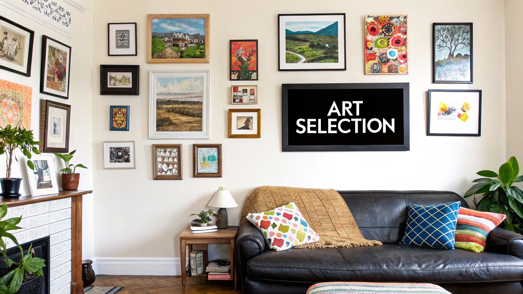
How to Arrange Wall Art Like a Pro (Without Making a Total Dog's Dinner of It)
Figuring out how to arrange wall art can feel a bit like explaining the offside rule to your mate after a few pints – confusing, frustrating, and likely to end with something slightly wonky. The simple approach? Treat your art like a team. Make sure the whole collection works together as a single, unified unit. Your goal is to fill the space with intention, making your wall look more like a perfectly curated playlist and less like a random jumble sale.
Your Walls Are Crying Out for Help
Let’s be brutally honest. Staring at a blank wall is about as exciting as a goalless draw on a wet Tuesday night in Stoke. You've got those amazing prints of Bowie, Cantona, or some classic film quote, but they’re still leaning against a wall, gathering dust in the corner. Consider this your official intervention.
We're here to help you transform that empty space into a gallery wall that showcases your top-tier taste in music, football, and everything in between. Think of this guide as your new gaffer, giving you the tactics to turn a boring wall into a masterpiece that screams personality. No more guesswork, no more wonky frames, and definitely no more beige misery.
Why Bother with a Plan?
You wouldn't build a fantasy football team without a strategy, would you? The same logic applies here. Just slapping things on the wall randomly is a recipe for disaster. A well-thought-out arrangement makes your collection look deliberate and stylish, not like an accident. It’s the difference between looking like a cool art collector and someone who just inherited their nan’s questionable picture frames.
And it seems everyone is getting in on the action. The UK wall art market is booming, generating around USD 3.6 billion in 2022 alone. That figure is expected to climb to nearly USD 5.5 billion by 2030, which proves that getting your walls sorted is no longer a niche hobby; it’s practically a national obsession. You can discover more insights about the UK wall art market and see how your tastes fit into the bigger picture.
What This Guide Will Do for You
This isn't your standard, stuffy interior design manual. We're going to give you practical, no-nonsense advice to make your home or office feel like an extension of you. We’ll show you how to arrange wall art properly, ensuring your place has as much character as you do.
Here's what you can expect:
- Simple tactics for laying out your prints before a single nail is hammered.
- Golden rules for measurements that even the most DIY-adverse person can follow.
- Tips on creating a theme, turning your prints into a visual mixtape of your passions.
So, grab your favourite prints. It's time to get them off the floor and onto the wall where they belong.
The Pre-Match Tactical Briefing
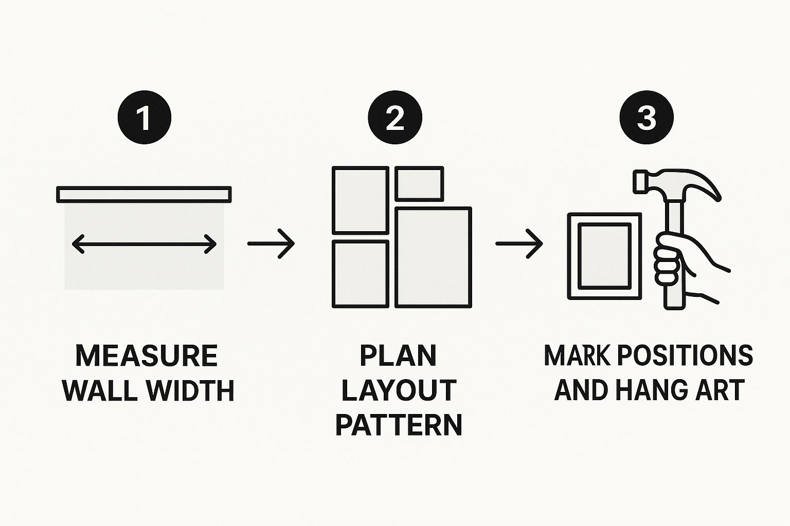
Right then, let's get your wall looking mint. Before you even think about picking up a hammer, you need a game plan. Just grabbing nails and going for it is a recipe for disaster – you'll end up with a wall that looks less like a curated gallery and more like a punk drummer's practice space after a long weekend.
Think of yourself as the gaffer, the Guardiola of your living room, planning your tactics before the big match.
The first move is simple: gather your squad of prints. Lay every single one out on the floor so you can see what you’re working with. This is your training ground. Does that Liam Gallagher print really work next to the Pulp Fiction one? Is the vibrant lemon from the Stone Roses artwork clashing with your team's crest? Sort it out now, not when there are holes in the wall.
Find Your Formation
A great gallery wall has rhythm. Mixing up sizes, shapes, and even the style of your frames is key. A wall full of identical frames can feel a bit rigid and boring, like a team stuck playing a flat 4-4-2 with zero flair. You want energy, a bit of swagger.
Here’s how to build your line-up:
- The Anchor Piece: Start with your biggest or boldest print. This is your star player, your Cantona. Don't stick it dead in the centre; place it slightly off-kilter and build the rest of the display around it.
- Balancing Act: If you've got a few larger pieces, spread them out. Distribute them evenly to create a sense of balance across the wall. You wouldn't put all your best strikers on one side of the pitch, would you?
- Fill the Gaps: Your smaller prints are your workhorse midfielders. Use them to fill in the spaces and connect the bigger pieces. They do the crucial job of making the whole arrangement feel cohesive and complete.
Your floor is your tactical whiteboard. Spend a good amount of time shifting prints around, swapping them out, and just seeing how they all look together. It’s far, far easier to spot a mistake on the carpet than it is after you've made a mess of your wall.
Time for a Quick VAR Check
Now for the secret weapon, the bit of kit that changes the game: brown paper and painter's tape. Trace each frame onto a sheet of paper—wrapping paper or old newspapers work a treat—cut them out, and tape them to the wall. This is your VAR check for home decor.
This simple trick lets you mess around with the layout as much as you want without leaving a single mark. You can tweak the spacing, try different heights, and get a real feel for how the arrangement works in the room. It’s all about making sure you get the decision right before you commit, avoiding the kind of decorating own goal that’ll haunt you for years.
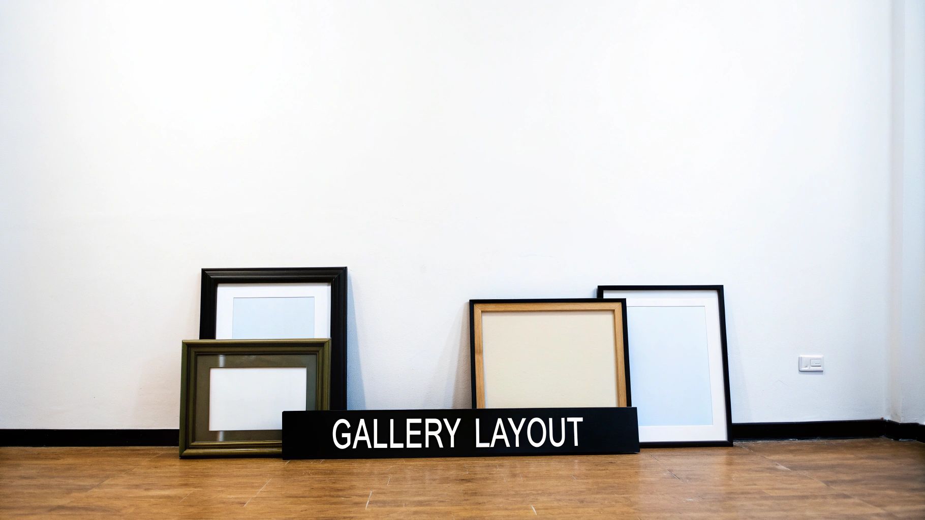
Gallery Wall Layouts for Every Vibe
Not sure where to start with your formation? Here's a quick look at different arrangement styles to help you pick your formation.
| Layout Style | Best For | Pro Tip |
|---|---|---|
| Grid (Symmetrical) | Creating a formal, clean look. Perfect for minimalist spaces or a series of matching prints. | Use a spirit level and measuring tape religiously. Even a tiny misalignment will stand out. |
| Organic (Asymmetrical) | A more relaxed, eclectic feel. Great for mixing different sizes, themes, and frame styles. | Start with your anchor piece off-centre and build outwards. Keep the spacing between frames consistent. |
| Top-Aligned | Hanging prints along a straight horizontal line at the top, letting the bottoms hang unevenly. | Works well above a sofa or headboard. Use painter's tape to create your top line before hanging. |
| Bottom-Aligned | The opposite of top-aligned; prints share a common baseline. This creates a solid, grounded feel. | Ideal for lining a hallway or above a long piece of furniture like a sideboard. |
Ultimately, the best layout is the one that feels right to you. Use these as a starting point, but don't be afraid to break the rules and create something that's totally your own.
Getting Your Measurements Spot On
Right, let’s get the technical stuff sorted. Nothing screams 'I did this after a few pints' quite like a crooked picture frame hanging halfway to the ceiling. It’s the offside rule of wall art; get it wrong, and the whole thing just looks amateur, no matter how cool your prints are.
Fortunately, there’s a golden rule that makes life a lot easier. You want to hang your art so the dead centre of the piece is at eye level. For most people, that’s somewhere between 145cm and 152cm (that’s 57-60 inches for anyone still using old money) from the floor.
This one simple guideline stops you from craning your neck or stooping down to see your glorious print of Ian Brown. It instantly makes the arrangement feel balanced and professional.
The Group Huddle Spacing
When you’re hanging a group of prints to create a gallery wall, the game changes slightly. You need to treat the entire collection as one single unit. Imagine a big rectangle around all your frames; the centre of that rectangle should be at that magic 145-152cm height.
Spacing between the frames is also crucial for a clean, organised look.
- Be Consistent: Aim for a consistent gap of 5-10cm (2-4 inches) between each frame. This stops the collection from feeling either cramped or disconnected.
- Measure Twice, Hang Once: Use your tape measure between each piece as you go. Don’t just eyeball it unless you enjoy making extra holes in the wall.
The most important tool in your kit? A spirit level. Seriously. Your phone probably has one built-in, so there are absolutely no excuses for wonky frames. A level picture is a happy picture.
This attention to detail is what separates a proper display from a chaotic mess. It’s no surprise that people are investing more in getting their homes right, especially with more of us working from our personal spaces. The global wall art market was valued at a massive USD 68.9 billion in 2025 and is set to keep growing, driven by our desire to make our homes feel unique. You can read more about the booming wall art market here to see just how big this trend is.
Getting your measurements spot on is the final piece of the pre-match puzzle. It ensures your meticulously planned layout translates perfectly from the floor to the wall, ready for you to admire.
Creating a Theme Like a Curated Playlist
A brilliant gallery wall tells a story. It’s not just a random collection of pictures; it’s your personal mixtape, but for your eyes. So, what’s the vibe? Are you creating a shrine to 90s Britpop, a celebration of your club’s glory days, or just a bonkers mix of movie quotes and abstract art?
The secret to arranging wall art so it actually looks cohesive is finding a common thread. This doesn't mean everything has to match perfectly—that would be as dull as a nil-nil draw. Instead, it’s about unifying your collection through a shared element.
Finding Your Vibe
Take a look at your favourite pieces and think about what connects them. It could be a consistent colour palette, a recurring subject, or even a particular frame style you've leaned into.
- Go Monochrome: Sticking to black and white prints creates a moody, classic look that’s effortlessly cool. It’s the Joy Division of interior design—timeless and full of atmosphere.
- Colour Riot: On the other hand, you could go bold with a riot of colourful graphics. If your prints share one or two key colours, they'll hang together beautifully, even if the subjects are completely different.
- Subject Matters: Grouping prints by theme is a great shout. You could have a wall dedicated to your football heroes, a corner for your favourite album art, or a section that celebrates iconic film moments.
And don't be afraid to mix your passions. A print of The Stone Roses can absolutely hang next to one of George Best. It's your wall, your rules. The key is finding that common thread, even if that thread is just 'stuff I think is class'.
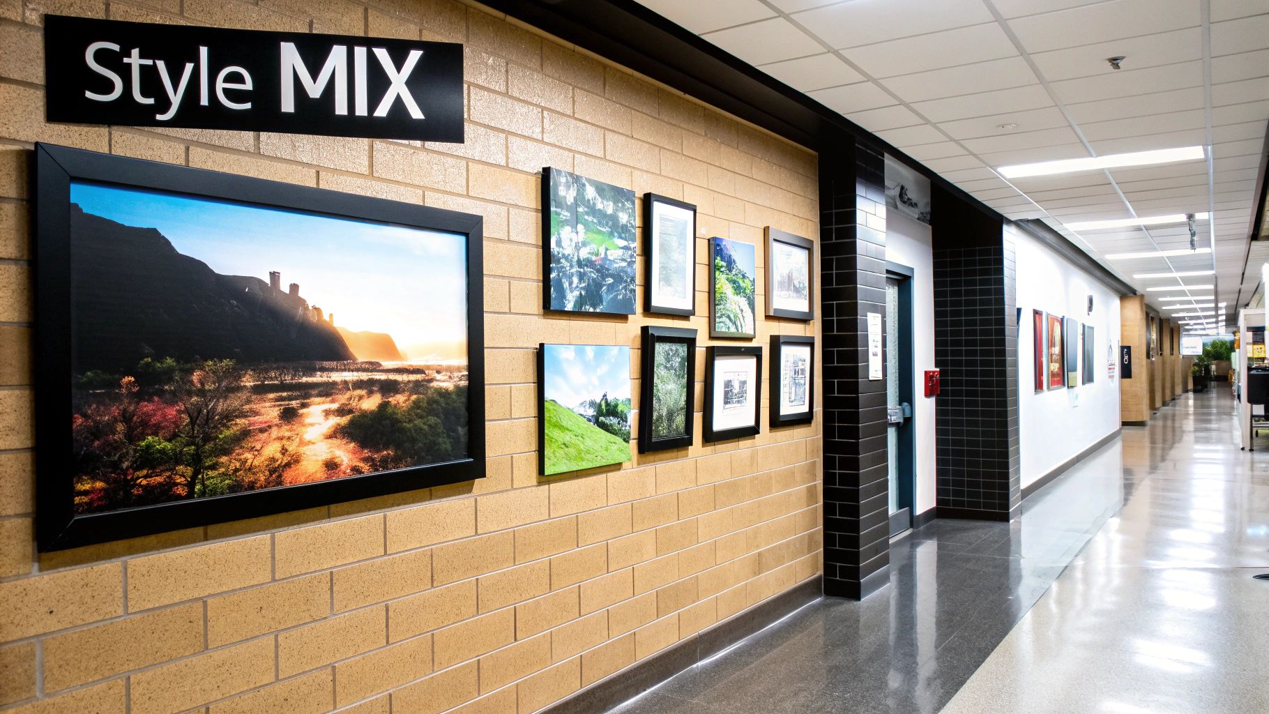
Mixing It Up Without Making a Mess
One of the best ways to create a dynamic gallery wall is by mixing different types of art. You could hang a bold lyric print next to a subtle graphic design, or a photographic portrait alongside an abstract piece. Our collection of general wall prints is a great place to find pieces that can tie a diverse collection together.
This approach adds layers and personality. It shows you've actually thought about the collection rather than just buying a job lot of matching frames from the nearest shop.
A great themed wall should feel like your favourite album: a collection of different tracks that work together to create a singular, brilliant experience. It’s all about flow and feeling.
Interestingly, it’s not just the look of our art that matters anymore; what it’s made of is becoming a huge factor. Consumer tastes in the UK have recently shifted toward sustainability and premium materials. In fact, in 2025, about 83% of consumers expressed a preference for brands with strong sustainability records, which influences their choice of decor like prints on recycled paper or frames from reclaimed wood.
It shows we're not just thinking about how our art looks, but the story behind it. You can learn more about evolving wall art trends and see how conscious choices are shaping our homes.
Hanging Your Art and Admiring Your Work
Right then, it’s the final whistle. The pre-match prep is over. You’ve planned, measured, and got your paper templates looking absolutely mint. Now it’s time to bring on the subs: your tools.
Before you start hammering, get a feel for your wall. Is it plasterboard? Solid brick? This dictates your tactics. A simple picture hook and nail might be fine for a lightweight frame on plasterboard, but a heavier piece on a brick wall will demand a drill, a wall plug, and a sturdy screw. Don't score an own goal by having your prized print of Morrissey crash to the floor.
Getting The First One Up
Your first print is the most important. It’s your captain, your anchor. Get this one perfectly level and in the right spot, because everything else will build from it. Grab your spirit level (or the app on your phone, no excuses) and make sure it’s bang on. Once it's secure, you can use it as the reference point for everything else.
Work outwards from your anchor piece, maintaining that consistent 5-10cm spacing you planned earlier. As you hang each frame, gently peel away the paper template from underneath it. This slow reveal is one of the most satisfying parts of the whole process, trust me.
Take regular breaks to step back and have a proper look. Sometimes what seems right up close looks a bit off from across the room. Step back, check the balance, and make sure your masterpiece is coming together as planned.
The Final Result
Keep going until the last print is up. Once you’ve peeled off the final bit of paper, the job’s a good 'un. You've successfully learned how to arrange wall art like a seasoned pro.
All that’s left to do is the victory lap.
- Put the kettle on: You’ve earned a proper cuppa.
- Stick on a celebratory album: Maybe the perfect tunes from our collection of song lyric prints can provide the soundtrack.
- Admire your handiwork: Bask in the glory of your perfectly curated wall.
It's no longer just a wall; it's a gallery of your passions, a visual playlist of everything you love. It’s a space that’s unequivocally, unapologetically you. Job done.
Your Wall Art Questions Answered
Alright, consider this your half-time team talk. You’re in the game, you’ve got the basics down, but a few questions are probably rattling around in your head. Let's clear up any confusion so you can get back out there and finish the job with the confidence of a penalty-kick specialist.
Here are the quick-fire answers to the questions we hear all the time when people are figuring out how to hang their prints.
Can I Mix and Match Different Frame Styles?
Absolutely. In fact, we encourage it. Sticking to one identical frame style can look a bit too uniform, like a perfectly manicured but soulless Premier League pitch. Mixing it up adds character and a more relaxed, eclectic vibe to your wall.
Think of it like curating a festival line-up. You want a mix of headliners and hidden gems. Combine a chunky, ornate frame with a couple of sleek, modern black ones. Throw in a natural wood frame for a bit of warmth.
The key is to find a common thread that stops it from looking like a jumble sale—maybe it’s a consistent colour in the prints themselves or a similar matting style.
How Do I Arrange Art Around a Big TV?
Ah, the TV. The big, black hole in the living room that sucks all the personality out of a wall. The trick is to make it part of the gallery, not the star player.
Build your arrangement around the screen. Don’t just stick a lonely print above it. Create a larger, asymmetrical gallery wall that envelops the TV, making it just one element among many.
This is a great way to show off a collection of your favourite lyric prints and make the wall a proper feature, not just a tech shrine.
My Frames Are Really Heavy. How Do I Hang Them Safely?
A tiny nail isn't going to cut it for your massive framed vinyl or that giant print of your team lifting the cup. For anything with some serious heft, you need to bring in the big guns.
- Plasterboard Walls: Use proper plasterboard plugs (the kind that expand behind the board) or self-drilling anchors. These provide a much stronger hold than a standard rawlplug.
- Brick or Masonry Walls: You’ll need to drill a hole and use a solid wall plug and a screw that’s long enough to get a proper grip.
Never, ever trust a sticky hook for anything heavier than a tea towel. It’s the defensive error that leads to a catastrophic own goal. Take the extra five minutes to use the right fixings.
Should Art Match the Sofa?
No, not exactly. Your art shouldn’t be a perfect colour match to your cushions like some sort of pre-packaged show home. Instead, it should complement the room's overall vibe.
If you have a neutral-coloured room, a bold, colourful print can be the splash of energy it needs. If your room is already quite vibrant, a more subtle black-and-white piece can provide a cool, calming influence. The goal is harmony, not camouflage.
Ready to turn those blank spaces into a testament to your top-tier taste? Dive into the Striped Circle collection and find the perfect prints to start your masterpiece. https://www.stripedcircle.com
Article created using Outrank
