
Matisse the Open Window: A Wild Colour Explosion Explained
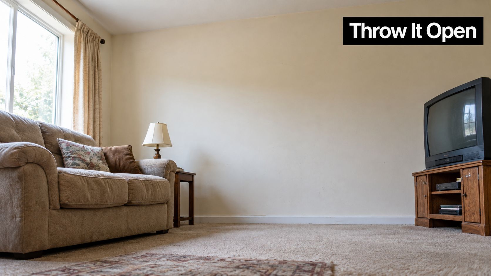
The telly's on, the sofa's comfortable, and that blank wall above it has somehow become the room's most forgettable feature. You've tried shifting a lamp and pretending the framed print from the spare room was always meant to be there. Still, the wall gives you nothing back.
That's where Matisse's The Open Window earns its keep. It's a harbour view that behaves less like a polite seaside postcard and more like a chorus bursting into the room: bright, loose, and completely uninterested in sitting in the background.
Table of Contents
- A Painting That Throws the Window Wide Open
- How a Quiet Summer in Collioure Set Paris on Fire
- Reading the Painting Without the Art Speak
- Who Owned It and Where It Lives Now
- Why the Painting Still Talks to British Walls
- Buying Prints and Reproductions Without Getting Burned
- Styling the Print in Real Rooms
- Why One Bold Print Is Worth a Hundred Safe Ones
A Painting That Throws the Window Wide Open
In the summer of 1905, Henri Matisse was working in Collioure, a harbour town on France's Mediterranean coast, alongside fellow painter André Derain. Looking through an open window, he saw boats, water, sky and walls. Then he gave the scene pink, green, violet, blue and orange, as if the view had walked into a record shop and come out wearing the loudest sleeve on the wall.
The result, Open Window, Collioure, is only about 55 by 46 centimetres, but its impact isn't measured in square metres. The window frames the harbour, while the colour takes over the job that realism usually handles. The painting doesn't ask you to admire a perfectly copied view. It asks you to enjoy what colour can do when it stops behaving itself. The painting's 1905 story and its place in Fauvism make clear why such a modest canvas became a landmark.
The Paris audience saw that energy in person at the Salon d'Automne. Matisse's work appeared in the exhibition that helped make Fauvism famous, a movement named after a critic's reaction to its artists' wild treatment of colour. You don't need a gallery hush or a degree to feel the appeal. It's the visual equivalent of a last-minute winner: the moment a room stops politely watching and gets properly involved.
That's the point of choosing art for home or office. A print should do more than match the cushions; it should make you look up from the telly, smile on the way past, and feel the room has a personality of its own. The Open Window may be small on canvas, but it arrives like a full-volume chorus.
How a Quiet Summer in Collioure Set Paris on Fire
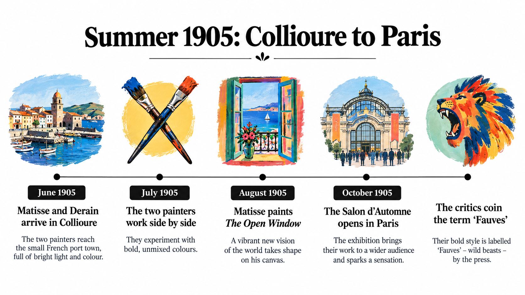
Two painters, a seaside town, and a palette that refused to behave. In Collioure, Matisse and Derain worked side by side, testing vivid colour and energetic brushwork against the familiar business of painting a view. Their experiments gave them room to make a place feel alive without matching every shade to what stood before them. The harbour became a testing ground.
Matisse's Open Window, Collioure emerged from that shared summer. He used contrasting patches of colour to organise the room and the view beyond it, loosening the hold of careful shading. You could still recognise the place. What changed was the freedom he gave himself to paint it, with colour carrying more of the picture's feeling.
From seaside experiment to Paris debut
The jump from seaside work to public exhibition mattered: experiments made between fellow painters were about to face a roomful of strangers.
Matisse showed four paintings at the Salon d'Automne, including Open Window, Collioure and Woman with a Hat, with the works displayed in Room VII on 18 October 1905, according to A historical account of Matisse and the 1905 Fauvist breakthrough.
Against traditional sculpture, those vivid paintings looked provocative enough for critic Louis Vauxcelles to describe the encounter as “Donatello among the wild beasts”. That phrase helped give Fauvism its name, from the French fauves, or wild beasts. A critic's joke became the label for a new attitude towards colour. Art history does enjoy a nickname that sticks.
The route from Collioure to Paris gives a print something beyond decorative appeal. On a British office wall or beside the living-room shelves, it carries the memory of painters trying things out before the crowd had its say. There's a football-terrace pleasure in that refusal to play safe. One summer's experiments became a public challenge to the idea that paintings had to imitate the eye, and Paris could not look away.
Reading the Painting Without the Art Speak
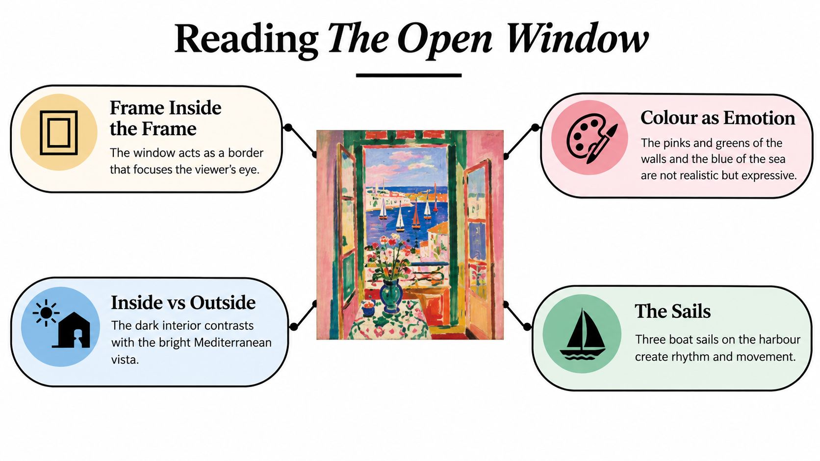
Start with the window. It makes a frame inside the frame, separating the interior from the harbour while pulling your eye through the picture. The opening is more than a bit of architecture. It gives the view a stage, like a lighting rig focusing attention on the lead singer.
Beyond it, the harbour, boats, sky and surrounding walls are arranged through contrasts of colour rather than conventional shading. Pink, green, violet, blue and orange sit beside one another without pretending they're a straightforward record of what Matisse saw. The colour is expressive: it gives the whole scene a pulse.
What to look for first
- The window frame: Notice how the border shapes your view of the harbour. You're looking out, but you're also aware of the room around you.
- The colour blocks: The pinks, greens, blues and oranges are the main event. They organise the image and make the interior and the view outside feel distinct.
- The boats and sails: Small shapes on the water keep the harbour from becoming a flat patch of colour. They give your eye somewhere to move.
- The brushwork: Matisse's marks are loose and visibly energetic, more like quick musical phrasing than the smooth finish of a carefully shaded drawing.
The composition works because it balances the inside and outside. The window holds the image together, while the harbour gives it room to breathe. The colours don't politely recede into a realistic distance; they keep their place on the surface, so your eye moves between the walls, the opening and the water.
An easy way to read it: Look at two colours side by side before asking what each object is. The contrast is doing much of the storytelling.
That's why you don't need art-school vocabulary to get the painting. Look at the shapes, follow the window's frame, then notice how the colours make the view feel lively rather than literal. It's a good reminder that a print can reward a quick glance and still offer more when you stop to look properly.
Who Owned It and Where It Lives Now
You've found a print for the wall above your desk, and the listing calls it Open Window, Collioure. Before choosing a frame, it helps to know where the original ended up. Its collecting history includes the John Hay Whitney Collection and a loan to London's Tate Gallery. Today, the painting belongs to the National Gallery of Art in Washington, D.C.
That London chapter was a loan, rather than a sale to the Tate.
The National Gallery of Art's catalogue record records the Tate loan in 1960–61, identifies the painting by accession number 1998.74.7, and gives its canvas dimensions as 55.25 × 46.04 centimetres and framed dimensions as 69.85 × 61.28 × 5.72 centimetres, making the canvas's height-to-width ratio about 1.20:1.
Those measurements are useful once the painting leaves the catalogue page and becomes a possible purchase. The canvas dimensions describe the painted surface; the framed dimensions include the surround and its depth. Confusing the two could leave you judging a reproduction against the wrong proportions. A seller's mock-up might look convincing above a sofa while quietly making the image wider than it should be.
Keep the original proportions in view when deciding whether a print suits your space.
Stretching the image changes the relationship between the window and harbour, a bit like hearing a familiar chorus played at the wrong speed. You recognise it, but something feels off. For a UK home or office wall, the catalogue offers a dependable reference before you commit to a frame.
The Tate loan also gives British viewers a specific piece of the painting's history to hold onto. This Mediterranean scene spent time in London before reaching its current home. Its travels belong to the wider story of collecting and displaying modern art, with a British stop along the way.
Why the Painting Still Talks to British Walls
Matisse's Collioure experiment didn't stay on the Mediterranean coast. Derain later carried Fauvist ideas into his 1906 London paintings, including celebrated views of the Houses of Parliament. The colours that had helped transform a harbour view could now meet the Thames, the city's architecture and that particular London light. The Metropolitan Museum of Art's exhibition guide connects Derain's London work to the Fauvist ideas he developed with Matisse.
That exchange gives The Open Window a satisfying British echo. A French seaside window leads, by way of Derain, to the Houses of Parliament. The painting's relevance isn't that it predicts every later artist or album sleeve. It's that it makes a clear case for treating colour as something expressive, not merely descriptive, a way of shaping mood as much as recording a scene.
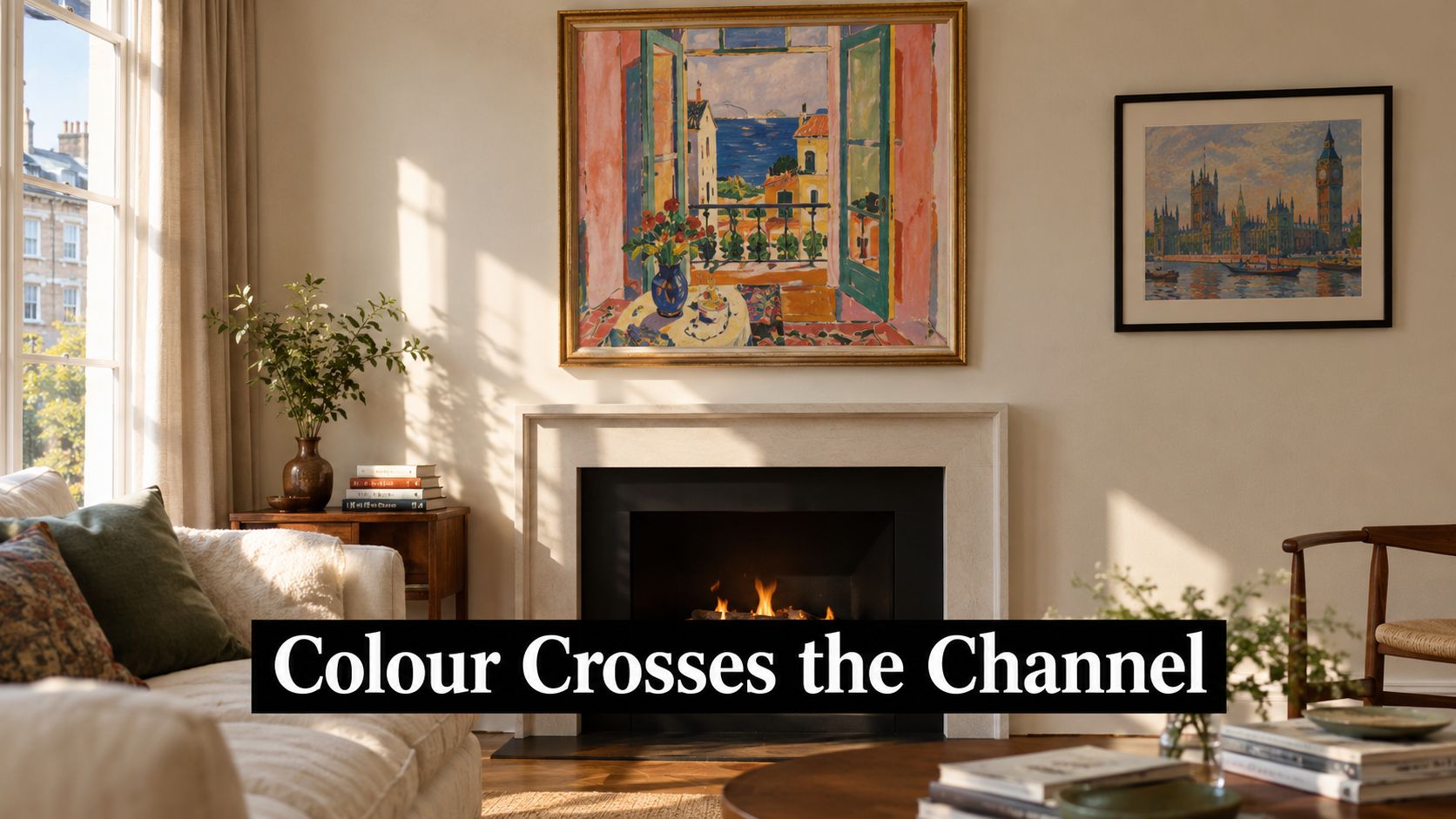
For a home or office, that means the painting can bring the energy of a chorus line, a last-minute winner or a guitar solo to a space that's taking itself a bit too seriously. Its bright colours give a room a focal point without relying on a photograph or a slogan to do all the work. You can enjoy it as a harbour scene, a piece of modern art history, or a welcome hit of colour when the day's been grey.
If you're thinking about how colour will sit alongside your existing walls and furnishings, this Dublin home palette guide offers a useful way to consider palette and atmosphere together. The broader point is simple: art doesn't need to match every object in a room. A bit of contrast can be what makes the whole arrangement feel intentional.
Hanging a reproduction is a small act of cultural exchange: Mediterranean light on a British wall, with enough attitude to keep the room from feeling like a waiting area. You get history, colour and a conversation starter without anyone needing to announce that the room has “a theme”.
Buying Prints and Reproductions Without Getting Burned
A print can look lively online and arrive with colours as flat as a nil-nil at half-time. Before ordering, check the image's proportions against the original, then ask how the seller handles colour and what materials the print uses. The National Gallery of Art's recorded dimensions give Open Window, Collioure an image ratio of approximately 1.20:1. Keep that relationship intact rather than letting a standard frame dictate the crop.
Archival pigment inks and substantial paper are good signs for a reproduction intended to hold rich colour and feel considered. Ask for clear details about the printing process and colour accuracy. If the greens look dull or the pinks have lost their punch, the image's lively balance can disappear.
A buyer's checklist
- Check the proportions: Make sure the image has not been stretched or cropped to fit a standard frame.
- Ask about the print process: Look for specific information about paper and pigment inks. “High quality” on its own tells you little.
- Think about the frame: A thin black frame gives the art a crisp edge. Natural wood brings warmth and softens the look.
- Prioritise the image: A sharp, colour-faithful print matters more than an elaborate frame around a blurred reproduction.
The original canvas is relatively small, but a reproduction can be larger if its proportions remain true. More room can let the colour make a stronger impression. Stretch the image, though, and the window and harbour start to relate differently, a bit like a chorus sung off-key.
Practical rule: Spend on a well-produced image first. A fancy frame can't rescue faded colours or wandering proportions.
Before you order, compare the listed dimensions with the image and measure the wall space you have in mind. This guide to print quality explains what to look for in a well-made reproduction. Choose a print that feels lively from across the room and holds its detail up close.
Styling the Print in Real Rooms
In a kitchen-diner, The Open Window can pick up the warmth of terracotta tiles, wood or a colourful vase without needing every accessory to match it. The pinks and oranges bring a sunlit note, while the greens and blues keep the palette from turning into a full-on tomato festival. Put it where people naturally gather and it has the easy presence of a song everyone knows the chorus to.
A home office is another good home for it. Against a grey wall or a plain backdrop, the painting gives the room a stronger point of view without needing novelty mugs to carry the personality. It's a welcome alternative to staring at a blank patch between meetings.
Find the room that needs a lift
A hallway benefits from art that rewards a passing glance. The framed window and busy harbour make a small pause in an otherwise purely functional stretch of wall. In a living room, hang it above a sofa where the colours can hold their own without competing with every other object.
But it won't suit every setup. In a strictly monochrome room, the saturation may feel like an argument rather than a feature. And in a tiny room already full of bold patterns, the painting could push the visual volume too high. Give it some breathing space and let its colour do the work.
Placement matters as much as the print. Before putting a hook in the wall, measure the available space and think about how the frame relates to nearby furniture. This precise picture hanging guide offers practical advice for getting the position right, while this guide to colour psychology in interior design can help you think through the mood you want the room to have.
The reason this painting works so well in lived-in spaces is that it has plenty going on, but it isn't a tangle of tiny details. You can enjoy it from across the room, then notice new relationships between the colours when you come closer. That makes it a styling cheat code for rooms that need warmth and personality without sacrificing a sense of order.
Why One Bold Print Is Worth a Hundred Safe Ones
The blank wall above the sofa doesn't need another object chosen because it was easy to coordinate. It needs something you'll notice when the telly's off, when a mate comes round, or when you walk through the room carrying a cup of tea. The Open Window brings that kind of presence through colour, composition and a history that connects Collioure to Paris, then reaches across the Channel to Derain's London work.
Its catalogue measurements give you a reliable way to choose a reproduction that keeps the image in proportion. Its colour gives you a practical way to add warmth and energy. And its harbour view reminds you that art can make a room feel more open, even when all it takes is a window painted on canvas.
A home doesn't become personal because everything matches. It becomes personal because the things on its walls reflect what makes the people in it smile. That could be a favourite band, a football club, or a bold modernist painting that has been making trouble since 1905. If pop-inflected art is more your tempo, explore this guide to pop art prints.
Go back to that tired wall. One carefully chosen print can do more for it than a row of safe, forgettable choices. Hang something with a bit of character, and let the room sing.
Striped Circle is a family-run business offering high-quality wall art, posters and greeting cards inspired by music and football, including prints celebrating iconic bands and clubs. Visit Striped Circle to find a bold print that gives your home or office a little more personality.
