
Personalized Greeting Cards That Actually Rock
You're standing in a supermarket aisle with three minutes before the tills close, holding a card covered in glitter, balloons and the words “Have a fabulous birthday!” Your sister is a lifelong football obsessive who once watched a cup replay on a phone in a hospital waiting room. The card, meanwhile, appears to have been designed for somebody who owns a fondue set and says “golly”.
That's the problem with generic cards. They're technically suitable, but emotionally about as accurate as a football pundit predicting a goalless draw after seven minutes. Personalized greeting cards work because they give the recipient something recognisable: a favourite band, a legendary match, a private joke, or a visual reference that says, “I know what makes you tick.” The result isn't just a card. It's a small piece of pop-culture art with an actual chance of surviving beyond bin day.
Table of Contents
- Why Generic Supermarket Cards Are Letting You Down
- The Case for Physical Cards in a Digital World
- Designing for True Fans With Music and Football Themes
- DIY Home Printing Versus Professional Custom Quality
- Nailing the Inside Message and Typography
- Ordering Logistics and Packaging That Feels Premium
- Where to Find the Coolest Custom Cards Online
Why Generic Supermarket Cards Are Letting You Down
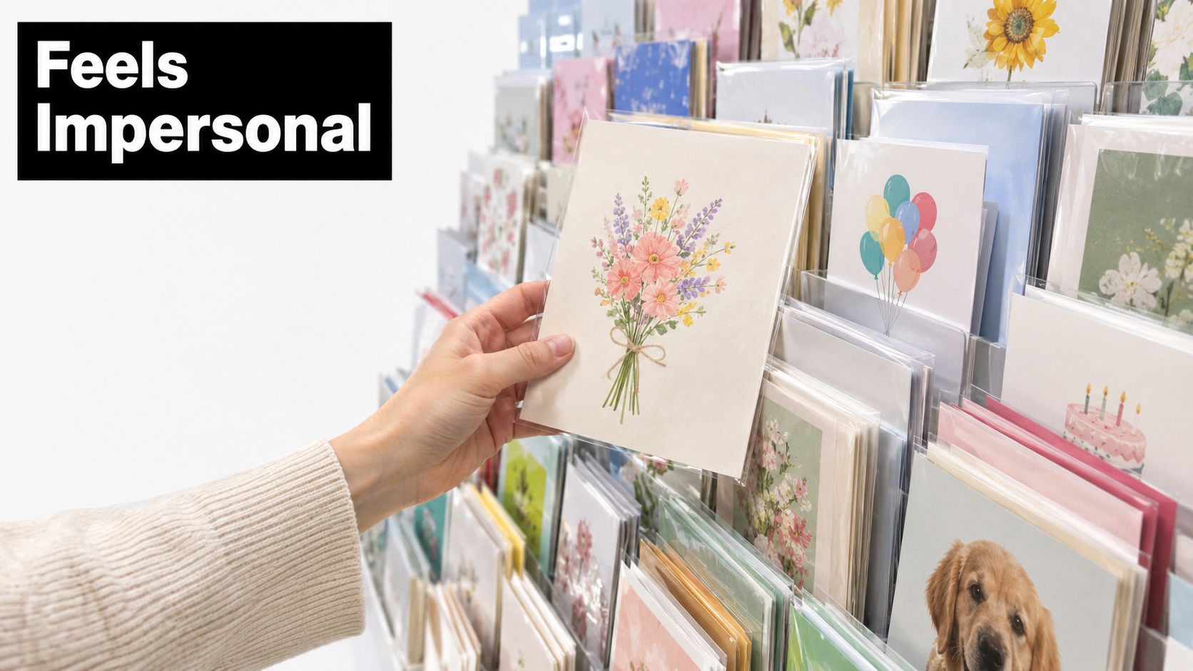
The supermarket card aisle has a particular talent for making thoughtful people look thoughtless. You arrive knowing your mate supports a specific club, worships one obscure 1980s band and considers “just popping out for one drink” a work of pure fiction. You leave with a card showing a generic cake and a joke that could have been written for anyone from your dentist to a moderately friendly neighbour.
Mass-produced cards fail because they remove the recipient from the equation. The design announces a category, such as birthday, retirement or anniversary, but it doesn't reveal why this person matters. A card that says “You're 40, not old” might raise a chuckle. A card referencing the recipient's favourite album, club chant or notorious inability to arrive before kick-off creates recognition. That little flash of “How did you find this?” is the entire point.
The recycling-bin test
A generic card often gets opened, admired politely and placed in a stack with bills, takeaway menus and a mysterious instruction leaflet for a lamp nobody remembers buying. A personalised design has another possible destination: the fridge, a desk, a bookshelf or a memory box.
That difference comes from specificity. A football fan might keep a card styled around the colours and character of their club. A gig-goer might display a design inspired by an alternative lyric or a favourite setlist. Someone who lives for pop-culture references may prefer an inside joke that makes sense to three people and one extremely committed Wikipedia editor.
The useful rule: If the card could be sent to almost anyone, it probably will be remembered by almost no one.
Niche designs also solve the last-minute gifting panic. You don't need to write a miniature biography or hand-cut a masterpiece at midnight. Choose a visual language that already belongs to the recipient, then add a message that sounds like you. The card does the heavy lifting without looking like it was rescued from a petrol station beside the meal deals.
That's where curated music, football and pop-culture artwork earns its place. It turns a routine paper object into a tiny portrait of someone's personality, which is a much better gift than glitter having another go.
The Case for Physical Cards in a Digital World
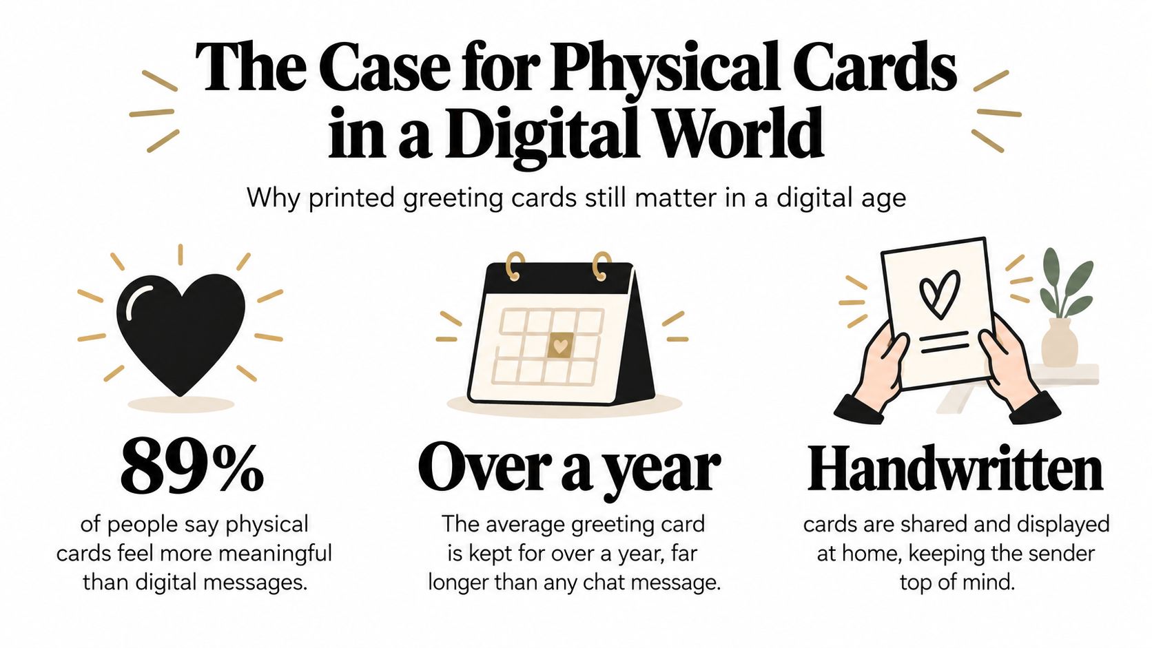
A WhatsApp message is convenient. It can also vanish beneath a group-chat debate about whether a midfielder has “lost it”. A physical card occupies space, arrives with intention and gives the recipient something they can hold, display and revisit. The emotional difference isn't nostalgia for its own sake. It's the combination of effort, material and permanence.
The UK remains a substantial greeting-card market. Moonpig's UK market overview estimates the market at £1.4bn, with 42 million adult card buyers purchasing an average of 19 cards per year, adding up to about 810 million cards annually. That's a mature, frequent habit, not a ceremonial tradition wheeled out once a decade.
Online ordering has room to grow without suggesting that physical cards have disappeared. Moonpig reports that 37% of UK adults bought at least one card online in 2023, while only 15% of total value and 6% of volume were transacted online in that year, as shown in its market overview. Most activity still happens beyond pure digital interaction, leaving space for web-ordered cards that retain a physical, tactile finish.
Why specificity changes the object
A digital greeting is usually experienced as a notification. A printed card has edges, texture, colour and a place in the room. Add an alternative lyric print, a football reference or a design recalling the recipient's favourite concert, and the card becomes closer to a miniature poster than a disposable message.
The wider personalized gift-card category reflects that appetite. Credence Research's UK market outlook values the UK personalized gift card market at USD 1,091.12 million in 2023 and projects it to reach USD 2,432.22 million by 2032, a projected 9.3% CAGR across that period. The numbers point to a preference for custom messages, photo-led designs and occasion-specific formats, not merely a desire to type somebody's name into a template.
| A generic message | A curated fan card |
|---|---|
| Marks the occasion | Marks the relationship |
| Works for almost anyone | Feels made for one person |
| Often disappears after opening | Can become part of a room |
| Communicates obligation | Communicates attention |
Premiumisation matters here too. A distinctive print gives the recipient a reason to keep the card, while good stock and crisp artwork make that choice feel natural. A digital message can be heartfelt, but a physical card that captures a beloved band or football memory leaves a different kind of evidence. It says somebody remembered the details.
Designing for True Fans With Music and Football Themes

Start with the obsession, not the occasion. “Birthday card” is the brief, but it isn't the creative direction. The useful question is, what would make this person stop halfway through opening the envelope and say, “That's so me”?
1. Find the reference with emotional mileage
For a music fan, avoid stopping at the band name. Choose the album they played during a memorable summer, the lyric they quote whenever somebody mentions rain, or the gig story they've told so often that even the dog knows the encore. An alternative lyric print can create the mood without turning the front cover into a crowded karaoke screen.
For a football supporter, colours are only the first layer. Think about the club's visual identity, a famous cup moment, a tactical shape they still discuss over Sunday lunch, or a chant that instantly transports them to the stands. A card based on a treasured football reference feels more considered than attaching a badge to a red background and hoping for the best.
2. Build the cover like a small art print
The strongest personalized greeting cards have a clear visual idea. Give the main reference enough room to breathe, use typography that matches the cultural source and keep the personal detail visible without making it look like a form from the council.
A card for a guitar obsessive could use the silhouette of a pick, a restrained colour palette and a line that only fellow fans recognise. A football design might borrow the rhythm of a match programme, using a formation, date or memorable phrase as the visual structure. Pop-culture humour works best when it rewards recognition rather than explaining the joke underneath it.
More ideas for balancing references, colour and composition appear in Striped Circle's greeting card design guide. The principle is simple: the artwork should feel good before the recipient reads the personal message.
Once the front cover works, add a small detail that belongs only to the recipient. It could be a nickname, a faux tour date, a playful “starting XI” or a line about the time they missed the first half because they were queuing for chips. Keep the joke affectionate. Football banter is a delicate art, and there's a fine line between “legendary” and “you're no longer invited to Christmas”.
The moving image can help clarify how fan-led designs come together, especially when music and sport references need to share the same visual space.
A useful test is to remove the occasion wording and look at the artwork alone. If it still resembles something the recipient would hang in a home office, pin beside a record player or display near a football scarf, you've created a keepsake rather than a decorated obligation.
DIY Home Printing Versus Professional Custom Quality
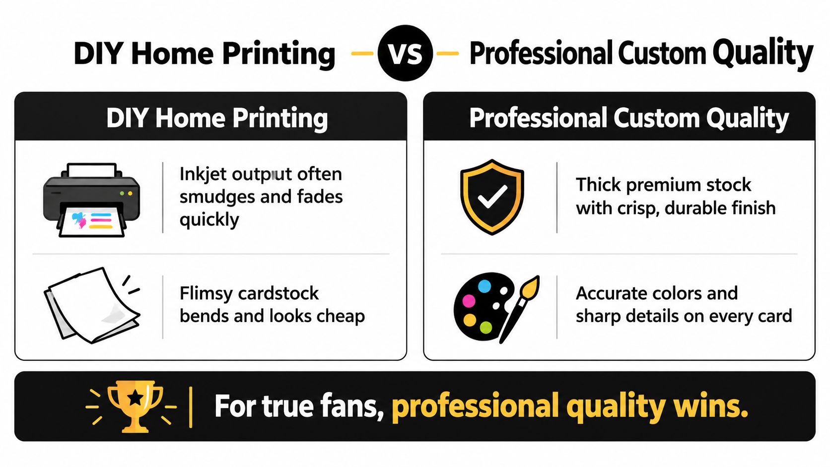
Your home printer has good intentions. It also has a history of producing faint blacks, surprise margins and one sheet that emerges with the emotional texture of a damp bus ticket. For a quick note, that may be acceptable. For a keepsake featuring detailed music artwork or an intricate football reference, print quality changes the entire impression.
DIY printing gives you control and immediacy. You can adjust the wording at midnight, fold the card yourself and avoid waiting for a delivery. The trade-off is consistency. Inkjet output can smudge, colours can shift between screen and paper, and thin card bends when an envelope looks at it with mild suspicion.
Where professional production earns its keep
Professional printing is especially useful when the design depends on sharp lines, accurate colour and small details. A football crest needs clean edges. A lyric-led composition needs readable type. Dark concert-inspired artwork needs blacks that look deliberate rather than like the printer has entered a period of personal decline.
| DIY home printing | Professional custom printing |
|---|---|
| Fast for urgent, one-off jobs | More dependable for finished artwork |
| Easy to change the message | Better consistency across colour and detail |
| Paper and ink depend on home equipment | Stock and finish can be selected for the design |
| Can look handmade, for better or worse | Suits a polished keepsake presentation |
Paper weight affects how the card feels before anyone reads it. A substantial stock resists bending and gives the artwork a more considered surface. Matte finishes can suit restrained, poster-like graphics, while gloss can make certain colours punchier. Neither is automatically correct. The finish should support the mood, not compete with it like a novelty commentator on a quiet match.
Production check: View the final design at its actual printed size, not only on a bright phone screen. Tiny type and delicate detail behave differently on paper.
For a deeper look at the charm and limitations of handmade approaches, this guide to handmade greeting cards offers useful context. Handmade can be wonderfully tactile, but professional production is the safer choice when the card is intended to double as a crisp piece of art.
Nailing the Inside Message and Typography
The front cover gets the applause. The inside message decides whether the card lands gracefully or falls over its own shoelaces.
Start by matching the tone. A dramatic music print doesn't need an inside message that reads like a corporate away-day email. A football joke can be warm without becoming a full match report, and a pop-culture reference should leave enough room for the recipient to enjoy the connection rather than receive a lecture about it.
Give the message a clear job
A good inside note usually does one of three things:
- Adds context: Explain why the reference belongs to the recipient.
- Adds affection: Say what you appreciate without reaching for a greeting-card cliché.
- Adds a punchline: Finish the visual joke with a line that sounds like your shared language.
“Hope you have a good one” isn't illegal, but it's rarely memorable. Try something more specific: “For the only person who can identify the opening riff before the song starts,” or “May your birthday have fewer defensive errors than that famous second half.” The wording doesn't need to be polished. It needs to sound like a human who has met the recipient.
Typography should support the artwork
Use a typeface that belongs to the cover's world. A bold, condensed style may suit a football-programme look. A quieter serif or clean sans serif may give an alternative lyric design more room to breathe. Avoid stacking several decorative fonts because they exist. That way lies the visual equivalent of three guitar solos happening at once.
If the card is printed blank inside, handwriting adds warmth and protects the composition. Leave generous negative space so the note doesn't feel squeezed into a corner. Write with a pen that won't bleed through the stock, and draft the message separately if your handwriting becomes experimental whenever a deadline approaches.
A short message with one precise detail beats a paragraph of general praise. Mention the gig, the chant, the shared journey or the running joke. The recipient should recognise the relationship, not merely the occasion.
Ordering Logistics and Packaging That Feels Premium
A perfect card arriving after the birthday is a tiny logistical tragedy. The artwork may be worthy of a gallery wall, but turning up on Wednesday for a Saturday celebration gives it the timing of a substitute warming up after the final whistle.
Check the production window before ordering, then account for delivery and the moment you'll hand over the card. Personalised work may need more preparation than an off-the-shelf design, so avoid leaving the order until the same day you start panic-Googling “best gifts for football fans”. Proofread every name, date and reference. A typo in a private joke is still a typo, but now it has travelled through a design process and possibly an envelope.
Use a practical ordering checklist
- Confirm the occasion: Match the artwork and message to the birthday, anniversary, thank-you or “just because” moment.
- Check the format: Make sure the card's size suits the envelope, display spot and amount of writing you want inside.
- Review the artwork: Look closely at names, punctuation, colours and small details before approving.
- Plan delivery: Order with enough time for production, postage and a backup plan if the recipient is never home.
- Inspect the packaging: Protective wrapping should keep corners clean and artwork dry without burying the card in unnecessary plastic.
Presentation affects the first five seconds. A proper envelope, a neat sticker or a restrained seal can make the card feel like a complete gift rather than a loose sheet of printed stock. Keep the extras aligned with the design. A music-themed card doesn't need a glitter explosion, and a football card probably won't benefit from a bow the size of a corner flag.
Sustainability belongs in that decision too. UK greeting-card business guidance highlights eco-friendly materials and water-based inks as major purchase drivers, showing that buyers increasingly expect sustainable packaging to match the quality of the card. That doesn't mean sacrificing presentation. It means choosing materials that protect the card while keeping the overall experience thoughtful.
Paying for dependable production, suitable stock and reliable delivery can prevent the costliest outcome, a card that looks rushed or arrives too late. The recipient may never know how smoothly the order went, but they'll notice when the corners are crisp, the envelope is clean and the design looks ready for the fridge, desk or wall.
Where to Find the Coolest Custom Cards Online
The best custom card isn't necessarily the one with the most personal data on it. It's the one that understands the recipient's world. A favourite band, a football colour scheme, an alternative lyric or a brilliantly niche reference can say more than a paragraph of generic sentiment.
That's why music and football artwork works so well as a greeting-card format. It already carries visual language, memory and atmosphere. A card inspired by a much-loved song can become part of a record-room display. A club-themed design can sit beside a scarf or programme. A witty pop-culture print can make an office desk less like a tax return waiting area.
The UK buying habit supports that physical approach. The Greeting Card Association's published market material says the UK spent about £1.7bn on greeting cards in 2019, with about £187m associated with Valentine's Day, Mother's Day, Easter and Father's Day cards. It also reports that 77% of card sales were everyday cards, sent for birthdays and other occasions. That creates plenty of room for designs that feel timely, funny and personal beyond the major calendar events.
For shoppers who want a card with more character than supermarket glitter, this guide to unique greeting cards in the UK is a useful starting point. Striped Circle offers music and football-inspired greeting cards, including designs such as “Come On Eileen”, supplied blank inside with a plain white envelope and printed on 350gsm card. Its wider collection also includes alternative lyric prints, music artwork and football-themed wall pieces, so the card can connect naturally to the art someone already keeps at home or in the office.
The point isn't to make gifting complicated. It's to stop choosing a card that could belong to anybody. Pick the reference that makes the recipient laugh, sing, groan or immediately start explaining a football match from fifteen years ago. That's where the keepsake begins.
Explore the music and football artwork at Striped Circle, including distinctive greeting cards and prints designed for fans with specific tastes. Choose a card that feels like an inside joke in paper form, then turn the next birthday, anniversary or “just because” moment into something they'll want to display.
