

UK Music Posters That’ll Make Your Walls the Headline Act
Let's be honest, that gaping hole on your wall isn't some bold minimalist statement. It's a festival stage just waiting for its headline act. UK music posters are the ultimate backstage pass, transforming a bland space into a proper, pint-in-the-air tribute to your impeccable taste in tunes.
They’re so much more than just paper, aren't they? They're visceral memories of that sweaty gig, the anthem that defined your uni days, and a guaranteed conversation starter when your mates pop round for a brew (or something stronger).
Your Walls Have A Big Blank Space (And They're Not Happy About It)
Face it, a plain wall is a criminal waste of potential. It’s a canvas that could be radiating a bit of Jarvis Cocker's swagger or Kate Bush's mystique. This isn't just about filling a void; it's about injecting your personality into your home or office. It’s about curating a space that makes you, and anyone who visits, grin like you’ve just blagged your way backstage.
We’re on a mission to banish the beige for good. Forget those generic, mass-produced bits you find in the big-box shops that scream 'I have zero personality'. We’re talking about tracking down that perfect print that feels like it was made just for you—a piece that celebrates the bands that actually shaped your world, not some stock photo model.
Finding Your Headline Act
Choosing the right print is a lot like building the perfect pre-match playlist. It takes a bit of thought, but when it hits, it’s pure magic.
To get you started, here are a few things to consider:
- Evoke a Memory: What was your first festival? That life-changing concert? The album that got you through a soul-crushing job? A poster can be a powerful anchor, instantly taking you back to those moments (minus the mud and dodgy burger).
- Match Your Vibe: Are you aiming for a chaotic, punk rock-inspired gallery wall, or more of a clean, minimalist Britpop tribute? The art should feel like a natural extension of your home's personality, whether that's 'cool and collected' or 'might spill a beer on the sofa'.
- Think Beyond the Obvious: Sometimes the most compelling prints aren't the famous album cover. They might be a clever interpretation of a lyric or a subtle design that only a true fan will clock on the second glance. It's like a secret handshake for music nerds.
Your home should tell the story of who you are, and be a collection of what you love. Decorating your walls with cool and unique prints is a brilliant way to stamp your personality on a space and make you smile.
This guide will walk you through everything, from the anarchic history of gig flyers to styling your space like a proper rock star. For more inspiration on giving your walls a tune-up, you'll love our guide to music artwork prints.
It’s about time your walls got the encore they deserve.
A Brief History of British Gig Posters
Ever wonder how gig posters became the art form they are today? Let's take a quick trip back through the visual history of British music. UK music posters were never just about selling tickets; they were the raw, visual heartbeat of our culture, plastered on bedroom walls and the sticky doors of legendary venues. Think of this as a backstage pass to the art that defined the decades.
Back in the swinging sixties, things were pretty straightforward. Posters for bands like The Beatles or The Rolling Stones were often simple, text-heavy announcements. Their main job was to get the word out – where and when – not necessarily to win any design awards. But even in their simplicity, they captured the explosive energy of the British Invasion.
Punk Anarchy and Indie Moodiness
Then, punk crashed the party like a pissed-off mate with a safety pin through his nose. Suddenly, posters were less about clean lines and more about pure, unfiltered chaos. Armed with photocopiers, Pritt Stick, and a massive dose of anti-establishment attitude, designers and fans alike created cut-and-paste masterpieces for bands like The Clash and the Sex Pistols. These flyers were messy, aggressive, and perfectly mirrored the music's raw, do-it-yourself spirit.
After that anarchic explosion came the more thoughtful, floppy-fringed indie scene of the 80s. The aesthetic shifted dramatically. Just look at the posters for The Smiths – they were often moody, melancholic, and artfully designed, using stark black-and-white photography and distinctive typography. They were less a punch in the face and more of a knowing, poetic glance over a pint of snakebite and black, capturing the vibe of a generation that valued introspection over outright rebellion.
This timeline shows how you can take a blank space and turn it into a personal gallery that tells your own story.
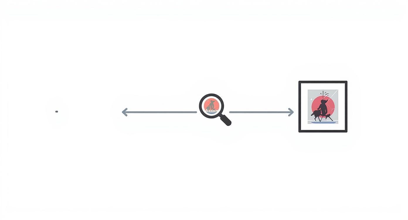
This visual journey highlights that finding your style is about transforming a blank canvas into a reflection of your personality.
The Britpop Revolution
The 90s arrived with a bucketload of swagger, and Britpop posters captured every bit of it. The artwork for bands like Oasis, Blur, and Pulp was bold, confident, and often drenched in Union Jack bravado.
These designs weren't just advertisements; they were declarations. They screamed "we are the biggest band in the world," and for a while, they absolutely were.
Using slicker graphic design, iconic photography, and often a nod back to 60s mod culture, these UK music posters became as legendary as the tunes themselves. They were the visual soundtrack to a decade of football-infused, lager-fuelled optimism, defining a uniquely British moment in time. From punk's photocopied fury to Britpop's polished confidence, these posters tell the story of who we were and the music that made us.
More Than Just Blu-Tack and Memories
Think that poster you nabbed from the merch stand is just a fond, slightly beer-stained memory? Think again, sunshine. That bit of paper you so carefully rolled up and protected from the mosh pit could be much more than a simple souvenir. Some UK music posters have quietly evolved from fan keepsakes into surprisingly valuable assets.
This isn’t about flogging your treasured memories on eBay for a quick tenner. It's about understanding the unique magic that can turn a tour poster into a genuine collector's item. It's a fascinating mix of art, history, and pure, unadulterated fandom. Turns out, your impeccable taste in music might just be a savvy investment. Who knew?
What Makes a Poster Worth More Than a Pint?
So, what exactly elevates a simple print into something special? It really boils down to a few key ingredients that create the perfect storm of collectability. Think of it like a band's classic lineup – when all the right elements come together, you get something truly legendary.
Here’s a quick rundown of what to look out for:
- Rarity is Everything: Was it a limited run for a one-off gig? Or a promotional poster that was never even meant for public sale? The fewer there are, the more a die-hard fan is going to want one. Simple supply and demand, innit?
- The Artist's Status: A poster from your mate's pub band is great, but a print from an early, pre-fame Arctic Monkeys show? That’s a different beast entirely. An artist's legendary status adds serious weight.
- The Gig's Significance: Was it a landmark festival appearance like Pulp at Glastonbury '95? Or the closing night of a famous venue? The story behind the gig adds a powerful layer of cultural importance.
- Condition Matters: Sure, creases, tears, and Blu-Tack stains are badges of honour from a well-loved wall. But for collectors, a mint-condition print is the holy grail. So maybe think twice before using it as a coaster.
The leap from wall decoration to cultural artefact happens when a poster captures a pivotal moment. It’s not just ink on paper; it's a snapshot of music history, proving your passion can have tangible value.
From Merch Stand to Auction House
The appreciation in value can be absolutely staggering. Vintage concert posters have become major collectible assets in their own right. A poster for The Beatles at Shea Stadium from 1966, for instance, once sold for £150,000, only to sell again for a whopping £275,000 just months later. Mad.
And it’s not just the old guard, either. A 2006 Nick Cave poster for a Manchester concert, originally bought for just £50, is now valued at around £1,000 – that’s a 20-fold increase. Not bad for a bit of paper.
Just like other cherished collectibles, rare music posters can be a hidden treasure. To get a broader sense of the market, you can discover more about other rare vintage items worth money that might be hiding in plain sight. It turns out that having good taste really does have its perks.
How To Spot A Quality Print (And Avoid Dodgy Tat)
Ever ordered a poster online, buzzing with excitement, only for it to arrive looking like it was churned out by a dodgy office printer from 1998? We’ve all been there. That sinking feeling when the colours are dull, the paper feels flimsy, and the whole thing seems less like art and more like a lost cat flyer.
Let's put a stop to that nonsense. This is your crash course in telling a gallery-worthy print from a forgettable, flimsy one. Knowing what to look for means the art you love will look just as brilliant on your wall as it did online—and it won't fade faster than a one-hit-wonder's fame.
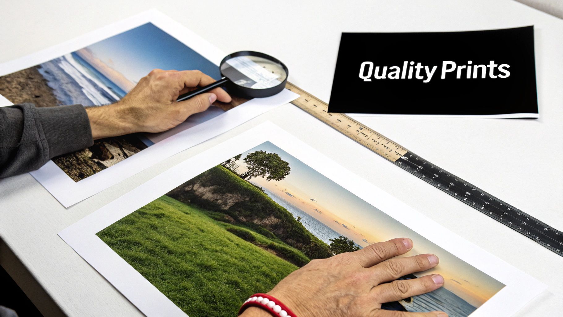
Paper Weight And The Feel Factor
First things first, let's talk paper. The weight, measured in GSM (Grams per Square Metre), makes a massive difference to how a poster looks and feels. Think of it as the difference between a proper Sunday league tackle and a gust of wind – one has substance, the other is just a bit pathetic.
Your standard office paper is a flimsy 80 GSM. A cheap, throwaway poster might clock in around 120-150 GSM. For that genuinely premium feel, you want something heavier, ideally 200 GSM or more. This thicker stock not only feels substantial in your hands but also hangs better on the wall and is far more durable, resisting those dreaded crinkles and creases.
The Magic Of Giclée Printing
Now for the part that really makes the colours sing. You'll often see the term "giclée" (pronounced zhee-klay) thrown around, and for good reason. It’s not just fancy art-speak; it's the gold standard for high-quality printing.
Giclée printing uses specialist archival inks and a high-resolution inkjet printer. This process creates a stunningly accurate colour reproduction with incredible detail and depth that standard printing simply can't match.
In short, it means your print will have vibrant, rich colours that are true to the original artwork. Even more importantly, these archival inks are designed to be fade-resistant, so your poster won't look washed out in a couple of years. It’s the difference between watching a gig from the front row and squinting at a fuzzy YouTube clip filmed from the back of the stadium.
To get a clearer picture, here's a quick breakdown of what to look for.
Quick Guide to Poster Print Quality
This table decodes the key terms that separate a high-quality music poster from a cheap imitation.
| Quality Factor | What It Means | Why It Matters For Your Wall |
|---|---|---|
| Paper Weight (GSM) | A measure of the paper's density. Higher GSM means thicker, more durable paper. | A poster with 200+ GSM hangs flat, resists damage, and feels like a genuine piece of art, not a leaflet. |
| Giclée Printing | A high-end printing method using archival-quality inks and fine-art printers. | Delivers incredibly rich, accurate colours and sharp details that won't fade over time. Your art stays vibrant. |
| Archival Inks | Pigment-based inks designed to last for decades without significant fading or discolouration. | Protects your investment. The artwork will look as good in ten years as it does on day one. |
| Finish (Matte vs. Gloss) | The surface texture of the paper. Matte is non-reflective, while gloss is shiny. | Matte finishes reduce glare, giving the art a sophisticated, gallery-like appearance from any angle. No one likes a shiny distraction. |
Ultimately, investing in a well-made print ensures the art you love truly lasts.
For a deeper dive into what makes our posters stand out, you can learn more about our commitment to print quality and see why we obsess over every single detail.
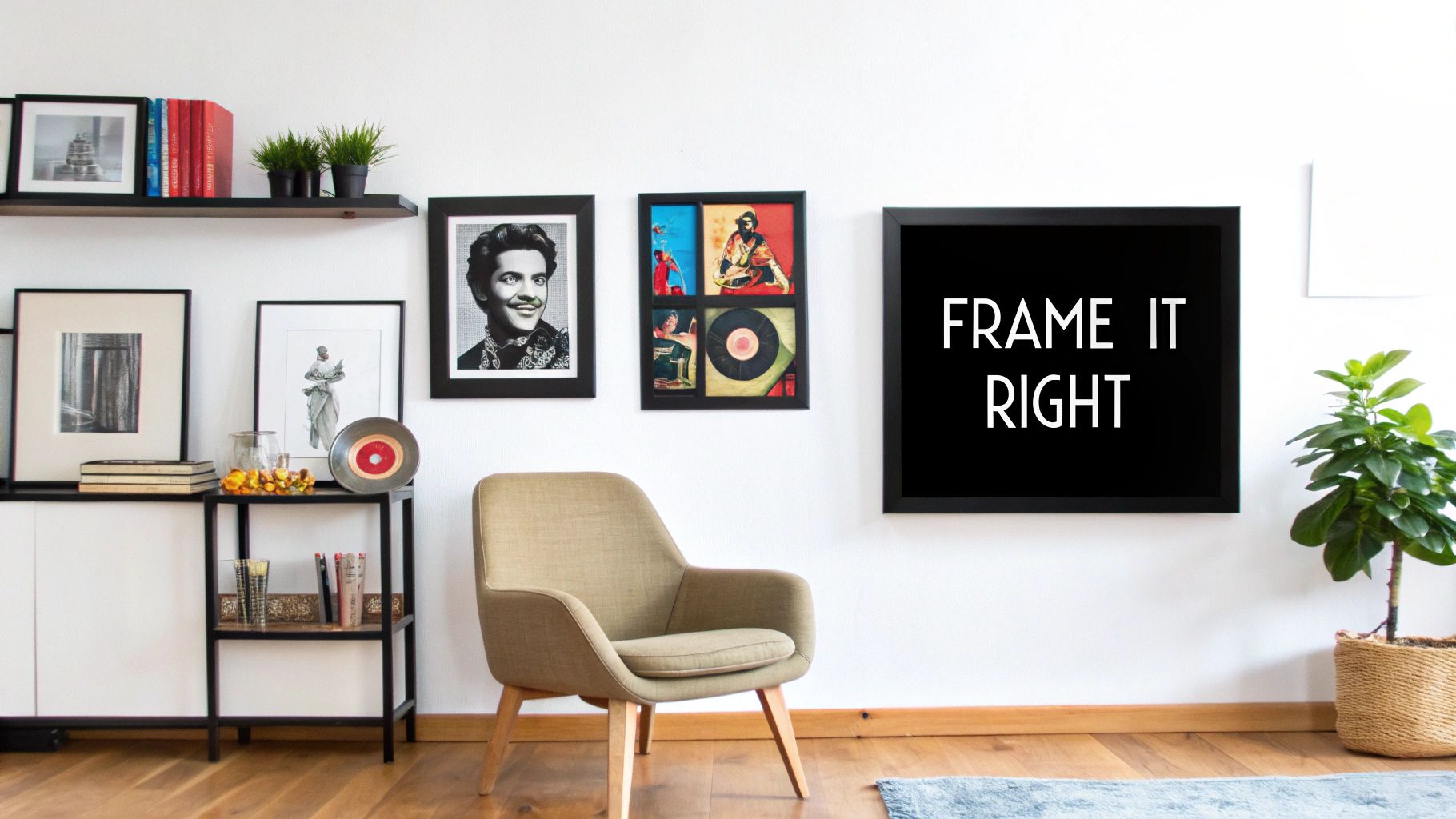
Styling Your Space Like A Rock Star
Right, you’ve done the hard part. You’ve trawled the internet, found the perfect print that screams your musical allegiance, and it’s finally arrived. So, now what?
If your first instinct is to reach for a sad, curled-up corner of Blu-Tack, we need to have a little chat. This isn't a student flat from 1999; this is your space, and that poster deserves to be the headliner, not the forgotten support act.
Displaying your UK music posters with a bit of flair is the difference between a curated, personal gallery and, well, a mess. This is your chance to create a feature wall that tells your musical story, from the indie anthems of your youth to the stadium-fillers you saw last month. It’s all about making your posters the undisputed rock stars of your home.
From Chaos To Curated Cool
The idea of creating a gallery wall can sound a bit daunting, but really, it's just about having some fun with it. Think of yourself as the band's manager, deciding who gets to share the stage. A great way to get started is by picking a theme.
- Group by Band or Artist: Got a lifelong obsession with The Smiths or Arctic Monkeys? Dedicate a whole section of your wall to your heroes. It’s a powerful, focused way to pay tribute.
- Curate by Colour: Grouping prints with similar colour schemes—like a collection of stark black-and-white posters—gives your wall a clean, cohesive look, even if the bands are worlds apart musically. It's the art-school way of saying "I've thought about this".
- Mix and Match Eras: Why not create a visual timeline of British music? Place a punk flyer next to a Britpop album print. It’s a brilliant way to show off the sheer breadth of your taste.
Getting the layout right is key to avoiding that cluttered, thrown-together look. Spacing is your secret weapon here. Give your prints a bit of breathing room so each one can shine. No one likes being crammed in at the front of a gig.
Framing The Legends
A decent frame is non-negotiable. It elevates a simple print into a proper piece of art, protecting it from dust, fading, and the occasional stray pint. A simple, thin black or white frame is a classic choice that lets the artwork do all the talking.
Don't be afraid to mix different frame sizes and styles. A bit of variety adds visual interest and personality, turning your wall from a uniform grid into a dynamic display that truly reflects you.
To really capture that rock star aesthetic, think about how other physical elements can transform a space and make a bold statement. You could even explore options for unique and stunning event decorations like LED light up letters. Whether you’re going for a chaotic rock 'n' roll vibe or a clean, modern display, the goal is the same: make your walls sing.
Why Physical Is The New Cool
In a world where your entire music library lives in a mysterious digital cloud and algorithms tell you what to listen to next, a quiet rebellion is brewing. We're seeing a huge resurgence of tangible, touchable things. It’s that simple, satisfying feeling of sliding a vinyl record from its sleeve or running your hand over the thick, textured paper of a quality print.
Sticking a poster on your wall is a bold statement of who you are. It's real, it's there, and you can't just skip it with a flick of a thumb. It becomes a physical anchor to the artists and albums that mean something to you—a constant reminder of the soundtrack to your life. Unlike a fleeting image on a screen, a print is a conscious choice, a piece of your personality you’ve decided to put on show.
The Return of the Real
This craving for something solid isn’t just a nostalgic whim; it's a genuine movement, and the vinyl revival is the perfect proof. Over the last decade, the UK music industry has seen vinyl revenue shoot up by over 650%, from £19.4 million in 2014 to an incredible £145.7 million in 2024. And it's not just old-timers re-issuing classics; eight of the top ten best-selling vinyl albums in 2024 were brand new. You can discover more about this impressive comeback for physical music and see the numbers for yourself.
This just goes to show we’re actively choosing to own physical versions of the music we love, not just rent it from a streaming service.
Owning a physical piece of music culture, whether it's a record or a poster, is about connection. It's a defiant act of curation in a world that’s increasingly digital and disposable.
It's about having something that doesn't just exist as data but has a real presence in your home or office. A great print is far more than just decoration; it’s a piece of your story, a badge of honour that says, "this is me, this is what I love." It’s a slice of musical history that you get to own, making your personal space feel that bit more authentic, and a lot more you.
Ready to make your walls sing? Explore the full collection of unique music-inspired prints at Striped Circle and find the perfect piece to tell your story. Check out our range at https://www.stripedcircle.com.
