
Artwork for an Office That Actually Inspires
 Let's be honest, most office walls have all the personality of a nil-nil draw on a rainy Tuesday night. Choosing the right artwork for an office is about transforming that beige void into something that actually inspires your team and impresses visitors. It's the difference between a Champions League contender and a team just happy to avoid relegation.
Your Office Walls Deserve Better Than Beige
Right, let's have a word about your office. Is it a sea of magnolia, punctuated only by a faded fire safety notice and maybe a passive-aggressive note about washing up? If so, you're missing a massive open goal. Your office walls are more than just structural necessities; they're the opening track on a killer album—they set the tone for everything that follows.
Think about it. When a client or a potential new hire walks in, what do those blank walls say about you? Probably not "we're a dynamic, creative force to be reckoned with." More like, "our company's favourite colour is beige, and our idea of a wild Friday is putting the recycling out a day early."
The Statement of Intent
Artwork for an office is a statement. It tells your team you care about their environment, and it shows your clients you have taste and a personality. It’s the visual equivalent of a perfectly timed guitar solo in an otherwise predictable song—it elevates the entire experience.
A well-chosen print, whether it’s a nod to a classic Britpop album or a clever typographic design, can spark conversation and foster a sense of shared culture. It can be a secret handshake for music fans or a talking point that breaks the ice in a stuffy meeting. Simply put, good art makes a space feel human.
This isn't just about making things look pretty. Studies have shown that an aesthetically pleasing environment can directly impact mood, reduce stress, and even boost productivity. A vibrant, engaging workspace makes people want to be there, which is half the battle won.
Moving Beyond the Generic
Luckily, sourcing great art has never been easier. The UK art market is the third most vibrant in the world, and with 59% of collectors now buying art online, businesses have direct access to incredible pieces without needing an art history degree. This trend shows that UK offices are increasingly using art to reflect a more inclusive and culturally diverse environment.
Getting started is the easy part. You can transform your space with just a few key pieces that reflect your brand's unique character. To give you some ideas, check out our guide on how to decorate walls for inspiration.
The right piece of art doesn't just fill a space; it completely transforms it. It's a quick win that speaks volumes about your company's culture before anyone's even had a cup of your questionable office coffee.
The Instant Impact of Office Art
A quick look at the immediate wins you get when you finally put something cool on the walls, comparing a lifeless space to a vibrant one.
| Office Vibe Check | The 'Before' Picture (No Art) | The 'After' Picture (Cool Art) |
|---|---|---|
| First Impression | "Is this a doctor's waiting room?" | "Okay, this place has a personality." |
| Team Morale | The gentle hum of existential dread. | Genuine smiles and actual conversation. |
| Creativity Levels | As barren as the walls. | Ideas are buzzing. Someone's doodling. |
| Client Meetings | "Let's get this over with." | "Love that print! Where did you get it?" |
See? It’s not just about looking good. It’s about creating a place where people feel energised and valued.
Your office walls are a massive, empty canvas. Settling for boring is a colossal own goal when you could be creating a space that inspires creativity, impresses clients, and makes your team genuinely happy to come to work.
Ultimately, the goal is to create a place that reflects the energy and passion of the people within it. Ditching the beige isn't just a design choice; it's a declaration that your company has a soul.
Finding Your Office Vibe and Visual Anthem
So, you've decided to rescue your walls from the beige abyss. Fantastic. Now comes the part that can feel like trying to agree on the car radio playlist for a ten-hour road trip. Do you go for classic rock anthems, obscure indie bangers, or that one guilty-pleasure pop song everyone secretly loves? Choosing the right artwork for an office is exactly the same—it’s about finding a visual anthem that everyone can get behind.
This isn’t about picking the first thing you see. It's about curating a vibe, a feeling. Your office art should be the soundtrack to your company's culture. You wouldn't play thrash metal in a yoga studio, so don't hang a serene watercolour in a high-energy sales pit. It’s all about matching the art's energy to your team's rhythm.
The goal is to avoid the dreaded ‘beige playlist’—that collection of generic, inoffensive prints that says absolutely nothing. Instead, you want a visual identity that feels authentic, inspiring, and maybe just a little bit cheeky.
Decoding Your Company Culture
Before you even think about browsing for prints, take a look around. What's the personality of your company? Are you a fast-paced tech startup fuelled by coffee and relentless optimism, or a creative agency that thrives on organised chaos and pop culture references? The answer will point you towards your perfect visual match.
A tech firm might lean into something futuristic and edgy—think bold geometric patterns or minimalist prints that look like they’ve been beamed in from the future. For a creative agency, quirky pop-art references or prints inspired by cult classic films could be the perfect fit, acting as an in-joke for those in the know.
This isn’t just about aesthetics; it's about reinforcement. The right artwork quietly broadcasts your values and culture every single day, reminding your team and telling clients exactly who you are without saying a word.
Translating Vibe Into Visuals
Once you’ve got a handle on your office personality, you can start thinking about specific artistic styles. Let’s use a music analogy to break it down, because everything is better with a music analogy.
- Abstract Art: This is your experimental B-side. It’s all about colour, emotion, and energy. Perfect for spaces where you want to spark creativity without being too literal or distracting.
- Minimalist Prints: Think of a perfectly produced synth-pop track. It’s clean, cool, and sophisticated. Ideal for creating a calm, focused atmosphere in meeting rooms or reception areas.
- Bold Typographic Art: This is your protest song with a clear message. It’s direct, witty, and makes a statement. A great choice for breakout areas or communal spaces where you want to inject some humour and personality.
- Music & Football Prints: These are the fan favourites, the festival headliners. They instantly create a sense of community and shared passion, perfect for making the office feel less corporate and more like a club everyone wants to be in.
The rise in demand for art in commercial settings reflects a broader trend where companies are investing in their workspaces to boost creativity and project a strong corporate image. Even the vintage segment is booming, with antique paintings and old-school scenes becoming popular in offices aiming to blend tradition with a modern working atmosphere. You can discover more insights into the UK wall art market and see just how big this movement has become.
Creating a Cohesive Theme
Choosing a theme doesn't mean every single print has to be identical. That’s like making a mixtape with only one artist—it gets repetitive fast. Instead, think of it like curating a festival line-up. You have your headliners (the big statement pieces) and your supporting acts (smaller prints that complement the main event).
The key is to find a common thread that ties everything together. This could be a consistent colour palette, a shared subject matter (like iconic album covers), or a particular artistic style. A unified theme makes the entire space feel considered and professionally styled, even if you did it all yourself.
For example, you could dedicate a wall to black-and-white photography, or create a gallery of prints featuring inspirational quotes from football managers and rock stars. The theme is your guide, ensuring that your office artwork tells a consistent and compelling story about your brand.
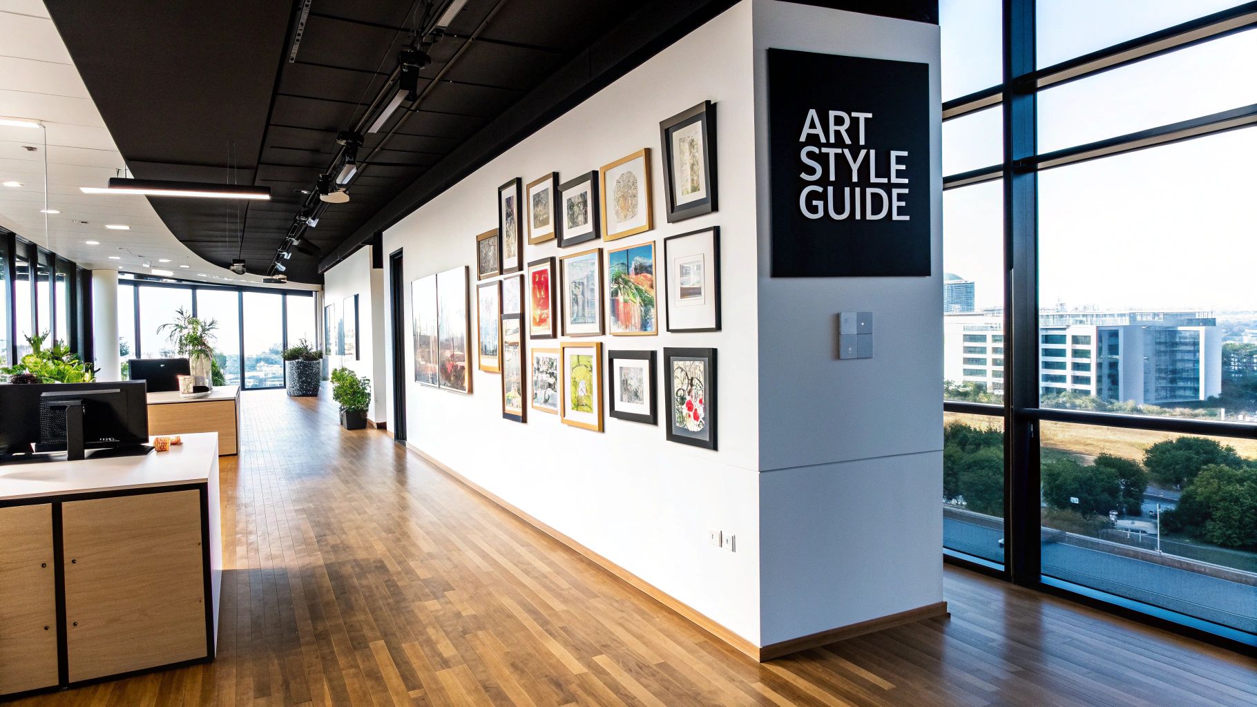
Mastering Scale and Placement in Your Space
Right, let’s talk tactics. Choosing a great print is only half the battle. How you display it is what separates the Sunday league hopefuls from the Premier League champions.
You wouldn't put a tiny speaker in the middle of a stadium and expect it to make an impact, would you? The same logic applies to your office walls. Getting the scale and placement right is everything; get it wrong, and even the coolest artwork can look awkward and lost. Get it right, and you create a focal point that commands attention and makes the whole room feel instantly more intentional.
This isn't some dark art reserved for gallery curators. It’s a set of simple, game-winning rules that anyone can follow to make their space look effortlessly cool.
The Lone Striker vs The Midfield Engine
Think of your art strategy like a football formation.
A single, massive statement piece is your lone striker—the focal point, the goal machine. It’s designed to draw the eye and dominate the space, grabbing all the attention. This works brilliantly above a large piece of furniture, like a sofa in a breakout area or behind the main desk in reception. It anchors the room and makes a bold, confident statement.
A gallery wall, on the other hand, is your midfield engine. It’s a collection of smaller prints working together to control the space. No single piece is the superstar; their collective power comes from how they’re arranged. This is perfect for larger, emptier walls or corridors where one print would just get lost. A well-curated gallery wall adds depth, personality, and tells a more complex story.
The biggest mistake people make is thinking small. A print that feels big in your hands can look like a postage stamp on a massive wall. When in doubt, always go a size bigger than you think you need.
Ultimately, the formation you choose depends entirely on the wall you’re working with and the vibe you want to create.
Getting The Hang Of It
Now for the practical bit. There are a few golden rules that will save you from a world of wonky pictures and misplaced drill holes. These aren't complicated, but they make a massive difference.
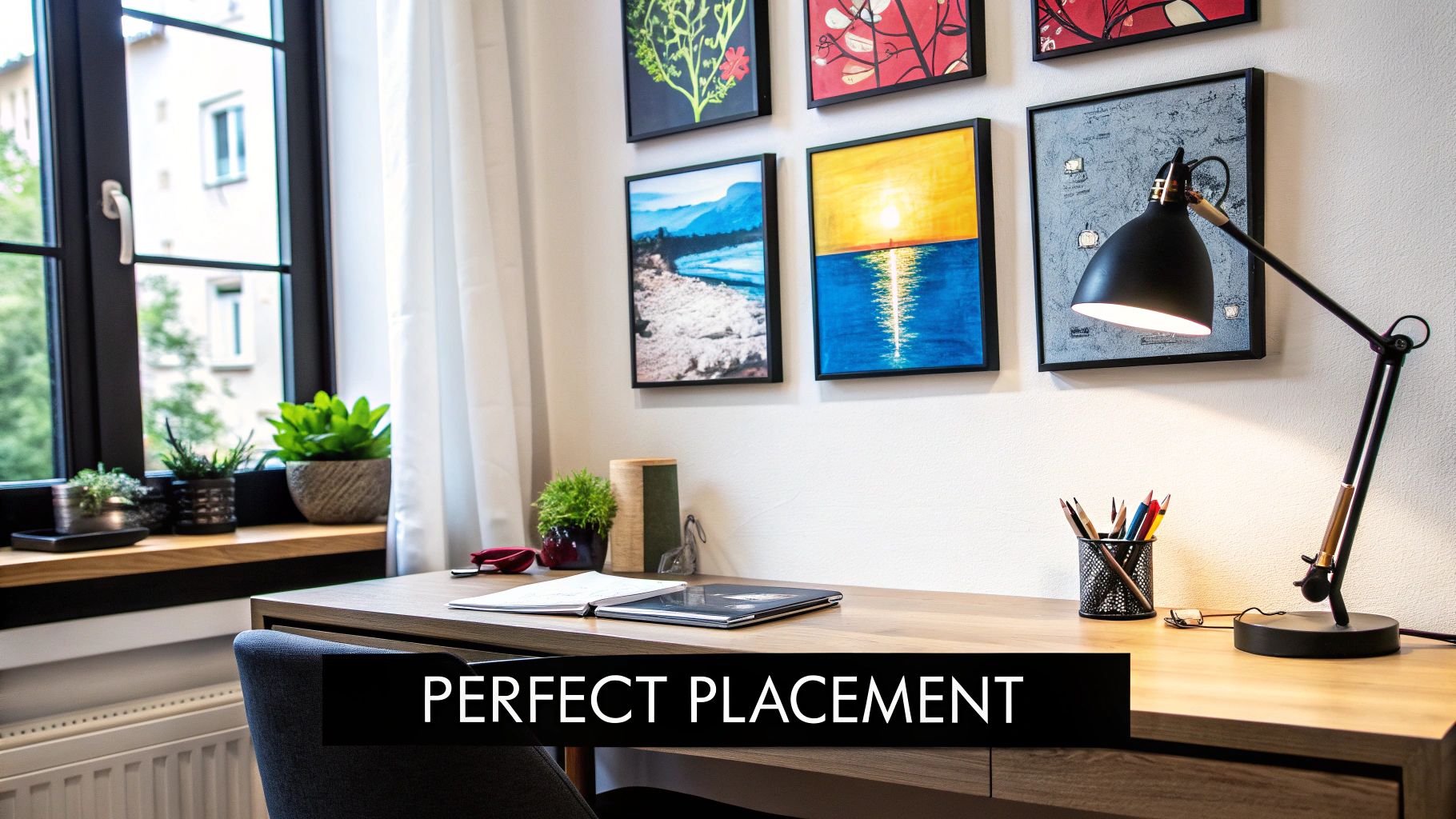
- The Eye-Level Rule: This is the holy grail of art hanging. The centre of your artwork (or the centre of your entire gallery wall) should be at average eye level, which is roughly 57-60 inches from the floor. People have a habit of hanging art way too high, making it feel disconnected from the room and everything in it.
- The Furniture Rule: When hanging art above furniture like a desk or sofa, leave about 6-8 inches of space between the top of the furniture and the bottom of the frame. This creates a visual link, making the art and furniture feel like a single, cohesive unit rather than two separate things floating in space.
- The Width Rule: As a guide, your artwork should be about two-thirds the width of the furniture it’s hanging over. A tiny picture over a massive sofa looks ridiculous, and a huge print crammed over a small table will just feel overpowering.
Getting the arrangement spot-on can be tricky. For a deeper dive into the specifics, you can learn more about how to arrange wall art like a pro in our detailed guide.
This concept map breaks down some budget-friendly options to get you started.
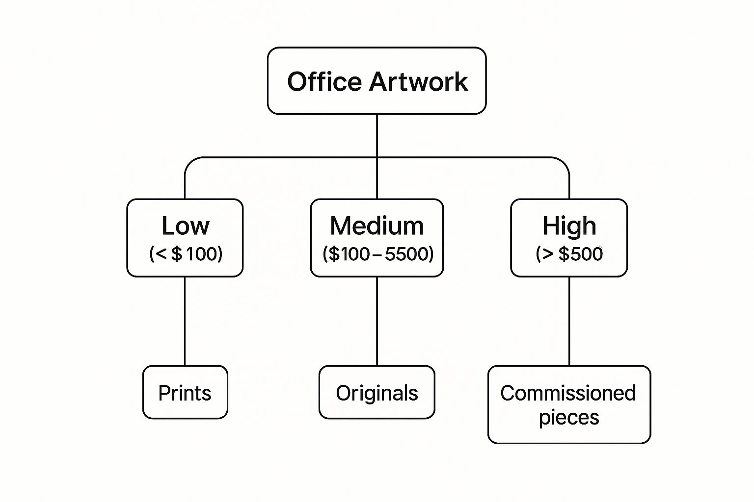
As you can see, you can make a huge impact with high-quality prints without needing to remortgage the office for an original masterpiece.
Alright, let's move past the theory. Time for the main event. We’re diving into the specific types of artwork for an office that will actually make your colleagues smile and get clients talking. It’s time to banish the generic hotel lobby art for good—you know the ones: washed-out landscapes, motivational quotes in a truly terrible font, and anything involving a lone tree.
Your office art should be a conversation starter, not just a space filler. It needs a bit of swagger, a wink and a nod that says, "We don't take ourselves too seriously, but we have impeccable taste." This is about picking out prints that have as much personality as the people who work there.
Forget 'corporate art' being a dirty word. Think of it as your company's curated playlist, full of absolute bangers.
https://www.youtube.com/embed/bZ9FdUS_aA0
The Typographic Power Play
Witty words on a wall? An absolute game-changer. Clever typographic prints are the perfect way to inject a bit of humour and personality into a space. They can be a cheeky inside joke, a lyric from a classic song, or a phrase that perfectly captures your company’s fighting spirit.
Imagine a bold, minimalist print in the kitchen that just says "More Espresso, Less Depresso." Or maybe a classic Britpop lyric from Pulp or Oasis in the breakout area that gets everyone humming along. It’s an instant mood-lifter and a slick way to build a sense of shared culture.
This isn’t about tired clichés like "Live, Laugh, Love." It’s about smart, sharp, and funny design that feels authentic to your brand. It's the difference between a dad joke and a perfectly delivered line from a stand-up comedian.
The Secret Handshake Print
Minimalist movie, music, or football prints are the ultimate "if you know, you know" nod to your team and clients. A subtle graphic referencing a cult classic like Pulp Fiction or The Big Lebowski in the boardroom acts as a secret handshake for fans. It immediately creates a connection and shows there are real, interesting humans behind the business.
These prints work because they're not obvious. They’re stylish enough to stand on their own as pure design, but they carry a hidden layer of meaning for those in the know.
- For the Music Buffs: An abstract design inspired by a classic Joy Division album cover.
- For the Film Fans: A minimalist poster featuring the iconic DeLorean from Back to the Future.
- For the Football Fanatics: A print celebrating a legendary goal or a beloved old stadium.
These pieces are more than just decoration; they're cultural touchstones that make the office feel less like a corporate box and more like a clubhouse.
Choosing art with personality is a smart investment in your work environment. The UK's artistic creation industry is booming, with projections estimating it will reach hundreds of millions in U.S. dollars. This growth is driven by companies realising the massive impact creative spaces have on employee well-being and engagement. Learn more about the growth of the UK's creative industry on Statista.com.
The Abstract Energy Boost
Sometimes, you just need a splash of colour without the distraction of a specific image. This is where abstract art comes in. It’s the perfect choice for busy areas or meeting rooms where you want to inject some energy and visual interest without pulling focus.
Think of it as the instrumental track on an album—it sets the mood without lyrics getting in the way. A great abstract piece can be calming or energising, sophisticated or playful, all depending on the colours and shapes you go for.
Don’t be afraid of bold colours, either. A vibrant splash of yellow can add optimism to a dreary corner, while cool blues can create a sense of calm in a high-stress area. The key is to find a piece that complements your space and adds the right kind of energy, proving that awesome artwork for an office can be both stylish and strategic.
Bringing Your Office Design Vision to Life
Alright, you’ve done the hard yards. You've scouted the talent, figured out your game plan, and now it's time to bring it all home. This is where you take all those brilliant ideas rattling around in your head and turn them into a reality that gets a standing ovation. This is where the magic happens.
The final whistle is about to blow on beige. We’re not just sticking a few pictures on a wall here; we're transforming a space from somewhere people have to be into a place they genuinely want to be. It’s the difference between a soulless corporate box and a creative hub buzzing with energy.
Executing The Game Plan
So, let's recap the key plays that will guarantee a win. Getting your artwork for an office spot-on really just comes down to a few core principles. Nail these, and you're sorted.
- Find Your Anthem: First things first, you need a theme that actually means something. Your artwork is your company's visual anthem. It should be a proper reflection of your culture, whether that’s cheeky Britpop lyrics, minimalist film posters, or bold abstract colours.
- Master the Scale: Don't get caught out with tiny prints on massive walls. Think of it like a lone striker (one big statement piece) versus the midfield engine (a gallery wall). Always go a size bigger than you think you need – it makes a real impact.
- Nail the Placement: Follow the golden rules. Keep the centre of the art at eye level (around 57-60 inches up), leave a bit of breathing room above furniture, and make sure the art is about two-thirds the width of whatever it's hanging over.
These aren't complicated tactics, but they’re fundamental to creating a space that feels considered, professional, and effortlessly cool.
Injecting Your Brand Personality
This is the most crucial part, so listen up. Your office art is a golden opportunity to broadcast your brand's personality without saying a single word. It’s about showing, not telling. Are you a bit witty and irreverent? A typographic print with a clever quip will do the trick. Passionate about music? A collection of alternative album art prints will feel like a secret handshake for fellow fans.
Every single piece you choose contributes to the story you're telling. It’s your chance to build a sense of community and shared culture. A well-placed print can spark a conversation, make someone smile on a grim Monday morning, or simply make the whole place feel more human.
The final message is simple: your office walls are a massive, empty canvas. Don't waste the opportunity to make them brilliant. It’s the easiest and most effective way to create a workspace that inspires creativity, impresses visitors, and makes your team feel right at home.
For businesses looking to create something truly unique that captures their specific vibe, exploring options for custom-made company artwork can be a total game-changer. It lets you craft a visual identity that is 100% yours.
Ditching Boring and Embracing Bold
Ultimately, the goal is to create a workspace that reflects the passion and drive of the people in it. Playing it safe with generic, inoffensive art is the biggest own goal you can score. It's a massive missed opportunity to connect with your team and your clients on a more personal level.
So, ditch the boring and embrace the bold. Choose prints that make you laugh. Select pieces that remind you of a classic gig or a legendary match. Curate a collection that feels like an extension of your brand’s soul. Your office deserves better than beige, and your team deserves a space that makes them proud to be there. Now go on, make it happen.
Frequently Asked Questions About Office Art
Alright, let's tackle a few of the lingering questions that pop up when you're about to turn your office walls into something special. You’ve got the game plan, you've scouted your prints, but a few pre-match nerves are totally normal. Here’s a quick rundown of the common head-scratchers.
How Do I Choose Art If My Team Has Different Tastes?
This is the classic "trying to get everyone to agree on a pizza topping" dilemma. One person wants pepperoni, another wants pineapple (a sackable offence, frankly), and someone else is campaigning for olives. You’re never going to please everyone with a single choice, so don’t even try.
The best way forward is to focus on a theme rather than a specific image. Maybe you can all agree on a colour palette that matches your branding. Or you could go for a broader theme like 'classic album covers', 'local landmarks', or 'understated movie posters'. This way, there's a unifying idea, but you still get plenty of variety.
Another great trick is to create zones. The sales area might get something bold and punchy, like a motivational quote from a legendary football manager. Meanwhile, the creative department could get something more abstract and experimental, like the cover of a Radiohead B-sides collection. You could even run a poll and let the team vote on a few curated options—making it a team effort is always better than a top-down decision.
Should We Invest In Expensive Original Artwork?
Honestly, for most businesses, high-quality prints are the perfect sweet spot. They give you that 'wow' factor and make the place look sharp without you having to remortgage the building or hire a security guard with an earpiece. Original art is fantastic, but it comes with bigger costs and insurance headaches you probably don’t need.
A brilliant, well-framed print of a design you love offers 99% of the impact for a tiny fraction of the price. It also gives you the freedom to switch things up in a few years without feeling like you’ve betrayed a priceless masterpiece.
Think of it like buying a brilliant tribute band's album—you get all the hits, the same energy, and none of the superstar ego or eye-watering ticket prices. It’s the smart, savvy choice that still delivers a top performance.
What Is The Biggest Mistake People Make With Office Art?
The number one fumble, the absolute sitter missed from six yards out, is playing it too safe. Choosing something utterly bland, generic, and soulless just to 'fill a space' is worse than leaving the wall empty. A stock photo of a leaf or a generic geometric pattern says nothing about your company except that you're afraid of having an opinion.
The biggest mistake is being boring. Art is your golden opportunity to show some personality, a bit of humour, and what your culture is all about. Don’t be afraid to pick something that starts a conversation or gets a smile.
The second-biggest mistake, a close runner-up, is getting the scale completely wrong. We’ve all seen it: a tiny, lonely picture floating in a vast sea of magnolia wall. It just looks timid and lost. When it comes to artwork for an office, our motto is simple: go big or go home.
How Often Should We Update The Office Artwork?
There's no hard-and-fast rule here, but a refresh every couple of years can work wonders for keeping the space feeling fresh and dynamic. It stops the place from feeling stale and shows your team that you're still invested in creating a great environment for them.
You don't have to replace everything at once, either. A brilliant tactic is to start a 'featured wall' that changes every six months with new prints, keeping the main statement pieces the same. It's a great way to keep things evolving and gives you an excellent excuse to browse for new, cool stuff. It’s like changing your team's kit for the new season—it keeps things exciting and gives everyone something new to look at.
Ready to transform your workspace from a beige bore-fest into a gallery of cool? Check out the full collection of music, football, and pop culture-inspired prints at Striped Circle and find the perfect artwork for an office that truly represents your team's unique vibe. Explore our collection.
