
Black and White Wall Art That Transforms Your Space
Picking the right art for your walls can feel like a last-minute penalty shootout. The pressure's on, you’re drowning in options, and you're terrified of picking something that will feel dated faster than last season's away kit. Let's be honest, nobody wants the interior design equivalent of a one-hit wonder.
But what if there was a classic, can't-miss choice that instantly makes any room cooler? The Stone Roses' debut album of interior design, if you will.
That's where black and white wall art comes in. Think of it as the vinyl record of decor: it's timeless, it's bold, and it simply never, ever goes out of style.
Why Monochrome Is Your Secret Weapon for a Cooler Home
Let's face it, life is complicated enough. Your walls shouldn't add to the chaos. Black and white art acts as a visual declutter, cutting through the noise to create a sense of calm and order—even if your home office is just a carefully organised stack of half-finished projects. It’s like the simple, perfect bassline from Peter Hook that holds an entire song together. It just works.
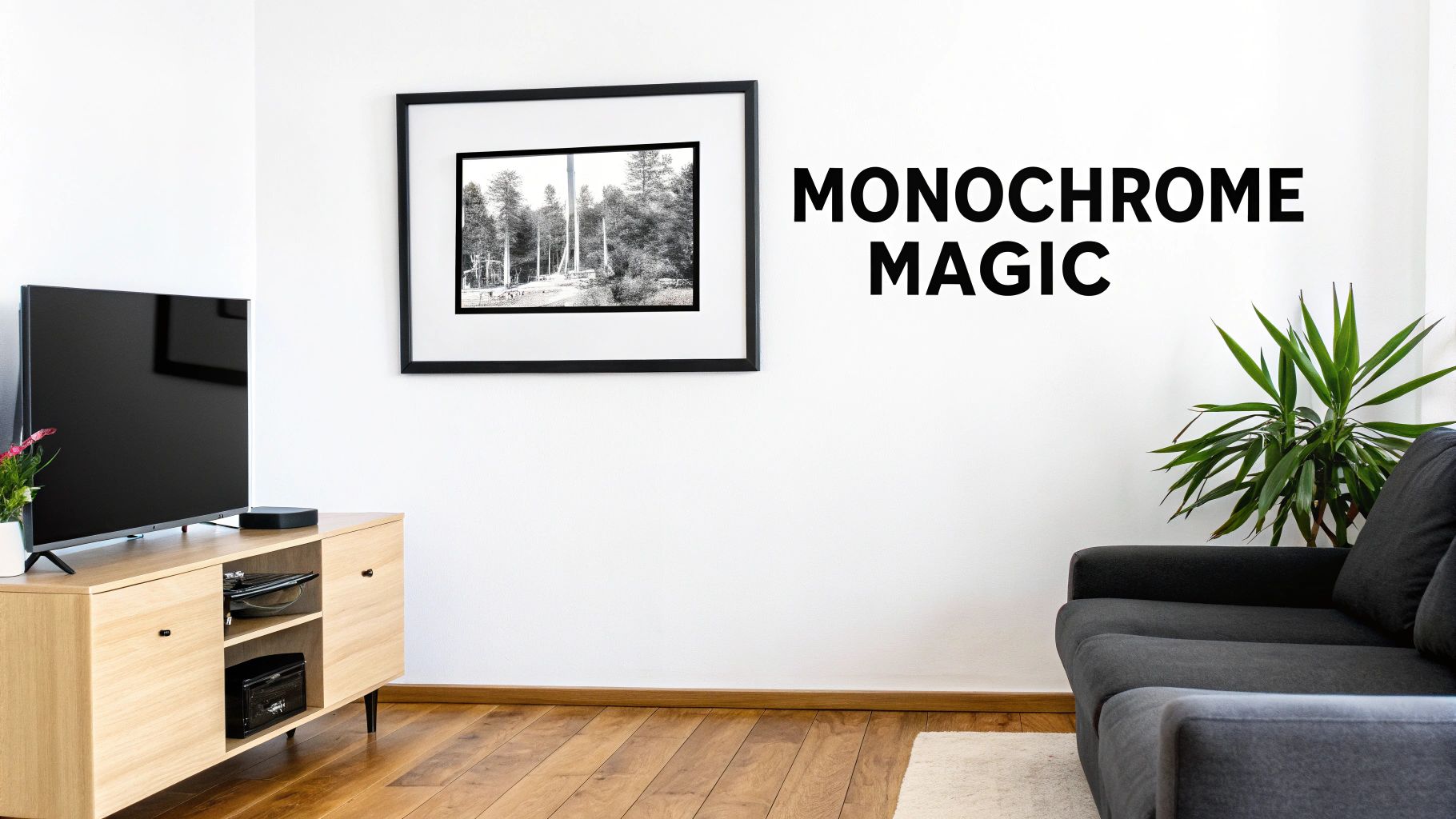
This isn’t about playing it safe; it's about being clever. A monochrome print is the ultimate team player, getting along with any colour scheme you throw at it. That means no more repainting the entire living room just because you bought a new set of cushions. It's the Zinedine Zidane of your decor—effortlessly cool, goes with anything, and makes everything around it look better.
It's a backdrop for your life that's as effortlessly cool as a Gallagher swagger or a perfectly executed Cruyff turn. It doesn’t follow trends; it sets the standard.
This versatility is a massive advantage, particularly in UK homes where space can often be at a premium. The UK wall art market is actually booming and is forecast to reach USD 5.5 billion by 2030, with monochrome palettes proving a popular choice for contemporary interiors. They have a unique ability to make smaller rooms feel more organised and intentional. If you're working with a compact space, these general styling principles from these small room decorating ideas can be a real game-changer.
Monochrome vs Colour Prints: A Head-to-Head Matchup
So, you're on the fence. Why go monochrome when there's a world of colour out there? Here’s a quick, slightly tongue-in-cheek comparison of why black and white might just be the winning strategy for your walls. It's the Manchester Derby of decor.
| Feature | Black and White Wall Art (The Headliner) | Colourful Wall Art (The Support Act) |
|---|---|---|
| Lifespan | Timeless. A legend. Looks as good in 20 years as it does today. | Can feel dated. The "what was I thinking?" choice of tomorrow. |
| Team Player? | Plays well with everyone. Fits any colour scheme, no drama. | A bit of a diva. Demands you redecorate the entire room around it. |
| Mood | Sophisticated, dramatic, emotional. Adds depth and a touch of class. | Can be fun and vibrant, but sometimes just adds to the visual noise. |
| Best For | Making a statement without shouting. Perfect for music and sports icons. | Brightening up a kid's room or creating a very specific, bold aesthetic. |
Ultimately, while colourful art has its place, monochrome offers a level of sophistication and flexibility that's hard to beat. It's the dependable choice that always delivers a top-class performance.
The Power of Simplicity
Choosing monochrome doesn't mean you're sacrificing personality—far from it. When you strip away colour, you're left with pure emotion, form, and story. It's the unplugged acoustic session of the art world.
Think about what that really means for your space:
- Timeless Appeal: A black and white portrait of your favourite musician or a minimalist print of a classic lyric will look just as sharp in ten years as it does the day you hang it.
- Emotional Punch: Without colour to distract the eye, the subject of the artwork really takes centre stage. This creates a much more direct and powerful emotional connection.
- Effortless Harmony: It lets you mix and match different styles and passions without anything clashing. That gritty football chant print can absolutely hang next to an iconic music portrait.
It's all about making a strong statement, quietly. If you're curious to learn more about how different palettes influence a room's atmosphere, our guide on colour psychology in interior design has some fascinating insights. In the end, it’s about turning the things you love into proper art.
Choosing a Print That Tells Your Story
Right, let's get to the fun bit: picking the perfect print. This isn't just about covering up a bit of blank wall; it’s about making a statement. It’s finding a piece of black-and-white art that tells your story before you even open your mouth. Are you the quiet indie fan whose soul is captured in an acoustic lyric print, or the loud-and-proud football fanatic needing a stadium anthem to fire up your home office?
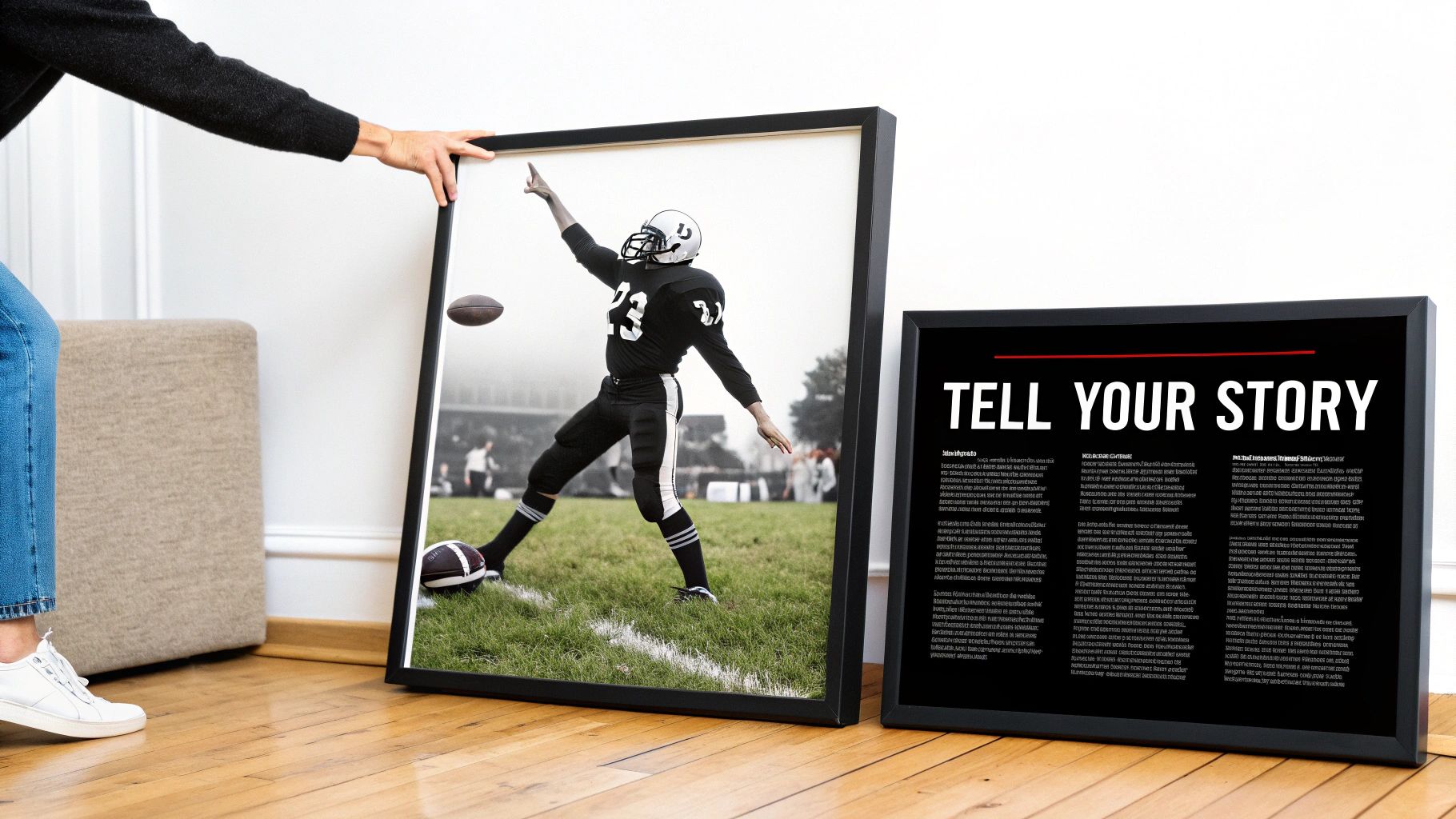
Think of your walls as your own personal billboard. What message do you want to put out there? The print you choose is a direct line to your personality, your passions, and, let's be honest, your impeccable taste. This is your chance to take a memory, a feeling, or a lifelong allegiance and make it a permanent fixture in your home.
Finding Your Vibe: Minimalist or Maximalist?
The sheer versatility of black and white is what makes it so brilliant. You can go for a minimalist typographic print—something subtle that whispers its coolness to anyone who gets close enough to read it. Picture a clean, simple print with a single, powerful lyric from The Smiths hanging in a modern, uncluttered living room. It's understated, but it says everything it needs to.
Or, you can go bold. Think big, graphic designs that are impossible to ignore. A gritty, in-your-face football chant print can inject some much-needed pre-match energy into a study. It’s like a visual shot of espresso on a Monday morning, a constant reminder of the weekend’s glorious highs (or painful lows).
Your walls are prime real estate for your personality. Don't waste the space on something generic that doesn't make you smile every time you walk past it.
The UK's art market is a massive part of our culture, valued at an estimated $11.9 billion in 2022. With our rich heritage in both music and football—from globally recognised bands to over 90 professional clubs—a print of a favourite lyric or club motto isn't just decoration; it's a piece of our shared identity. You can dig deeper into the cultural impact of the British art market to see just how deep these connections really run.
The Art of Gifting a Print
Choosing a print for someone else? That’s the ultimate test of friendship. Get it right, and you're a hero for life. Get it wrong, and… well, let’s not go there. The real secret is to tap into your shared experiences.
Here are a few pointers to make sure you nail it:
- The Inside Joke: Is there a song you both belted out at a festival until your voices gave out? A match you watched together that went down in history? Find a print that captures that specific moment.
- The Subtle Nod: Maybe your mate is a die-hard fan but isn't the type to hang a massive club crest on their wall. A more abstract design or a minimalist quote connected to their team could be the perfect solution.
- The Unspoken Bond: Think about the artist or team that defines your friendship. A lyric from that one Oasis album you had on repeat during a road trip is more than just a gift; it’s a shared memory, framed.
At the end of the day, the best black-and-white wall art is deeply personal. It’s a conversation starter, a daily dose of inspiration, and a tribute to the things that make you, well, you. So have a proper look around, find your story, and put it on the wall where it belongs.
Getting the Scale Spot On Without the Headache
So, you’ve found the perfect print. It’s got that Oasis swagger, that Cantona collar-up confidence. But now for the tricky part: what size do you actually get?
It’s a classic dilemma. Go too small and your masterpiece looks like a lonely postage stamp on a giant wall. Go too big and it’s like having a cinema screen in your loo, completely overwhelming the space.
This is where a bit of insider knowledge really helps. You don't need a degree in interior design, just a few solid rules of thumb to guide you. It's all about making your new black and white wall art look like it belongs there, not like a last-minute panic buy before your mates come over for the match.
The Not-So-Secret Rules of Sizing
Let's start with a golden rule the pros swear by: the 57-inch rule. The idea is to hang your art so its centre point is 57 inches from the floor. Why? Because this is generally considered the average human eye level, and it ensures the art is perfectly positioned for viewing without you having to crane your neck or crouch down.
Of course, rules are made to be broken, especially when you’re creating a space that’s all about your personality. But knowing the basic principles gives you a brilliant starting point.
Think of sizing like a setlist for a gig. You need your big, crowd-pleasing headliner, but you also need the supporting acts to create balance and flow. Get the scale right, and the whole show comes together perfectly.
Nailing It Room by Room
Different spaces have different demands. That massive print that looks incredible over your sofa would be a total disaster in a narrow hallway. Here’s a quick guide to choosing the right size for some common spots in your home.
Over the Sofa: This is prime real estate for a statement piece. A good guideline is to make sure your art is roughly two-thirds the width of your sofa. This creates a really balanced, anchored look. A single, large landscape print of your favourite band’s album cover art or a panoramic shot of your team's stadium works a treat here.
The Narrow Hallway: In tighter spots, you want to think vertically. A series of smaller, portrait-oriented prints (like A4 or A3) arranged in a column can draw the eye upwards and make the space feel taller. Just be sure to avoid wide, oversized pieces that will make the hallway feel even more cramped.
Above a Desk or Console Table: Similar to the sofa rule, aim for art that is about two-thirds the width of the furniture it's hanging above. This could be a single medium-sized piece or a pair of smaller prints side-by-side. This is the perfect spot for a bit of daily inspiration, like a favourite lyric print to get you through the workday.
Getting the size right is crucial, but don't forget the frame adds to the overall dimensions. Ultimately, trust your gut—if it looks right to you, it probably is.
Creating a Gallery Wall That Doesn't Look a Mess
Ah, the gallery wall. Done right, it’s a masterpiece—a curated collection that tells a story and makes you look like you’ve got your life completely together. Done wrong, it’s a chaotic jumble sale that gives your visitors a headache. Don’t worry, we're not going to let that happen.
This is your guide to creating a gallery wall that even your most critical aunt will have to admire. It’s all about mixing your passions—your black and white music prints, football memorabilia, and personal photos—into a visual playlist for your life. Think of it as organised chaos, with a heavy emphasis on organised.
Your Pre-Match Strategy
Before a single nail even thinks about meeting the wall, you need a game plan. The biggest mistake people make is trying to eyeball it. Spoiler alert: that rarely ends well. Instead, think like a tactical genius preparing for a cup final.
First, claim a decent patch of floor space and lay everything out. This is your training ground. Move your pieces around, see what works together, and get a feel for the overall flow. It's so much easier to swap a small print for a large one on the carpet than it is once you've got six holes in the plaster.
A brilliant pro tip is to use paper cutouts.
- Trace each of your frames onto some old newspaper or wrapping paper.
- Cut them out and label them so you know which is which.
- Use a bit of low-tack masking tape to stick these paper templates to the wall.
This simple trick lets you live with the layout for a day or two. You can move things around with zero commitment until you've found the perfect arrangement. It might feel like a bit of a faff, but trust me, it's a total game-changer. For a deeper dive into different arrangements, check out our guide on how to arrange wall art like a pro.
Mixing Your Media Like a DJ
A truly great gallery wall isn’t just about prints. It’s about texture, variety, and personality. Your black and white wall art provides that solid, cool baseline—the rhythm section that holds the whole thing together. Now it’s time to add the guitar solos.
Don’t be afraid to mix things up. Pair that moody Joy Division lyric print with a candid photo from a festival. Hang that minimalist sketch of your team's stadium next to a framed ticket stub from a legendary match. These personal touches are what turn a collection of pictures into a story.
The goal is to create a wall that's uniquely you. It should be a conversation starter, a collection of memories that makes you smile every time you walk past it.
The trend for personal, flexible displays is growing, especially as more of us live in smaller or rented homes. In fact, the UK picture frame market is set to grow by about 3.6% annually until 2030, driven by this very desire to create unique, affordable gallery walls.
Finding Your Layout Style
There are a few classic layouts that you can use as a starting point. You could go for a structured grid, where all the frames are the same size and evenly spaced. This creates a clean, formal look that works brilliantly with a matched series of black and white prints.
Or, you can embrace the more relaxed "salon" style. This is the organised chaos approach, mixing different sizes, shapes, and orientations. The key here is to maintain a fairly consistent gap between each piece—about 2 to 3 inches is a good rule of thumb—to stop it from feeling cluttered. Start with your largest piece slightly off-centre and build everything else out from there. It’s your wall, your rules. Have fun with it.
Framing and Hanging Your Art Like a Pro
So, you’ve picked the perfect print and nailed the size. Great stuff, but the job isn't quite done. A frame is to a print what a solid bassline is to a song—it pulls the whole thing together and makes it look sharp. This is where you elevate your black and white wall art from a student-digs poster to a proper piece of art.
Choosing a frame can feel strangely overwhelming, but it’s simpler than you might think. A sleek, thin black metal frame has that modern gallery feel, which works brilliantly for a minimalist lyric print. If you fancy something a bit warmer, a natural wood frame can soften the stark monochrome, adding a touch of classic, almost acoustic, warmth.
Getting It Straight and Secure
Now for the main event: hanging it. Honestly, nothing says “I lost interest” more than a wonky picture. We’ve all been there, hammering away, only to step back and see that slight, infuriating tilt.
Here’s an old-school trick I love: put a little dab of toothpaste on the hook on the back of the frame. Gently press it against the wall where you want it to hang, pull it away, and voilà—a perfect marker for your nail. No faffing about with a measuring tape.
Of course, the type of wall you're dealing with is a major factor. UK homes are a real mixed bag, from solid brick in Victorian terraces to plasterboard in newer builds.
- Plasterboard Walls: These are essentially hollow, so a simple nail or screw just won't hold. You’ll need specific plasterboard fixings to make sure your beloved Stone Roses print doesn't take a nosedive.
- Brick or Masonry Walls: Time to break out the drill. A sturdy rawl plug and a solid screw will keep your art secure, even during the most frantic goal celebrations.
For a bit more detail on the nitty-gritty of getting it spot-on, you might find this a step-by-step guide to hanging your picture with precision really helpful.
This simple flowchart breaks down the whole process, helping you plan everything out before you even touch a hammer.
The big takeaway here is preparation. A few minutes planning your layout on the floor can save you from a wall riddled with regretful nail holes.
A well-framed, perfectly hung print is like the final, satisfying click of a vinyl record dropping into place. It’s that moment where everything just feels right.
Getting this last part sorted is what transforms your print from something you simply own into a genuine feature of your home. It’s the difference between just having art and properly displaying it. So, take your time, choose the right frame, use the correct fixings, and give your new piece the grand entrance it deserves. Your walls will thank you.
Your Black and White Wall Art Questions Answered
We’ve covered the tactics, formations, and the final whistle. But just like any good gig, there’s always time for an encore to clear up those last few questions. Think of this as the post-match debrief, where we tackle the common queries we get about making monochrome art work for you.
It's all about making sure your walls look their absolute best and properly show off your brilliant taste in music, football, and, of course, interior design.
Can I Mix Black and White Art With Colourful Pieces?
Absolutely. In fact, you should. Think of your black and white prints as the steady bassline or the solid defensive midfielder in your gallery wall—they provide the cool, dependable foundation.
Adding a splash of colour is like a killer guitar solo or a last-minute screamer from outside the box; it cuts through and grabs everyone's attention. Placing a monochrome piece next to a vibrant one actually makes both of them pop even more. The key is to find a common thread. Maybe it's the frame colour, a shared theme (like all music legends), or just a similar mood. Black and white art is the ultimate team player, so don't be afraid to experiment.
What’s the Best Lighting for Black and White Prints?
Great question. You don’t want your moody Joy Division print looking like it’s lost in a dark cave. Natural light is always the undisputed champion, but let's be realistic—not every room is a sun-drenched paradise. If yours is more like a dimly lit club than a bright studio, indirect artificial light is your best friend.
The one thing you must avoid is aiming a single, harsh spotlight directly at the print. This creates a nasty glare, which is the visual equivalent of having someone stand right in front of you at a gig. You want to see the art, not a perfect reflection of your lightbulb.
Instead, go for track lighting or dedicated picture lights that wash a soft, even glow over the artwork. This approach brings out the beautiful contrast and sharp details without causing distracting reflections. It’s all about setting the right atmosphere.
How Do I Keep My Prints Looking Their Best?
You wouldn't leave your favourite records out in the sun to warp, would you? The same goes for your art. The biggest culprits that can ruin a print are direct sunlight, which causes fading over time, and plain old dust.
Keeping them in mint condition is surprisingly easy:
- Mind the sun: Try to hang your prints where they won't be blasted by direct sunlight for hours on end.
- A quick dust: A gentle wipe of the frame with a soft, dry cloth now and then is usually all the cleaning you’ll ever need.
- Smudge patrol: If the glass gets a bit smudged, just spray a little glass cleaner onto a microfibre cloth (never directly onto the frame itself) and give it a gentle wipe.
Treat them with a bit of care, and they'll be headlining on your walls for years.
Ready to find the perfect piece to kick off your collection? At Striped Circle, we’ve got a massive range of music and football-inspired prints that will make your walls sing. Find your new favourite at https://www.stripedcircle.com.
