
Geometric Wall Art: Your Friendly Guide to Cool Prints
You've moved into a new flat, unpacked the kettle, found the sofa cushions, and somehow the sitting room still looks like a waiting room for a furniture delivery. There's a bare wall opposite the telly, a couple of boxes pretending to be side tables, and a mug in your hand that's doing far more emotional heavy lifting than a mug should.
A full redecoration might not be on the cards, but one clever print can change the mood without summoning a decorator, remortgaging the cat, or arguing with a tin of paint. Geometric wall art gives a small room structure, colour and a focal point, whether your taste leans towards football terraces, synths, bold shapes or something that just makes visitors smile.
Table of Contents
- When the Wall Is Still Bare and the Vibe Is Missing
- What Geometric Wall Art Actually Means
- A Quick History of Shapes on British Walls
- Prints, Paper and Pixels That Keep Edges Sharp
- Sizing, Framing and Hanging Without the Headache
- Music and Football Prints That Actually Speak Fandom
- Room-by-Room Styling, Care and Gift Smarts
When the Wall Is Still Bare and the Vibe Is Missing
The first evening in a new place often arrives with high hopes and low furniture. You've got a mismatched sofa, a lamp balanced on a stack of books and a wall so empty it seems to be judging your life choices. The room isn't awful, exactly. It's just waiting for a bit of personality to turn “temporary rental” into “my place”.
That's where a well-chosen geometric print earns its keep. A strong circle, a tidy grid or a cluster of angular shapes can give the eye somewhere to land, which makes the rest of the room feel more organised even if the broadband router is still sitting on the floor. In a compact British living room, that focal point matters. You don't need to fill every inch. You need one piece that knows how to behave.
The print-shop rule: if a wall feels flat, start with one confident shape before adding five nervous little decorations.
Think of a small flat with a grey sofa, pale walls and not much natural light. A monochrome line print keeps things calm, while rust, ochre or teal adds warmth without demanding a new colour scheme. Above a desk, a compact abstract composition can make the corner feel intentional. In a hallway, a small mosaic-style print gives a narrow passage a bit of rhythm instead of leaving it as the place where coats go to die.
The useful shift is to treat wall art as part of the room's layout, not an afterthought. Recent UK trend coverage links demand for mid-sized prints and versatile formats with smaller urban homes and rental interiors, and identifies a gap in practical advice about scale, sofas, hallways and low-light rooms in its discussion of UK wall-art choices. That makes geometric wall art a space-solving purchase, not merely a style purchase.
The rest is pleasingly practical. You'll want to choose a visual language, check the print quality, get the proportions right and then decide whether your wall needs a subtle nod to music, football or both. No art-school beret required.
What Geometric Wall Art Actually Means
Geometric wall art is built from clear shapes, repeated lines and deliberate patterns rather than loose brushwork. It can be as simple as a black circle on cream paper or as lively as overlapping polygons in colours that look like a record sleeve and a football scarf had a very productive afternoon.
A football pitch is a handy comparison. The lines, circles and rectangles tell you where everything belongs, but the overall picture still has energy. A synth waveform works in a similar way. It repeats, rises, falls and creates a recognisable rhythm from a small set of marks. Geometric prints use that same balance of order and movement.
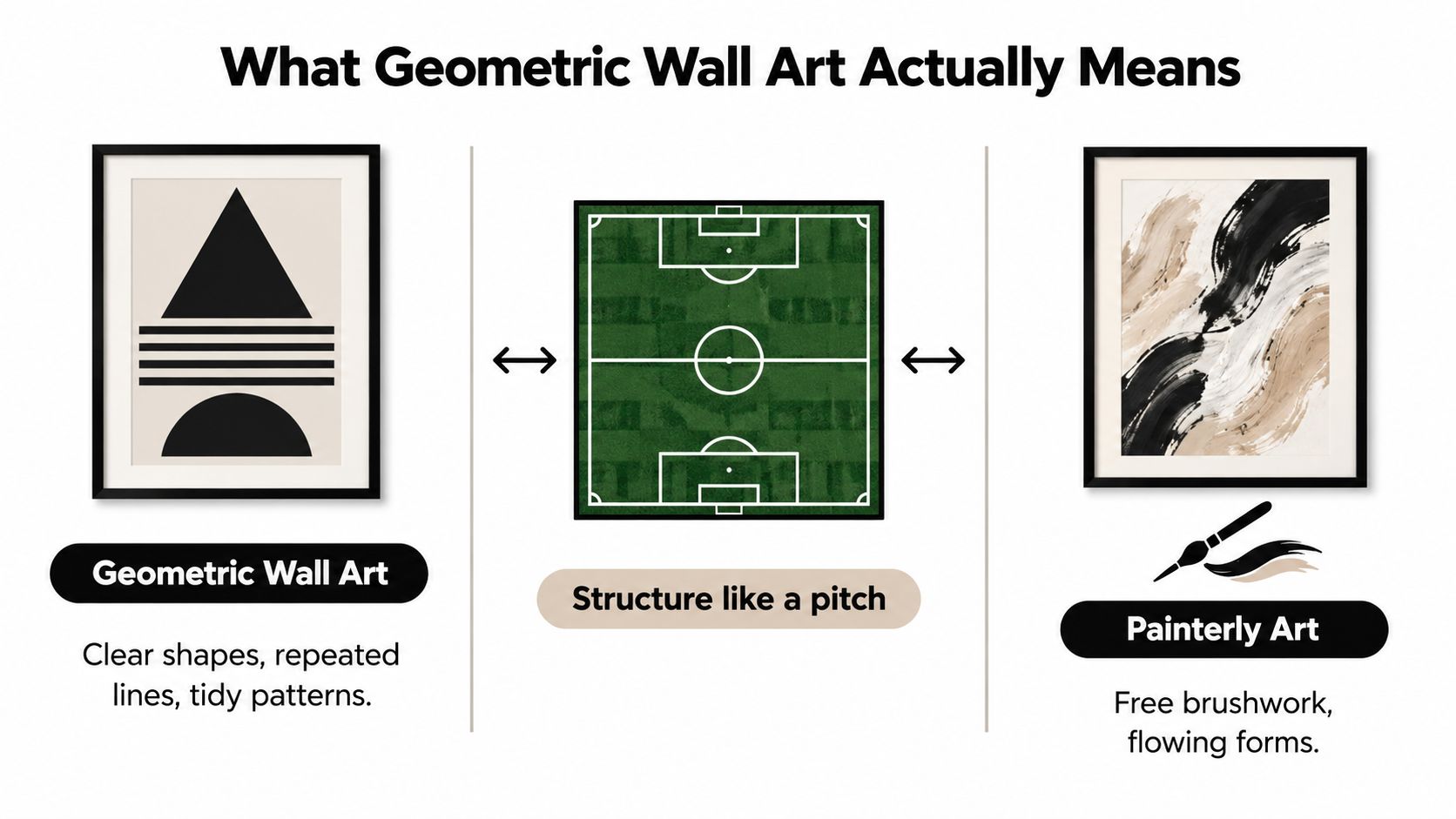
Four styles worth knowing
- Minimalist line prints use thin outlines, arcs and open space. They suit bedrooms, reading corners and home offices where you want the wall to feel composed rather than busy.
- Mid-century shapes bring in starbursts, atomic forms and rounded geometry. They're a good match for timber furniture, warm lamps and anyone who believes a sideboard is a personality trait.
- Bold abstract compositions layer triangles, blocks, circles and polygons. These work above a sofa or in a living room that needs a confident focal point, particularly when the furniture is plain.
- Mosaic-style pieces repeat smaller shapes to create a tiled effect. They're useful in hallways, stairwells and compact nooks because the pattern rewards a closer look without needing a huge canvas.
The trick is to match visual volume to the room. A sparse line drawing can disappear on a large wall, while a dense mosaic may overwhelm a narrow space. If your sofa already has loud upholstery, choose quieter geometry. If the room is mostly neutral, a bold composition can do the singing.
There's no rule saying geometric wall art must look severe. Curves soften it, uneven spacing gives it a handmade feel, and a cheeky colour combination stops the room resembling a very tasteful dentist's practice.
A Quick History of Shapes on British Walls
A small flat in Manchester, Glasgow or London can feel short on wall space, yet one well-chosen print can give a room its bearings. The idea has deeper roots than the latest poster-shop trend. Peer-reviewed research on British prehistory identifies geometric rock art in northern England and Scotland dating to the 3rd millennium BC, including cup-and-ring motifs carved into open-air rock. It also places British megalithic art in northern Britain in the 4th to 3rd millennia BC, often entirely geometric and sometimes tucked away in places such as Orkney in its study of British prehistoric art.
Spirals, circles, grooves and repeated marks kept turning up. The stone carvers were not checking whether a motif suited the sofa, naturally, but repetition still gave their surfaces rhythm and order. That same instinct helps a compact UK flat feel considered rather than cluttered. A print can define the wall above a desk, fill the narrow patch beside a bookcase or make a rental hallway feel less like a corridor in a student house.
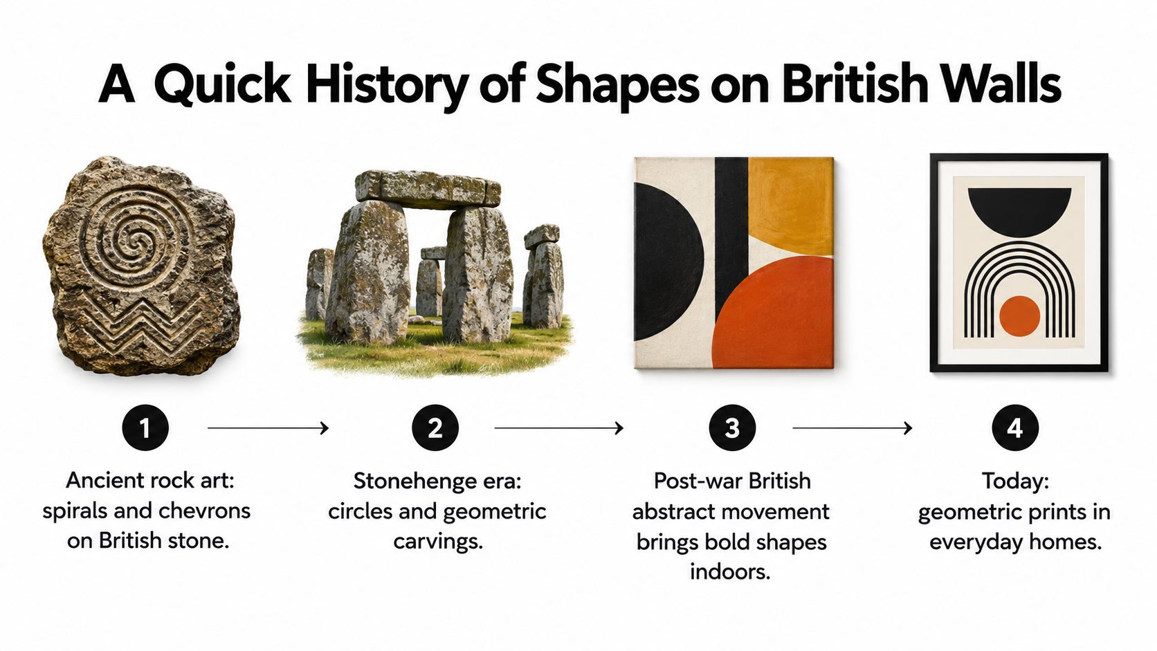
From carved marks to post-war walls
British geometric abstraction found an important institutional platform after the Second World War. The 1951 survey exhibition British Abstract Art at London's Gimpel Fils gallery brought together 55 painters and sculptors, helping formalise the post-war British geometric tradition as documented in this account of the exhibition.
British Art Studies describes a loosely connected group developing theories and working methods based on geometrical systems from the early 1950s. A later exhibition traced the movement's growth in Britain from 1951 through painting, sculpture and design. The story is less a neat school with matching blazers than a shared interest in systems, proportion and structure.
That history explains why a clean grid or sharply divided colour field sits comfortably in a British interior. It works beside tiled fireplaces, orderly terraces, record shelves and the national habit of putting the kettle on before making a serious design decision.
A modern buyer can take the friendly version home: a quiet line print, a spirited abstract, or a Striped Circle design nodding to a favourite band or football club. In a compact room, that choice solves a space problem as neatly as it shows personality. The shapes have been doing the heavy lifting for centuries.
Prints, Paper and Pixels That Keep Edges Sharp
Geometry is unforgiving in the best possible way. A fuzzy photograph can sometimes pass as atmosphere, but a soft triangle looks like the printer has had a minor wobble. Repeated lines, hard colour changes and symmetrical shapes reveal poor preparation quickly, especially when the print hangs close to eye level.
The familiar terms can sound more mysterious than they are. Giclée usually refers to a fine-art inkjet process, useful when you want nuanced colour and detailed edges. Litho is an offset printing method that makes sense for larger print runs. A digital C-type is produced through a photographic lab process and can give images rich tones, which suits geometric work that relies on deep blacks or saturated blocks.
The important question isn't which label sounds poshest. Ask what the artwork needs, how far away you'll view it and which paper or surface keeps the design clean.
Resolution without the pixel panic
For UK wall art and gallery prints, expert guidance points to 240 dpi as very good quality, while 150 dpi can be acceptable for large-format pieces viewed from a distance in this guide to image quality for printing. That's more useful than chasing a huge file for its own sake. Resolution should match the finished size and viewing distance.
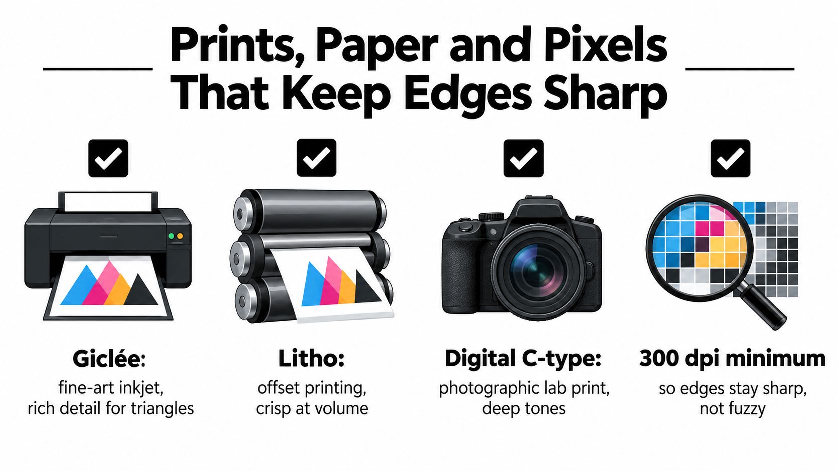
Ask before ordering: “Will the final file keep these edges crisp at the size I've chosen?”
Matte paper is usually a safe choice for flat colour blocks because it reduces glare, particularly opposite a window or lamp. Satin can give stronger colour and a slight sheen, though it may reflect light more noticeably. Canvas adds texture and softness, which can be lovely for an organic abstract, but it may take away some of the precision that makes a hard-edged grid appealing.
For a frame-free feel, acrylic and aluminium can make bold geometry look contemporary, while birch-ply brings warmth and a more tactile character. Whatever the substrate, check the paper weight, surface finish, ink type and fade-resistance information. A reputable print shop should tell you whether the chosen material suits the artwork, rather than waving you towards the most expensive option.
Use this quick checklist:
- File quality: Confirm the resolution works for the finished dimensions.
- Colour handling: Ask whether the printer can reproduce strong blacks and clean transitions.
- Surface choice: Pick matte, satin, canvas or a rigid substrate according to light and texture.
- Longevity: Check the ink and paper information, especially for a sunny room.
- Framing plan: Make sure the print size works with the frame and mount you intend to use.
For a deeper look at paper choices, this guide to print and paper types is a useful companion before you click the order button.
Sizing, Framing and Hanging Without the Headache
A print can be beautiful and still look wrong if it's too small for the sofa or too crowded above a desk. In a compact UK room, proportion does more work than expensive furniture. The right size gives the wall breathing space while making the artwork look like a decision rather than something you found behind the ironing board.
| Print Size | Best For | Frames Available |
|---|---|---|
| 30 x 40 cm | Hallways, shelves and small wall clusters | Slim black, oak and simple poster frames |
| 50 x 70 cm | Above a compact sofa, desk or sideboard | Black aluminium, natural oak and floating frames |
| 70 x 100 cm | A stronger focal point above a larger sofa or bed | Oak, aluminium and deeper statement frames |
A useful starting point for a single piece above a sofa is 50 x 70 cm. Choose 70 x 100 cm when the wall and furniture can support a bigger statement. For a hallway, several 30 x 40 cm prints can create rhythm without turning the passage into an exhibition of elbows.
Framing is part of the composition
Slim black aluminium keeps minimalist line work crisp and graphic. Natural oak warms up abstract shapes and works well with softer palettes. A floating frame gives a heavier mosaic or layered print a little breathing room, creating separation between artwork and frame.
For a grid, leave 5 to 8 cm between pieces so the gaps look intentional rather than accidental. Lay the prints on the floor first, then use paper templates on the wall. A phone-based spirit-level app can help, although it may also reveal that your apparently straight shelf has been lying to you for years.
UK hanging guidance commonly places the centre of wall art at about 1.45 m from the floor, with 15 to 30 cm of clearance above a sofa in this picture-hanging guide. Geometric compositions benefit from that care because the eye notices a drifting axis or inconsistent margin faster than it notices a wonky painting.
For a trio above a sofa, line up the centre of the group rather than measuring each frame from the ceiling. Mark the outer edges with low-tack tape, check the spacing from the cushions and only then reach for the drill. If you're renting, compare the weight of the framed piece with the rating on removable hanging strips. The wall may be temporary, but your satisfaction doesn't have to be.
More detail on choosing a frame is available in this guide to poster frame sizes.
Music and Football Prints That Actually Speak Fandom
A two-bed flat can hold a record player, a framed shirt and a sofa that already eats half the room. The trick is choosing fandom art that earns its wall space. A treasured scarf, an album played until the neighbours knew every lyric, or a club that has caused stress since childhood can all inspire a print without turning the lounge into a club shop.
Geometric work makes that translation neatly. A music print can turn sound waves, guitar strings or an album-cover mood into repeated lines and blocks. For music, a clever visual nod can feel more grown-up than a giant logo. Explore these music artwork prints for waveform and colour-block designs that keep the reference personal.
Football offers the same opportunity. Pitch markings, stadium geometry, shirt colours and terrace-like repetition can suggest match day without making the room look as if a souvenir shop has exploded. Striped Circle prints are especially useful in compact UK flats, where one well-chosen piece can bring club colour and personality without demanding a whole wall.
The audience for this art is broader than the old one-club stereotype. A UK football-fan survey found that 67% of UK football fans support Premier League clubs, while 57% also follow at least one other team to some degree, supporting a more flexible view of fandom in this UK football-fan survey. A print might celebrate a city, a favourite era, a stadium atmosphere or the beautiful chaos of match day.
Sky Sports' research adds another wrinkle. It says only 30% of fans are traditional one-club “lifers”, while 20% of people who identify as football fans but don't follow a team still watch football at least once a week or never miss a big game in its report on changing football fandom. That sounds familiar to anyone who supports one side, watches another league, follows a player and claims neutrality when the neighbours ask.
Picking a piece that survives cohabitation
- For a shared living room: Choose an abstract colour composition that nods to a club or band without taking over the furniture.
- For a home office: Try a blueprint-style stadium print, a restrained waveform or a monochrome line design.
- For a gift: Find a visual reference the recipient will recognise, but avoid guessing their second club. That way lies danger.
The Football Supporters' Association found that 63.9% of respondents support only one men's team, while 16.7% support more than one men's team in its 2023 National Supporters' Survey in its published survey statistics. Personal fandom has nuance, and good design leaves room for it.
Choose licensed work where relevant, or buy original fan art that does not pretend to be official. Geometry gives music and football prints enough polish to sit beside family photographs, even when the match result had rather less polish.
Room-by-Room Styling, Care and Gift Smarts
Take a small flat with a bedroom, one living room, a narrow hallway and a desk squeezed into a corner. It doesn't need the same print repeated everywhere. Each space can have its own tempo, like a decent playlist that knows when not to put three loud tracks back-to-back.
Bedroom calm
Start with a monochrome line set above the bed or opposite the wardrobe. Pair black and white geometry with sage and cream bedding for a quieter feel, or add a little warm wood through the frame. Keep the pattern open and let the wall breathe.
For a group of prints, align their centres at roughly 1.45 m in a gallery arrangement, using the hanging guidance discussed earlier. Above the bed, check that the frames sit securely and don't crowd the headboard.
Living room energy
A bold abstract stack works above a sofa, particularly when the furniture is neutral. Try ochre and navy for a warm, confident combination, or use teal and rust when the room needs a bit more character. If there's a radiator beneath the wall, leave enough visual and physical breathing room rather than forcing the frame into a cramped strip.
An accent wall can help a strong print feel intentional, but colour needs balance. These accent wall design tips offer useful guidance on managing contrast and proportion before you commit to a tin of paint.
Hallway and loo nook
Small mosaic tiles or compact circle prints are ideal for awkward sections of wall. They reward a closer look as people pass, which is handy because hallways rarely offer enough space for a grand gesture. A narrow black frame keeps the arrangement neat, while a pale oak frame stops it feeling too formal.
Use paper templates before hanging. Hallway walls often contain more hidden obstacles than expected, including switches, pipes and the mysterious hooks left by previous tenants.
Home office
A framed blueprint, stadium grid or restrained waveform adds focus without making the desk feel like a sports bar. Navy with cream works neatly against a pale wall, while muted teal can sit comfortably beside plants and timber shelving. Hang the centre of the piece at eye level when seated if the artwork is mainly for your own viewing, then check it from the doorway as well.
Caring for the print is simple. Dust the frame with a microfibre mitt, keep dye-based inks away from prolonged direct sunlight and avoid placing artwork where steam or condensation can reach it. Rotating seasonal prints can refresh the room and gives you an excuse to rediscover the one you bought after that particularly dramatic cup final.
For gifts, a 30 x 40 cm unframed print is an easy housewarming choice because it fits many standard frames and doesn't demand a complete knowledge of the recipient's interior design. A framed trio feels more substantial for a birthday, especially when the set connects to a favourite band, club or city without requiring a twelve-minute explanation.
A family-run UK print shop can also make the practical side less painful. Check dispatch times, packaging, frame options and delivery terms before ordering, particularly if the print is for a date rather than a vague future moment. Good wall art should arrive ready to enjoy, not looking as though it has completed an away day in a wet cardboard box.
Whether you're after a sharp monochrome set, a colourful football-inspired composition or a music print with a proper story behind it, Striped Circle offers quirky wall art, posters and cards made for music lovers, football fans and homes that need more personality. Have a browse, pick the shape that suits your space, and give that bare wall something worth talking about.
