
How to Choose Art for Your Home Without Having a Complete Meltdown
Choosing art for your home should be as much fun as watching your team bang in a last-minute winner, not as stressful as trying to get tickets for Glastonbury. Forget the dusty old rules you've heard from your nan. This is all about finding prints that shout you—your favourite tunes, your team’s colours, or just something that makes you crack a smile on a grim Monday morning.
It's time to ditch the idea that you need an art degree and just focus on what you actually love.
Ditch the Dread and Find Art You Actually Vibe With
Let’s be real, staring at a massive blank wall can feel more intimidating than trying to explain the offside rule to a tourist. A lot of people find choosing art the hardest part of decorating because it feels so permanent and personal. There's this weird pressure to buy something that screams "I'm a sophisticated adult with impeccable taste," when really, you just want something that looks mega.
But here’s the secret sauce: it doesn't have to be that deep. The goal is to make your gaff feel like your gaff.
- Trust Your Gut: If a print of your team's stadium gives you goosebumps or a lyric from a classic Madchester anthem makes you grin, that's all the justification you need. End of.
- Forget "Investment" Pieces: Unless you're secretly a Russian oligarch, art should be about a personal connection, not its potential resale value. You can read more about art market trends here, but honestly, buy what makes you happy.
- Start Small: You don't need to turn your living room into the Tate Modern overnight. Building a collection is a marathon, not a sprint. Like assembling the ultimate five-a-side team, it takes time.
So, Why Does It Feel So Hard?
That hesitation is real, and it often boils down to a fear of getting it wrong. The data below shows that while many feel intimidated by the whole process, it’s personal preference that ultimately leads to loving what's on your walls.
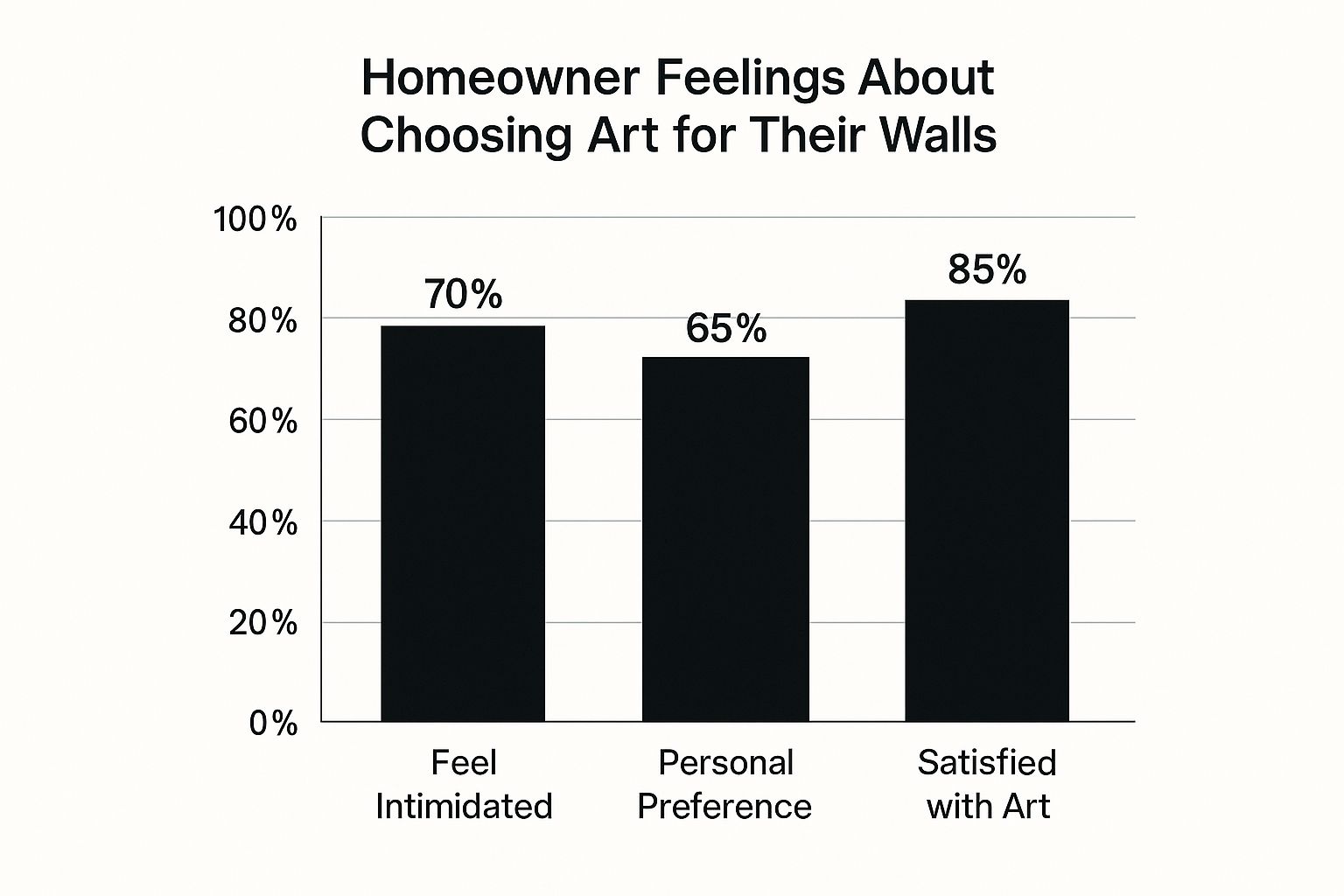
This just proves that pushing past the initial fear and choosing what you genuinely like is the key. So, consider this your official permission slip to have fun with it and make your home uniquely, brilliantly yours.
Let Your Passions Guide Your Prints
Your home should be a reflection of you, plain and simple. It’s the one place where your story is front and centre, so why shouldn't your walls get in on the action? When it comes to choosing art, think less about what's trendy and more about what truly gets your pulse racing.
Are you a die-hard indie fan who can still belt out every word to Wonderwall after three pints? Or maybe your weekends are entirely dedicated to the beautiful game, celebrating every goal and agonising over every VAR decision. Whatever it is that gets you buzzing, that's your starting point.
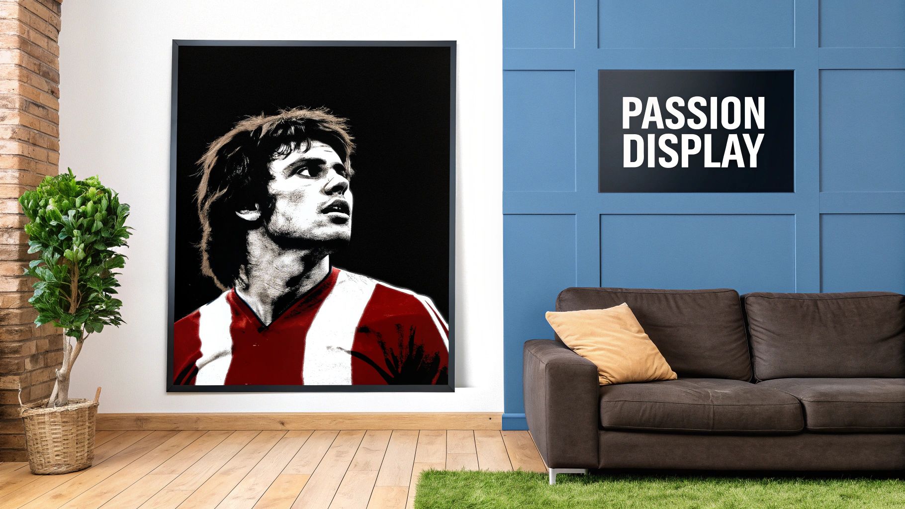
This is where you can get really creative. Move past the generic, soulless prints from the big-box stores and think about immortalising your heroes. Your walls are the perfect canvas for a subtle nod to a legendary guitarist or a bold graphic celebrating a club legend.
The best collections aren't just bought; they're curated like the perfect pre-match playlist. Each piece should have a personal connection, turning your home into a gallery that tells your story, not just a showcase of what’s in style.
How to Mix and Match Without It Looking Like a Jumble Sale
Now, you might be worried that hanging a print of Noel Gallagher next to a tribute to your football team will make your living room look like a student dorm. It’s a valid concern, but with a bit of thought, you can make it look absolutely class. The key is finding a common visual thread that ties everything together.
Here’s the game plan:
- Unify with Frames: This is the easiest trick in the book. Sticking to one style of frame, like all-black or natural oak, instantly makes a collection feel cohesive, no matter how different the art inside is.
- Create a Colour Connection: Look for a subtle colour that links two or more prints. That flash of red from your team’s away kit could perfectly pick up on a detail in a gig poster. It’s a small touch that makes a massive difference.
- Play with Different Styles: Don't be afraid to mix it up. A striking, graphic portrait of Gazza can look fantastic next to an understated typography print of an Oasis lyric. This kind of contrast adds visual interest and makes the whole arrangement feel more dynamic and intentional.
Using these simple tricks, you can turn a random assortment of things you love into a collection that looks deliberate and stylish. If you need a hand getting started, browsing some of the best places to buy art online can give you a massive dose of inspiration. After all, you’re creating a space that should make you smile every time you walk into it.
Mastering Size and Placement: No More Guesswork
Right, you’ve found a print you absolutely love. Maybe it's a slick graphic of your club’s stadium or a lyric that just hits different. Now for the big question: where on earth does it go? This is where we stop guessing and start putting a proper game plan together.
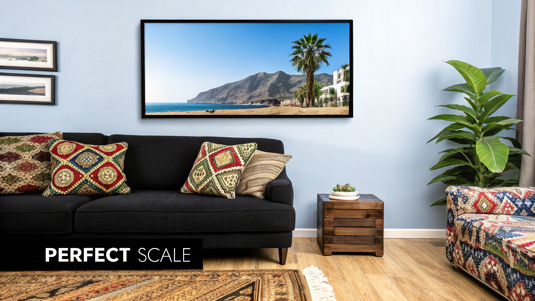
Putting a tiny print above a massive sofa is like sending a single striker up against a five-man defence—it just gets lost. The real secret to choosing art for your home is getting the scale right. A big, bold piece isn't just filling a space; it's anchoring the entire room and giving it a proper focal point, like a midfield general.
Nail the Hanging Height
Honestly, one of the most common own goals in home decor is hanging art way too high. It’s a classic mistake. People often stick things halfway up the wall, leaving them floating in a weird no man's land, looking like they're waiting for a bus.
Top Tip: The centre of your artwork should hang roughly at eye level, which for most people is about 57 inches (145cm) from the floor. This simple trick creates a natural line of sight and makes the art feel properly connected to the room, not like it’s trying to escape through the ceiling.
And when you’re hanging art above furniture like a sofa or a console table, aim to leave about 6-8 inches (15-20cm) of breathing room between the bottom of the frame and the top of the furniture. It’s a small detail that stops everything from looking cramped and cluttered.
Once you've picked your art, presentation is everything. If you're working with custom pieces or something a bit more unique, this DIY guide to framing cross stitch pictures has some brilliant tips that you can apply to all sorts of art.
Picking Colours Without Getting Bogged Down by a Colour Wheel
Let's be honest, the term "colour palette" can feel a bit... pretentious. It’s one of those phrases that sounds like it belongs in an art gallery, not your living room. But figuring out what colours work together doesn't have to be complicated.
Forget trying to memorise complicated colour theory for a minute. Instead, look for inspiration in the things you already love. Think about your favourite football kits, classic album covers, or even movie posters. The designers behind those have already done the hard work for you.
Take a look at Liverpool's iconic red, the unmistakable sky blue of Man City, or the bold black-and-white stripes of Newcastle United. These combinations are designed to grab your attention and stick in your mind for a reason. They just work.
Your art can play the same role in your room. A print featuring your team’s colours, for instance, can subtly tie the whole space together. It gives you a built-in palette to work with, connecting things like cushions or rugs without feeling forced. It’s a smart way to show some personality, and a subtle nod that fellow fans will definitely clock.
Using Colour to Create a Vibe
Here’s a simple trick I use all the time: find a secondary, less dominant colour in your chosen art piece and repeat it somewhere else in the room.
Imagine you’ve got a print with just a tiny splash of bright yellow in it. Suddenly, a yellow cushion on the sofa or a yellow vase on the shelf doesn't just look random; it looks like a deliberate, clever design choice. This little technique lets you introduce bolder accent colours without overwhelming the space.
Think of your main piece of art as the lead singer. The smaller accent colours are your backing vocalists—they’re there to support the main act and make the whole composition feel complete.
Of course, it’s not just about the art itself, but how it fits into the bigger picture. The goal is to create a space that feels intentional and, most importantly, feels like you. It's less about being perfectly "matchy-matchy" and more about creating a cohesive atmosphere.
For a deeper dive into making your wall colours and decor work together, these professional paint and decorating tips for refreshing your living space offer some brilliant advice that ties it all together beautifully.
Using Art in Unexpected Places: Think Outside the Box
Let's break the unwritten rule that says art belongs only above the sofa or in the hallway. Why should the most predictable spots get all the attention? Your home is filled with brilliant, overlooked corners just waiting for a piece of art to bring them to life.
Think about the downstairs loo. It's prime real estate for a quirky print that will make your guests chuckle. Or that blank wall in the kitchen? It's the perfect canvas for a bold, graphic piece—maybe a celebration of your morning brew or a classic album cover you love to cook to.
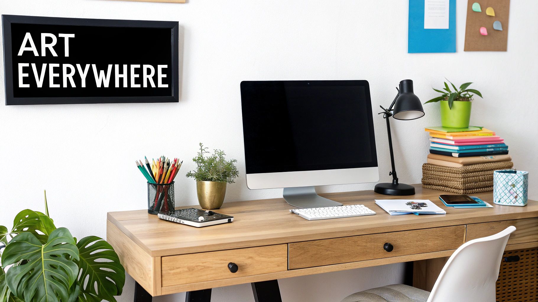
Even the home office deserves better than a dusty old calendar. A witty typographic print can be just the thing to get you through a tough deadline.
The trick is to match the art to the room's function and atmosphere. An energetic, colourful piece might be just the ticket for a buzzing social space like the kitchen, while something calmer and more subtle would feel right at home in the bedroom.
Match the Print to the Purpose
The art you choose can completely shift how a room feels. It's not just about filling a gap on a wall; it's about adding a layer of your personality where people least expect it.
-
The Kitchen: This is often the heart of the home, a hub of energy. Go for something bold. I love seeing food-related puns, a stylised print of a favourite band's album, or simply something that makes you smile while you wait for the kettle to boil.
-
The Bathroom: So often neglected, the bathroom is a fantastic spot for a bit of humour. A funny quote or a vibrant abstract print can transform a purely functional space into something memorable.
-
The Home Office: You want to surround yourself with inspiration here. It could be a tribute to a sporting hero known for their grit or a song lyric that fires you up. The right print can honestly make Monday mornings a little less painful.
At the end of the day, choosing art is deeply personal. It's about finding pieces that you have a real, genuine connection with. Don’t just buy something because it’s ‘in’; buy it because it makes your place feel more like home.
Curate a Collection That Tells Your Story
One great print is a fantastic starting point, but a true collection is what really starts to tell a story. Think of it less like creating a stuffy, formal museum and more like curating the ultimate visual playlist of your life. It’s all about adding pieces over time that map out your tastes, passions, and favourite moments.
The best collections aren't bought in one go; they grow with you. So, don't be afraid to mix things up a bit. A slick, modern music print can look absolutely brilliant next to a vintage-style football poster. It’s that exact blend of high and low, old and new, that makes a collection feel uniquely and authentically yours.
Adding Depth and Meaning
As your collection expands, you can start to be more intentional with your choices. It’s not just about what you hang, but who you support. A fantastic way to add genuine depth and new perspectives is by supporting a diverse range of artists. It's a move that's gaining real momentum in the art world.
A great collection is a conversation starter. It’s a visual diary that shares a bit of who you are with anyone who walks into your home. Each piece, whether it cost a tenner or a fortune, should have its own reason for being there.
Ultimately, this whole process is about creating a space that feels lived-in and loved. Every new print adds another layer to your home's narrative. You’ll find that a well-chosen collection does more than just decorate a room—it genuinely brings it to life.
And as you add those special pieces, remember that presentation is key. If you're wondering about the best ways to show off your growing collection, our guide on how to frame posters and prints will make sure every piece looks its absolute best. It's that final, crucial touch that pulls your whole story together.
Got a Few Lingering Questions?
It's completely normal to have a few questions swirling around before you commit to a piece of art. Let's tackle some of the most common ones I hear.
How Can I Mix and Match Art Styles Without Creating a Cluttered Mess?
The key to a beautifully curated, eclectic look is finding a common thread. This is the secret sauce that pulls everything together.
It could be a consistent colour palette, where a specific hue—say, a deep navy or a vibrant ochre—appears in each piece. Or maybe you unify everything with similar frames, like simple black or natural oak frames, which creates a sense of order even if the art inside is wildly different. Another great approach is to stick to a shared theme, like travel, music, or nature.
Think of a gallery wall: a mix of abstract prints, vintage photographs, and line drawings can look fantastic together if they're all housed in matching frames. It's all about creating a subtle connection that the eye can follow.
Is It Really Okay to Hang Prints in a Bathroom or Kitchen?
Yes, absolutely! Just be smart about it. These rooms can be a bit harsh on artwork, so you need to take a few precautions.
For a steamy bathroom, make sure your prints are properly framed with a sealed back. This is crucial for protecting the paper from moisture damage over time. In the kitchen, the main enemies are heat and grease. Simply hang your art on a wall away from the cooker or any major splatter zones.
With a little bit of planning, these spaces are perfect for showing off more playful and unexpected prints that can bring a lot of personality.
I see it all the time: people buy art just because it matches the colour of their sofa. Please don't do that! Your art should be something you genuinely connect with. Trends will fade, but a piece that makes you smile every time you see it is forever. Trust your gut, not just your colour swatches.
Ready to find prints that really speak to you? Dive into the Striped Circle collection and discover unique art inspired by the music and football you love. Find your next favourite print today!
