
How to Create a Gallery Wall That Rocks Your Gaf
A gallery wall isn't just a collection of pictures; it’s your personal story plastered on the wall. It’s a visual mixtape of your favourite things, mixing and matching prints, photos, and frames to create something that’s 100% you. I always see it as a three-part gig: curating your collection like a festival line-up, planning the layout on the floor first (the soundcheck), and then bringing it all to life on the wall to create a knockout focal point that’ll have your mates talking.
From Blank Wall to Headline Act
That big, blank wall is staring you down, isn't it? It’s practically begging for something more interesting than another coat of magnolia. The answer? A gallery wall. It’s your personal Hall of Fame, a visual mash-up of your favourite bands, life mottos from films you've seen a million times, and that one glorious moment your team lifted the cup.
This isn’t about creating a stuffy, silent museum. Forget that. This is about plastering your personality all over your gaff. Think less perfectly curated Pinterest board and more the glorious, organised chaos of a classic album cover. The whole point is to create something that’s unapologetically you.
Brainstorming Your Vibe
Before you even think about hammering nails or raiding the loft for old photos, let's talk themes. This is the single most important step. It’s what stops your wall looking like a car boot sale and turns it into a cohesive collection that actually makes sense. Your theme is the story, the thread that ties every single piece together.
Now, don't panic. A "theme" doesn't mean everything has to be matchy-matchy. Far from it. It could be anything, like:
- A Musical Shrine: A tribute to 90s Britpop, a deep dive into Northern Soul, or a visual history of your favourite band's album art. Think Oasis vs Blur, all day long.
- The Supporter's End: Why not dedicate the space to your team's glory days? Think legendary players, iconic goals, and ticket stubs from that unforgettable away day. It becomes your own personal trophy room.
- A Colour Story: Pick two or three main colours and find prints that stick to that palette. A simple black, white, and gold theme, for instance, can look incredibly sharp and sophisticated, even if the content is pure rock 'n' roll.
- Purely Personal: The ultimate mash-up. A mix of family photos, inside jokes immortalised in typography, and prints from places you've been. The only rule here is that every piece has to make you smile.
A gallery wall is so much more than decoration; it's a proper conversation starter. It’s your chance to show people what you’re all about without saying a word. It’s your own curated exhibition, and you’re the headliner.
Before you get cracking, here's a little table to help you nail down the mood for your wall.
Choosing Your Gallery Wall Vibe
| Vibe Check | What It Looks Like | Best For |
|---|---|---|
| Rock 'n' Roll | Bold fonts, band posters, iconic photography, dark frames. | Music lovers, creating an edgy, dynamic living space. |
| Minimalist Cool | Clean lines, lots of white space, a tight colour palette, abstract art. | Calming bedrooms or modern, uncluttered home offices. |
| Travelogue | Maps, city prints, personal photos, ticket stubs, vibrant colours. | Documenting your adventures and inspiring wanderlust. |
| Family Archive | A mix of old and new photos, kids' drawings, handwritten notes. | Creating a warm, nostalgic focal point in a hallway or living room. |
This is just a starting point, of course. The best walls often mix and match elements to create something truly unique and cool.
Is This Trend Here to Stay?
You might be wondering if you're a bit late to the party. Absolutely not. Gallery walls are still one of the most popular ways to display art in British homes. A recent survey by Ideal Home highlighted that over 60% of UK interior designers still recommend them as a go-to for personalising a space.
In fact, the trend has simply evolved. We've moved away from rigid, symmetrical layouts to more eclectic, ‘higgledy-piggledy’ arrangements, which now make up about 45% of new installations. It's all about looking more collected and less like you bought it all in one go from IKEA.
When you're thinking about your wall, don't limit yourself to just prints. For example, a great guide to choosing the perfect medal hanger for a feature wall shows how specific collections can create a powerful visual statement among your art. Ultimately, the best way to get going is by exploring ideas, and our guide on how to decorate walls offers a ton of inspiration to get you started.
Picking Your Prints Like a Record Producer
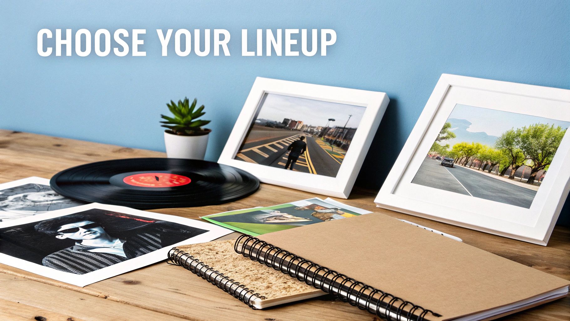
Right, this is where the magic really begins. Choosing your art is a bit like curating a festival lineup or producing a classic album. You're aiming for a mix of headliners, indie darlings, and a few wildcards to keep things interesting. We’re not talking about bland stock photos here; this is your chance to showcase bold, witty prints that spark conversations and make your mates jealous.
The trick is to assemble a collection that looks cohesive but not contrived—like a perfectly sequenced album where every track is an absolute banger. You’re looking for that sweet spot where a massive print of your club’s legendary striker can hang next to a subtle abstract piece and a typographic quote from your favourite film without looking like a jumble sale. It’s an art form in itself, really.
Finding Your Hero Pieces
Every great gallery wall needs an anchor. A lead singer. A Cantona. This is your hero piece. It's usually the largest or most striking print in your collection and should be the very first thing you place when planning the layout. It sets the tone for everything else.
Once you’ve got your headliner sorted, start building around it with your supporting acts. The key to creating some visual rhythm is to mix different types of art.
- Photography with Graphic Art: A moody black-and-white photo of your favourite city skyline can look absolutely brilliant next to a punchy, colourful graphic print of a song lyric.
- Typography with Portraits: Why not pair an iconic film quote with a stylised portrait of a football legend? The contrast between text and image gives the whole wall more depth.
- Album Art with Abstracts: The visual language of music is incredibly powerful. Mixing iconic album covers with abstract prints creates a seriously cool, cultured vibe. If you’re stuck for ideas, we’ve got a whole guide on framing your favourite album covers.
Your gallery wall shouldn't feel like it was bought in one go from a department store. It should feel collected, personal, and a bit chaotic—in a good way. Think of it as the visual equivalent of a killer B-side collection; full of hidden gems and personal favourites.
Nailing the Colour Palette
A unified colour palette is the secret handshake that makes a seemingly mismatched collection look intentional. You don’t need to be super rigid about it, but having a common thread really helps. Just pick two or three dominant colours and look for prints that feature them, even if it's just a small splash. This subtle link creates a visual harmony that ties the whole display together.
The trend right now is all about personality. Over 70% of UK online wall art retailers are seeing a massive surge in sales of bold, colourful prints, especially abstract art with deep terracotta, forest green, and electric blue tones. It seems we're all getting braver with our choices. In fact, 65% of people say they want their gallery walls to be ‘unique and conversation-starting’, as you can see in recent wall art trend reports.
Framing Your Collection Like a Pro
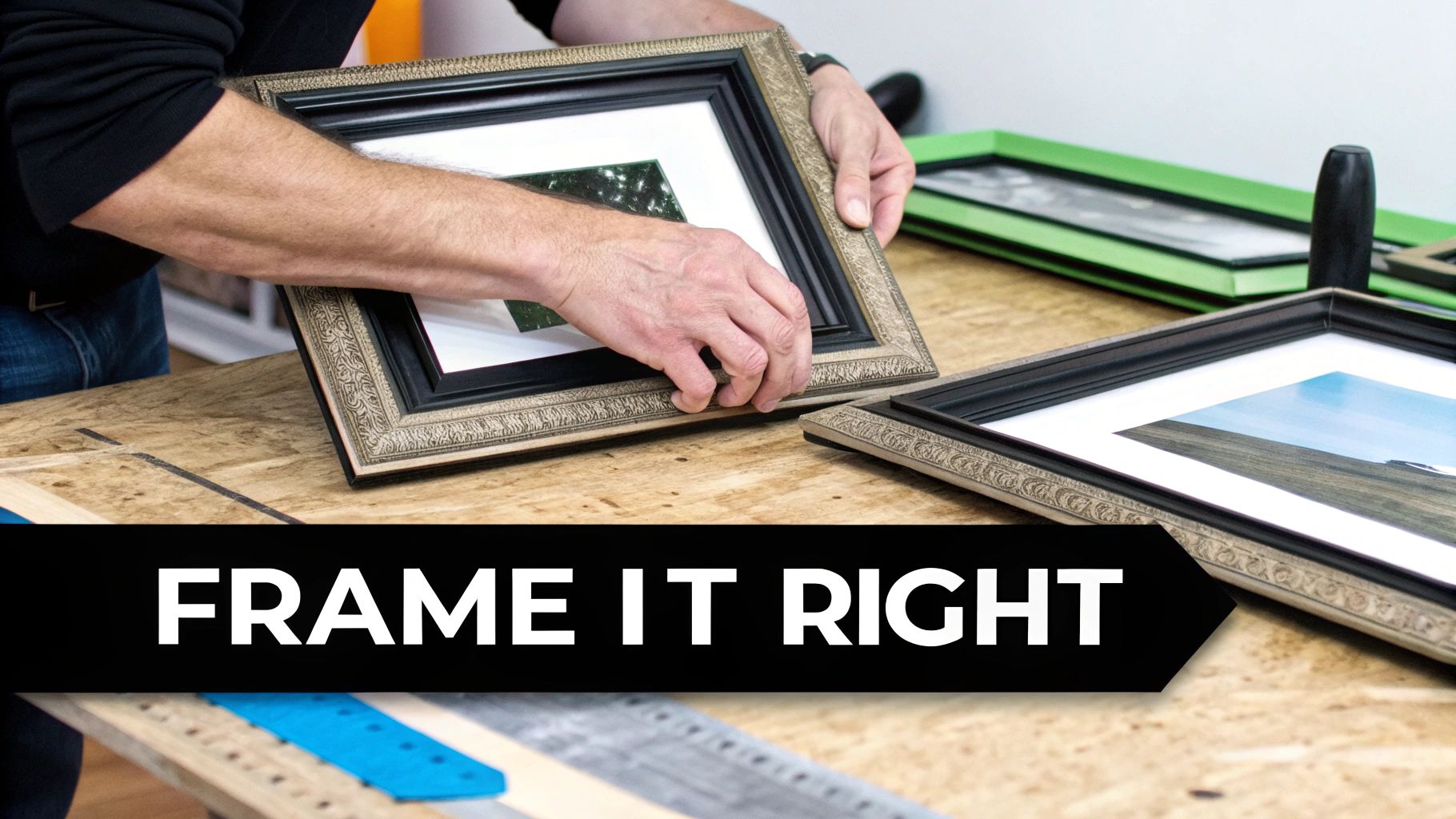
Think of your frames as the unsung heroes of your gallery wall—the solid, reliable drummer holding it all together. They might not grab all the attention, but they're absolutely crucial for pulling the entire look together. A quality frame can elevate a simple print into something special, while the wrong choice can make even the most stunning artwork fall flat.
Choosing your frames is where you really start to define the character of your wall. Are you aiming for a sleek, cohesive look with identical frames creating a sense of order? Or is your style more eclectic and personal, with a mix of materials and finishes that tell a story? There's no single right answer, but this decision will set the tone for everything else.
To Match or Not to Match
Sticking to a uniform set of frames—say, all slim black metal or all natural oak—creates a clean, gallery-like feel. This is a brilliant approach if you want the artwork itself to be the main event, and it works especially well for minimalist interiors or a collection of bold, vibrant prints that need a consistent border to ground them.
On the flip side, mixing and matching your frames adds a wonderful layer of texture and personality. Combining chunky wooden frames with thin metal ones, perhaps with a touch of antique gold thrown in, creates that sought-after 'collected over time' aesthetic. It feels authentic and uniquely yours. For a deeper dive, our guide on how to frame posters has plenty of practical advice.
The secret to successfully mixing frames is to find a common thread. This could be the colour (all black frames, but in different widths and styles) or the material (all wood, but with various stains and finishes). This subtle link is what keeps your wall looking curated rather than chaotic.
Finding the Right Vibe
The frame material does more than just protect the art; it injects a specific mood and style into your space.
- Sleek Metal Frames: These give off a modern, industrial, and crisp vibe. They're perfect for framing graphic typographic prints or stark black-and-white photography.
- Warm Wooden Frames: Wood brings a natural, organic, and often rustic charm. It’s ideal for adding warmth to a room and complements a more relaxed, cosy interior beautifully.
Sustainability is also becoming a key factor for many of us. It's no surprise that over 60% of London-based interior designers recommend metal and wood as their go-to choices. With online searches for wood-heavy interiors jumping by over 200% and 83% of UK shoppers saying they prefer brands with solid green credentials, it's clear that conscious, stylish choices are the way forward.
Get it Right on the Ground First: The Floor Rehearsal
Alright, put the hammer down. Before you make a single mark on your wall, we need a plan. This step is what separates a stunning, professional-looking gallery wall from one of those DIY fails you see on TikTok. Welcome to what I call the floor rehearsal.
Think of it like a band sound-checking before a big gig. You wouldn't just wing it on the main stage, and the same goes for your walls. This is your chance to experiment and get the arrangement absolutely perfect without making a load of unnecessary holes.
Mapping it Out on the Floor
First things first, clear a patch of floor that’s about the same size as your target wall space. Now, lay out all your framed prints and start arranging them. This is the fun part—treat it like a creative puzzle, shuffling pieces around until the whole thing just clicks.
This is where your anchor piece—that showstopper we talked about—really gets to shine. Place it down first, but try putting it slightly off-centre. Why? It's a classic design trick. An off-centre anchor encourages your eye to travel across the entire collection, rather than just getting stuck in the middle.
With your main print in place, you can start building out from there. A good rule of thumb is to position your next-largest piece diagonally opposite the first to create an immediate sense of visual balance. After that, it’s all about filling in the gaps with your other prints. It’s a bit like setting up a team photo; you position the key players first and then arrange everyone else around them.
My Golden Rule: Keep the spacing between your frames consistent. I always aim for about 2-3 inches between each one. This gives every print its own space to breathe but keeps the collection looking cohesive and intentional, not like an afterthought.
Tried-and-Tested Layouts
If you're staring at your prints and not sure where to begin, don't worry. There are a few classic layouts that are pretty much foolproof. See which one feels right for your space and your collection.
- The Grid: Think of this as the organised, symmetrical option. It’s perfect if your frames are all the same size and you want a clean, formal gallery feel. This layout brings a sense of calm and order.
- The Organic Cluster: This is a much more relaxed, free-flowing approach. You mix and match different sizes and orientations (portrait, landscape, maybe even a square frame) around your anchor piece. The result feels personal and effortlessly cool.
- The Staircase Climb: This one is a lifesaver for that tricky, sloping wall along your stairs. The idea is to arrange your prints in a staggered line that follows the upward angle of the staircase, creating a beautiful flow that draws the eye up.
No matter which layout you think you’ll go for, the floor rehearsal is the one step you can't skip. Lay everything out, step back, and live with it for a bit.
Once you’ve landed on an arrangement that you’re truly happy with, do the single most important thing: take a photo of it on your phone. Believe me, this photo will be your blueprint when it's time to start hanging. You’ll be glad you have it when you can’t remember if that Liam Gallagher print was supposed to go above or to the left of the abstract one.
Hanging Day Without the Drama
Deep breaths. This is it. The moment of truth. Hanging your gallery wall can feel as nerve-wracking as a penalty shootout, but with a bit of prep, you'll absolutely nail it first time. This is where that photo of your floor layout becomes your most valuable player.
Forget about complicated maths and expensive laser levels. We’re going old school with a foolproof method that guarantees a perfect transfer from floor to wall: paper templates. It’s a simple trick that lets you see exactly how it will look and make tiny adjustments before you even think about making a hole.
Paper Power: The Template Method
Grab a roll of craft paper (or even old wrapping paper) and trace around each of your framed prints. Cut out these paper shapes. Don’t forget to mark on each template exactly where the nail or hook needs to go – trust me, this is a game-changer.
Next, using painter’s tape (which won’t ruin your paint job), stick your paper templates onto the wall, replicating the layout you perfected on the floor.
Now, stand back. Admire your work. Does it feel right? Is that print of Ian Brown a bit too high? Now’s the time to shuffle things around with zero stress.
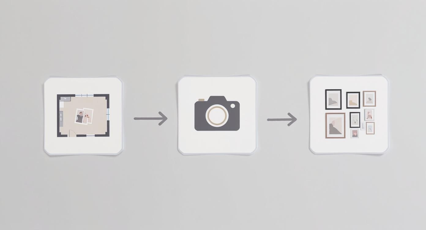
Having that photo of your floor layout as a reference point is what makes the transition to the wall far less intimidating. You're not starting from scratch; you're just executing the plan.
Choosing Your Hardware
Once you're completely happy with the paper layout, it's time to choose your weapons. The hardware you use really depends on your wall type and, let's be honest, how permanent you want this installation to be.
Here's a quick rundown of your main options:
- Traditional Picture Hooks: These are brilliant for plasterboard walls. They’re strong, reliable, and leave only a small pinhole behind if you change your mind.
- Command Strips: The holy grail for renters or anyone terrified of commitment. These adhesive strips are surprisingly strong and can be removed without a trace. Just make sure you get the right size for the weight of your frame.
- Wall Plugs and Screws: For brick or plaster walls, especially if you’re hanging heavier pieces, you’ll need to drill. It’s a bit more effort, but it’s the most secure option for your heavyweight headliners.
When you're ready, hammer your nail or apply your strip directly through the mark on your paper template. Rip the paper away, and you're left with a perfectly placed hook. Easy.
Gallery Wall Hanging Toolkit
Your essential checklist for a stress-free hanging day. No more, no less.
| The Must-Haves | The Nice-to-Haves |
|---|---|
| Craft paper | Protective sheet for floor |
| Pencil & Scissors | Another person for a second opinion |
| Painter's tape | A well-deserved cuppa for afterwards |
| Hammer | A playlist to get you in the zone |
| Your chosen hooks/strips | |
| Tape measure | |
| Smartphone (for the level tool!) |
This simple kit has everything you need to get the job done right without overcomplicating things.
The best tip I can give you for getting everything perfectly level? Use your smartphone. Most phones have a level tool built into the compass app. It’s surprisingly accurate and means you don’t have to splash out on a spirit level you’ll only use once.
If the thought of all this still feels a bit daunting, you can always look into professional picture hanging services to handle the job for you. But honestly, you can do this.
With your prints up and perfectly aligned, all that’s left is to stand back, put the kettle on, and bask in the glory of your new wall. You’ve earned it.
Your Gallery Wall Questions Answered
So, you’ve chosen your prints, you've played around with the layout on the floor, and you're ready to start swinging a hammer. Before you do, a few last-minute questions might be popping into your head. That's completely normal. Let's tackle those nagging doubts so you can get started with confidence.
How High Should I Hang Everything?
This is probably the most common question I get asked, and it's a good one. The professional standard is to hang your art so that the centre of the whole collection is at eye level. For the average person, this works out to be about 57 inches (that's 145 cm) from the floor.
But what if you're hanging the gallery wall above your sofa or a sideboard? Think of the furniture and the art as a single visual block. You'll want to leave a gap of about 6-8 inches between the top of the sofa and the bottom of the lowest frame. This creates a connection between the two, preventing the art from looking like it's just floating aimlessly on the wall.
What About Different Wall Types?
Ah, the great unknown that is your wall's interior. Knowing what you're working with will save you a lot of grief.
- Plasterboard: This is the most common wall type in newer homes. For standard prints, a simple picture hook will do the job perfectly. If you're hanging something a bit heavier, grab some dedicated plasterboard fixings for peace of mind.
- Brick or Plaster: If you give the wall a tap and it feels completely solid, you've got a proper masonry wall. This job calls for a drill, a wall plug (often called a rawlplug), and a screw. It’s a bit more involved, but once it's up, it's not going anywhere.
- Rented Accommodation: Making holes is often a big no-no when you're renting. This is where adhesive strips become your best friend. They're surprisingly strong these days and come off cleanly, which is great news for getting your security deposit back.
The key is to match the fixing to the job. You wouldn't use a drawing pin to hang a heavy mirror, would you? Using the right tool for your wall type is the difference between a secure display and a potential disaster.
Can I Add to My Gallery Wall Over Time?
Of course! In fact, the best gallery walls are the ones that grow and change with you. They should feel more like a living scrapbook than a static museum exhibit.
The 'organic cluster' layout we looked at earlier is ideal for this. Just start with a central group of your favourite prints and deliberately leave some space around the edges. When you find a new piece you love—a gig poster, a holiday photo, or a cool print from a local market—you can simply expand outwards. Your wall will start to tell an evolving story about your life and tastes.
Ready to get that collection started? Find prints that celebrate your passions over at Striped Circle. Whether it's the beautiful game or your favourite bands, we have art that will make your walls come alive. Find your next masterpiece at https://www.stripedcircle.com.
