
Your Guide to Cool Jazz Poster Art
At its heart, jazz poster art is the visual soul of the music. It’s the equivalent of a perfectly timed guitar solo for your eyeballs. It’s all about capturing the raw energy, the off-the-cuff improvisation, and the unmistakable spirit of jazz in a graphic format. These prints started out as a practical way to flog tickets for concerts and festivals, but they've since become celebrated pieces of art in their own right, bringing the electric atmosphere of a live performance straight onto your walls. They're so much more than old advertisements; they're cultural artefacts that tell the story of a genre.
Why Your Walls Are Crying Out for Jazz Art
Let’s be honest for a moment. Your walls have seen better days. They’re probably home to that one family photo that’s just a bit too small, a generic landscape print from a high-street shop, or worse, just acres of magnolia. They’re bored. They’re begging for something with a bit of personality, a dash of cool, and a real story to tell. Basically, they're the quiet kid at the back of the class, and they need to be taught how to rock.
This is where jazz poster art comes in, like a transfer deadline day signing that changes the whole season. It’s the ultimate cure for bland interiors and the sworn enemy of magnolia paint. This isn't just about sticking a picture of a saxophone on the wall and calling it a day. It’s about injecting a room with the lifeblood of one of the world’s most exciting musical genres. Each print is like a visual solo, a frozen moment of improvisation that turns a quiet corner into a proper conversation starter.
More Than Just Decoration
Think of it this way: your home is your personal festival main stage, and your walls are the line-up. Do you want a bill full of forgettable opening acts, or do you want headliners that command attention? A great jazz print does exactly that. It's the visual equivalent of a killer bass line—it holds the whole room together.
Here’s what makes jazz poster art the perfect addition to any space:
- It’s Packed with Personality: Unlike mass-produced art that says nothing, a jazz poster tells a story. It speaks of legendary artists, iconic venues, and historic moments in music. It says you appreciate culture, creativity, and things with a bit of soul. It says you're not a robot.
- It’s a Vibe-Setter: The right print can completely shift the atmosphere of a room. A bold, vibrant festival poster brings energy and excitement, while a moody, monochrome print of a lone trumpeter creates a more intimate, relaxed feel. It’s like having a volume knob for your room’s coolness.
- It’s Timelessly Cool: Jazz never really goes out of style, and neither does its art. These designs have a classic cool that transcends fleeting trends, ensuring your walls look sharp for years to come. It’s the Paul Newman of wall decor.
"A jazz poster is a snapshot of an attitude. It's the swagger of Miles Davis, the controlled chaos of John Coltrane, and the smooth sophistication of Duke Ellington, all captured in ink and paper. It’s not just art; it's an echo of the music itself."
Ultimately, choosing a piece of jazz poster art is a lot like picking a favourite album. It’s personal, it reflects your taste, and it brings you joy every time you see it. It’s a way to celebrate your love for music visually and create a space that feels uniquely yours.
To see how different musical genres translate into stunning visuals, you can explore our full range of music artwork prints. So go on, give your walls what they deserve—a bit of rhythm, a splash of colour, and a whole lot of soul.
A Quick History of Jazz Poster Design
Let's take a quick spin through the visual history of jazz. This isn’t some stuffy museum tour; think of it more like raiding your cool uncle’s record collection and seeing how the artwork shifted with every new sound. The story of jazz poster art is really the story of the music itself—a visual mixtape that grew up right alongside the tunes.
Just like the music, the posters didn't start out fancy. In the early days, they were purely functional. Picture the Big Band era: bold, shouty typography that practically yelled the time and place from a telephone pole. There was no room for subtlety. The goal was to get bums on seats, and the designs were as loud and direct as a trumpet fanfare.
The Bebop Revolution and Visual Cool
Then, Bebop arrived in the 40s and 50s. The music got faster, more complex, and a whole lot cooler. Suddenly, those old blocky letters just didn't cut it anymore. The art had to keep up. Designers started playing with moody photography, abstract shapes, and stark, minimalist layouts that mirrored the genre's new-found swagger.
This was the era of legendary designers like Reid Miles at Blue Note Records, who practically invented the look of modern jazz. His work was clean, clever, and impossibly stylish. He understood that a poster or an album cover wasn't just an advert; it was a statement. It was the first note you experienced before the band even played a single chord. These designs were less of a shout and more of a confident, knowing nod from across a smoky room.
This timeline shows how the art evolved to capture the culture, energy, and ongoing conversation of the music.
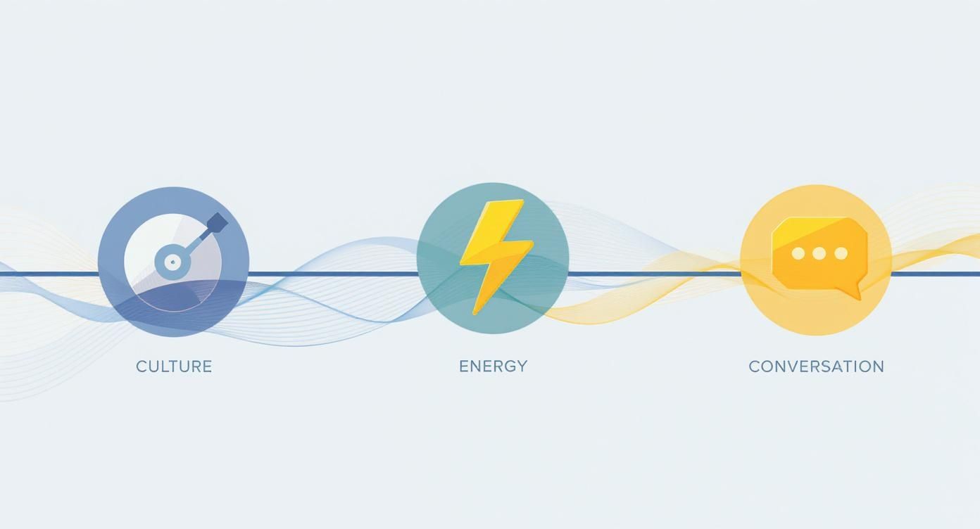 As the icons suggest, the design journey mirrors jazz itself, moving from a cultural announcement to an energetic expression and finally becoming a key part of the artistic dialogue.
Psychedelia Fusion and Festival Frenzy
As we cruise into the 60s and 70s, things got… weird. In the best way possible. Jazz started fusing with rock, funk, and soul, and the posters went right along for the ride. The clean lines of the 50s were swapped for swirling, psychedelic colours, trippy illustrations, and lettering that looked like it was melting off the page. It was wild, expressive, and a perfect match for the experimental spirit of the times. This is the kind of stuff that makes for a fantastic retro music poster today.
This visual explosion also coincided with the rise of the big international jazz festivals. Events like the Newport and Monterey Jazz Festivals needed posters that could capture the scale and excitement of seeing dozens of legendary artists in one place. These weren't just for local clubs anymore; they were iconic pieces of art designed to be collected and cherished, much like a festival T-shirt is today (only with infinitely more class).
Across the pond, the UK was having its own love affair with the genre, and its posters tell a story all their own. Believe it or not, the word 'jazz' was already in common use in Britain before 1919, with sheet music being published there from 1917. This early adoption set the stage for a rich tradition of jazz poster art throughout the 20th century. From gritty screen prints for Soho clubs to glossy designs for the London Jazz Festival, these posters tell a uniquely British story of the music.
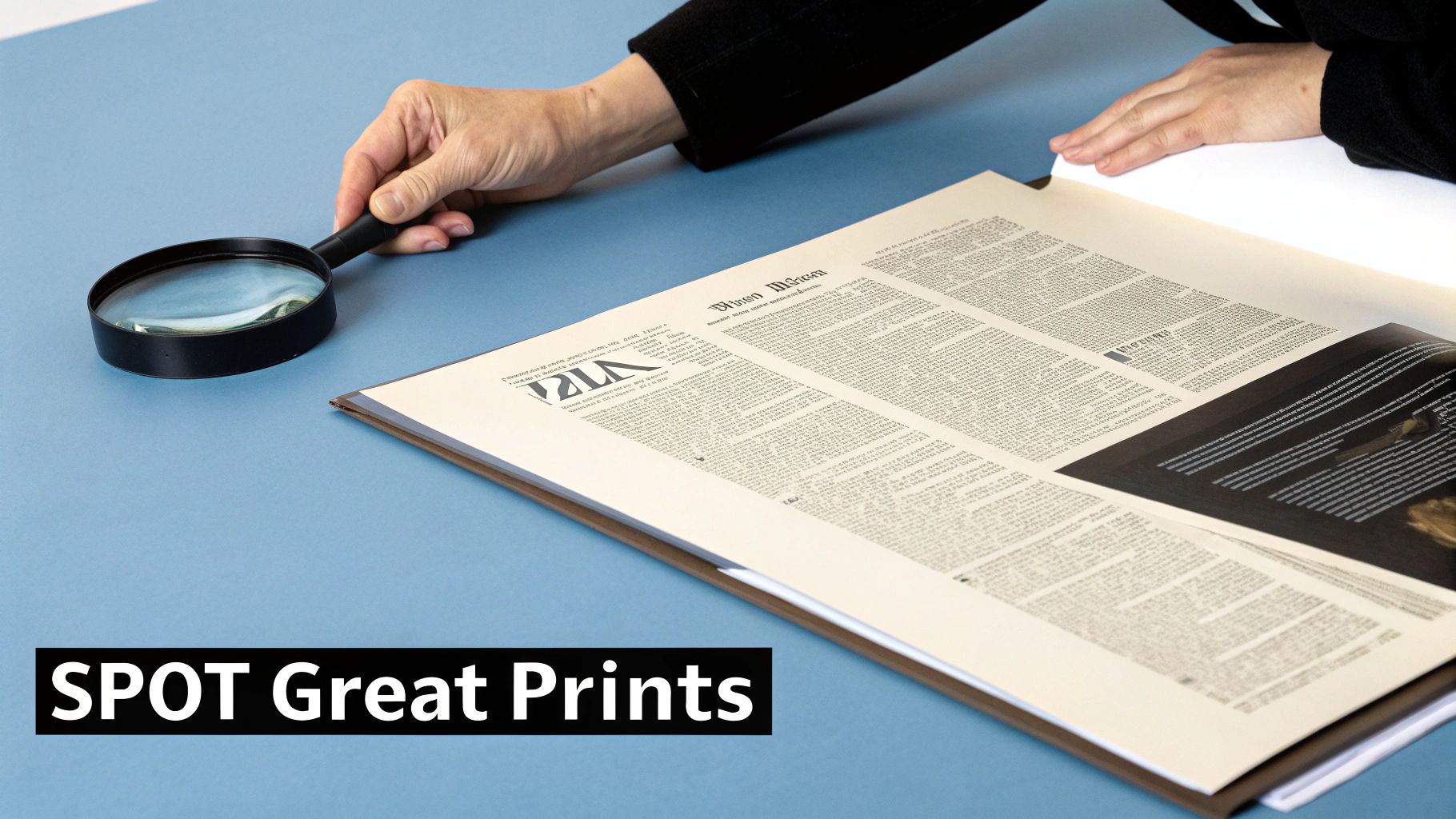
How to Spot an Amazing Jazz Print
So, you want to train your eye. Whether you're sifting through stacks at a market or browsing online, spotting a truly great piece of jazz art is a skill. It’s a bit like learning to hear the nuances in a Coltrane solo—once you know what to listen for, you can’t miss it. It’s all about looking past the surface.
Let’s start with a few basics, no art degree required. A brilliant print has a visual rhythm, just like the music it represents. Does the design lead your eye on a journey across the page? Does it feel balanced, yet full of energy? That’s what designers call dynamic composition, and it’s the secret ingredient that turns a simple poster into a work of art.
It's all in the details. You're looking for the little things that make a design sing, much like listening for that perfect riff in a live set.
What Makes a Design Pop
Beyond the overall layout, colour is a massive clue. Some of the most memorable jazz art, especially from the Blue Note Records era, uses a surprisingly limited colour palette to create a huge impact. Think stark blacks, clean whites, and then a single, sharp hit of electric blue or hot red. It’s pure confidence on paper.
The mood of a poster is so often set by its colours. To really get a feel for why certain combinations feel so right, this guide to color theory for designers is a fantastic starting point. It'll help you see the "why" behind the "wow."
Next up is the typography. On a jazz poster, the letters are never just functional text; they're an instrument in the band. They might be jagged and sharp like a bebop melody, or they might flow smoothly like a smoky ballad. Look for lettering that has its own personality and feels integrated into the art, not just slapped on top like a bad toupee.
A truly great jazz poster captures the improvisation of the music itself. It feels spontaneous yet deliberate, chaotic yet perfectly composed. It’s a visual paradox that, when done right, is pure magic.
Original Treasure vs Modern Masterpiece
This brings us to a crucial question: are you holding a piece of history or a modern tribute? An original is the real deal—a piece of paper that was physically there, in the club or at the festival, soaking up the atmosphere. They’re rare, they carry a story, and their price often reflects that. They're the holy grail.
A high-quality reproduction, on the other hand, is a fantastic way to bring classic art into your home without having to sell a kidney. It’s a flawless, vibrant print of an iconic design, made with modern archival inks and papers that will stand the test of time. Both have their merits. An original is an artefact; a reproduction is accessible art. You can dive deeper into this topic in our guide to understanding the appeal of limited edition prints.
This art form is a vital cultural record. Here in the UK, the National Jazz Archive is a testament to this, holding a massive collection with over 4,000 books and thousands of posters that document the visual history of the genre. It underlines just how important these designs are.
Ultimately, whether you choose an original or a reproduction, the goal is the same: find something that speaks to you, something that makes you happy every single time you look at it.
Finding and Collecting Prints Without Going Broke
Right, let’s talk brass tacks. You’ve decided your walls need a serious injection of cool, and jazz poster art is the answer. The good news is you don’t need to remortgage your house or sell a kidney to start a collection that looks like a million quid. This is your game plan for finding incredible prints without declaring bankruptcy.
Think of yourself as a crate-digger, but for art. The thrill of the hunt is half the fun. Your mission is to find pieces that make you grin every time you walk past them, whether they cost a fiver or a small fortune.
Your Hunting Grounds for Jazz Art
So, where do you actually find this stuff? Forget wandering aimlessly into sterile art galleries where the prices are whispered and you're terrified to breathe too loudly. The best jazz poster art is often found in places with a bit more soul.
Here are your prime locations:
- Online Print Shops: This is the easiest place to start. A good online store (like, ahem, ours) offers high-quality reproductions of classic designs. You get the iconic look without the vintage price tag and the stress of preserving fragile, old paper. It’s the Champions League of print shopping.
- Niche Marketplaces: Websites like Etsy or specialist art forums can be goldmines. You’ll find independent artists creating modern interpretations of jazz themes, alongside sellers offloading vintage finds.
- Record Fairs and Flea Markets: Get ready to get your hands dusty. This is where you might unearth a genuine hidden gem—an original poster for a local gig or a quirky festival print that no one else has. It’s a gamble, but the payoff can be huge. Like a 90th-minute winner.
The key is to keep your eyes peeled everywhere. You never know when or where the perfect print for your living room will pop up.
The Great Debate: Originals vs Reproductions
This is the big one. Do you hunt down an original, a "vintage" piece that was actually there, or do you grab a pristine, modern reproduction? Honestly, there’s no wrong answer—it’s all about what you want for your wall and your wallet.
An original vintage poster is a piece of history. It has lived a life. It might have creases, faded colours, or a tiny tear in the corner. That’s not damage; that’s character. It’s an artefact that connects you directly to a specific time and place.
A high-quality reproduction, on the other hand, is all about visual perfection. It’s a flawless tribute to a classic design, printed with modern archival inks on premium paper. It delivers that timeless cool with guaranteed vibrancy and longevity, making it the perfect choice for most of us who just want our walls to look amazing without the hassle.
Choosing between an original and a reproduction is like choosing between a vintage vinyl record and a high-res digital stream. One has the crackle and warmth of history; the other has clarity and accessibility. Both let you enjoy the music.
Think about the ecosystem that created these posters in the first place. The demand was driven by a buzzing live music scene. In Britain, a 2004-2005 study found a huge network of jazz venues, from small pubs with audiences of 30-50 people to larger arts centres. This infrastructure created a constant need for promotional jazz poster art, serving both commercial and cultural roles across the country. You can read more about the value of Britain's jazz scene.
Buying with Confidence
Whether you’re buying old or new, a few details matter. Always check the condition. For originals, a bit of wear is fine, but major damage can be a deal-breaker. For reproductions, ensure the seller specifies the paper weight and ink type—you want archival quality.
And don’t forget sizing. Measure your wall space before you fall in love with a poster. There’s nothing more tragic than buying a massive A1 print for a tiny hallway. It's the art equivalent of buying shoes that don't fit. A bit of planning ensures your new art fits its new home perfectly.
How to Frame and Style Your Jazz Art
Alright, you’ve done the hard part. You’ve hunted down and brought home the perfect piece of jazz poster art. Now for the moment of truth. Please, for the love of all that is holy, don't even think about reaching for the Blu-Tack or some dog-eared washi tape. A print with that much soul deserves a presentation that makes it sing, not mumble apologetically from a corner.
This is your guide to giving your jazz art the five-star treatment it deserves. We’re skipping the stuffy, generic advice and getting straight to the practical stuff that actually makes a difference. Think of the frame as the rhythm section for your visual solo—it’s there to provide structure and make the main event truly shine.
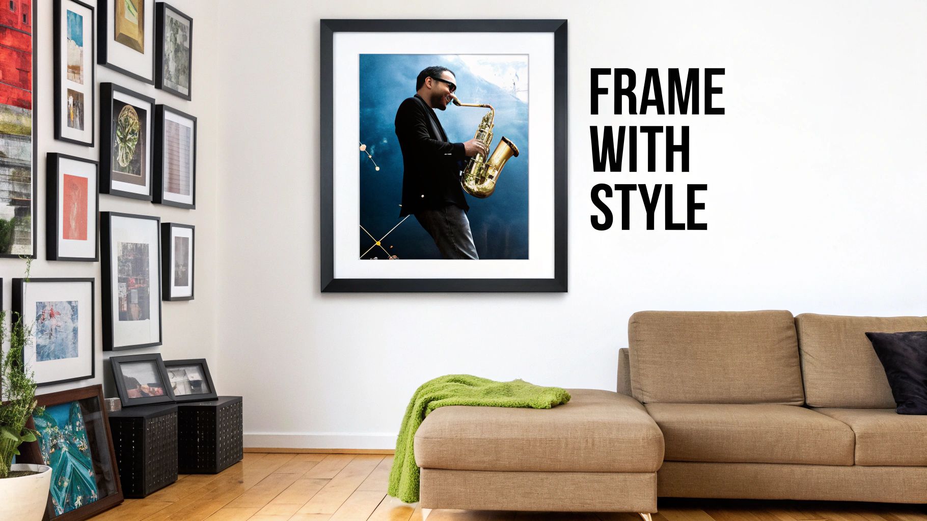
Choosing the Right Frame
The frame you choose can completely change the vibe of your print. It’s the difference between a polished studio album and a bootleg cassette recording. You need to find a partnership that works.
Here are a few classic pairings to get you started:
- Minimalist Black or White Frames: These are your ultimate all-rounders. The reliable centre-back of framing. A simple, clean frame lets the artwork do all the talking, which is perfect for those bold, graphic designs from the Blue Note era. It’s a crisp, confident choice that never goes out of style.
- Natural Wood Frames: Got a print with warmer tones or a more rustic, folksy feel? A natural oak or walnut frame can really bring out those earthy colours, adding a touch of warmth and texture to the whole setup.
- Metallic Frames: A thin metallic frame in gold, silver, or brass can introduce a little flash and sophistication. This works brilliantly with Art Deco-inspired prints or anything that needs a touch of glamour. A bit of showbiz.
And don't forget the mount (or matting). That cardboard border isn’t just filler; it gives the artwork breathing space, drawing your eye inward and elevating it to a considered piece of art. A crisp white mount is a no-brainer for adding that professional touch.
To Gallery Wall or Not to Gallery Wall
Now, where to hang this masterpiece? You’ve got two main strategies: let it fly solo or get the whole band together for a gallery wall jam session.
A single, oversized print can be an absolute showstopper. Hung above a sofa, a bed, or a turntable setup, it becomes the undisputed star of the room. It’s a bold statement that says, "Yes, my taste in art is as impeccable as my taste in music."
A gallery wall is like a perfectly curated festival line-up for your home. Each piece has its own stage, but together they create an unforgettable experience. The key is finding a rhythm that connects them all.
Creating a gallery wall is a fantastic way to display a growing collection. The trick is to find a common thread. You could group prints by a similar colour palette, a specific era, or even just a general vibe. Mix up the sizes to create energy and visual interest, but keep the spacing between the frames consistent to stop it from looking like a cluttered mess.
A top tip: lay everything out on the floor first. Perfect your arrangement there before you even think about picking up a hammer. It'll save you a lot of grief—and a lot of unnecessary holes in the wall.
Got Questions About Jazz Posters? We've Got Answers.
Alright, so you’ve journeyed with us through the smoky clubs and vibrant festival fields of jazz history. But maybe a few questions are still bouncing around in your head, like a tricky bass line you can’t quite pin down. No problem at all. We’ve pulled together some of the most common queries about jazz poster art to give you the answers, straight up.
Think of this as the encore. It's our chance to demystify a few things before you go out and start curating that incredible collection your walls have been waiting for. Let's dive in.
What’s the Difference Between a Vintage Poster and a Reproduction?
This is a fantastic question, and probably the most important one to wrap your head around before you start buying. An original vintage poster is the real deal. It’s the actual piece of paper that was printed way back when to promote a specific event—imagine a genuine 1965 print for a John Coltrane gig at the Village Vanguard. They are rare, often show their age with a bit of character-building wear, and are true collector's items.
A reproduction, on the other hand, is a modern reprint of that original design. Now, before you dismiss the idea, a high-quality reproduction isn't some dodgy photocopy from a cheap printer. The best ones are crafted using archival inks and heavyweight, acid-free papers to create a stunning, durable print that looks absolutely fantastic on a wall.
Think of it this way: a vintage original is like owning Eric Clapton's actual "Blackie" Stratocaster. A top-quality reproduction is like having a brand-new, perfect Fender Custom Shop replica. One is a priceless piece of history; the other is a flawless instrument you can actually play without having a panic attack.
For most of us who just want brilliant art that captures a legendary vibe—without the collector’s price tag and preservation headaches—a top-notch reproduction is the perfect choice. You get all the style, none of the stress.
How Can I Tell If a Jazz Poster Is Valuable?
Value is a curious thing, especially with art. For an original vintage poster, its value depends on a perfect storm of factors. Rarity is king—was it a limited run for a one-night-only show? The event itself is huge; a poster for a legendary Miles Davis performance at the Newport Jazz Festival will always command more attention than one for a quiet Tuesday night at a local pub. The designer also plays a massive part—was it created by a famous name like Reid Miles? And finally, condition is absolutely crucial. A pristine original is the holy grail.
For reproductions, the "value" is all about the quality of the print itself. Forget blurry, pixelated jobs run off on flimsy paper. You should be looking for a few key things:
- Archival-grade inks: This is a fancy way of saying the colours are designed to resist fading and will stay rich and vibrant for decades.
- Heavyweight, acid-free paper: This gives the print a substantial, quality feel and ensures the paper won’t yellow or become brittle over time.
In all honesty, though, the most important value is how much you love seeing it on your wall every day. A print that makes you smile is priceless, regardless of its auction potential. Speaking of which, original artwork for major events like the Telluride Jazz Festival can be valued at $4,500 or more, which just goes to show the financial and cultural worth these pieces can hold.
What’s the Best Way to Care for My Poster Art?
So you’ve invested in a piece of art that just oozes cool. Let's keep it that way. The number one enemy of great art (and vampires) is direct sunlight. UV rays will bleach the colours faster than a bebop solo. Hang your prints away from sunny windows, and if you’re framing something particularly special, it's worth investing in a frame with UV-protective glass for an extra layer of defence.
Humidity is the other main villain. This means the steamy bathroom is probably not the best home for your new Duke Ellington print, unless you’re deliberately going for a warped, weathered look. Before you frame it, handle your print with clean, dry hands to avoid leaving fingerprints or oily smudges.
A little bit of care goes a very long way, ensuring your art stays looking sharp for years and impressing anyone who walks through your door with your obviously excellent taste.
Any Tips for Creating a Gallery Wall with Jazz Posters?
Absolutely! A gallery wall is a fantastic way to show off your collection and make a huge statement. It’s like creating your own personal jazz festival line-up right there in your living room. The trick is to find a common thread that ties all the pieces together; otherwise, it can look less like a curated collection and more like a teenager’s messy bedroom.
Try grouping them by a unifying theme:
- By Colour: A wall of stark, monochrome black-and-white prints can look incredibly sharp and sophisticated.
- By Era: Dedicate a wall to the cool, minimalist designs of the 50s and 60s for a cohesive mid-century modern vibe.
- By Style: Group all your expressive, abstract, or typography-heavy posters together for a powerful visual story.
Don't be afraid to mix different sizes—it adds energy and stops the arrangement from feeling too static or formal. A great pro tip is to lay out all your framed prints on the floor first. You can play around with the arrangement until it feels just right, long before you start banging nails into the wall. You can use the same style of frame for a clean, unified look, or mix and match for a more eclectic, bohemian feel. Just remember to leave a couple of inches between each frame so the art can breathe. You're aiming for "curated," not "cluttered."
Ready to find the perfect headliner for your own walls? At Striped Circle, we live and breathe music, and we pour that passion into every print we create. Our collection is packed with high-quality jazz poster art and music-inspired designs that are ready to bring some soul to your space.
Explore the full collection and find your new favourite print at Striped Circle
