
Your Guide to the Perfect Retro Music Poster
Let's face it, a bare wall is a crime against good taste. It’s a huge missed opportunity to show off. A retro music poster isn't just a bit of paper you stick up; it’s an instant hit of personality, a sign of your excellent taste, and a bold statement that you’d rather be listening to The Smiths than sitting through another soul-crushing Zoom meeting.
Why Your Walls Are Crying Out For a Retro Vibe
Take a quick look around. Are the walls in your home or office actually inspiring you, or are they just... well, there? A retro music poster is your personal time machine. It’s a guaranteed conversation starter and a daily shout-out to that killer bassline or a lyric that completely changed your perspective on things.
Honestly, it’s the easiest way to take a space from a bland, magnolia-painted prison and turn it into a genuine reflection of who you are.
Think about the difference between putting on a perfectly chosen vinyl album and having to endure the mind-numbing repetition of whatever beige nonsense is on the radio. One has soul, a story, and a satisfying bit of crackle; the other is just background noise. Your walls deserve to have that soul. A punchy print from the height of Britpop or a swirling psychedelic gig poster from the 60s does more than just fill a space—it sets a whole mood.
More Than Just a Pretty Picture
A carefully picked print is a statement. It’s a subtle (or maybe not-so-subtle) way of letting visitors know, "Yes, my taste in music is brilliant, and no, we won't be putting any Coldplay on." It instantly connects you to a tribe, to a specific moment in time when music felt like it could change the world.
This isn’t just about filling that awkward gap next to the telly; it's about curating your own personal gallery of cool. If you're looking for more ideas on how to make your walls sing, you should explore our guide on transforming your space with music artwork prints.
This pull towards nostalgia isn't just a vague feeling; it’s a real, measurable trend. The comeback of the retro music poster is happening right alongside the UK's massive vinyl revival. Just look at the numbers: in 2023, physical music sales shot up by 10.9%, with vinyl sales alone soaring by an incredible 17.8%. It's clear that people are craving that tangible connection to the artists they love, and a poster is the perfect visual encore. You can discover more insights from the Entertainment Retailers Association.
So, whether you're trying to liven up your home office or bring a bit of character into the living room, a retro print is your secret weapon. It's a simple upgrade that packs a serious punch and is guaranteed to make you, and everyone who sees it, smile.
A Visual History of Music Poster Icons
Long before your phone became an endless scroll of new music, the humble poster was the original social media feed for music lovers. It was how you knew a legendary band was about to hit your town, and the designs themselves were pure visual statements, capturing the very soul of the music. This isn't some stuffy art history lesson; it's a quick trip through the decades that turned promotional paper into timeless art.
Let’s start with the swinging 60s. This was the age of psychedelic rock, and the posters were a perfect match. Think swirling, almost illegible fonts, mind-bending colour clashes, and imagery that felt like it had been pulled straight from a dream. These designs weren't just advertising a gig; they were trying to give you a taste of the experience. Many of these iconic looks drew inspiration from earlier movements, and you can see echoes of this artistic heritage in the history of Art Nouveau posters.
From Anarchy to Ambition
Then came the 70s, which basically ripped up the rulebook. Punk kicked the door in with a raw, do-it-yourself attitude. Posters were often thrown together with ransom-note lettering, grainy photocopied images, and a healthy dose of pure, unfiltered angst. It was messy, urgent, and utterly brilliant—the visual equivalent of a three-chord thrash.
The 80s, however, was all about slick ambition. New Wave and synth-pop brought in sharp geometric designs, neon grids, and bold, clean graphics that felt polished and futuristic. It was a world away from the gritty chaos of the punk scene. This was a decade that looked to the future, and the poster art reflected that perfectly.
A great retro music poster isn’t just a piece of paper; it's a time capsule. It bottles the sound, style, and attitude of an entire generation, ready to be uncorked on your wall.
The Rise of Britpop and Grunge
Finally, the 90s arrived, bringing a glorious clash of cultures. Over in the UK, Britpop swaggered onto the scene with a nod to 60s Mod culture—think bold Union Jacks, Fred Perry polos, and classic iconography. Meanwhile, across the Atlantic, Grunge offered a gritty, authentic alternative with its moody, lo-fi photography and understated typography.
This visual heritage is more than just nostalgia; it's a vital part of the UK’s cultural economy. The British Phonographic Industry recognises how merchandising, especially posters, keeps this history alive and kicking. Historically, music posters were cultural flags for movements like British rock and punk. Today, that legacy fuels a thriving market for authentic retro designs. Each era created its own visual language, one that still looks fantastic on a wall today.
How to Choose Your Perfect Retro Style
https://www.youtube.com/embed/O48rDn_LlsA
So, where do you start? Picking a retro music poster is a lot like putting together the first track for a killer mixtape—it sets the entire tone. Your wall is a blank canvas, and you're the DJ. What’s the vibe you're going for? Are you all about the peace, love, and Woodstock feel, or are you more at home in a dingy club shouting along to punk anthems?
This is about more than just grabbing a pretty picture. It's about finding that era that really gets your foot tapping. You need to connect with the whole package: the look, the feel, and the attitude of the design.
To really nail it, you might want to consider the unique styles of different sub-genres. For instance, you could delve into specific retro styles like Rockabilly to see just how deep these visual identities run. Every scene had its own uniform, and its posters were no different.
Pinpointing Your Decade
Let's be honest, you probably already have a gut feeling about this. Is it the swirling, free-spirited energy of the 60s? The raw, unfiltered rebellion of the 70s? Or maybe it’s the slick, synth-driven cool of the 80s or the gritty, authentic swagger of the 90s.
Each decade spoke its own visual language, and knowing the basics will help you find a poster that feels less like a decoration and more like a piece of you. We're talking about the typography that screamed a message, the colours that defined a movement, and the imagery that became iconic.
This infographic gives you a brilliant visual breakdown of music poster history, from the paisley-drenched 60s to the guitar-heavy 90s. 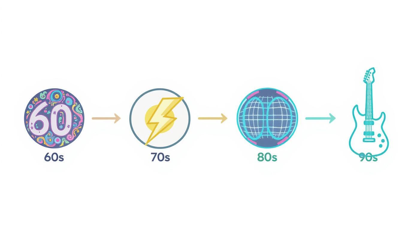 Every icon here represents more than just a style; it's a snapshot of the attitude that defined a decade's soundtrack.
The best retro music poster isn't the one that perfectly matches your sofa. It's the one that makes you want to turn the volume up to eleven, even when the house is empty.
To make it even easier, think of it this way: if your room were a song, what would it sound like? That’s your starting point.
Comparing The Eras
To help you find a look that’s genuinely you, we've pulled together the defining features of each era. Think of this as your cheat sheet for navigating the brilliant, noisy history of the retro music poster.
Retro Music Poster Styles by the Decade
Here's a quick-fire comparison of the key visual elements that define retro music posters from different eras, helping you find your perfect match.
| Decade | Key Vibe | Colour Palette | Typography Style | Perfect For |
|---|---|---|---|---|
| 60s | Psychedelic & Free | Earthy tones, oranges, purples, acid brights | Swirling, bubbly, hard-to-read | The creative thinker, the dreamer, the idealist. |
| 70s | Raw & Rebellious | Muted browns, bold reds, black and white | Cut-and-paste, stencilled, blocky | The non-conformist, the straight-talker, the punk at heart. |
| 80s | Bold & Futuristic | Neon pinks, electric blues, chrome, pastels | Geometric, digital, clean and sharp | The innovator, the pop fan, the one who loves a good synth line. |
| 90s | Gritty & Authentic | Muted greens, greys, stark monochrome | Distressed, handwritten, minimalist sans-serif | The indie kid, the loyal fan, the one with the worn-out band tee. |
Your chosen print is about to become a key part of your home’s story, so picking one that resonates with your personal style is what it's all about.
Creative Ways to Display Your Posters
Right, you’ve found the perfect retro music poster. It speaks to your soul. Now, for the love of all that is holy, please step away from the Blu-Tack. A print this good deserves far more respect than the temporary fix you used for your university dorm room posters. Let's give it the grand stage it deserves.
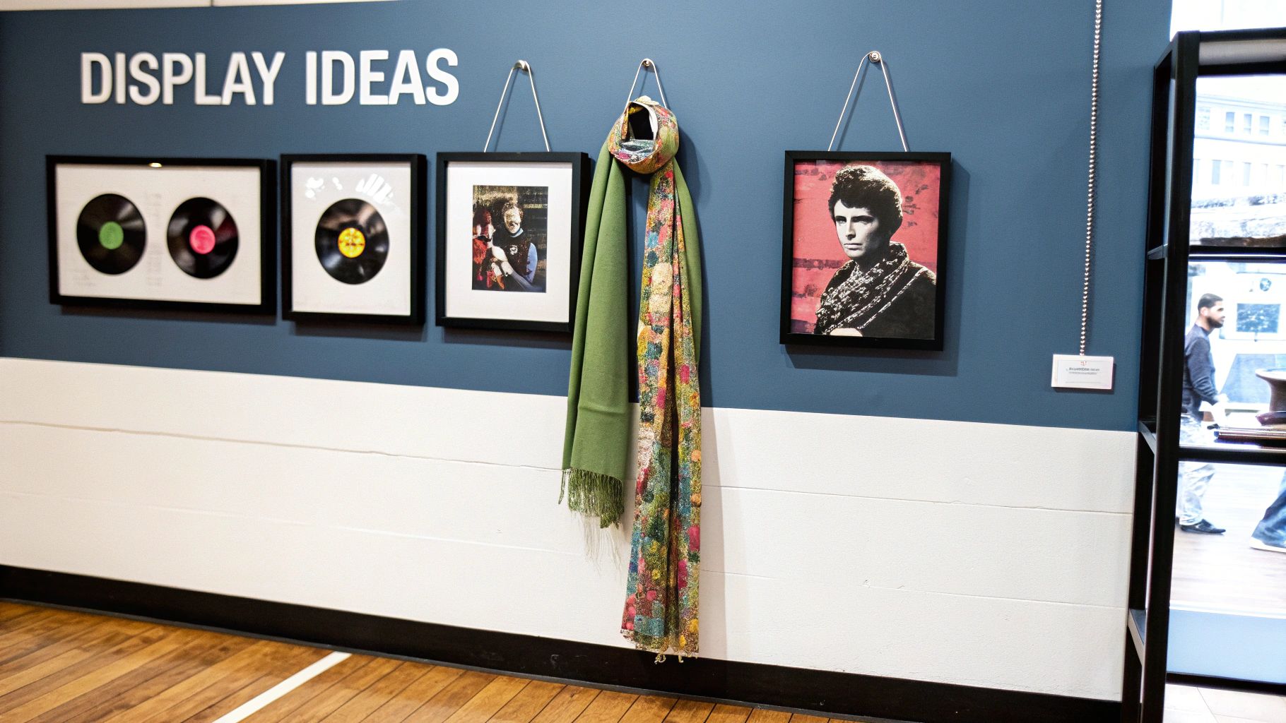
Giving your poster a proper display is what separates a piece of art from a forgotten flyer. A simple frame can completely transform its presence, elevating it from just a poster to a genuine centrepiece. It’s time to make your walls sing.
Frame It Like You Mean It
Choosing a frame is your first mission, and it's a crucial one. Your choice really sets the tone for the entire piece, so think about the vibe of both the poster and the room it's destined for.
- Sleek and Modern: A thin, black or white frame gives a sharp, gallery-like finish. This works brilliantly for graphic 80s prints or minimalist 90s designs, letting the artwork pop without any distractions.
- Rustic and Vintage: A distressed wood or ornate gold frame adds a layer of warmth and history. This is a fantastic choice for psychedelic 60s art or gritty 70s punk flyers, leaning right into that authentic, time-worn feel.
- Bold and Colourful: Feeling brave? A frame that picks out a secondary colour from the poster can make a massive statement and ties the whole look together beautifully.
The goal isn't just to hang a poster; it's to create a focal point. A great frame tells everyone that this isn't just decoration—it's a piece of personal history, carefully chosen and proudly displayed.
Go Big with a Gallery Wall
Why stop at one masterpiece? A gallery wall is the ultimate way to tell your story, letting you mix your favourite retro music poster with all the other bits and pieces that make you, you. This is where your personality truly gets to shine, creating a visual playlist of your life.
Imagine a classic Stone Roses print hanging next to your favourite football team's scarf, a candid family photo, and a quirky piece of art you picked up on holiday. Suddenly, your wall is more than just a wall; it’s a conversation starter and a collage of your greatest hits. If you need some pointers on composition, our guide on how to arrange wall art is packed with tips to get you started.
Don't be afraid to experiment with different sizes, frame styles, and even unconventional items. The best gallery walls feel like they’ve been collected over time, not bought in a single shopping trip. It's organised chaos at its finest.
Think Outside the Box
Frames are classic, but they’re not your only option. For a more relaxed, modern look, consider these alternatives:
- Magnetic Hangers: These simple wooden strips clamp onto the top and bottom of your print, offering a minimalist and stylish way to hang it without causing any damage.
- The Lone Champion: Make a single, oversized A1 print the undisputed star of the room. Placed above a sofa or bed, it creates a massive impact with minimal effort.
- Themed Arrangements: Why not group a few posters by genre or artist in your home office? It’s a great way to get a focused dose of inspiration when you need it most.
Ultimately, displaying your poster is all about having fun and making your space feel completely your own.
Protecting Your Prints for the Long Haul
You’ve finally got your hands on a brilliant retro music poster. It's a piece of history, a slice of pure cool for your wall. The last thing you want is for it to end up looking like a forgotten relic you’d find in a damp attic. You wouldn't leave a treasured vinyl record out in the sun to warp, so let’s give your new print the same rockstar treatment.
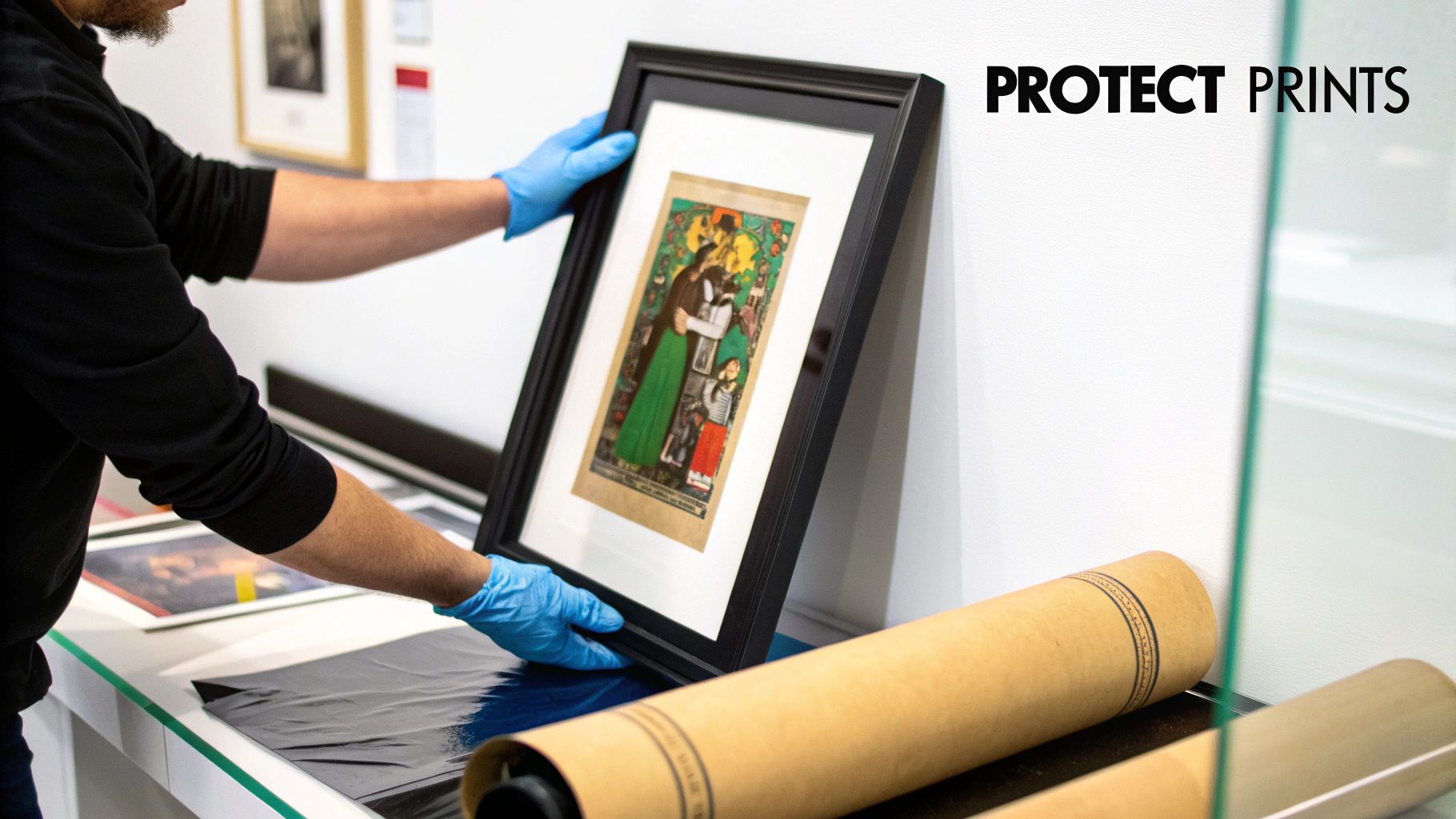
This isn’t about being precious; it’s just common sense. Think of it as a small investment to make sure your favourite band’s artwork stays looking sharp enough to impress visitors for years to come. After all, you want them admiring the design, not asking if it survived a flood.
Dodging the Main Villains
Your poster has two arch-enemies ready to ruin its good looks: sunlight and humidity. They are the sworn nemeses of vibrant colours and crisp paper everywhere.
-
Sunlight (The Silent Fader): Direct sunlight is the absolute worst. Its UV rays will bleach the colours from your print faster than a one-hit-wonder disappears from the charts. Keep your poster well away from windows that get blasted with sun all day.
-
Humidity (The Wrinkle Maker): That damp spot in the corner of the room? Your poster hates it. Moisture in the air can cause the paper to ripple, warp, and generally look a bit sad for itself. Steer clear of hanging prints in bathrooms or kitchens where steam is a regular guest.
A great retro music poster is an investment in your daily happiness. Protecting it properly ensures you get a lifetime of smiles out of it, not just a few fleeting years before it fades away.
The continued interest in physical music formats in the UK shows just how much we value having something tangible to hold onto. Even with streaming, sales of vinyl and CDs remain surprisingly strong, fuelling a collector’s market for memorabilia. This appreciation for the real thing, from the record sleeve to the gig flyer, is exactly why a well-preserved retro music poster feels so special. You can learn more about UK music retail trends and see this for yourself.
Simple Tricks for a Long Life
Luckily, protecting your print doesn’t require a degree in art conservation. A bit of smart framing goes a very long way.
Opting for a frame with UV-protective glass or acrylic is the ultimate defensive move against fading. When handling or cleaning, always use clean, dry hands and a gentle microfibre cloth to dust the frame. Treat it with a little respect, and it’ll keep bringing the good vibes indefinitely.
Celebrating More Than Just Music
Let's be honest, your excellent taste doesn't stop with your record collection. That same nostalgic buzz you get from a classic gig poster can be found in art celebrating your other passions. Why should music have all the fun when your walls could be paying tribute to a last-minute winner or a legendary film quote?
The whole retro design ethos—those bold colours, witty typography, and a massive dose of personality—translates perfectly to other bits of popular culture. It's all about capturing a moment, an emotion, a piece of history that makes you smile. Think of your walls as a gallery of your personal greatest hits, and that includes more than just music.
Expanding Your Wall Art Horizons
Try thinking about combining your passions into a cohesive collection that's uniquely you. It’s about creating a visual story of the things that make you tick.
- Iconic Football Moments: Imagine a retro-style print of a legendary goal or a celebrated manager. It brings that same raw, electrifying energy as a classic punk flyer.
- Cult Film and TV: A minimalist poster featuring a classic movie quote or a beloved TV character can add a touch of wit and understated cool to any room.
- The Beautiful Game & Beyond: Blending these interests creates a space that feels genuinely personal, telling a richer story than a single retro music poster ever could on its own.
Your home should feel like your own personal pub quiz team's greatest hits, a mix of music, sport, and film trivia that tells everyone exactly who you are.
This approach turns decorating into a form of storytelling. And if you want to extend that vibe beyond your own walls, you can celebrate a shared passion for sound with thoughtful presents by exploring unique gifts for music lovers. It’s all part of building a space that reflects every facet of your personality.
Common Questions About Retro Posters
Right, so you're ready to dive into the brilliant world of retro music posters, but you've probably got a few questions rattling around. Perfectly normal. Before you give your wall the makeover it deserves, let's clear up a few of the common queries we get.
Think of this as your backstage pass to all the essential info, without any of the boring bits.
Are These Originals or New Prints?
This is the big one. Almost everything you'll find for sale today are modern, high-quality reproductions of classic designs or brand-new art created in a retro style. A genuine vintage poster from a legendary gig can cost a small fortune and is often as fragile as a guitarist's ego.
Our prints give you that same iconic look and rebellious feel without the eye-watering price tag. You get all the style without constantly worrying that it might crumble if you sneeze too close to it.
What Size Poster Should I Get?
Choosing a size really just comes down to the space you're working with and the statement you want to make.
If you're building a gallery wall, a mix of A4 and A3 prints is perfect for creating that effortlessly cool, collected-over-time vibe. It lets you hang your favourite band right next to a classic footy moment.
But if you want a single poster to be the undisputed champion of the room—the headline act above your sofa or bed—then you need to go big. An A1 or A2 print will have a massive impact.
Pro tip: Cut some newspaper to the sizes you're considering and use a bit of masking tape to stick them to the wall. It’s a foolproof way to see exactly how a print will fit before you commit.
How Do I Match It to My Decor?
Honestly? Don't overthink it. A retro music poster isn’t meant to blend in like a chameleon; it’s meant to stand out and inject some personality into a room. A bold, psychedelic 60s print can add a fantastic pop of much-needed colour to a minimalist space, for example.
The most important rule is to simply choose something you absolutely love. If a print makes you smile every time you see it, it belongs on your wall, regardless of what colour your cushions are.
Can I Put One Up in the Office?
Absolutely! In fact, we strongly encourage it. The office is probably the place you need the most inspiration, especially during that post-lunch slump.
A sleek Kraftwerk print can add a touch of cool sophistication to your workspace. On the other hand, a vibrant Britpop poster might provide just the kick of energy you need to power through the afternoon. It’s a brilliant way to make your desk feel more like your own creative hub and less like a soul-crushing cubicle.
Ready to find the perfect print that screams 'you'? The Striped Circle collection is packed with unique designs inspired by the best of music and football, all ready to bring your walls to life. Check out our full range at https://www.stripedcircle.com and start your collection today.
