
Living Room Posters That Actually Mean Something
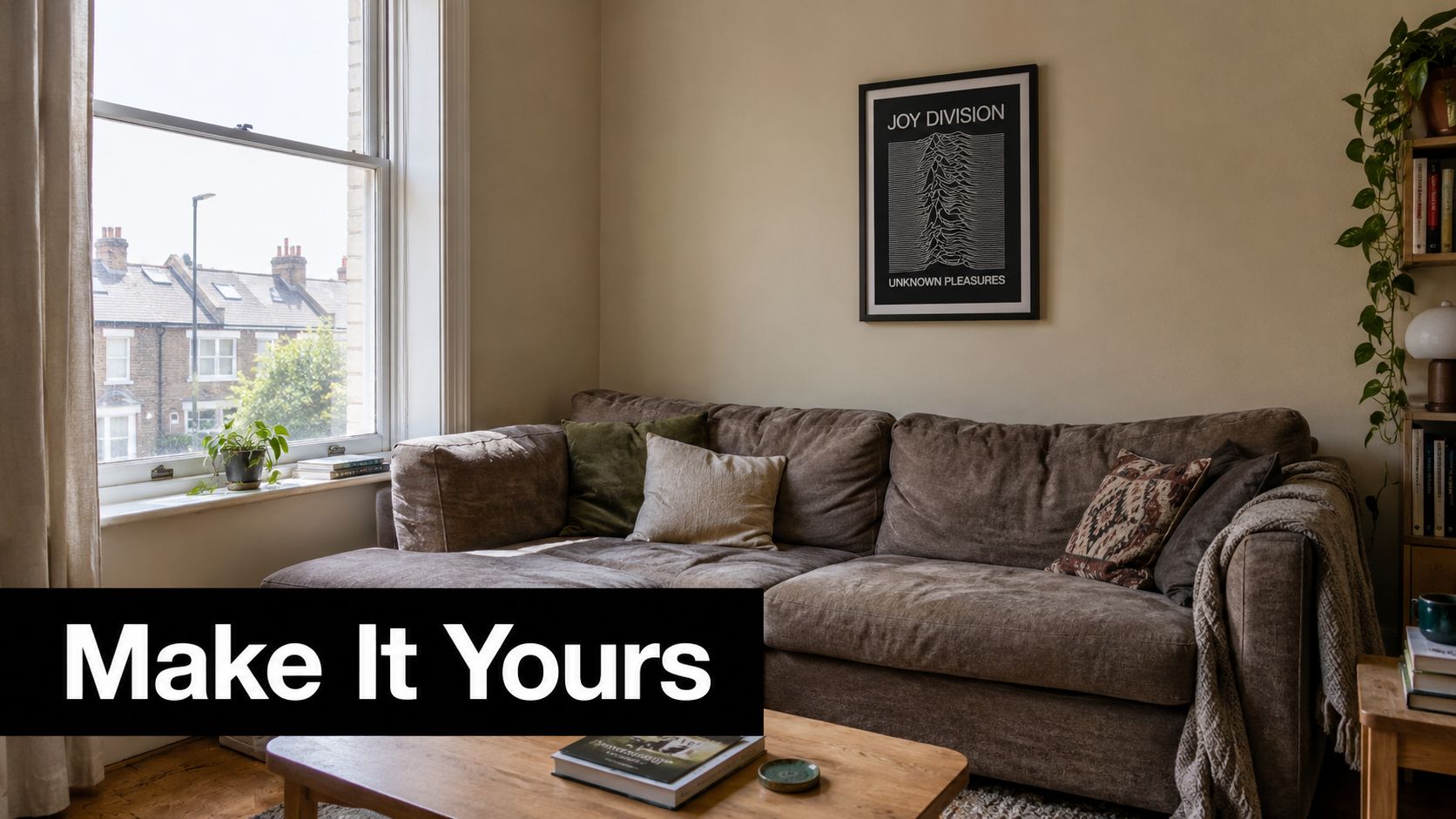
A beige Sheffield front room had spent years waiting for a personality transplant. Then a framed Joy Division print replaced the dated scene above the sofa, and by teatime the owner was grinning at the wall instead of apologising for it.
That's the quiet magic of living room posters. The right one doesn't just fill a blank patch. It tells visitors what you're into, gives the sofa some company, and makes the room feel less like a rental between viewings and more like your actual place.
Table of Contents
- The Living Room That Finally Feels Like Yours
- Why Posters Are a Proper Decor Category Now
- Picking the Right Size, Paper, and Frame
- Music Prints, Football Prints, and Everything Between
- Hanging Heights, Spacing, and Gallery Wall Layouts
- Looking After Your Posters for the Long Haul
- Buying Smart Without Getting Burned
- Your Pre-Order Checklist and Final Pep Talk
The Living Room That Finally Feels Like Yours
The room belonged to a 34-year-old music fan who'd rented for years. Beige walls, a tired corner sofa, the usual landlord-approved print, and a coffee table carrying three mugs despite there only being one person in the house. The Joy Division print changed the balance almost immediately. It wasn't loud, but it had presence. The room finally had a point of view.
That's why people often stare at bare walls for months. They're not short of taste. They're worried about choosing something they'll hate next week, or buying a frame that looks daft above the chimney breast, or making the front room feel like a student bedroom with better coffee. A poster has to earn its place because you'll see it while eating toast, watching football, answering emails, and pretending not to check your phone during a film.
A useful test: if you'd still enjoy the image when nobody else is in the room, it's probably a good choice.
Music prints bring mood and memory. Football prints bring loyalty, rivalry, and the occasional argument about a manager who should have gone years ago. Film, travel, and popular culture prints add a story without demanding that the rest of the room dress up for it. You can also borrow ideas from broader boho wall art ideas if your room leans towards woven textures, relaxed furniture, and collected objects.
The practical side matters just as much. Your wall may have a bay window, an alcove, a radiator in the wrong place, or a chimney breast that seems designed to reject every frame you own. The guide at how to decorate living room walls is useful for thinking through those quirks before you reach for the hammer. Size, paper, frame, spacing, and lighting all count, but the image comes first. Pick a poster you can live with, not one that merely looks convincing in somebody else's Instagram flat.
Why Posters Are a Proper Decor Category Now
Posters have moved well beyond the student-dorm stereotype. The UK wall art market generated USD 4,140.2 million in 2025 and is projected to reach USD 6,741.2 million by 2033, with a projected 6.4% CAGR from 2026 to 2033, according to the UK poster market outlook. That's a broad wall-art figure rather than a poster-only total, but it shows the scale of the category that living room posters sit within.
The same outlook identifies wallpapers, stickers, and wall coverings as the largest revenue-generating type in 2025. In other words, British households are already spending seriously on the surfaces around them. Posters sit comfortably inside that wider appetite for personal, changeable decoration, particularly when a renter can't repaint, drill freely, or replace a tired fireplace.
| Metric | Figure | Note |
|---|---|---|
| UK wall art market revenue in 2025 | USD 4,140.2 million | Broad UK wall-art category |
| Projected UK wall art revenue by 2033 | USD 6,741.2 million | Projection from the cited market outlook |
| Projected CAGR from 2026 to 2033 | 6.4% | Projection, not a guaranteed outcome |
| Largest type in 2025 | Wallpapers, stickers, and wall coverings | Posters belong to the wider decorative wall-products market |
A separate market estimate values the UK posters-and-frames wall-decoration market at USD 1.0 billion in 2024, rising to USD 1.1 billion in 2025 and USD 1.5 billion by 2033, as reported by Verified Market Reports. The figures use different market definitions, so they shouldn't be mashed together as if they're measuring the same basket. They do point in the same direction, though. Wall prints are a meaningful decor purchase, not a last-minute filler for an empty student flat.
More choice, less waiting around
Online poster shops have also changed the buying experience. You can compare paper finishes, frame colours, print sizes, limited editions, and delivery options without standing in a high street framing shop wondering whether your order has entered a mysterious three-week holding pattern. Print-on-demand studios have widened the range too, from lyric prints and football graphics to niche cultural references that would never fill a traditional shop window.
Instagram and Pinterest have helped gallery walls become familiar, although they can make every room look suspiciously fond of beige boucle. The useful lesson isn't to copy a finished image. It's to see posters as a proper design tool, alongside paint, lighting, rugs, and furniture. A good print can add colour, rhythm, or a bit of mischief without asking the landlord for permission.
Picking the Right Size, Paper, and Frame
Start with the wall, not the shopping basket. Measure the usable space above the sideboard, sofa, fireplace, or chimney breast, then mark the furniture width with low-tack tape. A small poster floating above a broad sofa looks apologetic. A huge frame squeezed beside a bay window looks as though it lost an argument with the architecture.
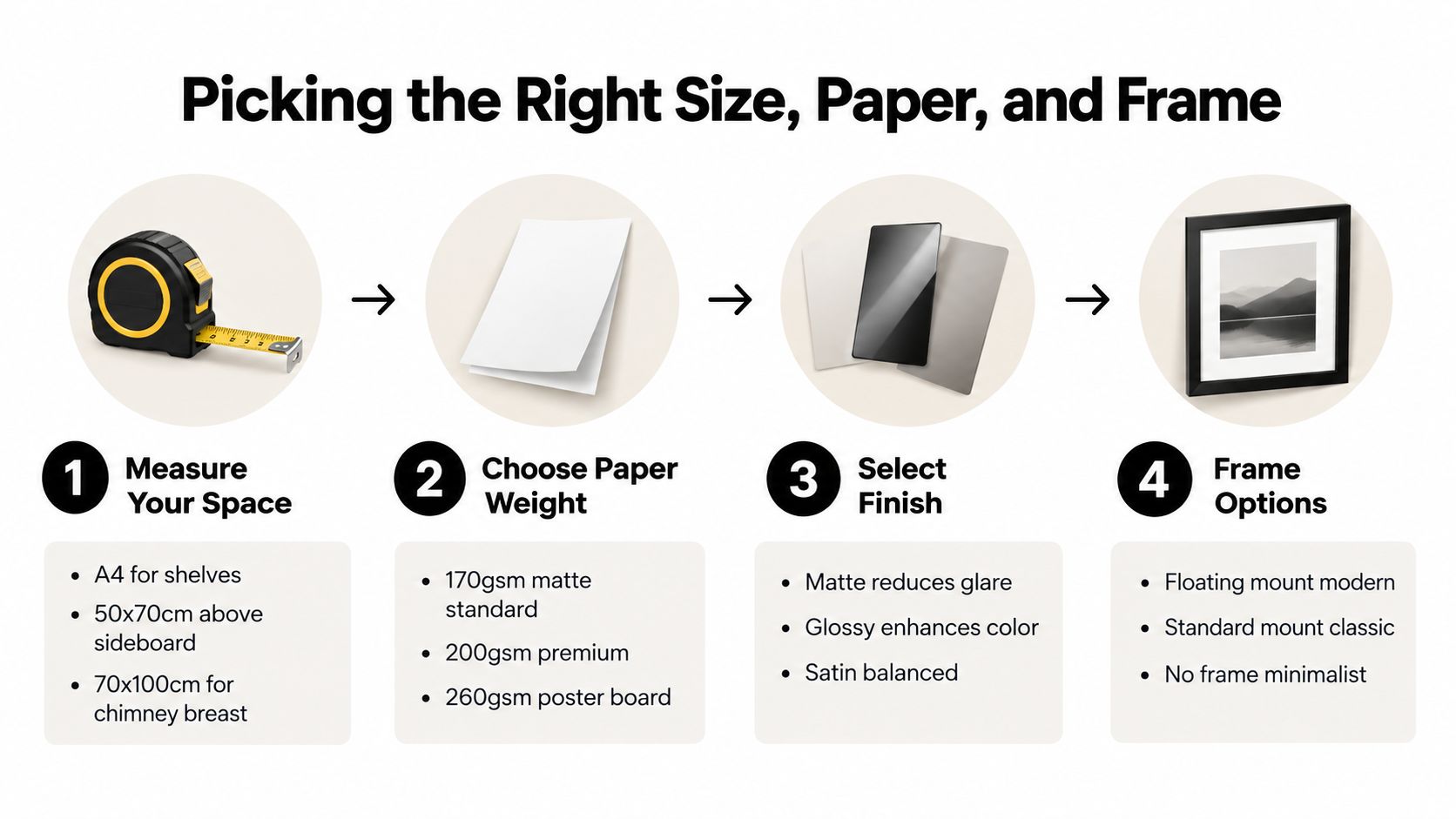
A4 works nicely on shelves, narrow walls, and small alcoves. A 30 x 40cm print suits a side table or a modest section beside a bookcase. 50 x 70cm is a dependable size above a sideboard or armchair, while 70 x 100cm can hold its own on a chimney breast or as a single statement above a generous sofa. For more combinations, use this practical guide to choosing the right poster frame size.
Match the stock to the mood
Paper weight affects how a print feels before you've even looked at the image.
- 170gsm uncoated paper gives a softer, art-print feel and works well in a relaxed room with timber, linen, or painted furniture.
- 200gsm satin stock gives colours more richness while keeping reflections under control.
- 250gsm and above adds a more substantial, premium feel, particularly when the poster is displayed without a mount or handled during framing.
UK poster suppliers recommend 200 to 275gsm matte or fine-art stocks for reducing glare and holding blacks effectively under typical home lighting, as outlined by My-Picture's poster print guidance. A north-facing flat may benefit from the richer contrast of satin. A bright south-facing terrace often behaves better with matte, especially if the sofa faces the wall and you don't want your own reflection joining the artwork.
Let the frame speak quietly
A shallow 15mm frame gives a clean, modern outline. It's a good match for graphic music prints, white walls, and furniture with simple lines. A 25 to 30mm frame has more visual weight and suits traditional rooms, dark timber, picture rails, or a wall where the poster needs to stand up against patterned wallpaper.
Standard glass is fine where there's little direct sunlight and no obvious risk of knocks. Acrylic is lighter and safer around children, pets, or a narrow passage. UV-protective glazing makes sense on a sun-trap wall, particularly near a bay window. Anti-reflective glazing or soft, indirect light can also improve legibility, while UV-protective framing and LED picture lights without UV output help protect colour saturation, according to the supplier guidance linked above.
Music Prints, Football Prints, and Everything Between
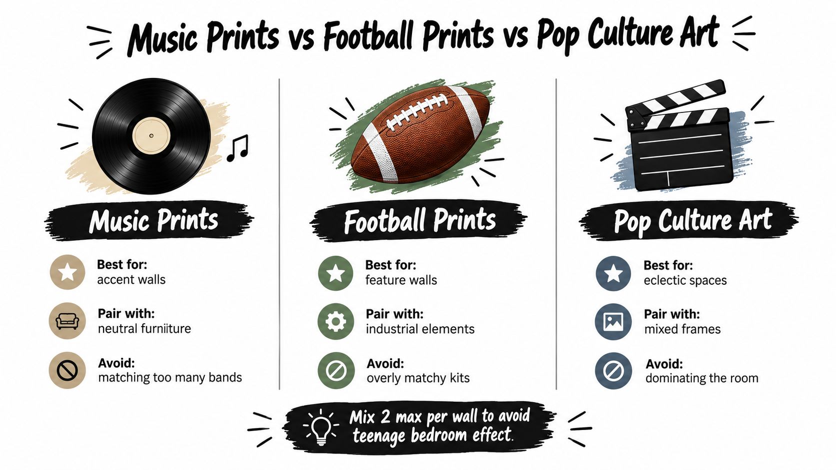
Music prints and football prints do different jobs. A music print carries mood, era, and memory. It might bring back a first gig, a record discovered in a parent's collection, or the band that got you through a grim commute. A football print carries tribal loyalty. It says who you support, which colours matter, and possibly that you'll be unavailable during the derby.
Film, travel, and broader pop-culture prints bring narrative. They can make a room feel curious rather than themed. The safest approach is to choose one lead genre and let another appear as an accent, rather than asking every wall to host a separate fan club.
Give the wall a pecking order
A useful editorial rule is 70% dominant subject, 30% supporting accent. If music leads, let most of the wall share a similar emotional or visual language, then use one football print to add a jolt of colour. If a football print is the hero, keep the supporting music or film piece quieter in scale and palette.
No more than two hero pieces above the sofa usually keeps the wall feeling grown-up. Typography matters too. A beautifully restrained lyric print can look odd beside a blocky, distressed football graphic if the lettering styles clash, even when both images are brilliant.
The music print collection and ideas can help when you're deciding whether a lyric, album-inspired, or band-led piece suits the room's tone.
Colour is the tiebreaker when subjects compete. A Beatles print beside a Liverpool FC print can work if the reds, creams, blacks, or muted paper tones sit together naturally. It can look chaotic if one uses neon brights, another uses a vintage sepia treatment, and the sofa is already wearing a loud geometric throw. Don't buy a poster because it's fashionable. Buy it because you'll still enjoy seeing it after the current internet obsession has moved on to lamps shaped like mushrooms.
Hanging Heights, Spacing, and Gallery Wall Layouts
The most expensive poster in Britain can look wrong if it hangs too high. Start around 145cm from the floor to the centre of the artwork, then adjust for your ceiling height, furniture, and radiator. In a room with lower ceilings, dropping the centre slightly can make the arrangement feel connected to the sofa rather than stranded near the cornice.
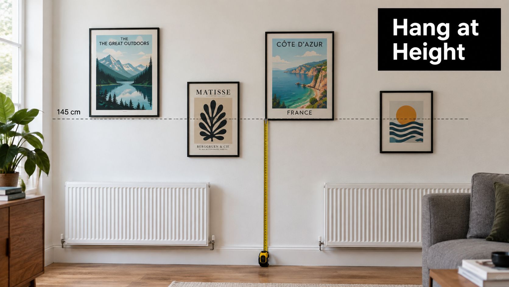
Keep the bottom edge of a large poster comfortably above the furniture. If a radiator sits below it, leave enough breathing room for heat and for cleaning. Above a long sofa, align the lower edges of several frames rather than letting each one wander at a different altitude like a flock of uncertain pigeons.
Choose a layout with a job
A tight cluster works well for a busy music collection. Leave 5 to 8cm between frames so the group reads as one arrangement. A looser collection needs 10 to 15cm, giving each print more room to breathe and making mixed subjects feel intentional.
- Salon style: Mix sizes and orientations around one strong anchor. It suits collected music prints and rooms that already contain books, plants, and objects.
- Grid: Keep frame sizes and gaps consistent. It gives football or typography prints a crisp, organised feel.
- Linear row: Place matching or related pieces in a straight line above a sideboard. This is calmer and works well in narrow rooms.
- Diagonal: Let the frames rise or fall along a stair-like path. It can balance a sloping ceiling or awkward architectural feature, but it needs careful measuring.
Chimney breasts reward one confident statement or a narrow vertical stack. Alcoves beside bookcases are better for smaller framed prints that follow the shelf rhythm. Bay windows need attention to glare, so a side wall can be wiser than the obvious central position.
Before drilling, cut paper templates to each frame size and tape them to the wall. Better still, lay the actual frames on the floor, photograph the arrangement, and shift pieces around until the balance feels right. This short video offers another visual reference for planning and hanging framed art:
Command strips can suit lighter unframed prints in rental homes, but follow the product's weight guidance and clean the wall first. For heavier glazed frames, use appropriate fixings rather than trusting optimism and a sticky pad.
Looking After Your Posters for the Long Haul
A print above a radiator often tells the same sad story. It looks fine when it goes up, then repeated heat and dry air leave the paper less flat, the frame seals less reliable, and the whole arrangement looking tired sooner than expected. A south-facing bay window can be even harsher. By late summer, direct sun may have taken the edge off colours that once looked properly punchy.
Conservation framing guidance from First4Frames' UK poster preservation advice recommends acid-free matboards and foam-core backing, while warning against dry-mounting original posters. It also recommends display conditions around 18°C to 21°C with 40% to 55% relative humidity to reduce paper-fibre stress, acid burn, and cockling. Those figures aren't a target for turning your lounge into a museum. They're a useful reminder that stable indoor conditions are kinder than dramatic swings.
Protect the vulnerable spots
Direct sunlight deserves the most attention. Choose UV-blocking glazing or acrylic for a poster near a bay window, skylight, or bright south-facing wall. Standard glass is generally adequate for a hallway print that never receives a strong beam, provided the print isn't already fragile or especially valuable.
A heavier 200gsm print will usually cope more confidently with ordinary seasonal humidity changes than a flimsy 120gsm flyer reprint. The paper still needs space and support, though. Acid-free backing helps, and avoiding dry-mounting preserves the option of reframing later.
Cleaning should be boring, which is exactly what you want.
- Dust lightly: Use a soft microfibre cloth on the frame, not on an exposed print.
- Keep sprays away: Kitchen cleaner, glass spray, and artwork make a poor dinner party.
- Check the seal: Inspect the back of the frame annually for gaps, loose tape, or signs of moisture.
- Rotate thoughtfully: Moving prints between safer walls seasonally can refresh the room and reduce prolonged exposure to one patch of light.
If a frame sits near a radiator, shift it to a cooler wall rather than trying to solve the problem with heroic amounts of polish. The room will survive the rearrangement, and your poster may enjoy the reprieve.
Buying Smart Without Getting Burned
Cheap posters aren't automatically a false economy. Sometimes you're paying less because the design is simple, the paper is unframed, or the seller keeps production efficient. The real question is what you're receiving for the price: paper weight, ink quality, colour calibration, packaging, and a sensible answer if the print arrives looking like it fought the delivery van.
A basic digital print can be perfectly suitable for a temporary rental refresh. Giclée printing may offer finer detail and a broader tonal range, while pigment inks are often chosen for longevity. That doesn't make every giclée listing good, and it doesn't make every standard digital print poor. Ask what the seller uses instead of being dazzled by a photograph of a frame in a marble hallway.
Paper thickness deserves the same scrutiny. 200gsm can feel substantial in a frame, while 350gsm has more board-like presence and may suit a premium, unmounted display. The number alone doesn't tell you everything. Surface, coating, ink, trimming, and how the print is packed all affect the result.
What a reliable order looks like
For a practical benchmark, Striped Circle's wall-art operation uses sturdy tubes, cardboard stiffeners, plastic sleeves, tracked shipping, and no-quibble returns as part of its customer-facing approach. That's one option among many, but it shows the level of detail buyers should expect from a seller who understands that a print can be damaged before it reaches the frame.
Watch for these warning signs:
- Missing dimensions: If the listing doesn't state the paper size, don't guess from the mock-up.
- Only artificial room images: Ask for a close-up or a photograph showing the actual print surface.
- No paper information: A seller should be able to describe the stock and finish in plain English.
- Vague colour language: “Premium quality” tells you less than a clear explanation of the print process.
- Unclear returns: Creases, corner damage, and wrong sizes need a straightforward remedy.
Keep this five-point checklist beside your phone before buying:
- Confirm the exact dimensions.
- Check paper weight and finish.
- Ask how the print is produced.
- Read the packaging and delivery details.
- Find the returns policy before paying.
A low price can be sensible. A low price with no dimensions, no material details, and no protection in transit is usually just a future argument with customer service.
Your Pre-Order Checklist and Final Pep Talk
Before you click buy, run through these five points:
- Measure the wall: Check the usable space, furniture width, radiator position, and nearby doors or windows.
- Choose framed or frameless: Decide whether the room needs a clean modern edge, traditional weight, or a lighter rental-friendly solution.
- Match the palette: Pick colours that work with the sofa, rug, curtains, and existing objects rather than treating the poster as a lone island.
- Check paper and ink: Confirm the stock, finish, print method, and whether the artwork suits the light on that wall.
- Verify delivery and returns: Make sure the seller protects the print properly and explains what happens if it arrives creased or damaged.
A good living room poster can do more than decorate. It can bring back a song, honour a club, start a conversation, or make you laugh while you're waiting for the kettle to boil. That emotional job matters as much as size and framing, because a wall with meaning will always beat a wall that's merely beige.
Striped Circle is a sensible starting point if you're after music-led, football-inspired, lyric, and popular-culture wall art for a home or office. Choose the image first, measure twice, and give the frame enough room to breathe. Your front room doesn't need to look like a showroom. It needs to look like yours, preferably with better tunes and fewer apologetic nature scenes.
Striped Circle offers music prints, football-inspired artwork, lyric designs, posters, and greeting cards made for homes, offices, and gifting. Visit Striped Circle to find a print with a bit of personality, then give that blank wall the job it's been avoiding.
