

Your Gaff Needs a Vintage Music Poster. End of.
A proper vintage music poster is so much more than just old paper with a band's name on it. It’s a slice of history, a shot of pure, undiluted cool you can hang on your wall. These pieces are cultural artefacts, capturing the raw energy of a specific moment – before autotune, before stylists, before everything got a bit... beige.
Think of them as the visual equivalent of a killer guitar riff. A proper screamer.
What Makes Vintage Music Posters So Cool?
Let’s be honest, anyone can print a picture of their favourite band and stick it up with Blu Tack. But a proper vintage music poster? That’s a different league entirely. It’s the difference between watching a shaky phone recording of a gig from the back of the O2 and actually being in the front row, feeling the bass drum kick you in the chest. These posters have a soul, a texture, and a story that a modern reprint just can't replicate.
They are time capsules, designed to grab your attention in a pre-internet world. Artists had to be bold, inventive, and sometimes downright weird to make their work stand out on a crowded street. This wasn't about perfectly photoshopped headshots; it was about capturing a vibe.
The Art of an Era
To help you get your eye in, it's worth knowing that every decade had its own visual language—a signature style that makes a poster instantly recognisable. A '60s psychedelic masterpiece for a gig in San Francisco looks nothing like a gritty, DIY punk flyer from '80s London, and that's the magic.
Here's a quick look at how things evolved.
Quick Guide to Vintage Poster Eras
| Era | Defining Art Style | Common Themes | Why It's Cool |
|---|---|---|---|
| The '60s | Psychedelic, Art Nouveau-inspired, swirling fonts, clashing colours | Peace, love, counter-culture, festivals | They’re mind-bending visual trips that perfectly capture the era's experimental spirit. Basically, your wall on acid. |
| The '70s | Glam rock glitter, earthy tones, bold photography, emerging punk rawness | Rock gods, rebellion, folk introspection | From stadium-sized egos to back-alley attitude, the '70s had it all. Flares and all. |
| The '80s | DIY cut-and-paste, stark black & white, neon pop, new wave graphics | Anarchy, political dissent, pop culture, high energy | The posters feel as urgent and unfiltered as the punk and new wave music they advertised. Like a good two-footed tackle. |
This is, of course, just a starting point. The real fun is in discovering the nuances and seeing how artists broke the rules.
A vintage poster is a statement. It tells people you appreciate the history, the artistry, and the authentic spirit of the music, not just the Spotify playlist. It says you’ve got taste, a bit of swagger, and you know your stuff. Basically, you're not a tourist.
The Feel of Authenticity
Beyond the artwork, the physical object itself is a huge part of the appeal. Old-school printing techniques like offset lithography gave these posters a distinct look and feel. The ink sits on the paper differently, the colours have a unique depth, and the paper itself has aged, gaining a character that simply can't be faked.
This tactile quality is what really seals the deal. You can almost feel the history in the paper stock. It’s this combination of iconic art, historical context, and physical authenticity that transforms a simple advertisement into a piece of art.
Owning one isn't just decorating; it's curating your own personal museum of cool, one legendary gig at a time. It’s a guaranteed conversation starter and a daily reminder of the music that shaped generations, and that's sure to make you smile.
A Visual History of Rock and Roll Art
Alright, let's take a trip back in time, tracing the visual history of the music poster. It's quite a ride, starting when concert promotions looked more like wanted posters for a boxing match and blasting right through to the mind-bending colours of the sixties. This isn't some stuffy museum tour; think of it as a visual mixtape of the art that gave the music its face.
In the early days of rock 'n' roll, posters were purely practical. Imagine bold, blocky letters shouting the names of Chuck Berry or Little Richard, printed on cheap card stock. They were designed to be slapped on telephone poles and brick walls with one simple job: get people through the door. They had a certain raw charm and an undeniable energy, but they weren't exactly works of art yet.
Then, the 1960s happened. And everything changed.
The Psychedelic Explosion
The mid-sixties, especially in creative hubs like San Francisco and London, saw the music poster get a serious makeover. As bands started pushing the boundaries of sound, artists began experimenting with visuals to match. The Haight-Ashbury scene in San Francisco became a creative furnace, birthing a whole new graphic language meant to capture the psychedelic experience on paper.
This wasn't just advertising anymore; it was an invitation to an altered state. Artists like Wes Wilson and Victor Moscoso took massive inspiration from the flowing, organic lines of the Art Nouveau movement from the turn of the century. They twisted and warped lettering until it was almost unreadable, forcing you to stop and really look. For an even deeper dive into this incredible style, check out our guide on those swirly Art Nouveau posters.
These posters weren't just selling tickets; they were selling a feeling. They were the visual equivalent of a distorted guitar solo—vibrant, chaotic, and utterly mesmerising. The goal wasn't clarity; it was to make you feel like you were already at the gig.
This visual revolution quickly jumped across the pond. In the UK, the 1960s was a landmark decade for music posters, fired up by the cultural and artistic explosion of the time. The era saw poster art revived with a heavy dose of Art Nouveau influence, marked by elaborate, hand-drawn typography and organic, flowing shapes.
New Influences and Bolder Statements
But it wasn't all about swirly fonts. The pop art boom, led by giants like Andy Warhol, also crashed into the music scene. Suddenly, posters were drenched in bold, clashing colours and screen-printed imagery, turning musicians into iconic, repeatable symbols. Think of it as the visual version of a catchy pop hook.
At the same time, a fascination with Eastern culture began to filter into both the music and the art. You started seeing elements like:
- Mandalas: Intricate, symmetrical designs representing the universe.
- Sacred Geometry: Patterns and shapes found in nature and spiritual art.
- Vibrant Symbolism: Imagery borrowed from Indian and other Eastern cultures.
This eclectic mix of influences created a rich visual tapestry. A poster for a British band might blend the slickness of pop art with the spiritual depth of a mandala, all rendered in the fluid style of Art Nouveau. It was a cultural mash-up that perfectly mirrored the experimental sounds coming from the amplifiers on stage.
These posters became the visual soundtrack for a generation. They weren't just disposable ads; they were collectible pieces of art from the moment they were printed. They captured the rebellion, the creativity, and the sheer joy of a world-changing decade, proving that sometimes, the best art is the stuff you find stuck to a wall.
How to Spot an Authentic Vintage Gem
So, you’ve been rummaging through a car boot sale or your grandad’s attic and stumbled upon what looks like a rare Rolling Stones poster from '72. Before you start planning your early retirement, let’s pump the brakes. Telling a genuine vintage gem from a clever modern reprint can be trickier than guessing the lyrics to Smells Like Teen Spirit on the first listen.
This is your detective's guide to becoming a bona fide poster sleuth. Forget the magnifying glass and deerstalker hat (unless that’s your look, of course). We’re talking about practical, real-world clues that separate the priceless originals from the pretty-but-worthless fakes. It’s all in the details, and knowing them can mean the difference between owning a piece of history and, well, a piece of paper.
Get a Feel for the Real Deal
The first and most important lesson is to trust your senses. A genuine vintage music poster has lived a life, and it shows. The paper itself is often your biggest clue. Modern posters are typically printed on glossy, clay-coated paper that feels smooth and uniform. An authentic older poster? Not so much.
You should be on the lookout for:
- Paper Stock: Vintage posters were often printed on thinner, uncoated paper stock. It might feel slightly rougher or more fibrous to the touch.
- Natural Ageing: Look for a subtle, even yellowing or patina, especially around the edges. This is different from the fake, tea-stained look of a cheap reproduction. Real ageing is graceful, not blotchy.
- Imperfections: Tiny pinholes in the corners, faint fold lines, or minor edge wear can actually be good signs. It suggests the poster did its job—it was hung up and loved.
The Secrets in the Print
How a poster was printed is a massive giveaway. Before high-resolution digital printers became the norm, most posters were created using a technique called offset lithography. This method leaves behind a very specific tell-tale sign that modern printers can't easily replicate.
If you look incredibly closely (a small magnifying glass or your phone's camera zoom is perfect for this), you'll see the image is made up of tiny dots arranged in a rosette pattern. This is the hallmark of old-school printing. A modern digital print, by contrast, will either have a much finer, almost invisible dot pattern or a spray of ink with no clear structure.
Think of it like this: an old poster's print quality is like vinyl—it has a certain warmth and a physical texture to its creation. A modern digital reprint is more like an MP3—it's clean, sharp, and perfect, but sometimes lacks that tangible character.
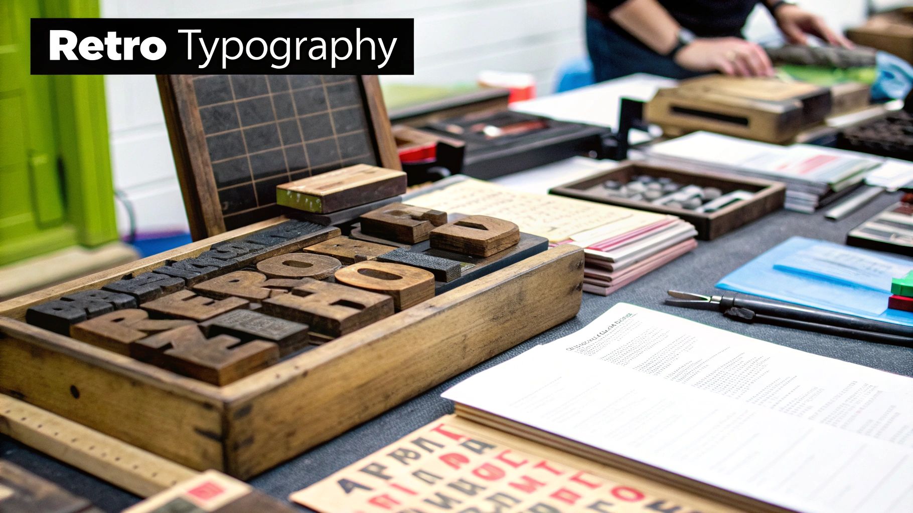
This mock-up of a vintage concert poster highlights the kind of classic design elements that make these pieces so iconic.
The stylised instruments and ornamental borders are hallmarks of an era where art was as important as advertising.
Authentic Vintage vs Modern Reprint
To make it even clearer, let's break down the key differences you'll want to look for side-by-side.
| Feature | Genuine Vintage Poster | Modern Reprint |
|---|---|---|
| Paper Quality | Thinner, often uncoated and slightly fibrous. Feels its age. | Thicker, typically glossy or with a modern satin finish. Feels uniform and new. |
| Printing Dot Pattern | A distinct "rosette" pattern of dots visible under magnification. | A very fine dot pattern, a random ink spray, or no visible dots at all. |
| Colour & Fading | Colours may be slightly faded but look authentic to the era. | Colours are often overly bright, saturated, and sometimes digitally sharpened. |
| Signs of Age | Natural patina, gentle yellowing, pinholes, or soft creases. | May be artificially aged with fake stains or distressed edges. Looks forced. |
| Dimensions | Often has non-standard, historical dimensions. | Usually printed in standard modern sizes (A3, A2, 24x36 inches). |
Knowing these tell-tale signs is your best defence against buying a reproduction advertised as the real deal.
First Prints vs Later Editions
Now, let's add another layer to your detective work. Not all authentic old posters are created equal. You have first prints, which were printed before the concert, and later printings, which might have been produced for merchandise or subsequent tours. First prints are almost always more valuable.
So, how do you tell them apart? It’s all about the fine print.
- Printer’s Marks: Look for a credit line for the printer, promoter (like the legendary Bill Graham), or artist. These are often tucked away at the very bottom.
- Union Bugs: Some older posters, particularly from the US, have a small "union bug" logo, indicating they were printed by a unionised shop.
- Date and Venue Information: Check that the date, venue, and supporting acts all line up historically. A quick search online can confirm if the billing is accurate for that specific gig.
It’s also worth understanding the difference between an original and other collectible versions. For more on this, our breakdown of prints versus limited editions is a great place to start. Armed with this knowledge, you can approach that dusty old find with confidence, ready to spot a true piece of rock and roll history. Happy hunting
From Gig Souvenir to Smart Investment
Remember that crumpled gig poster you stuffed in your pocket after a sweaty night out? The one you thought would look cool on your wall for a bit? Who knew that flimsy piece of paper you almost binned could one day be worth more than the tickets, the dodgy merch, and the overpriced pints combined?
It sounds a bit mad, doesn't it? But what was once a disposable piece of advertising has morphed into a serious collector's item. The market for a classic music poster vintage piece has absolutely exploded, turning a niche hobby into a legitimate field for collectors and investors. That punk flyer you nabbed from a sticky venue floor is now considered proper rock and roll memorabilia, and it might just be a prized asset.
What Drives the Price Tag?
So, what transforms a simple poster from a wall-filler into something an auction house would get genuinely excited about? It’s a cocktail of factors, a bit like what makes a supergroup work. You need just the right combination of legendary status, scarcity, and artistic flair.
Several key elements come into play when determining a poster's value:
- The Artist's Legacy: It goes without saying that posters for iconic, game-changing artists like David Bowie, The Clash, or Led Zeppelin will always command higher prices. The bigger the legend, the more valuable the memorabilia.
- Rarity is Everything: How many were printed in the first place? And, more importantly, how many actually survived? Original posters were often torn down, lost, or damaged, making the few that remain incredibly scarce and sought-after.
- The Artist Behind the Poster: Just like with the bands, the poster artists themselves can be rock stars. A piece by a famous designer like Rick Griffin or Wes Wilson isn't just a gig advert; it's a signed masterpiece in its own right.
- Condition, Condition, Condition: While a few pinholes might add a bit of character and tell a story, a poster that has been well-preserved will always fetch a higher price. Mint or near-mint condition is the holy grail for serious collectors.
It’s this perfect storm of factors that can send prices skyrocketing. A poster that was once handed out for free can suddenly become a savvy investment, all thanks to a growing appreciation for the history and artistry it represents.
From Pocket Change to Small Fortune
The shift in value over the years has been staggering. It’s a classic tale of supply and demand, with a bit of rock and roll swagger thrown in for good measure. As generations of music fans have grown older, they’ve sought to reclaim a piece of their youth, driving up the desire for authentic memorabilia from legendary gigs they might have attended (or wished they had).
The economics and collecting trends for vintage concert posters in the UK really show how much things have changed. Back in the 1980s and early 1990s, many classic rock posters were still relatively cheap and quite hard to find. For example, a 1967 Otis Redding concert poster once bought for £75 could later be valued at over £1,000—a massive increase in collectible value. Similarly, gig posters for acts like Ike & Tina Turner, once sold for around £100, have appreciated hugely as awareness and demand grew. You can find out more about how concert poster values have evolved and the trends behind these changes.
It's a fantastic realisation that your passion for music has a tangible value. That poster you bought because you loved the band isn’t just a memory; it’s an appreciating asset that looks a hell of a lot cooler than a share certificate.
This isn’t about flipping posters for a quick profit, of course. It’s about recognising that the cultural artefacts we love have a value that goes far beyond the purely sentimental. It’s proof that investing in things that make you smile can sometimes be the smartest move of all. So next time you see a cool print, remember it’s not just decoration—it’s a piece of history.
Styling Vintage Posters Like a Pro
So, you’ve done the hard part. You’ve hunted down and landed an amazing vintage music poster—a real classic. But now for the moment of truth: getting it on the wall without making your living room look like a teenager’s bedroom. Don’t just slap it up with Blu Tack and call it a day. That piece of history deserves the superstar treatment.
Displaying your poster is an art in itself. Think of yourself as the band's promoter; it's your job to make sure your star looks its absolute best. The right frame, the perfect spot, and a bit of creative flair can turn a cool print into the undisputed headliner of your home décor. It’s all about making a statement that says, "I have impeccable taste in both music and interior design."
Frame It Like You Mean It
First things first: the frame isn’t just for protection; it’s part of the performance. A cheap, flimsy frame can kill the vibe faster than a power cut mid-solo. The goal is to complement the artwork, not compete with it.
A simple, thin black or natural wood frame is usually a safe bet, letting the poster’s design and colours do all the talking. Think of it as the classic white tee and jeans of the framing world—effortlessly cool and always in style.
That said, don't be afraid to get a bit more creative. A bold, ornate frame could ironically work wonders for a gritty punk flyer, while a sleek metallic one might give a psychedelic ‘60s print a modern edge. Just remember to use UV-protective glass or acrylic to stop your prized possession from fading faster than a one-hit wonder.
Creating the Ultimate Gallery Wall
One poster is cool, but a collection? That’s your personal hall of fame. A gallery wall is your chance to tell a story, mixing and matching different sizes, eras, and styles to create something that’s uniquely you. The trick is to find a common thread, whether it’s a colour palette, a specific decade, or just a general feeling of rebellion.
Here are a few ideas to get you started:
- The Eclectic Mix: Combine a huge, colourful psychedelic print with smaller, starker punk flyers. The contrast creates a visual energy that shows off the breadth of your taste.
- The Thematic Hang: Group posters by genre (all Northern Soul, perhaps?) or by a favourite artist. This creates a focused, curated look that’s pure class.
- The Grid System: For a more organised, modern feel, arrange posters of a similar size in a neat grid. It’s a sharp look that turns your collection into a single, powerful piece of art.
Think of your gallery wall as your own festival line-up. You're the promoter, deciding who gets to be the headliner and which acts will support them. The goal is a show-stopping arrangement that keeps people looking.
For more detailed tips, you can explore our full guide on how to arrange wall art like a seasoned pro.
Light It Up
Finally, don’t forget the lighting. You wouldn’t go to a gig and stand in the dark, would you? The right lighting can make the colours on your poster pop and bring the artwork to life.
A well-placed picture light can make a single statement piece feel like it’s on display in a gallery. For a full gallery wall, adjustable track spotlights are brilliant for highlighting individual prints and creating a dramatic effect.
With a little thought, you can transform your collection from simple wall-filler to a genuinely stylish focal point. It’s your music, your history, and your space—so show it off with the swagger it deserves.
Your Vintage Poster Questions Answered
Right, you’re officially intrigued. You've learned the lingo, you can spot a psychedelic swirl from a punk rock scrawl, and you’re ready to turn a blank wall into a personal museum of cool. But before you dive headfirst into the world of collecting a classic music poster vintage style, you probably have a few burning questions.
Don't worry, we've got you covered. Think of this as the encore to our guide—the bit where we answer all the nagging queries and send you off feeling like a seasoned pro. From where to find these gems to how to keep them looking pristine, here are the answers you need.
Where Do I Even Start Looking for Vintage Posters?
This is the big one, isn't it? Finding authentic vintage posters isn't as simple as popping down to the local HMV, but that’s all part of the fun. The hunt is half the adventure, like digging through crates of vinyl to find that one rare pressing. You've got a few solid options to explore.
Online is obviously a massive marketplace. Specialised dealers, online auction sites, and even dedicated forums are treasure troves for collectors. Just be sure to buy from reputable sellers with solid reviews—the internet can be a bit of a Wild West, and you want to ensure you're getting the real deal.
Offline, the thrill of the chase really comes alive:
- Record Fairs and Flea Markets: These are your best bet for a happy accident. You might have to sift through a lot of old junk, but unearthing a hidden gem for a few quid is a feeling that's hard to beat.
- Antique Shops: Many antique dealers have a section for ephemera (a fancy word for paper stuff that wasn't meant to last). You can often find posters tucked away here.
- Specialist Poster Galleries: For the more serious collector, dedicated galleries offer curated collections of authenticated, high-quality pieces. You’ll pay more, but you’re paying for provenance and peace of mind.
How Much Should I Expect to Pay?
Ah, the million-dollar question (or, hopefully, the twenty-quid question). The price of a vintage music poster can range from less than the cost of a pint to more than a season ticket at Old Trafford. It all boils down to the factors we've discussed: the band's fame, the poster's rarity, its condition, and the artist who designed it.
A lesser-known band from the '80s might only set you back £20-£50, while a mint-condition, first-run poster for a legendary Beatles or Hendrix gig could easily run into the thousands. Don't be disheartened by the high end of the market. There are fantastic, affordable pieces out there that still pack a massive punch of style and history.
The best advice? Buy what you love. If a poster makes you smile every time you see it, then it’s worth every penny, whether it cost you a tenner or a grand. Your walls, your rules.
How Do I Take Care of My New Poster?
So you’ve brought your new pride and joy home. Excellent. Now, let’s make sure it outlives us all. Paper is fragile, and a vintage poster has already survived decades—it's your job to get it through a few more.
The two biggest enemies of your poster are sunlight and moisture. Direct sunlight will fade the vibrant inks faster than you can say "one-hit wonder," and humidity can cause the paper to ripple or even develop mould.
Your preservation checklist should include:
- UV-Protective Framing: We mentioned it before, but it's worth repeating. This is non-negotiable. It’s like a bouncer for your artwork, keeping out the harmful rays.
- Acid-Free Materials: Make sure your framer uses an acid-free mount and backing board. Standard materials contain acids that can leach into the paper over time, causing it to become brittle and yellow.
- Smart Placement: Keep your framed poster away from direct sunlight, radiators, and damp walls (like in a bathroom). A cool, dry spot is ideal.
Following these simple rules will ensure your piece of rock history stays looking sharp for years to come.
Are Reprints Ever a Good Idea?
Let’s be clear: there’s nothing wrong with a good-quality reprint. If you adore the artwork of a poster that costs more than your car, a modern print is a brilliant and affordable way to get that style on your wall. They're perfect for decorating and showing off your taste without the stress of owning a fragile, expensive antique.
The only time reprints become a problem is when they’re passed off as originals. As long as you know what you’re buying, go for it! A great design is a great design, regardless of when it was printed.
Why Are Original Posters So Rare Anyway?
It's easy to forget that these posters were never meant to be collected. They were temporary, disposable advertisements. Most posters from the 1930s to the 1960s were printed in fairly small numbers, often just 800 to 1,200 copies per design for campaigns like those run by London Transport. The ones that survive today are the lucky few—unissued prints from printer archives, copies saved by the designers, or those swiped from a venue wall by a forward-thinking fan. You can learn more about the scarcity that drives the vintage market and how it adds to their value.
This scarcity is precisely what makes owning an original music poster vintage piece so special. It’s a survivor, a colourful whisper from a bygone era, and now it’s yours to enjoy.
Ready to find a print that tells your story? At Striped Circle, we live and breathe this stuff. Our walls are covered in it, and we believe everyone deserves a home that makes them smile. Dive into our collection of music-inspired prints and find the perfect piece to start your own gallery of cool.
Explore the full collection at https://www.stripedcircle.com.
