

Cool Posters: Your Guide to a Legendary Wall
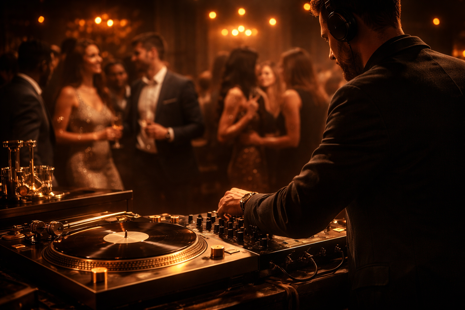
You know the wall. The one behind the sofa, above the desk, or glaring at you from the kitchen while you wait for the kettle to boil. It's beige. It's blank. It has all the charisma of a nil-nil draw in sideways rain.
That's usually the moment posters enter the chat.
Not the curled-up relics from your teenage bedroom. Proper posters. The kind that make a room feel like yours. A print that nods to your favourite album, your club, a legendary lyric, a terrace chant, or a joke only fellow obsessives will get. Good wall art doesn't just “match the décor”. It gives the room a pulse. It tells people who lives there before you've even offered them a brew.
And if your taste swings between football folklore, music history, and things that make guests laugh out loud, even better. Your walls should feel less like a waiting room and more like your own personal hall of fame.
Table of Contents
- Beyond the Blu-Tack Why Your Walls Deserve Better
- Finding Your Anthem in Art Form
- Nailing the Details Before Nailing the Wall
- A Hangmans Guide to Perfect Placement
- Styling and Gifting Your Favourite Posters
- The Striped Circle Difference
Beyond the Blu-Tack Why Your Walls Deserve Better
A blank wall can make a whole room feel unfinished. You can have a lovely sofa, a decent lamp, and a rug that cost more than you'd like to admit, but if the wall behind it is doing absolutely nothing, the room still feels like it's waiting for someone to move in.
Posters fix that quickly, but the good ones do more than fill space. They show taste, humour, memory, allegiance. A framed lyric print can remind you of the first band you loved properly. A football print can mark a club, a city, or a moment you still bring up like it happened yesterday. A clever poster in the kitchen can make even burnt toast feel slightly more artistic.
That appetite for personal art isn't just in your head. The Global Posters and Frames Market was valued at 6.6 USD Billion in 2024 and is projected to reach 9.8 USD Billion by 2035, with growth driven by interest in home décor and personalised art, according to Wise Guy Reports on the posters and frames market.
Blank walls don't look minimalist by default. Sometimes they just look like you've run out of ideas.
The beauty of posters is that they sit in a sweet spot. They're expressive without needing a gallery budget. They can be playful, nostalgic, stylish, loud, subtle, or all five if you've got broad tastes and no intention of apologising for them.
A lot of people get stuck because they think wall art has to be serious to look good. It doesn't. A wall can be cool and funny. It can celebrate Bowie, Britpop, a cult striker, or a ridiculous food pun. If it makes you smile every time you walk past, it's doing the job.
And if the thought of hanging anything fills you with low-level dread, there are neat ways to get started without turning the wall into Swiss cheese. A practical guide on how to hang posters without frames is a good place to begin if you want personality on the wall without committing to a toolbox-based drama.
Finding Your Anthem in Art Form
Some people know exactly what they want on the wall. Others just know they want it to feel more “me” and less “rental property brochure”. That's normal. Choosing posters gets easier when you stop thinking in terms of generic art and start thinking in terms of identity.

Music posters that say more than a playlist ever could
Music posters tend to fall into a few clear camps.
One camp is lyric-led prints. These are brilliant if you like art that feels a bit knowing. Maybe it's a line that only proper fans will clock straight away. Maybe it's typography doing the heavy lifting, with colour and layout creating the mood. These work especially well in offices, hallways, and reading corners where you want something clever rather than chaotic.
Then there's the retro gig-poster feel. Big shapes, bold colours, a bit of swagger. These suit people who want their wall to feel like a venue wall, a record sleeve, or a lost piece of tour history. If your taste leans towards indie, classic rock, soul, or anything with a bit of heritage, this style lands beautifully.
A third category is graphic pop culture crossover. These prints borrow from music but also from food, humour, cinema, or design history. They're ideal if you want your home to feel relaxed and human, not like you're curating a museum where nobody's allowed to laugh.
If you want to browse ideas in that lane, this collection of music posters for different rooms and moods is useful because it shows how varied the category really is.
A useful way to choose is to ask one simple question. Do you want the poster to start a conversation, trigger a memory, or subtly signal your taste? All three are valid. They just create different rooms.
- Conversation starter: witty print, bold visual, something guests spot immediately
- Memory trigger: lyric, venue-inspired design, album-era colours
- Quiet signal: minimal typography, restrained palette, fan-reference only insiders get
That same thinking appears in other areas of culture too. If you've ever seen VinylGold's approach to personal event music, you'll recognise the idea straight away. Personal taste matters more when it reflects a real story, not a generic template.
Football posters with proper personality
Football posters can go gloriously wrong when they're too busy, too glossy, or trying far too hard to look “epic”. The stronger ones usually pick a lane and commit.
Some celebrate club identity through colours, kit-inspired geometry, or terrace energy. Others focus on iconic moments. A winner in stoppage time. A cup final image. A stadium silhouette that means everything to people who know. Then there are clean, modern football prints, where the design is stripped back and the emotion comes from recognition rather than clutter.
The best football posters don't need to explain themselves. Fans get them immediately.
This is also where style matters. A loud, graphic club print can work in a games room or office. A more restrained football poster can sit surprisingly well in a living room without making it look like the club shop exploded.
For a quick burst of inspiration on visual direction, this clip is worth a look.
The sweet spot is choosing posters that feel like your version of fandom. Not just “I support them”, but “this is the football and music culture that shaped me”.
Nailing the Details Before Nailing the Wall
A brilliant poster can still end up looking wrong. Usually the culprit is not the artwork. It is the sizing, print setup, or framing choice around it. Same energy as putting a vintage shirt in a plastic sports bag and acting like it is museum-worthy.
That matters even more with music and football prints because they carry emotion. A gig poster from the band that soundtracked your uni years, or a print of that last-minute winner you still talk about like it happened yesterday, deserves better than a guess-and-hope setup.
Start with size, then build around the room
Poster sizing in the UK usually follows the ISO A-series, which keeps the proportions consistent from one size to the next. Adobe outlines the basics in its guide to UK poster sizes, DPI, and colour settings.
The useful bit is simple. A4 is 210 × 297 mm and the sizes scale up through A3, A2, A1, and A0 at 841 × 1189 mm. Because the ratio stays the same, a design can move up in size without being awkwardly cropped or stretched. That is handy if you love the same music print in a snug office and a larger version in a hallway.
Here is the quick match-up.
| Size | Dimensions (mm) | Best For |
|---|---|---|
| A4 | 210 × 297 | Shelves, desks, narrow wall gaps, small kitchens |
| A3 | 297 × 420 | Home offices, gallery walls, bedside areas |
| A2 | 420 × 594 | Hallways, reading corners, statement singles |
| A1 | 594 × 841 | Above sofas, dining spaces, feature walls |
| A0 | 841 × 1189 | Big impact walls, studios, bold focal points |
A few rules make choosing easier:
- Detailed artwork in a tight spot: A4 or A3 often looks cleaner and more deliberate.
- Above furniture: A2 or A1 usually has enough presence without bullying the room.
- One hero print: A1 or A0 works well if the design has space to breathe.
If you are stuck between two sizes, go by viewing distance. A lyric-heavy music poster read up close can be smaller. A bold football print with a stadium silhouette often earns a larger format because it needs that across-the-room punch.
Print quality decides whether it feels special
Low print quality ruins the mood fast. You may not say, “Ah yes, the resolution is off,” but you will notice the fuzziness, the weak blacks, or club colours that look slightly cursed.
For print, artwork should be 300 DPI at final size and in CMYK rather than RGB, as noted earlier in Adobe's guidance. That helps the finished poster look sharp on the wall instead of merely decent on a screen.
Simple test: if the file was made for Instagram, it may disappoint at poster size.
Paper stock changes the result as well. Matte paper feels calmer and cuts glare, which suits many music and football posters because you want to see the design, not your ceiling light reflected back at you. Gloss can make colours pop, but it is fussier about placement, especially opposite windows or lamps.
And before anything goes up, check the wall itself. Dust, flaky paint, and greasy marks can mess with adhesive strips, hooks, or nails. If the surface needs sorting first, these steps to prep walls for painting are handy, because the same prep makes poster hanging less annoying too.

Frame or no frame
Framing changes the mood straight away.
Unframed posters feel relaxed and youthful. That works nicely in music corners, creative desks, and spaces where a bit of raw energy suits the room. A framed poster feels more settled, more intentional, and closer to “personal gallery” than “student rental survival plan”.
For passion-led prints, the frame should support the story rather than steal the limelight. A slim black frame is usually a safe bet for gig posters, album-inspired designs, and football prints because it gives structure without shouting over the artwork. White frames suit lighter rooms. Natural wood adds warmth, especially with retro matchday prints or vintage-feeling band artwork.
If frame sizing always turns into a small household crisis, this guide to what size poster frame you need makes the whole thing much easier.
The goal is simple. Your poster should look like it belongs there, like your walls are saying, “Yes, this person has taste, memories, and probably strong opinions about midfielders and B-sides.”
A Hangmans Guide to Perfect Placement
Saturday afternoon. You've got a fresh poster, a decent tune on, and the dangerous little thought that says, “I can probably just wing this.” That thought is how great prints end up slightly crooked, weirdly high, or floating miles above the sofa like they've been sent off and told to watch from the stands.

The calm way to hang a poster
Placement works a lot like picking the right spot for a striker or a lead guitar solo. Context matters. A poster above a console table, bed, or sofa should usually be centred to the furniture beneath it, because that pairing reads as one visual unit. Centre it to the whole wall instead and things can look oddly adrift, even if the measurements are technically right.
Start with a trial run. Tape up a sheet of paper, or mark the outer edges with masking tape, so you can check the size in the room before making any holes. It is much easier to move pretend art around than real hardware.
Then keep the process simple:
- Choose the viewing height first. Aim for a position that feels natural from where you use the room, whether that's sitting on the sofa, standing in the kitchen, or walking down the hall.
- Mark both sides carefully. A tape measure beats hopeful guessing every time.
- Use a level app or spirit level for framed pieces. Your eyes are brilliant at spotting a crooked frame after it's up, and strangely optimistic before that.
- Match the hanging method to the poster and wall. Adhesive strips can suit lighter pieces and rental homes. Nails or proper picture hooks are usually better for heavier framed prints.
- Check the view from across the room. Doorways, seating positions, and room entrances reveal wonky placement fast.
A tiny bit of toothpaste on the hook point can mark the wall neatly before you hammer. Ridiculous trick. Handy trick.
Where people usually go wrong
The classic mistake is hanging a poster too high. Unless your living room has the proportions of a cathedral, art looks better lower than people first expect. Eye level is the friend here. Ceiling worship is not.
Another slip-up is ignoring what sits around the poster. Leave enough breathing room above furniture and beside nearby frames so the piece feels intentional, not squeezed in like an away fan in the home end.
If you want a more measured walkthrough for framed pieces, Giorgi Bros. picture hanging tutorial is useful because it explains the process without assuming you own a toolbox that could rebuild Wembley.
A playful print can also help you choose the right spot because it sets the mood so quickly. Another One Bites The Crust from Striped Circle's Music x Food Collection uses a retro 1970s look and works well in places where people pause long enough to enjoy the joke, such as a kitchen wall, dining nook, or hallway corner. It's available in a range of sizes and formats, so you can match it to the space instead of forcing the space to serve the print.
A good poster deserves a proper position. Get that right, and your wall stops looking decorated and starts feeling personal, like your own little hall of fame for the bands, matches, and moments you care about.
Slightly low and centred beats high and hopeful every single time.
Styling and Gifting Your Favourite Posters
One great poster can lift a room. A few well-styled posters can make it feel like someone interesting lives there. Someone with opinions. Someone who knows both their favourite album opener and their club's most underrated full-back.

How to build a wall that looks curated, not chaotic
The trick with a gallery wall isn't cramming every available frame into one nervous rectangle. It's giving the eye a pattern to follow. That pattern can come from matching frame colours, a shared theme, repeated sizes, or a limited colour palette.
A music-and-football mix can work brilliantly when there's one thing holding it together. Maybe all the prints use black frames. Maybe they all lean retro. Maybe the posters switch between bold statement pieces and quieter designs so the wall has rhythm instead of visual shouting.
Try one of these easy setups:
- The anchor method: one larger print in the centre, smaller ones around it
- The pair-and-balance method: two related prints side by side, then one offset piece nearby
- The shelf lean: frame several pieces and lean them on a picture ledge for a less formal feel
Leaning larger prints is especially good if you like changing things around. It gives a room that slightly creative, studio-ish mood without needing to commit to a full geometric masterpiece on plaster.
A good poster wall should feel collected over time, even if you sorted it in one Sunday afternoon with a tape measure and a podcast on.
Why posters make brilliant gifts
Posters work as gifts because they're personal without being awkwardly intense. You're saying, “I know what you love, and I found something that reflects it.” That lands better than panic-buy socks, and it takes up less room than an impulse drum kit.
They're also memorable in a very literal way. Printed posters offer long-term value because they stay visible, and print supports memory retention and emotional resonance, according to Ideal Print's discussion of printed posters and memory. That makes sense in everyday life. A print sits there month after month, becoming part of someone's routine and story.
Good gifting moments include:
- Birthdays for proper fans: a club print, lyric print, or inside-joke design
- Housewarmings: something that makes a blank new wall feel lived-in fast
- Workspaces: posters that inject character into home offices and studios
- Just because: arguably the best category of gift, because nobody has to pretend they needed another mug
The strongest gift posters usually combine fandom with tone. Not just “you like football”, but “you love this club, this era, this style, this joke”. That's where posters stop being decoration and start feeling like identity.
The Striped Circle Difference
Most advice around poster design has focused on academic conferences and information delivery, while guidance for posters meant for home decoration is much thinner. That gap matters because people don't choose wall art the way they read research visuals. They choose it through taste, memory, humour, and cultural connection. That broader gap is noted in Astrobites' discussion of the Better Poster movement and where poster guidance falls short.
That's why posters for music and football fans need their own logic. A home print doesn't need to summarise findings. It needs to feel right in the room and right for the person living with it. It should spark recognition, not just occupy wall space.
Striped Circle approaches that idea from a very specific angle. The brand is family-run and focused on wall art inspired by music, football, and witty cultural references. That means the work sits in a space between mass-market generic décor and formal gallery art. It's designed for people who want walls with a bit of life in them.
If you've made it this far, you probably don't want art that could belong to absolutely anyone. You want posters that reflect what you play, watch, sing, remember, laugh at, and care about. That's the whole game really. Better walls. More personality. More moments where you glance up and think, yes, that's exactly my sort of thing.
If your walls are ready for a bit more character, have a browse through Striped Circle. You'll find posters and prints inspired by music, football, and the kind of pop culture references that make a room feel more like home.
