
Retro Football Posters: Styles, History and UK Buying Tips
Buying retro football posters by club allegiance alone is terrible decorating advice. Loving your team doesn't mean every sepia-tinted badge deserves a place above the sofa, especially if the designer's put the wrong sponsor on the shirt and apparently built the stadium from memory.
Choose with two kinds of authenticity in mind: does the artwork get the football right, and can the seller explain its image rights? Then ask whether it'll suit your wall. That's how you get a print that makes you smile, rather than a permanent VAR review in the hallway.
Table of Contents
- Retro Football Poster Styles at a Glance
- Where Retro Football Posters Came From
- How to Spot an Accurate Retro Poster
- Copyright, Licences and What Is Safe to Hang
- Sizing, Framing and Hanging Your Print
- Buying and Collecting Retro Football Posters in the UK
- How Striped Circle's Prints Fit the Retro Look
Retro Football Poster Styles at a Glance
Retro football posters fall into recognisable styles. Knowing which you're looking at helps you decide whether you're buying graphic art, a matchday memory or a documentary record before you spend a penny.
Retro football poster styles at a glance
| Style | What it looks like | Best for | Reference point |
|---|---|---|---|
| Transport and travel art | Simplified type, bold geometric shapes, travel imagery | Fans who love graphic design | Interwar London Transport posters |
| Pencil-and-ink stadium walk | Hand-drawn look, walk into the ground, club colours in the frame | Matchday memories | Modern nostalgic illustration |
| Minimalist crest | Single badge, flat colour, plenty of white space | Small rooms and offices | Modern design, no fixed era |
| Match-date or tournament poster | Date, score or tournament branding | Anniversary gifts and big-game fans | 1966 World Cup promotional posters |
| Photographic print | Players or grounds shot in a documentary style | Collectors wanting realism | Archive match and stadium photography |
| Kit-era colourway | Shirt palette and sponsor from one specific season | Fans who follow a particular era | Period photographs and archive references |
Choose the feeling, not just the badge
Transport-era graphics are my choice for a shared living room. Simplified lettering and strong geometry give non-football people something to enjoy too. You get the sporting connection without making the room look like the club shop's overflow warehouse.
A pencil-and-ink walk to the ground serves a different purpose. Streets, scarves and the approach to a stand capture the bit of matchday that a scoreline can't. Buy this for someone who remembers the walk with their dad as clearly as anything that happened on the pitch.
The minimalist crest suits a compact office or an otherwise busy wall. White space gives the badge room to breathe, although minimalism won't rescue an inaccurate crest. For more visual comparisons, our guide to football poster designs helps you weigh up different approaches.
When realism matters most
Choose a photographic print when the exact player, ground or moment matters more than illustration. Inspect the preview closely: a beautifully composed photograph can still make a disappointing enlargement if the underlying image isn't sharp enough.
Treat most contemporary retro prints as designs borrowing an older visual language, not as historic artefacts. Borrowing a style isn't the same as reproducing an original, which makes the artwork's description important.
Match the style to the room and the person, then check the football and provenance before buying.
Where Retro Football Posters Came From
Football posters were never just souvenirs. Artists used the game to sell journeys, communicate political ideas and advertise things that had very little to do with the Saturday team sheet.
The National Football Museum's account of football art includes an 1892 political poster showing Joseph Havelock Wilson as a goalkeeper, alongside a 1935 Shell advertising poster by Paul Nash using football-pitch geometry and a ball. Football, politics and advertising were already sharing the same poster space. The design lesson worth stealing: a pitch outline or a recognisable pose communicates football without filling every corner with badges.
When getting to the match became the message
During the interwar period, London Transport companies under managing director Frank Pick commissioned professional artists to encourage public-transport journeys to sporting events, according to the University of Lancashire football-art thesis.pdf), which recorded 67 football-related images, including 48 posters, in the London Transport Museum's online collection at the time of the study.
These were public-facing commissions aimed at ordinary passengers. The artwork had to catch attention, communicate quickly and make a journey feel worthwhile. That standard still holds for a print you'll mostly glance at while walking past with a cup of tea.
Look for simplified typography, strong geometric composition and transport imagery. An approach road, station reference or stadium silhouette establishes a sense of place without explaining every brick. That economy is exactly why the style hangs so well on a chimney-breast wall: it reads from across the room, and it rewards a closer look when you're standing in front of it.
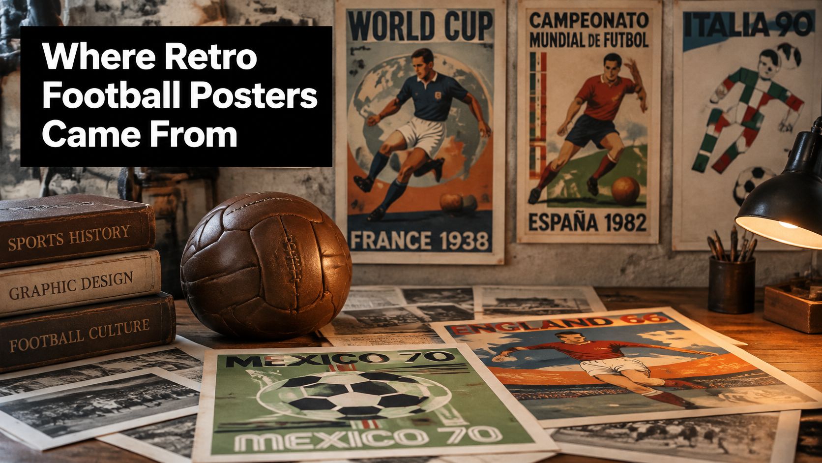
The tournament poster becomes national wallpaper
According to De Montfort University's World Cup history, the Football Association's small promotional budget for England's 1966 World Cup made posters integral to publicity, with more than 100,000 promotional items issued, including British Transport and Police posters, and England's 4–2 victory over West Germany after extra time at Wembley gave that campaign an enduring sporting reference point.
Notice that the distribution figure covers promotional items rather than posters alone. It still shows how much physical publicity mattered when tournament information had to reach people away from a screen.
A convincing retro design borrows the discipline of historic graphics: clear composition, purposeful lettering and a reason for every mark on the page.
That's the takeaway for today's wall. Give more design value to a poster with strong composition and deliberate lettering than one that merely looks old. A strong idea carries the print; artificial creases and a brown tint only dress it.
How to Spot an Accurate Retro Poster
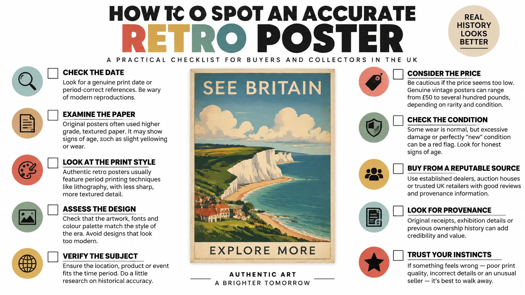
A convincing new illustration beats a dubious old scan. Fresh artwork can carry a specific season, a coherent kit and clear provenance, while a genuine archive photograph may have been downloaded and printed with no explanation attached. Faded paper proves nothing on its own.
Start with the period the seller claims to depict. If the description only says "classic football", decide whether you're happy buying a general mood rather than a particular season.
Run the football checks
- Identify the season. Confirm the competition, year and whether the shirt is home or away. A design celebrating a particular campaign needs a coherent reference point: a greatest-hits outfit assembled from different eras makes the shirt impossible to place.
- Check the sponsor and badge. Compare the sponsor's lettering, placement and crest version against a period reference. A familiar logo in the wrong shape or position is enough to make the shirt feel wrong.
- Cross-check the colours. Use period photographs or archive material, allowing for ageing and photographic lighting. Don't assume today's online club palette describes every earlier kit.
- Test the stadium. Look at roofs, stand configurations, signage and the approach to the ground. A modern stand looming over an allegedly historic scene is a more serious problem than an illustrator simplifying a window.
- Separate official from unofficial. Ask whether the design is licensed by the club. Unofficial prints are common and can be perfectly lawful. The problem starts when a seller presents one as official merchandise.
One failed check needn't sink a print, as long as the seller can explain the choice. A stylised stadium is a design decision. A wrong-era sponsor is a research failure.
Make colour do a proper job
Colour isn't decorative confetti. An ethnographic study of Burton Albion supporters documented coordinated yellow-and-black clothing and interpreted it as a performance of shared club identity. Your print should respect that connection rather than swapping in a fashionable palette that makes the team unrecognisable.
For a strong composition, put club colours in the largest visual areas: background blocks, shirts, scarves or lettering. Keep contrasting accents for the focal subject, and avoid scattering equally bright details everywhere. Otherwise the eye has no clear route through the design.
Shrink the product preview to thumbnail size, then view it from across the room. The subject should remain clear without your having to inspect the sponsor with a magnifying glass. If the badge reads at arm's length while the ground behind it softens into shape, the composition is doing its job.
The final gut test is simple: could someone who lived through that season recognise it within a few seconds?
Copyright, Licences and What Is Safe to Hang
Retro isn't a legal category. The UK government's copyright guidance explains that copyright protects original creative work and generally prevents others using it without permission. Making an image look older doesn't remove that protection.
Emotional authenticity and legal authenticity are separate questions. A picture can capture your first match perfectly while leaving its seller unable to explain who authorised the reproduction.
Image types and what to check before buying
| Image type | Usually safe? | Question to ask the seller |
|---|---|---|
| Original artwork by a named designer | Generally safe when the seller holds the necessary rights | Who designed it, and can they show proof of ownership or a licence? |
| Licensed club or player imagery | Safe when the licence covers the use | Is there a licence statement, and who is the rights holder? |
| Public-domain historic image | Often free to reuse once copyright has expired, subject to its status | Who created the image, and when? |
| Scan of a modern photograph | Risky without permission | Did the photographer or agency give permission? |
This is general information, not legal advice. The table concerns the seller's authority to reproduce and sell the image, not a blanket promise that every buyer can reuse it.
Buying a print isn't buying reproduction rights
Hanging a purchased print at home is different from scanning it for merchandise or using it in advertising. Don't assume ownership of the paper gives you ownership of the artwork. Public display in a commercial setting can also raise different questions from ordinary domestic use.
Original illustration deserves scrutiny too. Drawing a new version of someone else's photograph doesn't automatically settle every rights issue, and changing the image doesn't make those issues disappear. Copyright isn't the only consideration: club names and crests can involve trade marks, while player imagery can raise likeness, endorsement and related rights concerns.
Buyer's safeguard: Keep the product description, receipt and any written explanation of the image rights together.
A useful seller's answer names the designer, photographer, agency or archive and explains the basis for reproduction. An old picture found online is a location, not permission.
For collectibility, you need an intelligible chain of provenance, not merely reassuring adjectives. If the seller can't say where the image came from, treat the print as a decorative guess rather than a collectible, and choose a clearer source if rights remain uncertain.
Sizing, Framing and Hanging Your Print
An A1 print centred over a two-seater sofa looks deliberate. The same print squeezed onto a hallway wall looks like it's queuing for a bus. Measure the usable wall, including the furniture beneath it, before settling on a size. Cut a paper template or mark the outline with low-tack tape, then stand at the doorway and judge it from where you sit.
Poster sizes and where they work
| Size | Where it works best |
|---|---|
| A5 | Desk, bathroom, back of a door |
| A4 | Shelf, hallway, small frame |
| A3 | Bedroom or office wall above a desk |
| A2 | Living room, single-wall statement |
| A1 | Above a sofa or bed |
| A0 | Large feature wall or office lobby |
Treat these as starting points and adjust for your furniture. A small print earns its place inside a shelf arrangement, and a large one needs breathing room on every side or it reads as wedged in. Whatever size you land on, a historically sharp design bought from a seller who can explain the artwork's origins is the one that keeps earning its wall space after the novelty wears off.
Choose the frame and fixing together
Pick a clip frame for a pared-back finish and quick print swaps, and pair it with a rated adhesive hanging strip or a wall hook sized to the load. The frame holds the glass and backing; the fixing holds the wall, so buy both together. Renting? Read the tenancy agreement and check the wall surface before ordering hardware.
Choose wood for warmth in a traditional room, especially beside timber furniture or record shelves. A slim metal frame suits modern flats and offices, where a chunky moulding would boss the artwork around. Our guide to how to frame posters walks through mounts, glazing and moulding widths.
UV-filter glazing cuts light exposure, so treat it as backup rather than a licence to hang a favourite print in full sun. Keep paper clear of radiators and steamy bathrooms. A small framed print can handle a well-ventilated bathroom; a treasured one belongs somewhere drier.
For an unusually broad feature wall or a custom project, KLM Design & Prints LTD's oversized poster printing is a useful resource when weighing up large-format production. Check image resolution, finished dimensions and framing practicality before committing to an enlargement.
Hang it like part of the room
Centre the artwork at roughly 150 cm from the floor, then nudge it for furniture and seated eye level. Keep grouped frames about 5 cm apart so they read as one display rather than strangers at a bus stop.
- Check the load. Use damage-free hooks only within the pack's stated weight rating and surface guidance, and weigh the frame and glazing together before trusting the number.
- Connect the colours. Share a colour between the football artwork and a band poster, or unify the wall with matching neutral mounts. A red-shirted winger next to a red album cover looks curated; a random clash looks like a car boot sale.
- Clean carefully. Dust glazing with a dry microfibre cloth. If cleaner is needed, spray the cloth, never the glass, to keep liquid from seeping towards the print.
One football piece among music and art prints usually feels more personal than a wall of competing crests. You're decorating a home, so match the print to the room rather than to a team sheet.
Future Market Insights' wall-art coverage discusses curated interiors and sustainability considerations. The recommendation that outlasts any trend forecast is simpler: clearly described materials, a frame you'll keep and artwork you won't tire of when the manager changes.
Buying and Collecting Retro Football Posters in the UK
Specialist print shops are the easiest starting point for clearly described contemporary prints. Auction houses and second-hand marketplaces suit older pieces, but you'll need to do more detective work before pressing buy.
Ask for exact dimensions, including borders, and establish whether you're buying an original-period poster, a later reproduction or a new illustration. Those are different purchases, even when the listing uses vintage enthusiastically enough to qualify for a yellow card.
Inspect the paper, not just the preview
- Request revealing photographs. Ask for the front, reverse, corners and any damage in natural window light, without filters.
- Read the condition. Look for fold lines, foxing, edge wear, fading and signs of previous mounting. Decide whether damage is acceptable before paying, not after framing.
- Verify scarcity. Ask about the print run, edition markings and supporting paperwork. A handwritten number needs context.
- Check the logistics. Read return conditions and delivery estimates before ordering a frame, especially for a gift.
Demand for football's visual past is measurable: eBay UK reported searches for retro football shirts up 136% in 2021, with the average second-hand shirt selling price up 25% on the previous year, as reported by iNews. Those are shirt figures, not poster valuations.
Separately, Ewbank's 2025 publication reported UK sporting memorabilia sales by value up 391% during its covered period. Neither figure promises that your framed print will fund retirement.
Collect for the wall first. Treat resale value as an uncertain bonus.
Our guide to the best websites for posters provides another starting point for comparing buying routes. Keep the seller's details, purchase date, image source and condition photographs with the receipt, so you can establish exactly what you bought later.
How Striped Circle's Prints Fit the Retro Look
A retro look does not require a 1970s original. Striped Circle's football prints are contemporary illustrations built around recognisable grounds and matchday rituals, covering clubs in the Premier League, Championship, League One, League Two and Scottish Premiership. The Beautiful Game prints alone cover all 92 English clubs, so the odds are decent that your lot is in there.
That answers both halves of the authenticity question neatly. Nobody is dressing a new illustration up as an archive find, and an original modern design carries none of the copyright doubt that comes with scanned vintage posters. Hang it, enjoy it, job done.
Family memories, with room for the record collection
The "Holte Enders in the Sky" - Aston Villa Football Club print-wholesale is an illustrated Aston Villa print, the sort of piece that celebrates a club's identity for the supporter who grew up with it.
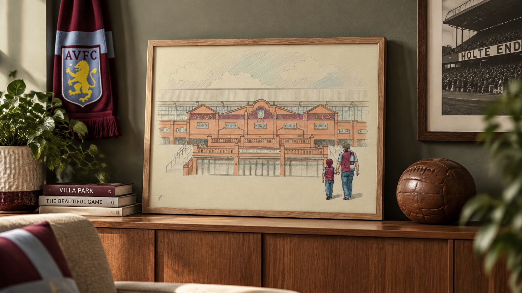
For a personal family piece, The Beautiful Game, Your Way starts from £19.99, a personalised print built around your own football story. The wider range covers music prints, alternative TV and film prints, art and places prints, framed prints and gifts, so football can share the wall with the rest of your life.
- Build around the person. Choose the ground or family connection they care about, not the most famous badge in the catalogue.
- Mix interests naturally. Put football beside the music and places that mean something to you.
- Buy deliberately. Free delivery applies on orders over £40. Add a second print because you want it on the wall, and treat the saving as a bonus.
Pick something that makes you smile on an ordinary Tuesday. That beats matching the current league table.
Striped Circle offers football, music and art prints for homes and offices with a bit of personality. Visit Striped Circle to find a ground, colourway or family football print that earns its place on your wall, preferably without requiring a post-match explanation.
