
Alternative Rock Art: A UK Guide to Buying and Styling
You've got a blank wall above the sofa, a phone full of gig photos and a framed print in your basket that looks suspiciously smaller than the toaster. Your flatmate wants something tasteful. You want something that suggests you've enjoyed yourself since leaving university.
Alternative rock art can do both. The trick is buying for the wall you have and the music you care about, rather than choosing the most famous face with a guitar.
Table of Contents
- Alternative Rock Art Defined by Its Look
- How UK Punk and Britpop Shaped the Look
- Choosing Prints by Taste, Region and Room
- Matching Print Sizes to Your Walls
- Styling Alternative Rock Prints at Home and in the Office
- How to Buy, Hang and Care for Your Prints
- Gift Ideas and Picking Your First Print
Alternative Rock Art Defined by Its Look
Alternative rock art is wall art that borrows the visual language of alternative rock record sleeves, gig flyers and fanzines. It isn't just a band name placed above a photograph. The lettering, texture and colour should carry some of the music's personality.
Look for texture first: photocopy grain, paint splatter, torn edges or rough collage. Then notice the typography. Cut-out letters feel confrontational; a lyric in carefully spaced type can feel intimate; a single oversized word can do the visual equivalent of grabbing the microphone.
Colour completes the impression. A restrained base with a loud accent usually works harder than a rainbow of competing details. Fluorescent pink against black can suggest a late-night venue doorway without making your living room resemble the merchandise stall.
Recognise the design before the band
A band photograph records who was there. A well-designed alternative rock print also communicates an attitude through cropping, spacing and contrast. Photography can absolutely belong in the design, but it needs more thought than dropping a publicity shot into a frame.
Think of your favourite band T-shirt. The good ones say something without needing a tour date underneath. A print should have that same independent appeal, especially when someone who doesn't know the music walks into the room.
Alternative rock art styles at a glance
| Style | Typical look | Works best in |
|---|---|---|
| Post-punk minimalist | Stark type, one or two colours, lots of negative space | Quiet rooms and home offices |
| Britpop colour | Bold, sunny palettes and retro band photography | Living rooms and games rooms |
| Distressed punk poster | Cut-paper type, splatter, photocopy grain | Hallways, bedrooms and bars |
| Lyric-led typography | One song line in large, confident type | Anywhere you want a conversation starter |
A post-punk design might place a tiny angular image in a generous cream border. Britpop colour might use a tightly cropped band photograph against bright blue. A distressed poster can make deliberately uneven lettering its focal point, while a lyric print might give the strongest word almost the entire sheet.
If you're considering a coordinated arrangement rather than a standalone poster, you can find coordinated three-panel wall art at Lucas Furniture & Mattress to compare how connected compositions work across separate panels. Borrow the compositional lesson, not necessarily the subject matter.
Use the table to choose the mood before browsing. Otherwise, you'll buy an energetic punk collage for the room where you're trying to answer emails without grinding your teeth.
How UK Punk and Britpop Shaped the Look
UK punk and post-punk helped establish an important idea: the artwork could be part of the band's message, not merely the envelope it arrived in. That's why a rough-looking poster can feel more convincing than a perfectly polished image with nothing to say.
The University of the Arts London exhibition guide documents British punk graphics from 1976 to 1984, spanning sleeves, posters, typography and regional work beyond London, alongside the wider art-school environment associated with bands including Gang of Four, Scritti Politti, Soft Cell and the Mekons. Music and visual art weren't separate departments politely exchanging emails. People moved between them.
From the photocopier to the record shop
Designers including Jamie Reid, Peter Saville and Malcolm Garrett helped shape the visual language of British punk, new wave and post-punk, as discussed in University of the Arts London's account of punk design. Their approaches weren't interchangeable, which is precisely the point: alternative music never had a single approved house style.
Cut paper, ransom-note lettering and photocopied imagery made artwork feel accessible and immediate. On a wall, those qualities still work because you can sense the decisions behind them. Someone cut, placed, enlarged or disrupted something rather than choosing the default template.
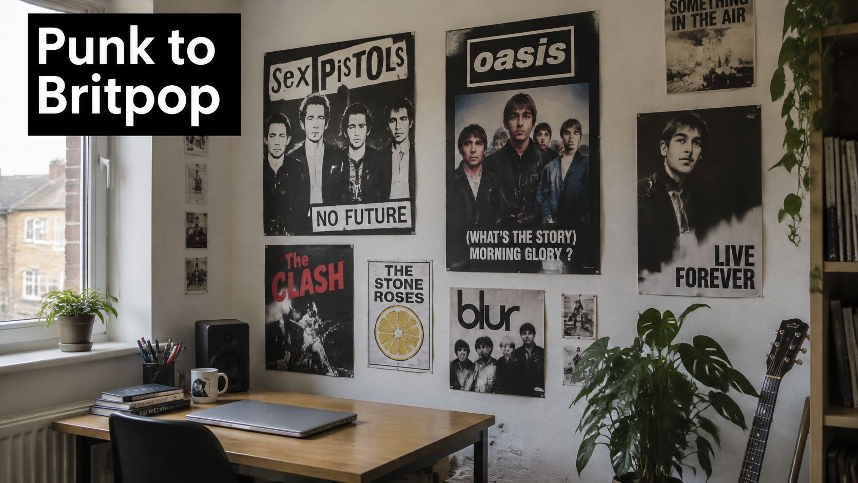
Britpop brought a different kind of visibility. According to Thupster's Britpop history, Blur's Country House sold 274,000 copies in its first week against 216,000 for Oasis's Roll with It during the September 1995 rivalry, while Definitely Maybe was certified seven-times platinum by the BPI. That was a chart contest with the emotional temperature of a derby, only with more parkas.
Album sleeves, band photography and tour visuals circulated through ordinary homes, not just specialist record shops. Bright colour and recognisable photography could now communicate belonging as effectively as a deliberately abrasive collage.
A useful visual timeline
- 1976 to 1984 punk graphics: Handmade production, confrontational lettering and regional identities became central to the look.
- 1993 to 1997 Britpop: Album-era photography and confident colour helped alternative imagery reach a mass audience.
- Today's wall prints: Buyers can choose between those visual traditions without pretending their sitting room is a museum reconstruction.
When comparing retro music posters, look for a coherent design language rather than an artificial aged-paper filter. Collectors value sleeve and poster design as visual culture because the composition matters alongside the musical association.
That's the difference between a print with history behind it and a beige rectangle wearing a vintage hat.
Choosing Prints by Taste, Region and Room
A print tied to your first gig or a favourite album will usually mean more to you than a familiar band portrait chosen to impress an imaginary panel judging your record collection. Let the music lead, then choose a design that suits the room.
The Statista overview of UK live-music attendees' genre preferences includes alternative rock, punk, alternative and indie among listeners' choices. Those tastes call for different visual treatments, from stark black-and-white graphics to warmer, softer palettes.
Start with memory and musical taste
A first gig, an album played while moving cities or a lyric linked to someone important gives a print a personal reason to be on your wall. The design can be subtle: a familiar phrase or evocative colour may carry the memory without reproducing a ticket or album sleeve.
Subgenre helps narrow the choice. Post-punk minimalism suits a taste for precision and restraint. Emo's confessional typography feels more personal, while softer indie palettes bring warmth to a room. Your listening habits can change, so choose the image you'll still enjoy seeing each day.
Let place and room purpose refine it
Manchester, Sheffield, Bristol, London, Glasgow and Cardiff each offer routes into musical identity. Choose a place with personal meaning, such as Sheffield for a first gig or the city where a favourite venue still comes up in conversation. A venue name, street reference or locally meaningful symbol can make a more specific choice than a globally famous band portrait.
Match the print to how you use the room. A bedroom can hold a personal reference. A hallway needs an image that reads at a glance; an office calls for a design that stays comfortable through an afternoon of spreadsheets, rather than one that only works under gig lighting.
A lyric from a university flatmate's playlist can carry more warmth than a full band line-up. Keep the palette limited when combining personal references, so each piece can register without turning the room into a shrine that visitors feel obliged to approach respectfully.
Before buying, ask yourself:
- Personal connection: Which band, place or scene matters most to you?
- Room fit: Does the print suit how you use the room as well as your taste?
- Conversation value: Will visitors recognise it or ask about it?
- Staying power: Will you still enjoy seeing it after your decorating enthusiasm shifts?
Often, the best choice is the one that makes a mate quote the lyrics on sight. Ideally, they stop before attempting the difficult high bit.
Matching Print Sizes to Your Walls
Print sizes, dimensions and where they work best
Dimensions below are trimmed paper dimensions, before a mount or frame.
| Size | Where it works best |
|---|---|
| A5, 148 × 210 mm | Desk corners, bookshelves and gift-sized framing |
| A4, 210 × 297 mm | Bedroom shelves and study walls |
| A3, 297 × 420 mm | A single statement above a desk or bed |
| A2, 420 × 594 mm | Living room focal point above a sofa |
| A1, 594 × 841 mm | Hallway or stairwell hero piece |
| A0, 841 × 1189 mm | Feature wall or office statement piece |
Measure the setting, not just the paper
Start with the usable wall area. Measure between door frames, shelving, switches and any furniture that visually defines the space. Then check the furniture underneath, because a print can fit the wall yet look stranded above a broad sofa.
For a hypothetical layout, try a paper template covering about two-thirds of the furniture's width. Treat that as a starting composition, not a building regulation. A tall portrait print above a narrow console needs a different balance from a wide, horizontal arrangement over a sofa.
Use low-tack decorator's tape to mark the outside corners, testing it somewhere discreet first. Stand in the doorway and sit where you'll normally see the artwork. A print that looks substantial at arm's length can shrink alarmingly from the opposite side of the room.
Frames and mounts add width. Check the outer frame measurement before ordering, and use the poster frame sizing guide to distinguish paper size from the finished object.
Sizing check: Judge the framed outline from your normal viewing position, not with your nose against the plaster.
Where the usual advice bends
- Narrow stairwells: A tall A1 or A0 composition can use height effectively, provided it clears the handrail and moving furniture.
- Small rented walls: A3 or A4 groupings are easier to rearrange around awkward sockets and existing fittings.
- Sloped ceilings: Leave breathing room around the frame so its top edge doesn't appear wedged beneath the slope.
- Detail-heavy artwork: Small lettering rewards close viewing. Don't put it somewhere you can only read it by standing on the sofa.
For a gallery arrangement, mix sizes but keep a dominant piece. Equal visual weight everywhere makes the display feel indecisive.
Choose the largest size that still looks comfortable within the usable space. In a trial layout, leaving about 10 cm clear at either side can help you spot when the frame is becoming a squeeze rather than a statement.
Styling Alternative Rock Prints at Home and in the Office
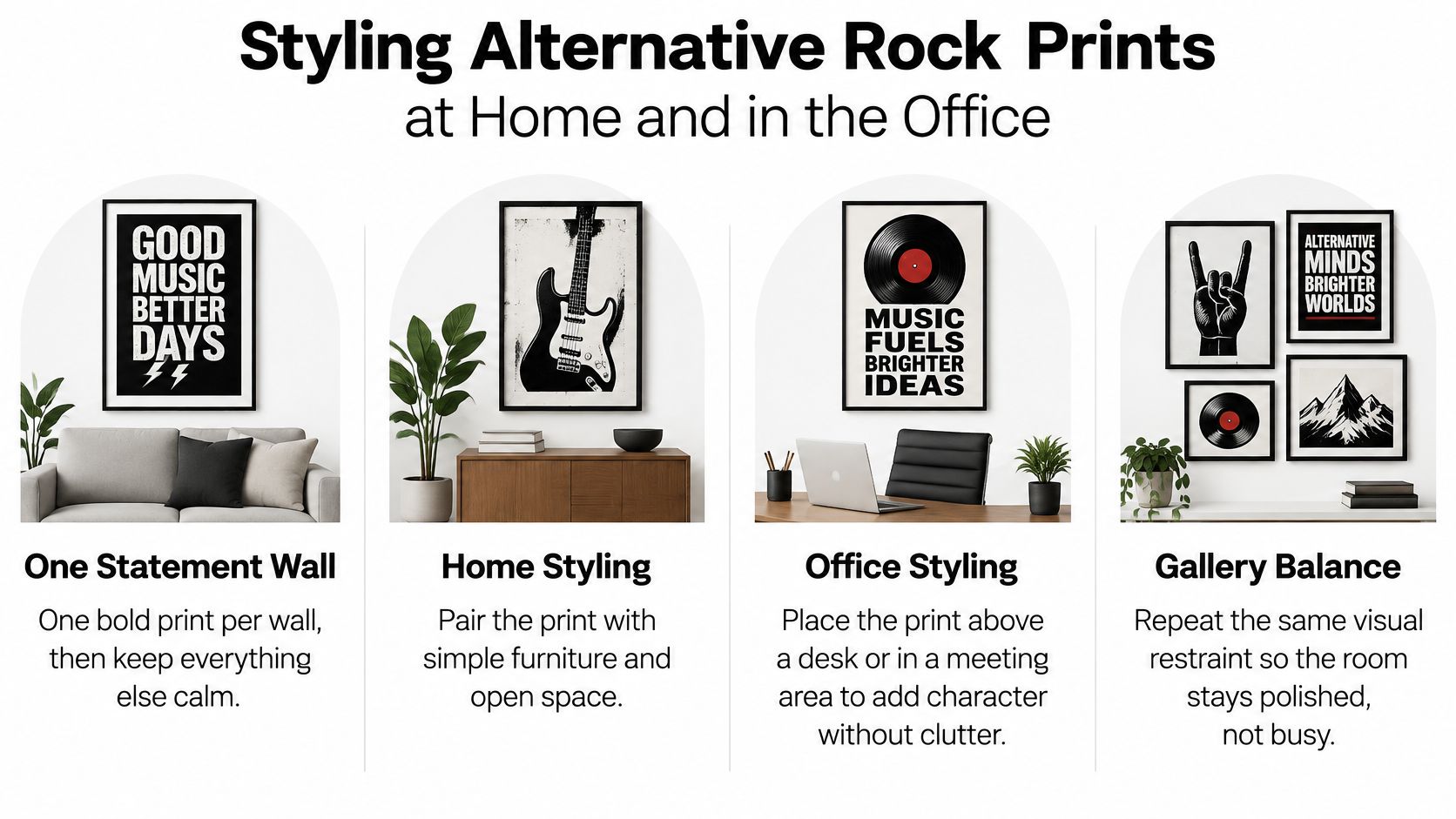
Give a bold print a wall it can lead. Keep neighbouring objects calmer so the composition has somewhere to breathe. You're arranging a room, not competing with the poster-covered staircase outside a gig venue's toilets.
The same restraint works in an office. Art should add personality without becoming the most demanding participant in the meeting.
Place it where people actually look
Test the centre of the artwork near standing eye level, then adjust for the furniture and how you use the room. For example, you could begin a mock-up with the centre around 150 cm from the floor, then lower it if the room is mainly enjoyed seated.
Don't hang artwork close to the ceiling merely because there's an empty nail there. Above furniture, connect the print visually to the desk, sofa or sideboard rather than leaving an awkward stretch of bare wall between them.
A colourful Britpop print works with a neutral sofa and a bright cushion that repeats an accent from the artwork. If busy upholstery is competing with the print, you can browse stretch-fit couch covers from Casamé Home as an alternative to replacing the sofa. Calm the background before adding more decorative objects.
For a grey or black desk setup, a minimalist post-punk print can provide character without extra visual noise. A distressed punk poster is more forgiving in a hallway or bedroom, where its roughness feels deliberate rather than disruptive.
Keep the office readable
Choose lyrics you're happy for clients to read. Avoid imagery that needs a lengthy defence, and check how the artwork appears behind you on video calls. Cropped lettering can produce an entirely different message once your head obscures the middle.
Lighting needs a practical test too. Sit in the usual chair with the lamp switched on and check whether the glass reflects the bulb. Reposition the lamp or angle a picture light until the artwork, not the glare, is visible.
For a gallery wall, repeat the frame colour and keep the gaps consistent. In a mock-up, try gaps of about 5 cm, then adjust to suit the frame widths and overall grouping.
- Repeat an accent: Echo a colour in a cushion or desk accessory.
- Keep the surround simple: Don't crowd the frame with unrelated ornaments.
- Check the backdrop: Test office artwork through your actual camera.
- Agree shared-space choices: The flatmate's veto is easier to negotiate before you drill.
How to Buy, Hang and Care for Your Prints
Make the buying decision before the drill comes out
- Set your budget and choose the size first. Include the frame, mount and hanging hardware, not just the paper. A bargain print becomes less bargain-like when its unusual dimensions demand bespoke framing.
- Read the product specification. Check paper weight, finish, production method and whether the order includes a frame. Ask how it's packaged too: rigid protection or a suitable tube matters more than an encouraging sticker.
- Compare the delivered total. Check dispatch times, delivery charges and the returns terms that apply to your chosen product. Only combine purchases when you want the additional artwork; buying a print you dislike to save postage is an own goal.
- Unbox on a clean, dry surface. Handle the sheet by its edges with clean, dry hands, and let rolled paper relax flat before framing. If you're planning the job, allow a day rather than trying to wrestle a tightly curled sheet straight into its mount.
Hang securely and protect the paper
- Match the fixing to the wall and frame weight. Use suitable picture hooks, rated fixings or a picture rail, then mark the position with a pencil and check it with a spirit level. The Tip Top Furniture & Mattresses hanging tips offer a useful positioning walkthrough, but inspect for concealed cables and pipes before drilling.
- Avoid direct sunlight and damp walls. Sunlight can fade printed colour, while moisture can distort paper and encourage mould. For a valuable or sentimental piece, ask a framer about conservation mounting and glazing with UV protection rather than assuming every frame offers it.
- Clean the glazing without soaking the frame. Start with a dry microfibre cloth, lightly dampening the cloth only if necessary, and never spray liquid directly onto the glazing. Keep moisture away from frame joints and check the care instructions before using cleaning products on acrylic.
- Reuse what still works. Keep sound frames and mounts when you move, replacing damaged components rather than the entire assembly. Separate packaging materials for recycling and avoid permanently bonding a print to its backing if you may want to reframe it.
The common mistake: Don't hang paper artwork above a radiator. Repeated heat can dry and distort the sheet, leaving your carefully chosen print looking like it survived the away coach.
Gift Ideas and Picking Your First Print
A good music gift says you paid attention. It needn't prove you've memorised the recipient's entire listening history, including the experimental phase everyone politely ignores.
Choose around their habits and memories. A famous band is not a universal safe bet.
Match the print to the person
- The music lover who has everything: Choose a first-gig reference or an album-era design with personal significance. They may own the record already, but not your reason for choosing it.
- The football fan: Look for a lyric or match-day phrase with a witty angle. Avoid rival-club colours unless you're deliberately starting trouble.
- The colleague: Keep a desk print visually simple, with a punchline that works beyond the office in-joke.
- The new-flat resident: A confident design can help make an unfamiliar space feel like theirs. Check their preferred colours before turning up with a fluorescent surprise.
- The teenager: Let them choose the lyric-led piece. Your approval isn't the main qualification, though shared-wall diplomacy still applies.
For recipient-led ideas, browse this UK guide to gifts for music lovers when you know their taste but haven't settled on a format.
Choose something they can live with
Striped Circle is a family-run UK business making wall art, posters and greeting cards inspired by music and football. Its range includes alternative lyric prints and artwork celebrating bands and clubs, with new products added regularly. The "All You Need is Love..." - Wall Art Print brings colour and humour. Orders over £40 qualify for free delivery.
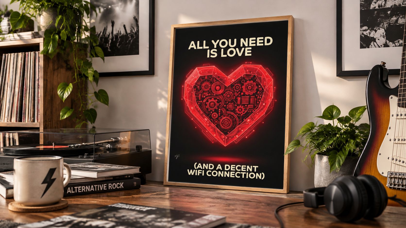
RAJAR's Summer 2025 MIDAS survey recorded a long-term decline in listening to owned music, despite a slight recent resurgence. A physical print gives music a visible place in everyday life, rather than leaving it on a screen.
Pick a design that suits the recipient and their room, then check the size against the space before ordering. A well-chosen print beats a last-minute gig T-shirt, especially when the wall is ready for it.
Striped Circle offers music- and football-inspired wall art, posters and greeting cards for homes and offices. Visit Striped Circle to choose a print connected to a favourite sound, shared joke or match-day loyalty.
