
Find the Perfect Retro Music Posters for Your Walls
Let's be honest, your walls are bored. They’re crying out for something with a bit more personality than that safe shade of magnolia you thought was a good idea in 2011. The answer, my friend, is retro music posters. Think of them as more than just decoration; they're a time machine for your living room, a statement about your impeccable taste, and a proper tribute to some absolute monster tunes.
Why Your Blank Walls Deserve Retro Music Posters
A blank wall is like a silent room. It does the job, sure, but it’s completely missing a soundtrack. Retro music posters are the vinyl crackle, the opening guitar riff, the thumping bassline that gives a space its soul. They don't just fill a gap; they inject life, energy, and a proper story into your home or office. It's about having unique, cool prints on your wall to make you and others smile. Simple as that.
These prints are also fantastic conversation starters. A slick Oasis print doesn't just whisper that you like "Wonderwall"; it shouts that you remember the swagger of Britpop, the bucket hats, and the glorious sibling rivalries. It’s a nod to a specific moment in time, a cultural touchstone that instantly connects you with anyone who gets it. It's the visual equivalent of the 'Alan Partridge shrug'.
More Than Just Nostalgia
Of course, nostalgia is a huge part of the appeal. Seeing a poster for The Smiths can transport you straight back to a gloomy Tuesday in your teenage bedroom, no questions asked. But it’s also about celebrating timeless design and attitude. The raw, DIY aesthetic of an old punk flyer or the bold, graphic style of a New Wave album cover is art in its own right. It’s the music’s spirit, made visible.
In a world dominated by digital playlists and fleeting trends, a physical print is a permanent declaration of your musical allegiance. It’s a way to make your passions tangible and show the world (or at least your mates who come over for a cuppa and nick your biscuits) what you’re all about.
These posters offer a brilliant way to personalise your space and make it feel truly yours. They can set the mood for an entire room, whether you're aiming for a chilled-out vibe or something a bit more energetic. To really nail that vibe, you could even explore broader visual trends like the popular lofi aesthetic, which often shares a cosy, nostalgic feel with retro music. At the end of the day, it's all about surrounding yourself with things that make you happy.
A Visual History of British Music Poster Design
Ever wondered why a gritty 70s punk poster looks a world away from a swaggering 90s Britpop one? It’s not just the questionable haircuts. The design of retro music posters tells a story—a visual evolution that perfectly mirrors the sound and attitude of each decade. It’s a crash course in UK music culture, told through typography, colour, and pure, unadulterated attitude.
Think of it this way: a music poster is the band's handshake. A 70s punk poster is a firm, slightly grimy grip that says, "We're here to make some noise." An 80s New Wave print is a cool, detached wave from across a synthesiser. And a 90s Britpop poster? That’s an arm slung around your shoulder, spilling your pint and pulling you in for a massive singalong.
The Raw Energy of Punk
The mid-to-late 70s were all about DIY anarchy. Punk posters were less about polished graphic design and more about raw, urgent communication. We’re talking ransom-note lettering cut from newspapers, grainy photocopied images, and a general two-fingers-up to the establishment. They were messy, immediate, and utterly brilliant.
This raw energy was incredibly effective. During the 1970s punk explosion, posters for The Sex Pistols' notorious 'God Save the Queen' release in 1977 sold over 250,000 copies across various print runs. In fact, music archivists estimate that by 1979, up to 15% of households in industrial cities like Sheffield had a punk poster tacked to a wall.
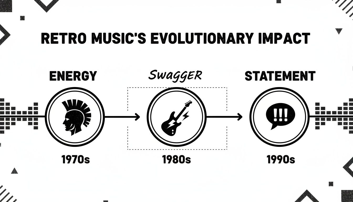
The timeline above really captures how music's visual identity shifted—from the pure, unfiltered energy of punk to the more curated style and bold statements of later decades.
This table gives you a quick breakdown of what makes each era's poster style so distinct.
A Quick Guide to Retro Poster Styles by Era
| Era | Key Visuals | Vibe and Attitude | Iconic Bands |
|---|---|---|---|
| 70s Punk | Cut-and-paste lettering, high-contrast photocopies, clashing colours, graffiti | Raw, rebellious, DIY, anti-establishment, urgent | The Clash, Sex Pistols |
| 80s New Wave | Geometric shapes, neon palettes, airbrushed graphics, stylised typography | Sleek, futuristic, artistic, moody, sophisticated | Duran Duran, The Cure |
| 90s Britpop | Bold band photography, minimalist layouts, classic sans-serif fonts | Confident, cool, laddish, nostalgic, anthemic | Oasis, Blur, Pulp |
As you can see, the shift from one decade to the next wasn't just about the music changing; it was a total overhaul of the visual culture surrounding it.
Synths, Style and the 80s
As we moved into the 80s, the design language cleaned up its act. The raw punk aesthetic gave way to bold geometric shapes, neon colours, and sleek, often futuristic typography. Bands like The Human League and Duran Duran embraced a more stylised, almost corporate look that reflected the glossy, synth-driven sound of the era.
This is when iconic imagery for bands like Pink Floyd became just as recognisable as their music, often appearing on everything from posters to merchandise like Pink Floyd band stickers.
Britpop's Confident Cool
Then came the 90s, and with it, Britpop. The design focus shifted again, this time towards photography and pure swagger. Posters for bands like Oasis, Blur, and Pulp were often simple but incredibly powerful, featuring confident, moody shots of the bands themselves. The typography became cleaner, often using classic, no-nonsense fonts that let the image do all the talking.
It was all about attitude. The posters weren't just advertising a gig or an album; they were selling an identity, a lifestyle, a feeling that you were part of the coolest gang in town.
This era cemented the idea of the band as a brand, with a consistent visual style that was every bit as important as the music. From the raw cut-and-paste of punk to the polished cool of Britpop, each period left its own unique mark. To see more, why not explore our deep dive into the world of UK retro posters?
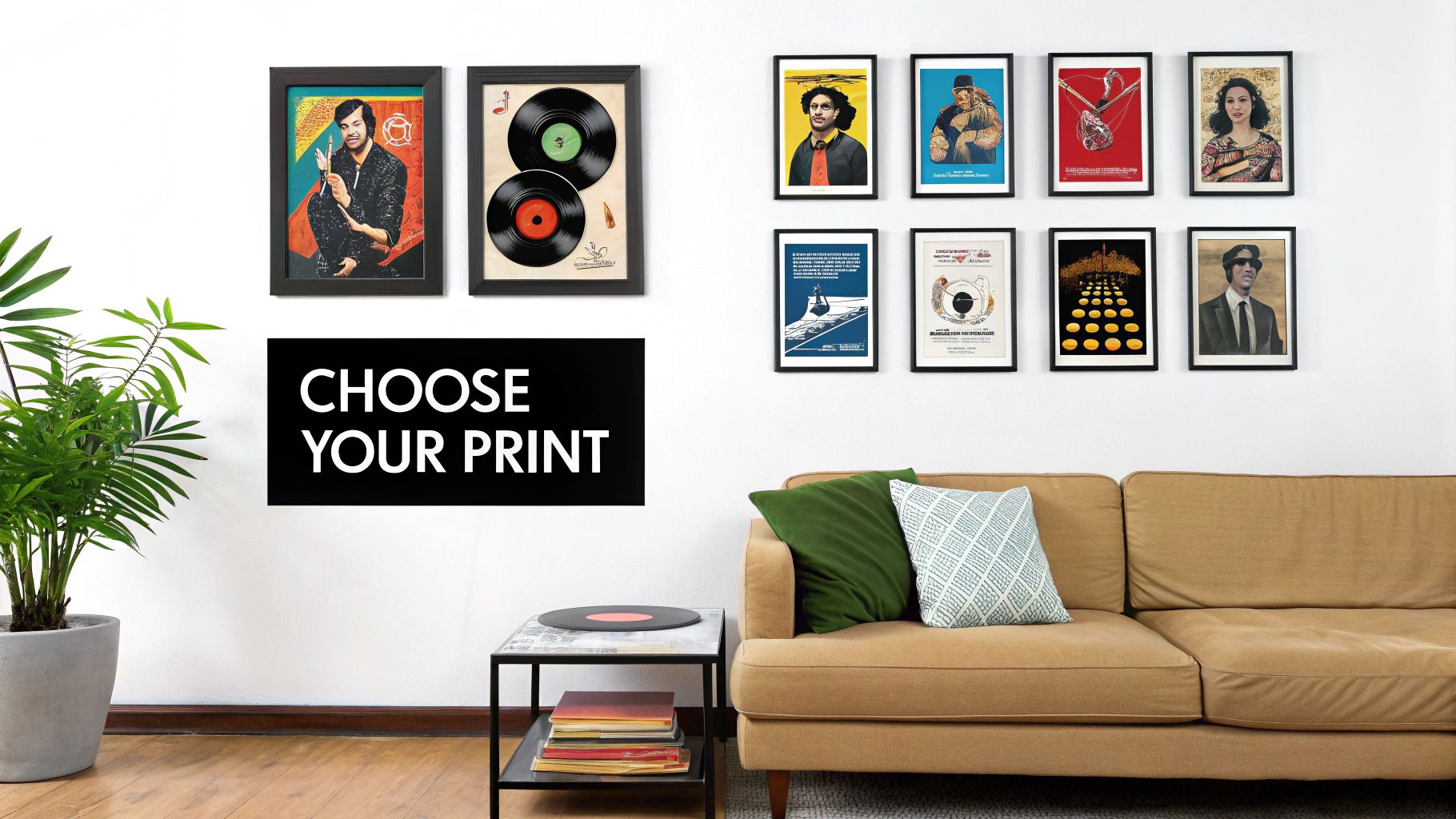
How to Choose the Right Print for Every Room
Right, so you’ve decided your walls are crying out for a bit of character. Fantastic. But now for the tricky part: figuring out which retro music posters go where. That massive print of The Stone Roses might look absolutely spot on in your home office, but it could get some funny looks over Sunday dinner with the in-laws.
Choosing the right print isn't just about covering up a blank space; it’s about setting a mood. Think of it as creating a soundtrack for your home, where every room has its own perfect tracklist. When you get it right, your house starts to feel like a home that’s genuinely yours—full of your stories, memories, and maybe a few questionable dance moves from back in the day.
The Living Room Statement
Your living room is the main stage. It's where you have your mates over, unwind with a good film, and generally let your impeccable taste shine. This is the perfect spot for a real statement piece or, better yet, a full-blown gallery wall that maps out your musical journey.
- Mix and Match Eras: Why not hang a moody Joy Division print next to a vibrant Oasis one? It shows you've got range.
- Tell a Story: Group posters from your most memorable gigs, the first albums you ever bought, or the bands that were the soundtrack to your uni days.
- Keep it Cohesive: Using similar frames or a consistent colour palette helps tie everything together, making it look curated rather than chaotic.
This is your chance to create a centrepiece that gets people talking. It’s the visual equivalent of dropping the needle on a killer record when guests walk in.
Kitchen Disco and Bathroom Banter
The kitchen is often the true heart of the home, so why not give it a beat? A cheeky lyric print from Pulp’s "Common People" above the toaster or a bold Happy Mondays design can inject some much-needed energy into your morning coffee routine. Go for something upbeat, fun, and maybe a little bit sarcastic.
And let's not forget the bathroom. Even a small, witty print in the loo can add a surprising dash of personality. Just be sure it’s framed properly to protect it from the steam of those long, contemplative showers where you solve all the world's problems.
Your home office is your creative sanctuary, so pick prints that get your brain buzzing. An inspirational lyric from David Bowie or the rebellious spirit of a punk-era poster could be the very thing you need to power through that to-do list. Just try to avoid anything too distracting, unless your goal is to spend the day staring at Ian Brown’s glorious swagger instead of working.
At the end of the day, choosing art is deeply personal, and there are no hard-and-fast rules. If you’re looking for a bit more guidance, feel free to check out our guide on how to choose art for your home. The most important thing is to pick prints that make you smile every single time you walk past them.
Framing and Caring for Your Wall Art
You’ve done it. You’ve found the perfect retro music poster, the one that speaks right to your soul. Now, for the love of all that is holy, don’t let it meet a tragic end with a bit of blu-tack and those sad, curly corners. It’s like buying a vintage Stratocaster and using it as a cricket bat.
Let's get that masterpiece properly on the wall, looking so good it’ll make your other possessions jealous. A good frame doesn't just protect your print; it elevates it from a poster into a genuine piece of art. It’s the difference between a student digs vibe and an "I've definitely got my life together" statement.
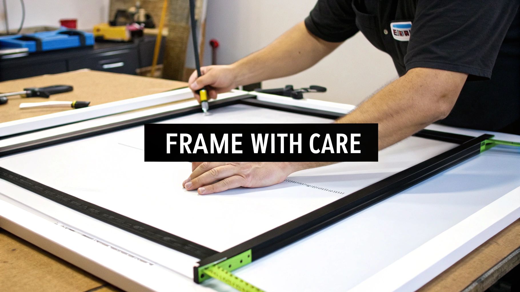
Choosing Your Weapon: The Right Frame
Picking a frame is all about matching the vibe of the print and the room it's going in. You wouldn't put a gritty punk flyer in an ornate gold frame, would you? (Actually, that could be ironically brilliant, but let's stick to the basics for now).
- Sleek and Modern: A simple, thin black or white frame is a can't-go-wrong choice. It’s clean, sharp, and lets the artwork do all the talking. This look is perfect for bold, graphic 80s designs or minimalist 90s Britpop posters.
- Rustic and Vintage: Natural wood frames bring a real warmth and character. They work a treat with posters that have a more organic, earthy colour palette—think 70s folk rock or festival prints.
- The Power of the Mount: A mount (that white border between the print and the frame) is a complete game-changer. It gives your art some breathing room and makes it look instantly more professional, like it belongs in a gallery.
Hanging Without the Headache
Now for the practical bit: getting it on the wall without turning your plaster into Swiss cheese. The goal is a balanced, eye-level display that doesn't look like you did it after a few too many pints.
A common myth is that you need to hang everything perfectly symmetrically. Nonsense. A balanced, slightly asymmetrical gallery wall often feels more dynamic and interesting. It's about visual weight, not perfect alignment.
To avoid disaster, lay your prints out on the floor first. Arrange them, rearrange them, take a picture with your phone, and then start hammering. This simple step can save you a world of pain and polyfilla.
For more in-depth advice, our guide on how to frame posters has you covered. Finally, remember to keep your prints out of direct sunlight to prevent the colours from fading, and give the glass a gentle wipe now and then to keep them looking pristine. Simple as that.
Why Our Prints Are a Smarter Choice
You can find retro music posters in a million places online, that’s true. Big, faceless companies will happily send you a flimsy bit of paper that sort of looks like your favourite album cover. But here’s the thing: you can’t buy passion, and you definitely can’t buy the obsessive, slightly nerdy care we pour into every single print that leaves our little studio.
Striped Circle isn’t some slick corporate machine. We’re a family-run outfit, born from a lockdown project fuelled by a love for music, football, and the eternal quest for something decent to stick on the walls. We're not just selling posters; we're sharing a piece of what we love, hoping it makes you smile as much as it makes us.
This isn’t just our passion project, either. Our teenage sons are our official (and brutally honest) cool-checkers. If a design doesn’t get their nod of approval, it doesn’t make the cut. It’s a simple system, but it keeps us on our toes and makes sure our prints have genuine, cross-generational appeal.
What Really Sets Us Apart
So, what makes choosing us a smarter move? It all comes down to a few simple things we’re ridiculously proud of. We obsess over the details because we know they matter.
- Unbeatable Print Quality: We’re proper print geeks. We use high-quality, heavyweight paper and archival inks to make sure the colours pop and the details are razor-sharp. Your print won’t just look good today; it’ll look brilliant for years to come.
- Unique, Original Designs: You won't find our stuff anywhere else. Every design is created in-house, inspired by iconic lyrics and moments in British music history. They’re for the fans who want something a bit different, a bit cleverer.
- Passion You Can Feel: We genuinely love what we do. Every order is packed by us, with the kind of care you only get from a small business that values every single customer.
This whole venture is a celebration of the tangible. In a world of streaming, holding a high-quality print of an Arctic Monkeys lyric feels like a small act of rebellion. It’s about owning a physical piece of the culture you love.
The UK's physical music industry is thriving—it's valued at over £8 billion, with vinyl sales booming and a whole new generation discovering the joy of collecting. Specialising in prints for UK bands like Arctic Monkeys, whose debut album posters sold 120,000 copies, is our way of tapping into that same love for tangible art. We’re creating something real that brings a bit of joy to your walls. It’s no surprise when you read about how female artists and vinyl sales are dominating the UK charts; it’s clear that physical media is here to stay.
Choosing a print from us isn’t just a transaction. It's an invitation to support a small, UK-based business that genuinely cares about the art it creates and the homes it ends up in. We’re glad you’re here.
Your Retro Music Poster Questions Answered
Alright, let's have a chat. We get it—buying art can feel like a big decision, and you’ve probably got a few questions buzzing around. Think of this as your friendly, no-nonsense FAQ, where we tackle the most common queries about our retro music posters.
From picking the right size to wondering if your new print will survive in a house with a football-mad Labrador, we've heard it all. So, let’s get these questions sorted and get you one step closer to turning those boring blank walls into a proper tribute to great British music.
How Good Is The Print Quality Really?
This is the big one, isn't it? You want to know if what you're buying will look sharp, vibrant, and worthy of its spot on your wall. In short: yes, absolutely. We're complete geeks when it comes to print quality.
We use heavyweight 200gsm museum-quality paper for a premium, satin finish that feels substantial in your hands. The inks are archival, which is a fancy way of saying the colours will stay rich and won’t fade over time—even if your memories of that 2005 festival are a bit hazy.
It’s simple, really. We make prints that we’d be proud to hang in our own homes. If it’s not good enough for us, it’s definitely not good enough for you. We wouldn’t have it any other way.
What Size Poster Should I Get?
Ah, the age-old question. The honest answer? It depends entirely on your space and the statement you want to make. Think of it like turning up the volume on your stereo—sometimes you want it subtle, other times you want it to shake the windows.
Here’s a quick guide to help you decide:
- A4 (The Understated Nod): Perfect for smaller nooks, gallery walls, or propping up on a desk or shelf. It’s a subtle but cool way to show your love for a band.
- A3 (The Classic Choice): This is the sweet spot for most people. It's big enough to make an impact on its own but also works brilliantly as part of a larger collection.
- A2 (The Main Event): Go big or go home. An A2 print is a proper statement piece, ideal for hanging over a sofa, bed, or your beloved record player. It demands attention.
Do Your Prints Come Framed?
Another excellent question. To keep things simple and give you the freedom to match your own decor, our prints are sold unframed. This lets you choose a frame that perfectly suits your style, whether that’s a sleek black number or something a bit more rustic. It also helps us keep our postage costs down and get your order to you safely and efficiently.
How Are The Posters Shipped?
We take as much care with our packaging as we do with our printing. Nobody wants to receive a creased or damaged poster—that’s just criminal.
Your print will be carefully rolled and shipped in a sturdy, reinforced cardboard tube to ensure it arrives at your door in pristine condition, ready for its new home. It’s practically bomb-proof.
The love for physical media isn't just a passing phase; it’s a proper movement. Back in 2025, the Entertainment Retailers Association (ERA) revealed that while music revenues hit a record £2.45 billion, physical sales stole the show, growing by a huge 11.5%. It feels a bit like the poster boom of the 1980s, when posters for events like Live Aid in 1985 were flying out, with over 1 million copies distributed via music magazines alone. You can discover more insights about these music business stats on completemusicupdate.com and see how tangible art continues to thrive.
Ready to find the perfect print that tells your story? At Striped Circle, we’re not just selling posters; we’re sharing our passion for the music and culture that shaped us. Dive into our collection and find a piece of wall art that makes you smile.
Explore our full range of retro music posters at Striped Circle
