

A Witty Guide to Art for Living Room Walls
Choosing the right art for your living room can feel like a bigger decision than your club’s new third kit, but it’s a lot simpler than you might think. It’s really just about swapping those bare, personality-free walls for something that screams you—whether that’s a tribute to your favourite band, a nod to your football club, or a quote that makes you grin. Think of it as the ultimate character injection for the main stage of your home.
Your Living Room Walls Are Crying Out for Help
Let's be honest, staring at a blank wall is about as exciting as a 0-0 draw on a rainy Tuesday night. Your living room is the hub, the command centre, the place where you celebrate last-minute winners and belt out Oasis classics after a few too many. It deserves so much better than boring.
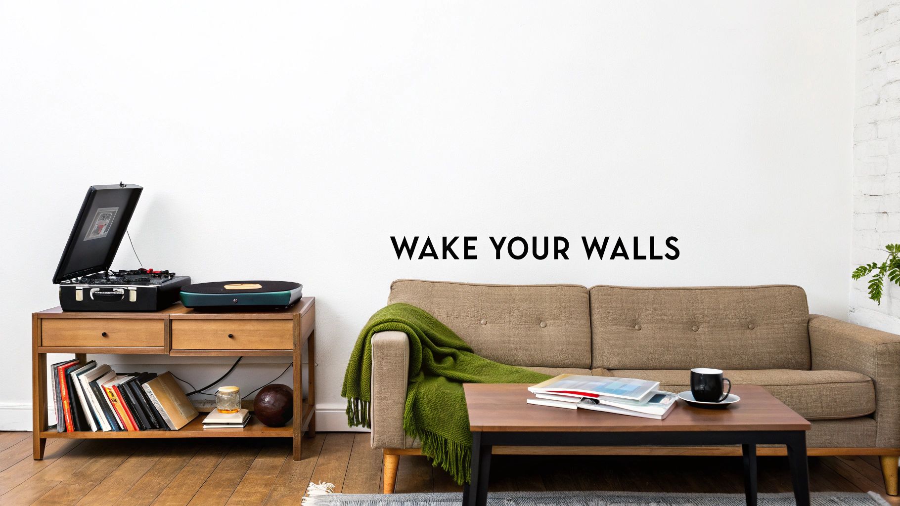
This guide is for anyone who knows their walls are there for more than just holding the roof up. We’re here to show you that choosing art isn't some high-brow, intimidating chore reserved for stuffy galleries. It’s actually a brilliant, dead-easy way to stamp your unique personality all over your space and make your mates jealous.
Why Your Walls Need a Voice
Just picture your living room walls as a blank canvas, waiting for you to tell a story. The right piece of art can completely transform a room's entire vibe. It’s what separates a soulless showroom from a space that feels genuinely yours—a place that makes you, and your mates, feel right at home.
- Show Off Your Passions: Why keep your love for The Smiths or your lifelong devotion to your team to yourself? Wall art is your chance to wear your heart on your sleeve—or, well, on your wall. It's the ultimate power move.
- Spark Conversations: A unique print is a guaranteed conversation starter. "Is that a stylised map of Hillsborough?" or "Where did you get that Stone Roses lyric print?" It beats talking about the weather, any day.
- Finish the Room: Art is the final piece of the puzzle. It’s the one thing that ties all your furniture, colours, and personal taste together into one cohesive, brilliant package. It’s the Liam to your Noel (in the early days, obviously).
And you're not alone in wanting to liven up your living space. The UK art market is booming, with the United Kingdom accounting for almost 20 percent of global art sales, putting it second only to the US. It seems we're all starting to realise our walls deserve a bit more love. You can find out more about the UK's thriving art market on Statista.
Picking the Right Art Size Without a Meltdown
Choosing the right size of art for your living room can feel like a high-stakes decision. Go too small, and the piece looks like a lonely postage stamp on a giant envelope—completely lost and a bit sad. Go too big, and your sofa suddenly looks like it's been swallowed by a behemoth. It’s a proper headache.
But don't worry, there’s no dark art to this. I've got a couple of simple, no-nonsense rules of thumb that'll have you sizing up your walls like a pro. Think of them as your tactical instructions for a guaranteed win.
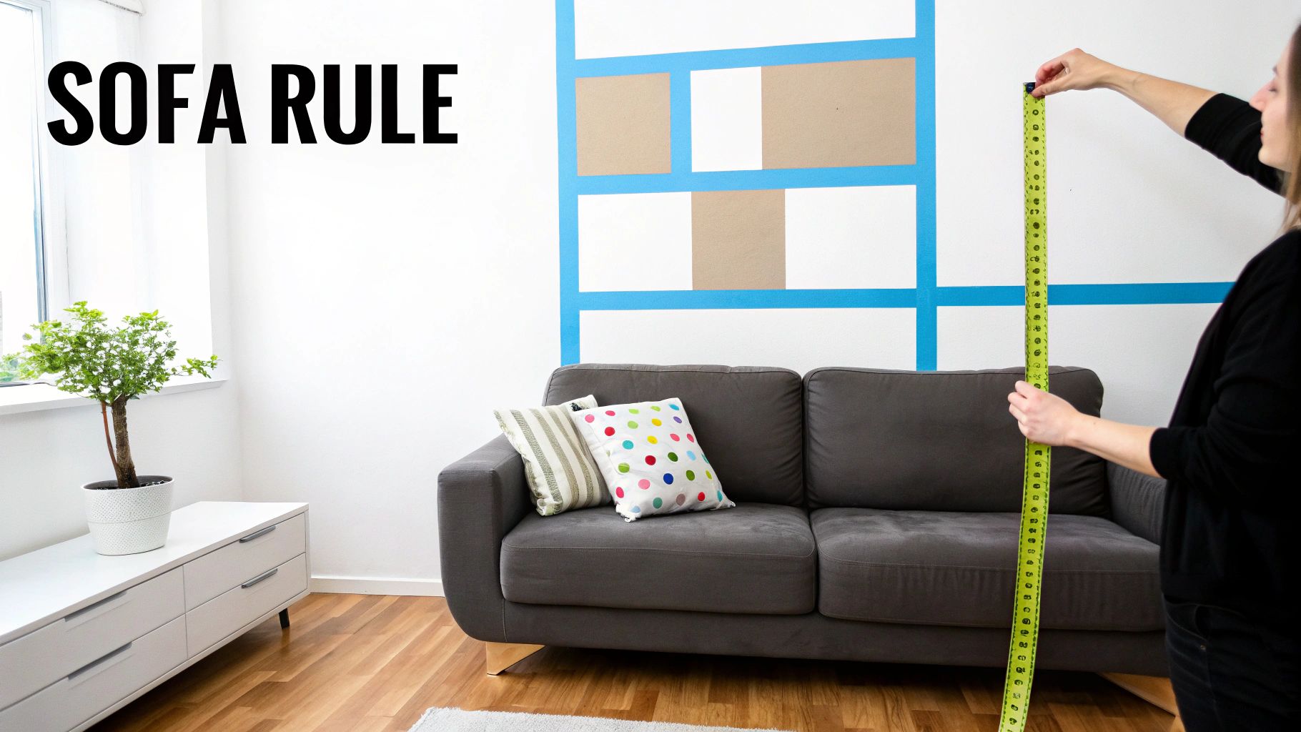
The Two Golden Rules of Art Sizing
First up, let’s talk about the 'sofa rule', which is dead simple. Your art (or a collection of prints) should be about two-thirds the width of the furniture it’s hanging over. This simple guideline creates a balanced, pleasing look that just feels right, preventing the art from either overpowering the sofa or looking like a timid afterthought.
Next, we have the 'eye-level rule'. Galleries and designers live by this one. The centre of your artwork should hang roughly at eye level, which for most people is about 57 inches (or 145 cm) from the floor. This stops you from making that classic mistake of hanging art so high it looks like it’s trying to escape to the ceiling.
Forget guesswork. These rules are your best mates when choosing art. They ensure your new print doesn’t just hang on the wall, but actually belongs there, creating a focal point that looks deliberate and stylish. No VAR needed here.
A No-Fuss Guide to Visualising
Before you commit and start knocking nails in, it's always smart to visualise how the art will actually look in your space. One of the best tricks in the book is using painter's tape or even paper cut-outs to mark the dimensions on your wall.
- Measure the desired size of your print on the wall.
- Stick the tape on to create a temporary frame.
- Step back and have a proper look from different angles and at different times of the day.
This simple step removes all the anxiety. You can see exactly how much real estate the art will occupy, helping you choose the perfect piece of art for your living room with total confidence.
Still mulling over frames? They play a big part in the final dimensions. For some extra tips, check out our guide on what size poster frame you might need.
Creating a Vibe with Colour and Style
Right, let’s talk vibes. Every living room has one, whether you’ve planned it or not. The real question is, what vibe are you aiming for? Is it ‘chilled Sunday morning listening to The Smiths’ with a brew, or is it more ‘pre-match hype before the derby,’ buzzing with nervous energy? This is where choosing the right art for your living room becomes your secret weapon.
Art is the quickest way to steer your room’s atmosphere in the direction you want. It’s not just about filling a space; it’s about making a statement. You get to decide if your art will be the loud, swaggering frontman or the cool, subtle bassist holding everything together.
Focal Point or Finishing Touch
Think of it this way: a bold, vibrant print of your team’s stadium acts as a focal point. It’s the first thing people see, a confident declaration of loyalty that screams team pride. It grabs attention, just like a last-minute goal, and dictates the room's energy.
On the other hand, a minimalist lyric print can be a complementary piece. It’s a more understated nod to your favourite band, a stylish in-joke for those who get it. Instead of shouting, it subtly ties the room together, harmonising with your existing decor like a perfectly mixed track. Neither approach is better; it just depends on the story you want to tell.
Your art should be a reflection of you, not something ripped from a generic catalogue. It’s about telling your story, whether that’s through a vibrant illustration of Anfield or a quiet, clever lyric from an Arctic Monkeys tune.
Getting Your Colours Right
Now, let’s get into colour without it sounding like a boring art lesson. You’ve basically got two main strategies: harmonise or contrast.
-
Harmonising Hues: This involves picking art that features colours already present in your living room—in your cushions, rug, or even a favourite armchair. It creates a cohesive, pulled-together look that’s calm and intentional. It’s the interior design equivalent of a well-drilled defence; everything just works together seamlessly.
-
Stylish Contrast: Fancy being a bit more daring? Choose art with colours that deliberately pop against your wall colour. A bright yellow print against a dark blue wall, for example, creates a massive impact. It’s a confident, energetic choice that shows you’re not afraid to break the mould. It's the rock and roll option.
Choosing colours can feel a bit daunting, but it’s a massive part of setting the mood. If you want to dive deeper into how different shades affect a room's feel, you can learn more about colour psychology in our interior design guide. Ultimately, whether you match or clash, the goal is to create a space that feels authentically yours.
How to Arrange Art Like You Know What You're Doing
Right, you’ve got your prints, you’ve measured the space, and now it’s time for the main event: getting them up on the wall. This isn't just about banging a nail in and hoping for the best. Nailing the arrangement is what separates a living room that looks effortlessly cool from one that feels like a chaotic jumble sale.
The single statement piece is a classic for a reason. Imagine one massive print of your favourite album art or a stylised illustration of your club’s ground hanging proudly over the sofa. It’s a confident, bold move—the lead singer of the room, demanding attention and setting the entire tone.
The Art of the Gallery Wall
But what if you’ve got a few pieces you love? Welcome to the gallery wall, your chance to create something truly personal. The secret here is to avoid a layout that looks like the Gallagher brothers’ relationship—all over the place and clashing. You’re aiming for the harmony of a well-drilled back four, where every piece works together perfectly.
Here's the best trick in the book: lay all your prints out on the floor first. Live with the arrangement for a bit, move things around, and find a balance that feels right before you even think about picking up a hammer. This simple step will save you from turning your wall into Swiss cheese with unnecessary holes.
This diagram shows how your chosen art really defines the vibe of your space, whether it's acting as a focal point or complementing the decor you already have.
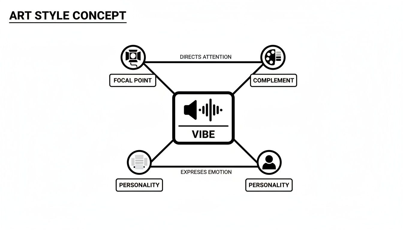
It’s all about how your choices directly express your personality and guide the eye, creating a cohesive atmosphere in the room.
Choosing Your Formation
Just like a football manager picking their squad, you’ve got a few formations to choose from when arranging your art for your living room:
- The Grid: This one is for the perfectionists. All your frames are the same size, spaced out with military precision. It’s clean, organised, and looks incredibly sharp. The Pep Guardiola of layouts.
- Asymmetrical Balance: A more eclectic, laid-back approach. Feel free to mix different sizes, orientations, and even frame styles. The key is to balance the visual weight—don’t lump all the big, heavy pieces on one side. It's organised chaos, like a classic Blur gig.
- Linear Hang: This involves arranging prints in a straight line, either horizontally or vertically. It works brilliantly down a hallway or stretched out along the length of a large sofa.
The recent surge in home decorating, especially since lockdown, has made us all far more conscious of our living spaces. People spent so much more time at home, sparking a huge increase in DIY projects and wall art purchases to make their surroundings more enjoyable.
Once you’ve settled on the layout, mastering the physical act of hanging is key to a polished look. You can learn how to correctly hang your pictures with precision for that truly gallery-worthy finish. For even more ideas, check out our own guide on https://stripedcircle.com/blogs/posts/how-to-arrange-wall-art like a pro.
Finding Your Perfect Match from the Stands to the Stage
Right, let’s get one thing straight. Those generic ‘Live, Laugh, Love’ prints are the beige cardigans of the art world—safe, utterly forgettable, and a bit sad. Your living room is the main stage of your home, and it deserves a headliner with a bit of swagger, not a bland support act. Your walls are crying out for something that tells a story, sparks a debate, and makes people smile.
This is where the magic happens. Swapping a generic print for something that screams you is the quickest way to inject pure personality into your space. It’s about celebrating your passions, loud and proud.
From the Terraces to Your Wall
Imagine a stylised, minimalist print of Anfield. It’s more than just a picture of a stadium; it’s a nod to every nail-biting match, every last-minute winner, and every chorus of "You'll Never Walk Alone" you've ever belted out. It’s a quiet statement of loyalty that only fellow fans will truly get. That’s the kind of art for your living room that starts a real conversation.
Or perhaps you’re a die-hard Madchester fan. An alternative Stone Roses lyric print, featuring a lesser-known line from a B-side, instantly separates you from the casual listener. It’s an insider’s nod, a piece of art that shares a secret history with anyone who understands its significance.
Choosing art based on your passions isn’t just decorating; it’s curating your own personal museum of what you love. It turns a blank wall into a statement of identity, a visual playlist of your life’s soundtrack.
The Ultimate Gift-Giving Power Move
Let’s not forget the sheer panic of last-minute present buying. We've all been there, grabbing a boring gift set in a desperate rush. A unique print based on someone’s favourite band or football team is a legendary gift-giving move.
It shows you’ve paid attention. It’s thoughtful, personal, and infinitely cooler than a pair of socks. Giving a mate a Britpop-inspired poster for their 90s revival gallery wall isn’t just a gift; it’s a tribute to shared memories of questionable fashion and brilliant tunes.
- For the Music Buff: Think beyond the obvious album cover. A print celebrating a specific gig, a classic lyric, or even the architecture of a famous venue shows real thought.
- For the Football Fanatic: A stylised map of their club’s neighbourhood or an abstract design using the team’s iconic colours is a classy way to show support without turning the living room into a pub.
These pieces are more than just wall fillers; they are reflections of identity. To begin exploring a vast selection and find pieces that resonate with your personal style, you can delve into a curated collection of Home Decor Art. Finding that perfect match transforms your home from just a place you live into a space that truly represents who you are.
Buying Art Online Without Getting Ripped Off
Buying art online can feel a bit like signing a new striker you've only seen on YouTube clips. It looks amazing on screen, but what’s the quality really like when it arrives? You don't want to spend your hard-earned cash on a print that looks like it came off a dodgy office printer from the 90s.
Thankfully, you don’t have to just cross your fingers and hope for the best. With a bit of savvy, you can easily spot the difference between a top-tier print and a Sunday league knock-off. It’s all about knowing what to look for, so you can buy with the confidence of a manager who’s just signed a future legend.
Know Your Paper and Print Quality
Let's be clear: not all prints are created equal. The real difference between a premium piece that lasts a lifetime and a cheap poster that fades in a year often boils down to two things: the printing method and the paper itself.
When you're browsing, keep an eye out for these terms:
- Giclée Printing: This is the gold standard in the print world. It's a fancy term for a process that uses high-quality archival inks to create a rich, vibrant finish. Crucially, it won't fade faster than a one-season wonder.
- Paper Weight: Always look for a good, hefty paper, which is usually measured in grams per square metre (gsm). Anything 200 gsm or more feels substantial, hangs better, and just screams quality.
Think of it like this: a cheap, flimsy print is like a dodgy bootleg recording of a classic album—the soul just isn’t there. A high-quality giclée print on thick paper is the fully remastered vinyl version—crisp, rich, and built to last.
Check the Small Print
Before you hit that 'buy' button, it pays to do a little detective work. Always scout out the seller’s customer reviews to see what real buyers are saying about their experience and the product quality.
It's also a good idea to quickly check their delivery and return policies. Any reputable seller will be completely transparent about these things, which should give you the peace of mind you need to complete the purchase.
Online shopping has completely changed how we find art for a living room, with digital platforms now being the main way many of us discover and buy pieces. You can find out more about the modern art market on Arterritory. When you shop smart, you can be sure you're getting a piece that’s worth every penny.
Your Questions Answered
We get it. Choosing art for your living room can feel like a bigger commitment than picking a new favourite band. To wrap things up, here’s a quick-fire round answering some of the most common questions we hear. No fluff, just straight-talking advice to get you over the finish line.
How Do I Know If Art Clashes with My Room?
Honestly, stop worrying about "clashing." If you love a piece of art, it's rarely a wrong choice.
Think of it like a killer guitar solo over a steady rhythm section—a bit of contrast is what makes things interesting. If a bright, bold print of your favourite album cover makes you happy in your minimalist, neutral room, then it works. The only rule is that it has to make you smile.
Should All the Art in My Living Room Match?
Absolutely not. In fact, please don't. A room where every piece of art follows the same theme or colour scheme can feel a bit sterile, like a hotel lobby.
Mixing a cool football stadium print with a minimalist lyric poster and maybe a vintage gig flyer creates a space that feels collected and authentic. It’s your story, not a catalogue showroom. Variety adds character and makes the room feel like it has evolved over time.
Art isn't about following rigid rules; it's about expressing personality. Your living room should be a gallery of the things you love, not a perfectly coordinated, soulless space. Mix it up and have some fun with it.
What's the Biggest Mistake People Make?
The biggest fumble is overthinking it until you end up with nothing. Paralysis by analysis is a real thing.
People get so bogged down in rules about size, colour, and style that they never actually hang anything, leaving their walls depressingly bare. The second biggest mistake? Buying boring, generic art just to fill a space. Your walls deserve more personality than that. Choose something you love, hang it up, and enjoy it. It’s that simple.
Ready to find the perfect piece that tells your story? Explore the full collection of unique, high-quality music and football-inspired prints at Striped Circle and give your walls the character they deserve. Find your match at https://www.stripedcircle.com.
