
Black and White Striped Curtains: A Styling Guide for 2026
The popular advice about black and white striped curtains is only half right. Yes, stripes can make a window look taller or wider, but that doesn't mean every stripe improves every room. A chunky black band in a small box bedroom can make the window look like it's wearing a referee's shirt, while a fine vertical stripe in the same space can lift the whole wall.
The essential choices hinge on stripe scale, direction, fit, hanging geometry and what sits behind the curtain. A striped curtain isn't a neutral bit of fabric waiting politely in the background. It's a large printed surface, so it has to get along with your wall art, lighting, furniture and the actual proportions of the room.
Table of Contents
- Why Black and White Striped Curtains Are Doing More Heavy Lifting Than You Think
- Picking the Right Stripe for Your Room
- Measuring, Fabric and UK Safety Basics Before You Buy
- Hanging Black and White Striped Curtains So They Actually Look Good
- The Quiet Bit - How Striped Curtains Actually Keep a Room Warm
- Styling Striped Curtains with Music and Football Wall Art
- Care, Cleaning and Final Curb Appeal
Why Black and White Striped Curtains Are Doing More Heavy Lifting Than You Think
"Black and white stripes" describes a colour pairing, not a finished look. Pinstripes feel neat and precise. Pencil stripes sit somewhere between delicate and graphic. Ticking stripes bring a relaxed farmhouse or utility feel, while awning, candy and block stripes are much louder, with the visual confidence of a pub sign that knows it has excellent taste.
Direction changes the mood too. Vertical stripes pull the eye upwards and can add rhythm to a low ceiling. Horizontal stripes spread the eye across a short wall, although they can make a busy window feel even wider. Diagonal or railroaded layouts are statement choices. They can look brilliant, but they aren't the option I'd choose for a room already full of angles, shelves and football scarves.
British window dressing has a surprisingly long history behind it. A historical account records the arrival of the first divided curtains in England in the 1670s, a move away from single side-pulled curtains towards more structured window treatment. Patterned textiles later developed alongside wider decorative cloth trends, helping establish curtains as a distinct interior category rather than mere draught blockers. Voila Voile's UK curtain history and product guide also shows how monochrome stripes remain part of the modern British offer, from ready-made panels to made-to-measure fabric.
IKEA UK lists white and black striped curtains in a standard 145 x 250 cm size at £29, while another UK product listing gives a 3 cm horizontal repeat and 280 cm fabric width. Those offers matter because they show the pattern isn't some niche boutique experiment. It spans mass-market windows and custom projects.
My rule: treat the stripe as the loudest thing in the room. Choose it before you choose the cushions, not after.
If you're pairing the curtains with monochrome posters, lyric artwork or graphic football prints, plan the whole wall together. A useful companion read is this guide to black and white wall art, particularly if the curtains are going to sit directly behind a gallery wall. The curtain should provide rhythm, not start a fight with every frame.
Picking the Right Stripe for Your Room
Start with the window and room size, not the name of the pattern. A narrow box room with a small sash window doesn't have enough visual breathing space for enormous block stripes. A generous bay window, stairwell or long living-room opening can handle much more pattern before it starts shouting.
Match scale to the wall
Use fine pinstripes, pencil stripes or ticking in small bedrooms, box rooms and compact flats. Their repeat gives the eye something to follow without turning the curtain into the room's only feature. Wide awning, candy and block stripes work better in larger living rooms, stairwells and bay windows, where the pattern can breathe across a longer drop.
Direction should solve a proportion problem. Choose vertical stripes for low ceilings or squat windows, horizontal stripes for short walls that need visual width, and diagonal or railroaded designs only when you deliberately want a graphic focal point.
The black-to-white balance changes the atmosphere. A 50/50 split feels crisp and assertive. A 70/30 design, with either black or white dominant, is easier to control. A 90/10 treatment reads almost like a plain curtain with a strong accent, which is useful when the room already contains plenty of artwork. White-dominant stripes keep a darker room feeling lighter. Black-dominant stripes look more theatrical and will show pale dust, pet hair and lint with impressive honesty.
| Room | Best stripe scale | Direction | Black:white ratio |
|---|---|---|---|
| Small bedroom | Fine pin or ticking | Vertical | 30:70 or 50:50 |
| Box room or flat | Pencil stripe | Vertical | 30:70 |
| Bay-windowed living room | Bold awning or block | Vertical or horizontal | 50:50 |
| Stairwell | Medium candy stripe | Vertical | 50:50 |
| Short feature wall | Fine or medium stripe | Horizontal | 30:70 or 50:50 |
| Statement sitting room | Wide block or diagonal | Whichever suits the architecture | 70:30 |
For the difference between striped and stripped furniture, Lewis and Sheron Textiles' tips for striped vs stripped furniture are a useful reference point. The important distinction is simple: a striped object carries repeated visual direction, while a stripped-back room needs texture and proportion to stop it looking unfinished.
Test before committing
Hold a paper or fabric sample against the window at roughly the same height as the finished curtain. Stand at the room entrance, then beside the window. If the stripe is the first thing you see from both positions, that's fine if you've chosen a statement treatment. If it makes the room feel cramped, move down a scale.
Practical test: if the stripe width feels larger than the window's visual frame, choose a narrower repeat. The curtain should frame the opening, not swallow it.
Colour balance also affects styling with prints. A white-dominant curtain gives black frames and monochrome music photography room to stand out. A black-dominant curtain wants lighter walls, stronger lighting and fewer competing patterns. For broader guidance on how colour influences interiors, use this resource on colour psychology in interior design.
Measuring, Fabric and UK Safety Basics Before You Buy
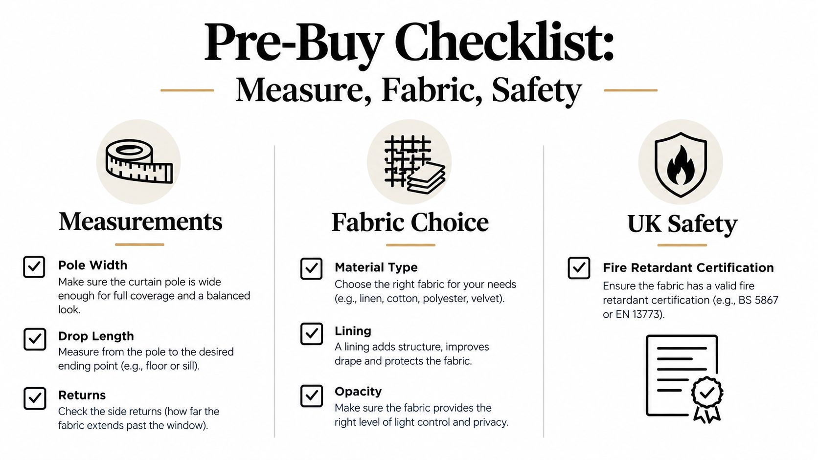
A beautiful stripe can't rescue a curtain measured like a guess. Start at the hardware, not the glass. Measure the full pole or track width, include returns where the fabric travels back towards the wall, and allow enough centre overlap for the panels to close without leaving a bright vertical slit.
Measure the drop from the actual hanging point to the intended finish. Decide whether the curtain will stop at the sill, below the sill or at the floor before ordering. Radiators matter too. A long, heavy curtain hanging directly over a radiator can trap heat in the wrong place, while a short drop beside a cold window can look accidental.
Choose fabric for the job
Light printed cotton gives a relaxed drape but offers limited privacy and little night-time warmth unless it has a lining. Cotton with acrylic thermal lining feels more substantial and keeps the stripe visible while adding structure. Interlined fabric gives the fullest, most luxurious fall, although dense cloth can soften the sharpness of a fine repeat.
Black and white prints reveal uneven lining more readily than softer patterns. Ask for a swatch and check it in daylight, lamplight and against the wall colour. Look at the reverse side too. A curtain that looks crisp from the front but translucent at the seams will make the room feel less finished.
The thermal mechanism depends on the air layer between the fabric and glass, not on the print. UK-relevant research reports energy-savings ranges of 24–38% in one study and 41–62% in another, with the fixing and resulting air gap identified as important factors in insulation performance. The published window-covering study supports the practical conclusion: a well-fitted ordinary striped curtain can outperform a badly fitted “thermal” one.
Check the label, not the sales patter
For UK domestic and contract use, verify the exact made-up curtain specification against BS 5867 Part 2, with Type B as the minimum standard and Type C for higher-risk areas. NHS guidance explains that vertical textile surfaces can allow flames to travel rapidly upwards and across fabric, so check the supplier's documented flame-performance classification rather than assuming a decorative print is safe. NHS fire-safety guidance for curtains and drapes is the sensible starting point for higher-risk settings.
Before spending anything, check:
- Measurements: pole width, track returns, centre overlap and finished drop.
- Fabric: fibre content, weave, opacity, lining and how the repeat matches across panels.
- Installation: stack-back space, radiator clearance and bracket position.
- Safety: the exact BS 5867 type and whether the supplier can provide certification.
Hanging Black and White Striped Curtains So They Actually Look Good
Three small installation choices decide whether the curtains look like a showroom feature or a school play backdrop: pole height, centre overlap and finished drop.
Mount the pole around 10–15 cm above the window frame where the architecture allows it. A higher pole gives the eye more wall before it reaches the pattern, which helps a low ceiling feel taller. Make the brackets wide enough for the curtain to stack beside the window instead of covering half the glass when open.
At the centre, make the panels meet properly and overlap by at least 5 cm. Without that lap, daylight creates a bright vertical stripe through the join. That accidental stripe is rarely charming, especially when the rest of the curtain is carefully aligned.
Get the bottom line right
A 1–2 cm clearance above the floor gives most rooms a crisp, practical finish. A kissing drop works particularly well with bold vertical stripes because the eye can follow one uninterrupted line from pole to hem. Puddling belongs in a dressier room and needs fabric with enough weight to fold attractively. Lightweight cotton gathered in a heap just looks as though it lost a small argument with the hoover.
Sash or eyelet headings tend to flatten the pattern. Pinch pleats create more vertical rhythm and give medium or wide stripes a refined finish. Match the pole diameter to the weight of the fabric. A flimsy 16 mm pole can sag under lined cotton, leaving the centre of the curtain lower than the edges and turning your clean geometry into a tired smile.
The best stripe in the world still looks cheap if the pole sags.
This short visual guide is useful before you drill anything:
Once the curtains are up, hang wall art from the same visual logic. Use proper picture wall hooks for framed prints, then align the main row with a consistent horizontal reference rather than scattering frames wherever a nail happens to land.
The Quiet Bit - How Striped Curtains Actually Keep a Room Warm
The stripes don't insulate your room. The air gap behind the curtain does.
A lined curtain creates a still layer of air between the glass and the room. That layer slows convective heat loss through the window, but it only works properly when the curtain is wide enough to cover the opening, hangs close to the wall and falls beyond the sill or window recess. Gaps at the sides, a short drop or a loose installation let moving air circulate around the fabric.
Lining options vs warmth and drape
| Lining type | Warmth | Drape | Stripe clarity |
|---|---|---|---|
| Unlined printed cotton | Low | Light and relaxed | Very sharp in daylight |
| Cotton with acrylic thermal lining | Medium to high | Fuller and more structured | Clear, with softer folds |
| Interlined curtain | High | Heavy and luxurious | Strong, but less crisp in deep folds |
| Triple-weave blackout | High | Dense and substantial | Strong from the front, bulky at the stack |
The published research cited above reports energy-savings ranges of 24–38% and 41–62% in different studies, but those findings don't promise one universal result for every UK window. Window type, fixing and fit change the outcome. Treat the figures as evidence that setup matters, not as a guarantee printed on a packet.
A thin printed cotton can be perfect for a bright sitting room where the curtain is mostly decorative. For a bedroom that gets cold at night, order black and white striped curtains as lined pairs rather than sheer showpieces. The lining will affect the drape, but fit beats stripe width every time.
Styling Striped Curtains with Music and Football Wall Art
Black and white striped curtains work best when they act as a visual equaliser for the rest of the room. They supply rhythm and contrast, so the prints can bring the personality. Try to make every surface shout and you'll end up with a home that feels like a merch stand after closing time.
The case for music-led wall art is hardly niche. UK recorded-music consumption reached a 20-year high in 2024, equivalent to 201.4 million albums, while consumer spending reached £2,389.8 million. Streaming generated £2,018.4 million and vinyl sales reached £196 million, according to Official Charts' UK music consumption report. Music still belongs on the wall because it still belongs in people's daily lives.
A music room
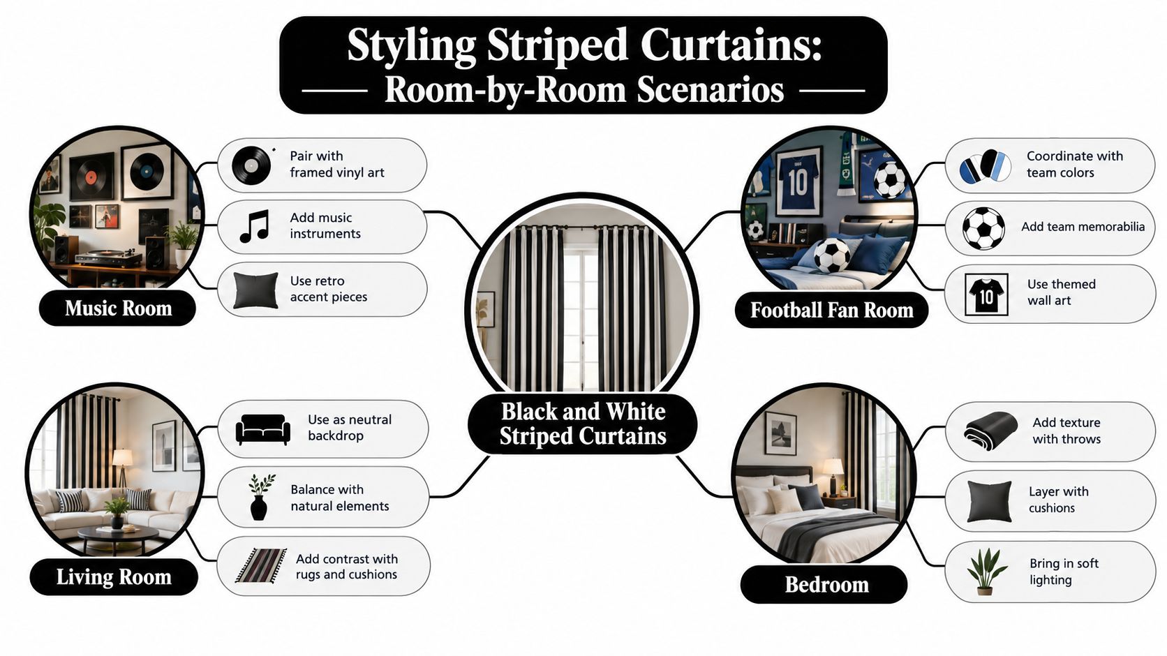
Use thick vertical stripes behind framed black-and-white gig photography. Keep the frames black and let the curtain share the artwork's monochrome palette. The stripes provide movement behind still photographs, while a single accent colour in a lyric print, record sleeve or poster prevents the room from becoming visually flat.
Don't hang a large striped curtain beside a wall packed with tiny frames. The competing repeats will make both elements look fussy. Give the curtain a calmer section of wall, then build the print arrangement around one strong centrepiece.
A football snug
Choose narrow horizontal stripes if the room already contains a shirt, boot or stadium print in a club colour. The curtain can echo the straight lines of a pitch while the single-colour artwork does the actual shouting. Football gives you a powerful shared reference point. Around 48 million people attended men's regulated football matches during the 2025 to 2026 domestic season, including competitions and internationals, as recorded in the UK Government's football attendance data.
A hallway gallery
Run vertical stripes alongside the stairs, then hang a small salon wall of mismatched music and football frames. Keep the frame colour consistent, vary the print sizes and align the overall arrangement rather than every individual edge. A corridor should read as a gallery, not a shop window.
For bedrooms and mixed walls, the SouthShore Fine Linens pattern guide offers useful pattern-pairing principles. Change the scale between curtain and artwork, keep the palette talking and avoid repeating the exact same geometric language everywhere.
Music remains a particularly natural wall-art theme. Ofcom found that six in ten respondents listened to a music station each week, compared with 34% listening to speech-based stations, in its 2024 Audio Report. A separate 2025 to 2026 YouGov Profiles study found that 84% of adults in Great Britain described themselves as music fans and 16% said they were listening to more music than a year earlier, as reported by Music-News.
The mistakes are predictable: clashing stripe directions, equally loud pattern scales and frames hung at random heights. Let the curtain be the rhythm section. Your print should be the lead singer.
Care, Cleaning and Final Curb Appeal
Black and white striped curtains need care because the contrast exposes every lazy decision. Dust on the pole shows up against white fabric, yellowing whites make the entire window look tired, and uneven hems become obvious the moment sunlight hits the floor.
Check the care label before washing. Lightweight washable cotton may cope with a gentle cycle, while lined, interlined or treated curtains may need dry cleaning. Polyester can usually tolerate lower ironing temperatures than cotton, but test an inside hem first. Heat can flatten texture, mark synthetic fibres and leave a glossy patch that catches the light like a bad idea.
Keep the contrast clean
Wash dark and white striped fabric according to the manufacturer's instructions and avoid aggressive chlorine bleach, which can weaken fibres and create uneven whitening. For yellowing white sections, an oxygen cleaner is the safer first choice when the fabric label allows it. Don't soak an unknown fabric and hope for a miracle. Test a hidden area before the whole curtain becomes an experiment.
The lining decides how often the curtain needs a full clean. Vacuum or brush the face gently, especially along the hem and folds, then deal with the lining and heading separately if the care instructions require it. Dust the pole and finials with a soft cloth or a small brush attachment. This takes minutes and stops the hardware looking neglected beside fresh fabric.
If the curtains are too large for your machine or the lining has become grimy, use a professional curtain cleaning service that can identify the fabric and treatment before cleaning it. Sending an interlined curtain into an ordinary wash cycle is how people accidentally create expensive bedroom blinds.
Finally, treat the curtain and wall art as one design decision. Keep the visible drop consistent across matching windows, align the curtain frame and the main music or football print along the same horizontal line, and leave enough quiet wall around the boldest element. That small bit of discipline makes the room feel designed rather than assembled during half-time.
If you want the walls to join in with the same sense of humour, browse Striped Circle for music, football and culture-led prints made to make homes and offices smile. Choose the artwork after you've settled the stripe scale, then build a wall that feels personal rather than showroom-perfect.
