

Dining Room Artwork Prints: A Guide to Walls That Wow (and Don't Bore Your Mates)
Choosing dining room artwork prints is your golden opportunity to inject some proper personality into a space that, let's face it, is usually as exciting as a nil-nil draw on a wet Tuesday night. The secret is to choose pieces that actually mean something to you. It's time to sub off those bland, generic landscapes for art that sparks a debate and shows off your true passions, whether that’s the genius lyrics of The Smiths or a legendary moment from the Theatre of Dreams.
Your Dining Room Walls Are Crying Out for a Decent Signing
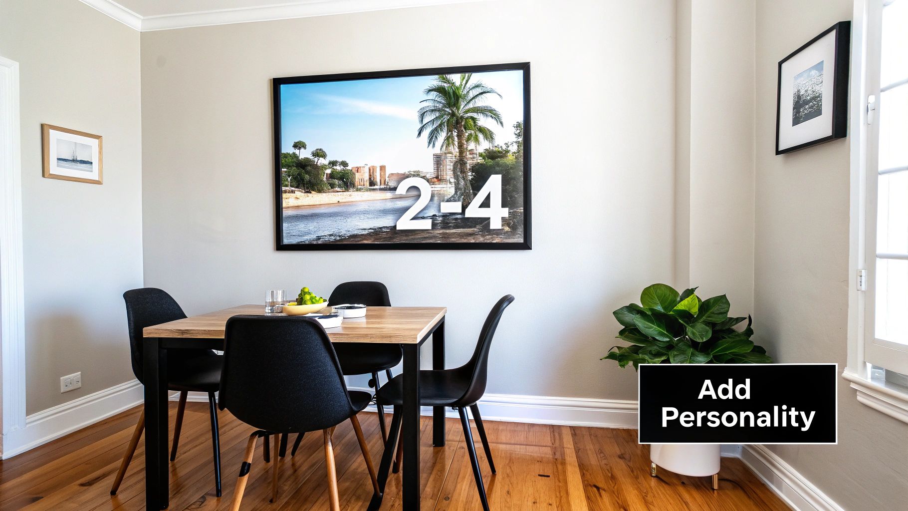
Let's be honest for a second. Most dining room walls are a bit… beige. They’re the forgotten space in the home decor squad, patiently waiting on the sidelines while the living room hogs all the glory. This is where we come in, your allies in the art world, ready to stage a friendly intervention. Like a new manager with a fresh tactical approach.
Forget those stuffy, generic abstract splodges you’d find in a hotel lobby. We’re talking about transforming your dining space into a proper conversation starter—a place that screams "you". Think of this guide as your pre-match pep talk, helping you navigate the transfer market of art and secure a star signing for your wall.
From Blank Canvas to Fan Zone
Your dining room walls are a blank canvas with massive potential. This is the room where you break bread, share stories, and passionately argue over whether Noel or Liam was the real genius in Oasis. So, why should the walls stay silent? They should be shouting about the things you love, and we're here to help you get it spot on.
Our mission is to arm you with the know-how to:
- Avoid rookie errors: We’ll cover everything from figuring out what size print won't look like a postage stamp on a billboard to choosing themes that actually get you buzzing.
- Showcase your passions: Whether you're a die-hard music fanatic or a lifelong football supporter, your walls can celebrate your allegiances with genuine style, not just a tatty scarf pinned up.
- Inject some real soul: Ultimately, it's all about making the room feel like yours.
Your home should tell the story of who you are and be a collection of what you love. Choosing art isn't just about finding something to match the sofa; it's about finding a piece of yourself to hang on the wall. It’s your own personal trophy cabinet.
Creating a Cohesive Vibe
Crafting a top-tier atmosphere isn't just about the art you hang, but how everything in the room works together. While your walls provide a prime canvas, remember that a holistic approach to design considers all the elements. For instance, think about how complementary elegant table linens can enhance your dining room's personality, tying the whole look together seamlessly.
This guide is just the beginning. For more inspiration on transforming your entire home, check out our comprehensive advice on how to decorate your walls. We’ll show you how to nail the execution and make a statement that’s uniquely you, turning that once-forgotten dining room into the true heart of your home.
Step 2: Choosing Themes That Hit the Right Note
Right, let’s talk themes. This isn’t about matching your art to your napkins – that’s a surefire way to create a room with the personality of a post-match press conference. Instead, think about the atmosphere you want to create. Are you aiming for the buzz of a pre-match pint at the local, or the chilled-out vibe of a Sunday morning with your favourite album on the turntable?
Your theme is your statement piece. It’s what tells your guests, "Yes, I have impeccable taste, and yes, that is a subtle nod to The Smiths over the sideboard." It sets the tone for every meal, every conversation, every moment spent in that room.
Music and Football: A Match Made in Heaven
For music lovers, the options are practically endless. Forget generic musical notes or pictures of violins; we can do better than that. Think bigger. Think cooler. How about a subtle print with iconic lyrics from Oasis or the Arctic Monkeys that only true fans will spot immediately? Or you could go bold with a graphic design celebrating a legendary gig you actually went to.
And for the football faithful, this is your chance to show your club pride with a bit of class. Ditch the shiny club shop poster and opt for something more refined, like a stylised illustration of your team's historic stadium or a retro print of a classic kit. It’s all about celebrating the beautiful game without making your dining room look like a teenager’s bedroom.
The best dining rooms are a reflection of everything you love. Combining a print of your favourite band with a tribute to your football club isn't chaotic; it's a visual autobiography. It’s the story of your life's soundtrack and your sporting highs and lows, all playing out on your walls.
Finding Your Dining Room's Signature Style
Mixing your passions is where the real magic happens. A gallery wall that features both a Joy Division lyric print and a minimalist design of Old Trafford tells a compelling story. It creates a space that is uniquely, unapologetically yours—a place that sparks genuine conversation over dinner. The key is to find a common visual thread, perhaps a consistent colour palette or matching frames, to tie it all together beautifully.
This table should give you a few ideas for pairing a vibe with our prints.
| Desired Vibe | Striped Circle Print Ideas | Why It Works |
|---|---|---|
| Cool & Contemporary | A minimalist stadium print or a bold, typography-based lyric print. | Clean lines and monochrome palettes create a modern, sophisticated feel that’s effortlessly stylish. Less is more, innit? |
| Retro & Nostalgic | A classic football kit design or a print celebrating a vintage album cover. | Taps into a sense of history and nostalgia, adding warmth and character. It’s a proper conversation starter about the good old days. |
| Energetic & Bold | A vibrant anthem print or a colourful depiction of a legendary goal. | Bright colours and dynamic designs inject energy and life into the room, perfect for lively dinner parties. It's got 'top bins' energy. |
| Subtle & Sophisticated | An understated music lyric quote or an architectural sketch of a beloved ground. | It’s a nod to your passions without shouting about it. This approach feels personal, curated, and refined. The thinking fan's choice. |
Ultimately, choosing your theme is about finding what resonates with you.
This personal approach to home decor has become massively popular. Since 2020, there's been a huge surge in people getting creative at home, driving a 40% annual growth in the dining furniture and decor market. People are looking for ways to switch off and make their spaces more personal. This is exactly where handcrafted-feel music and football prints come in. If you're interested, you can check out the full research on UK arts and crafts trends to see just how much we've all embraced making our homes our own.
Creating this vibe isn't just a fleeting trend; it's about making your house feel more like a home. It's about surrounding yourself with things that make you smile, every single day.
Mastering the Art of the Hang
Alright, your prints have arrived. You’ve scouted the talent and signed your star players, but the job's not done yet. Now for the tactical masterclass: hanging them. Get this wrong, and your dining room's vibe is facing relegation. Get it right, and you’re lifting the trophy.
You’ve got two classic formations to choose from here. You can either go for a single, heroic statement piece or an eclectic, personality-packed gallery wall. Both can be champions, but they demand different strategies. It's like deciding between a lone target man up front or a fluid, attacking midfield – each has its own unique strengths.
The Lone Striker vs. The Five-a-Side Team
A single statement print is your Didier Drogba – a powerful, undeniable presence that just dominates the space. It’s bold, it’s confident, and it pulls all the attention. This approach works brilliantly with a large-scale piece, like a stylised print of your team’s stadium or a massive, moody lyric from a Stone Roses classic. The secret is to give it the breathing room it deserves to truly command the wall.
On the other hand, a gallery wall is the art world's equivalent of a perfect five-a-side team. It’s a carefully curated collection of smaller, individual talents that work together to create something unstoppable. This is your chance to mix a print of your favourite album cover with a retro kit design, weaving a visual story that’s uniquely yours. For a deeper dive into arranging your own dream team of prints, you should definitely check out our guide on how to arrange wall art.
The process of finding the right art for your space can be broken down into a few key stages.
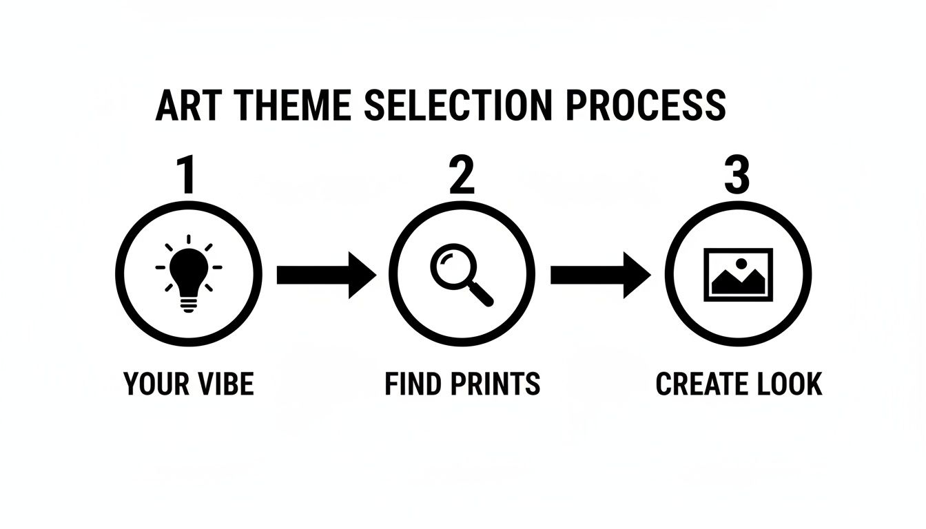
As you can see, figuring out your vibe, sourcing the prints, and creating the final look are all part of one fluid process.
The No-Nonsense Hanging Cheatsheet
Let’s be honest, the fear of turning your wall into something resembling a block of Swiss cheese is very real. But I’ve got a game-changing pro tip that will save both your sanity and your plaster.
- Paper Cut-outs Are Your Best Mate: Before you even think about picking up a hammer, trace each of your frames onto paper. Cut them out, and use a bit of blu-tack to arrange them on the wall. You can move them around endlessly until the layout feels absolutely perfect, all without committing to a single nail.
- Spacing is Key: When creating a gallery wall, aim for a consistent gap of about 2-3 inches between each frame. This simple rule keeps the collection looking cohesive and professional, rather than like a chaotic jumble.
Don’t just eyeball it. The paper cut-out method is the VAR of interior design. It lets you review the decision before making the final call, guaranteeing a flawless result every time.
The good news is, you’re not alone in this. The UK art market has become the world's second-largest, now accounting for 18% of global sales. This boom is largely fuelled by online platforms making it easier than ever to get your hands on affordable prints of alternative lyrics or club legends, truly democratising art for every dining room.
Once you have your prints and a plan, the final step is getting them on the wall perfectly. For a brilliant walkthrough, have a look at a step-by-step guide to hanging your picture with precision.
Getting the Scale and Placement Spot On
Alright, let’s get down to the nitty-gritty. Nothing kills the vibe faster than a brilliant print that’s hung so badly it looks like a mistake.
A tiny A4 frame floating on a massive wall is the interior design equivalent of your team’s star striker shanking a penalty. It’s just painful to see. Likewise, hanging a piece so high that your guests need binoculars to admire it is a rookie error we can easily avoid.
This is all about the details that separate a well-put-together room from a "that'll do" job. Nailing the scale and placement is the secret sauce that makes your new dining room artwork prints look like they were always meant to be there.
The Golden Rule of Eye Level
Before you reach for the spirit level, let's talk about the single most important rule in the art-hanging game: the 'eye-level' rule. The centre of your artwork should hang roughly at eye level, which for most people is about 57-60 inches (145-152 cm) from the floor.
Why? It’s simply the most natural and comfortable viewing height. It means your art is engaging with people in the room, not looming over their heads or cowering by the skirting boards.
You wouldn't put the telly on the ceiling to watch the match, would you? The same logic applies to your art. Hang it where it can be seen and appreciated without causing a neck injury.
Following this simple guideline ensures your print is perfectly positioned to draw people in, whether it’s a stunning graphic of Anfield or a classic lyric from The Jam.
Sizing Up Your Space
Choosing the right size print is just as crucial as where you hang it. For a piece that’s going above furniture, like a sideboard or console table, a good rule of thumb is to aim for artwork that is about two-thirds the width of the furniture it sits above. This simple ratio creates a fantastic sense of balance, making the furniture and art look like a cohesive unit.
- For that big, empty feature wall: Don't be timid. Go big or go home. A single, large statement piece will have far more impact than a smattering of smaller ones. Be bold and let that print own the space.
- For those awkward spots: We all have them—that weird corner or the small bit of wall between a door and a window. Don’t neglect these areas! A slim, vertical print can work wonders here, turning a forgotten nook into an intentional design feature.
The goal is to make your dining room artwork look like it belongs. It shouldn't compete with your furniture but complement it, like a perfectly weighted through ball to your star forward. By thinking about placement and sizing first, you’ll ensure your new prints look less like a random afterthought and more like a tactical masterstroke. Your walls will thank you for it.
Frames, Lighting, and Finishing Touches
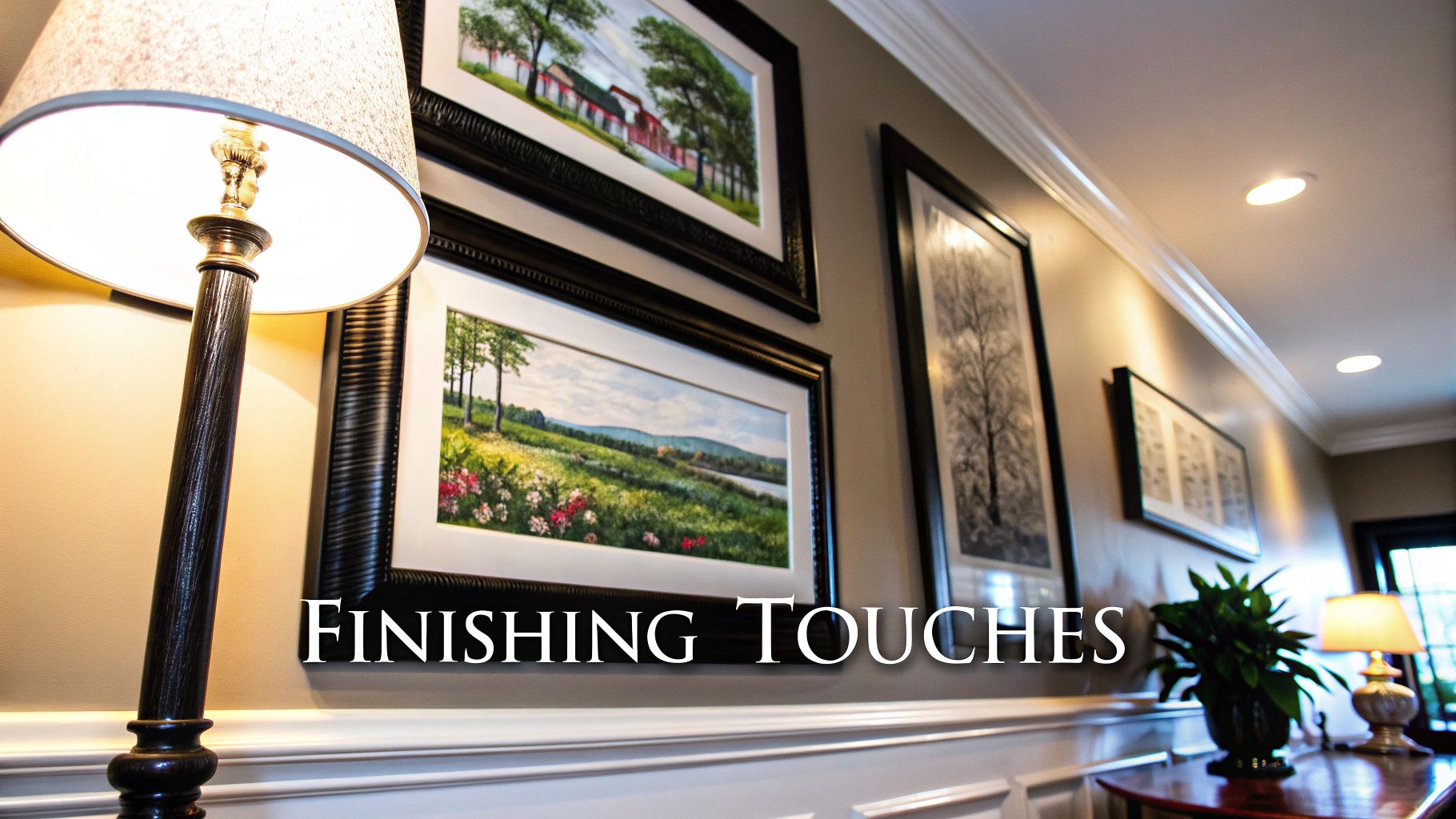
Alright, you’ve picked your prints and you’ve managed to hang them without turning your wall into a dartboard. Top job. But we’re not quite finished. Now comes the final 10% that makes 90% of the difference—it's the equivalent of finding the perfect pair of trainers to go with a new jacket. It's time to talk frames and lighting.
Choosing the right frame is almost as important as choosing the print itself. It’s the difference between a superstar signing and a panic buy on deadline day. A sleek, thin black frame often lets the artwork do the talking, especially for a minimalist football stadium print or a bold lyric design. Think of it as the dependable centre-back of the framing world—solid, reliable, and never lets you down.
On the other hand, a natural oak frame can add a bit of warmth, which is perfect for prints with a retro feel, like a classic Oasis album-inspired piece. Don't be afraid of a splash of colour, either. A bold frame can pick out a key colour in the print, tying the whole thing together beautifully. For a bit more guidance, you can get the full rundown from our experts on how to frame posters and make them look class.
Let There Be (The Right) Light
Once framed, don't let your masterpiece languish in the shadows like a forgotten B-side. You’ve invested in awesome art, so it deserves its moment in the spotlight. Lighting is that final, crucial touch that can make your dining room artwork prints truly pop.
You don't need a stadium's worth of floodlights. Often, it's about making clever use of what you already have.
- Existing Lamps: Can you angle that floor lamp to wash the wall in a warm glow?
- Picture Lights: A dedicated picture light is a real game-changer. It’s a direct, focused beam that makes any print look like it belongs in a gallery.
- Natural Light: Position your art to catch the daylight, but be mindful to avoid direct, harsh sunlight which can cause fading over time.
Think of lighting as the final mix on a classic album. It sharpens the details, boosts the colours, and makes the whole thing sound (or in this case, look) absolutely brilliant.
This attention to detail is part of a bigger picture. The UK home decor market is set to hit a massive USD 31.89 billion by 2030, driven by more and more of us wanting to make our homes feel personal. Post-lockdown, affordable upgrades like wall art have soared, with 40% of UK consumers now wanting decor that reflects their passions, like music and football.
These finishing touches are what elevate your dining room from ‘nicely decorated’ to ‘wow, who’s your interior designer?’.
Got Questions? We've Got Answers
Right, let's tackle some of the common head-scratchers that pop up when you're choosing art for your dining room. We've heard just about everything, so we've pulled together the queries that come up time and time again from music and football fans just like you.
How Do I Protect My Artwork Prints from Kitchen Grease and Food Splashes?
A cracking question, and a very real danger! The best line of defence is a quality frame with a glass or acrylic front. Think of it as a physical barrier against rogue splashes of bolognese or festive gravy mishaps—it's like having a world-class keeper between the sticks.
When you're deciding on placement, try to avoid hanging your prized prints directly in the line of fire. If your dining area is part of an open-plan space, maybe don't hang that beautiful Oasis print directly opposite the kitchen entrance.
A quick cleaning tip: always spray cleaner onto a cloth first, not directly onto the frame. This stops any liquid from seeping behind the glass. Our dining room artwork prints are on high-quality paper, but giving them a framed home is the best way to keep them looking top-notch for years of post-dinner analysis of the match.
Can I Mix Different Styles Like a Band Print and a Football Print in the Same Gallery Wall?
Absolutely! In fact, we wholeheartedly encourage it. Your walls should reflect all the brilliant, and sometimes contradictory, sides of your personality. The trick to making it work without looking like a jumble sale is to find a common thread that ties everything together.
Think of it like picking a team—you need balance. Here’s how you get it:
- A unifying colour palette: Maybe all the prints feature a splash of your team's colours, subtly linking a Courteeners lyric print to a stylised Old Trafford one.
- Consistent frame style: Using the same style of frame—all black, for instance—creates a clean, cohesive look, no matter what’s inside them.
- A thematic link: You could group a print of your favourite Liverpool band next to one of Anfield, creating a proper Scouse corner that tells a story.
Mixing themes is what stops a gallery wall from looking like a generic hotel lobby and makes it uniquely yours. It’s your personal Hall of Fame, so don’t be afraid to put your heroes side-by-side.
What's the Biggest Mistake People Make with Dining Room Artwork?
Hands down, the most common fumble is getting the scale completely wrong. People are often far too timid, choosing art that's way too small for the wall. The result is a print that looks lost and insignificant, like a lone fan in the away end. A single, small A4 print floating on a large empty wall almost always looks like an accident.
Our advice? Always go bigger than you initially think you need. A large statement piece has infinitely more impact and shows confidence. If you're working with a budget, remember that a gallery wall of smaller prints grouped closely together can create the illusion of one large, impressive piece. So, be bold, measure up properly, and don’t be afraid to make a statement!
Is It Okay to Hang Art in a Dining Room That Doesn't Get Much Natural Light?
Definitely. A darker room isn't a problem; it's an opportunity to get creative with your lighting. This is where strategic artificial light becomes your best mate, ready to put in a man-of-the-match performance.
A single, well-placed picture light mounted above a key print can create a dramatic, gallery-like effect that looks incredibly sharp. Alternatively, a stylish floor lamp angled towards your gallery wall can wash it in a warm, inviting glow, perfect for setting the mood during dinner.
As for the prints themselves, think about choosing artwork with a lighter background or vibrant colours to help brighten the space. It's best to avoid very dark or moody prints that might just get lost in the shadows. With the right lighting, even the darkest dining corner can become a stunning focal point that shows off your impeccable taste.
Ready to turn your dining room from bland to brilliant? Explore the full collection of music and football prints at Striped Circle and find the perfect pieces to tell your story. https://www.stripedcircle.com
