

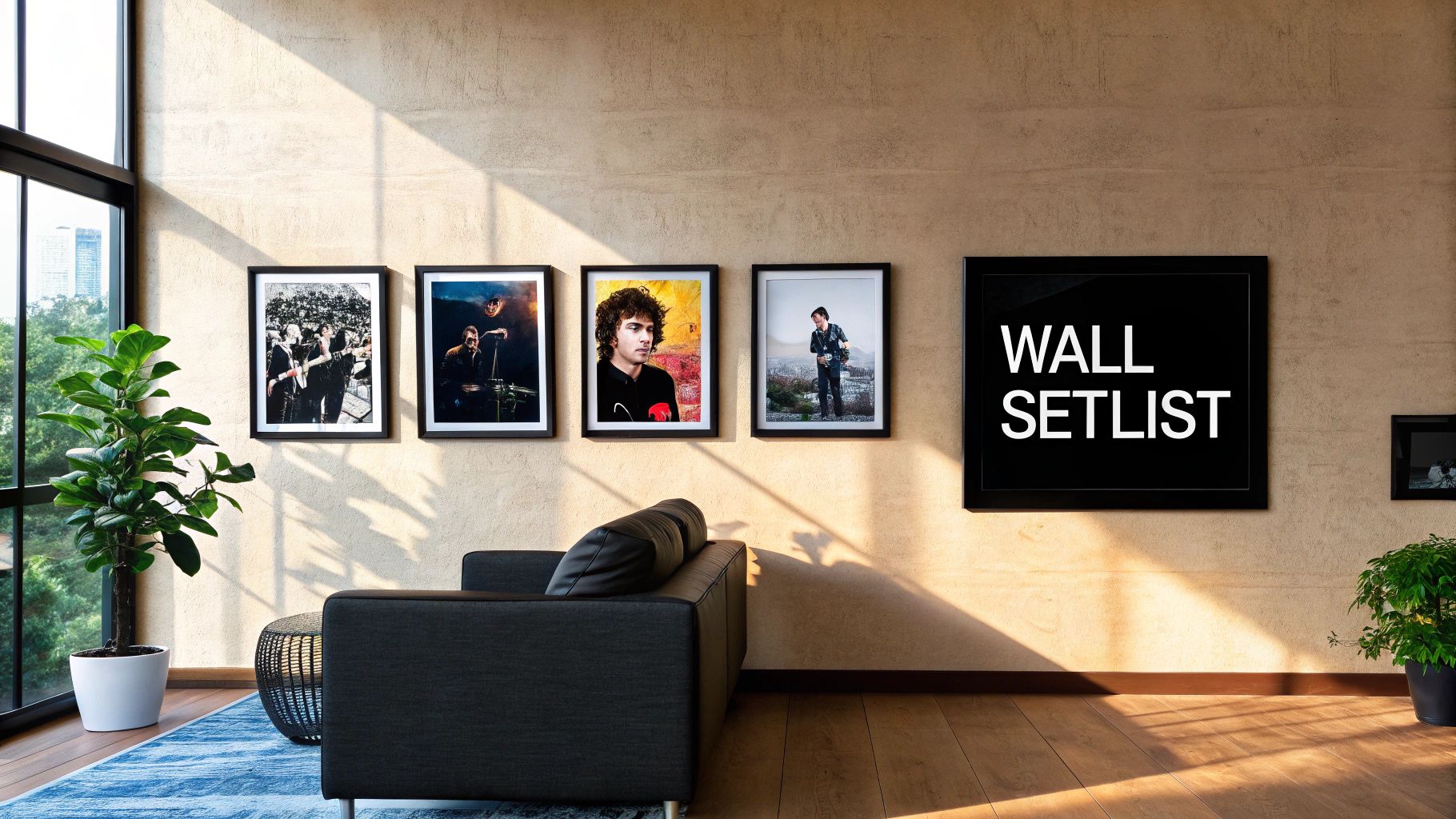
Frames Design On Wall From Blank Space To Masterpiece
A great gallery wall is your chance to turn a blank space into a personal hall of fame. It's a tribute to the tunes that defined your youth and the teams that gave you glorious highs and soul-crushing lows. You're not just hanging pictures; you're creating a visual story that’ll make your mates jealous and put a smile on your face every time you see it.
Your Wall's New Setlist
Let's be honest, a blank wall is a massive missed opportunity. It's like having a festival ticket but deciding to stay home and watch the highlights later. It’s a silent, boring space just begging for some personality. This is where you get to play curator, manager, and head roadie all in one, transforming that empty expanse into the main stage for your favourite memories and passions.
Think of it as your own personal gallery, a shrine to the things that truly matter to you. We're talking about more than just decoration here; this is about surrounding yourself with the visual soundtrack of your life. It’s the ultimate way to make your home or office feel authentically yours.
Setting The Stage For Your Masterpiece
Before you even think about layouts or hammering a single nail, it's worth taking a moment to figure out the overall vibe you're aiming for. Are you a minimalist who prefers a clean, organised look, or are you more of a glorious maximalist, ready to fill every inch with stories? If you're not sure where to start, getting a clearer idea is the first step. You can begin by finding your home decor style.
Getting a handle on your personal style ensures your wall tells a coherent story, rather than looking like a jumble sale of random pictures. A little bit of prep work here goes a long way.
The Goal: Create a space that not only looks brilliant but also feels like a genuine extension of your personality. Your walls should be a conversation starter, not just a backdrop.
Consider this guide your warm-up act. We'll cut through the noise and give you a solid game plan for designing your gallery wall. We’ll cover everything from choosing the right prints—from that iconic Oasis lyric to your club’s crest—to getting the layout just right. Let's turn that blank canvas into something special.
The Pre-Match Tactics For Planning Your Gallery Wall
Right, before you go hammering nails into the wall like a roadie setting up for a stadium gig, let's talk tactics. A brilliant gallery wall isn’t just thrown together; it’s planned with the precision of a legendary manager’s formation. This section is your tactical briefing, the pre-match huddle where we sort out the game plan.
Putting cool prints on your walls is more than just filling a gap—it’s a massive trend. In fact, the UK wall art market, which includes framed designs on walls like ours, hit a staggering £2.8 billion in revenue back in 2022. It just goes to show how much we Brits love making our homes unique, especially with prints celebrating our favourite bands and beloved football clubs.
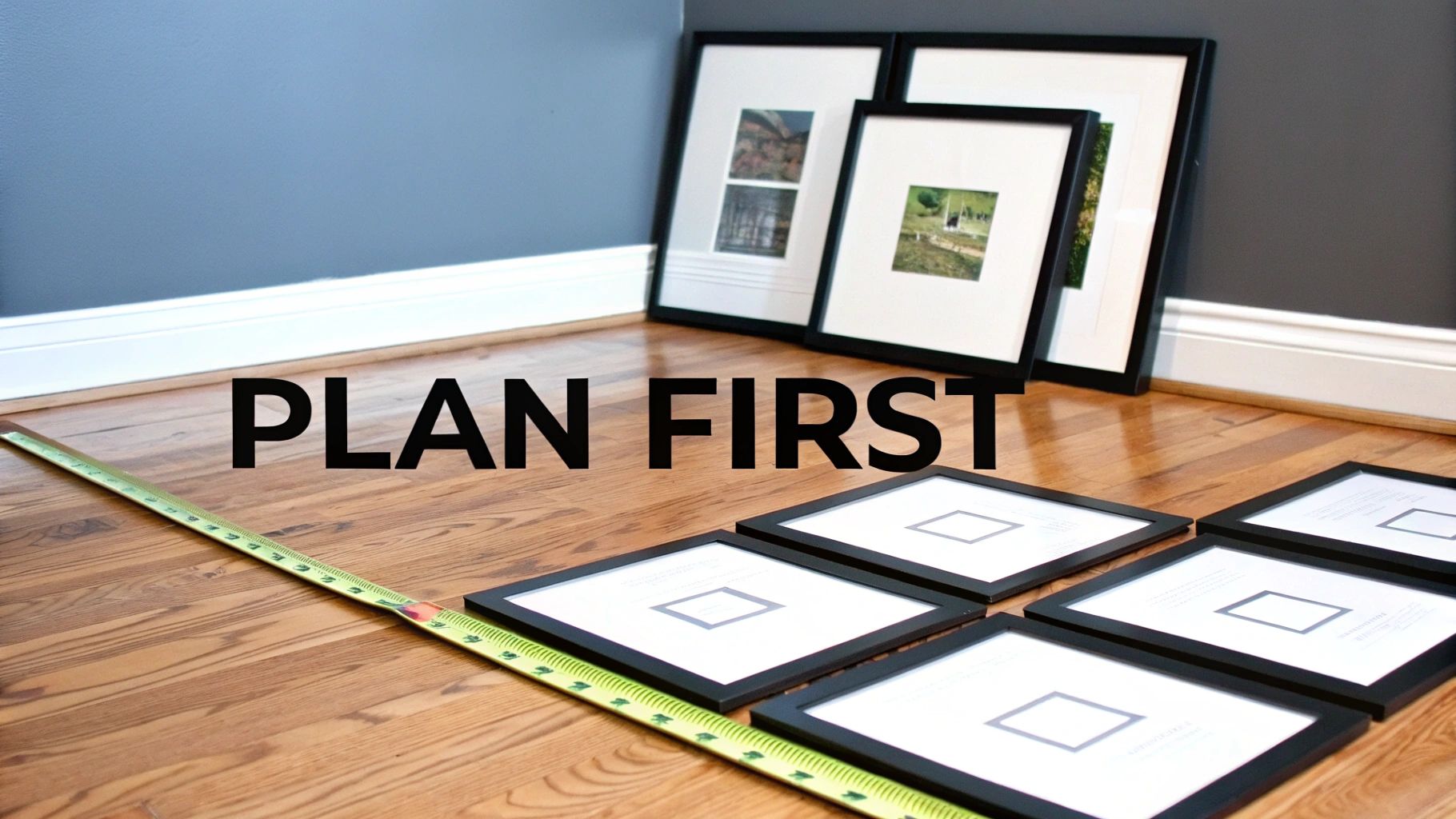
Measure Twice, Hammer Once
First things first, get your tape measure out. You need to work out the total area you want your gallery wall to fill. A good frame design on a wall starts with knowing your pitch. Are you dedicating a small section above the sofa, or going for a full-blown feature wall that screams "Wonderwall" at everyone who walks in?
Once you have your dimensions, I recommend taping off a corresponding rectangle on your floor. This creates a no-risk practice area where you can experiment with your layout without turning your actual wall into something resembling a practice dartboard.
The Paper Template Trick
This is the oldest trick in the book for a reason—it works flawlessly. Get some old newspapers, wrapping paper, or any scrap paper you have lying around and cut out templates for each of your frames. Just trace each frame and cut it to size.
Now you can start arranging these paper cutouts within your taped-off area on the floor.
- Move things around: See how that massive Stone Roses poster looks next to a smaller, more subtle lyric print.
- Mix up sizes: Play with the balance between your large statement pieces and the smaller supporting acts.
- Check the flow: Does the arrangement guide your eye naturally across the collection, or does it feel like a chaotic mess?
This simple step saves you a world of pain, filler, and potential domestic disputes. When you're happy with your floor layout, take a quick photo on your phone for reference.
Pro Tip: Don’t be afraid to mix and match frame styles and colours. A bit of variety adds character. A sleek black frame next to a natural wood one can create a brilliant dynamic, as long as the prints inside share a common theme or colour palette. If you need help figuring out sizes, check out our guide on what size poster frame you need.
Getting these pre-match tactics right is the difference between a title-winning display and a relegation battle. Plan it out properly, and the actual hanging part will be a walk in the park.
Picking Your Formation: Gallery Wall Layouts
Right, let's get into the fun part: deciding on a layout. This is where you move from just having a bunch of cool prints to creating a genuinely impressive feature wall. The layout you choose, or your ‘formation’, is what gives your gallery wall its personality and impact.
Think of it like setting up your team before a big match. Are you going for a rigid, organised 4-4-2, or something more fluid and creative? The same logic applies here. This isn’t about following stuffy art gallery rules; it’s about picking a setup that makes your Pulp and Premier League prints look legendary.
The Grid: The Minimalist 4-4-2
If you appreciate order and precision, the grid layout is your tactical masterclass. It’s clean, it’s organised, and every single piece has its place. This formation is absolutely perfect if you've got a series of prints that are all the same size and orientation—think a collection of your favourite album covers or a tribute to every football kit your team has worn.
It’s the defensive midfielder of wall design: reliable, structured, and quietly brilliant. To pull this off, you can't just eyeball it. Precision is everything.
- Uniformity is non-negotiable: Every frame must be the same size and orientation (all portrait or all landscape). No exceptions.
- Spacing is critical: The gap between each frame has to be identical, both horizontally and vertically. A spirit level and a tape measure are your best friends for this job. I find that 5-8cm is usually the sweet spot for spacing.
The end result is a powerful, unified statement. It's less of a chaotic mosh pit and more of a perfectly synchronised headline act.
Salon Style: The Energetic Free Role
Now we're talking. If the grid is your disciplined back four, the Salon Style is your maverick number 10, given a free role to create a bit of beautiful chaos. This is the layout for the maximalists, the collectors, and anyone whose ticket stubs, gig posters, and cherished photos are currently spilling out of a shoebox.
It’s an organised riot of different sizes, shapes, and frame styles. You’re essentially creating a visual timeline of your life’s greatest hits, all playing at once. Imagine a wall dedicated to your football club's greatest moments: a huge print of that last-minute winner, surrounded by smaller framed tickets, programmes, and photos from the day. That’s the Salon Style spirit.
You’re essentially creating a personal museum. It’s a bit more work to get the balance right, but the payoff is a wall that’s bursting with personality and stories. My advice? Start with your largest, most important piece as the anchor and build outwards from there.
This approach has become a huge part of UK home decor. In fact, the wall art sector is set for a 6.3% growth spurt from 2025 to 2035, which just shows how much we Brits love personalising our spaces. It’s a trend that sees people turning to independent brands like ours for unique prints that tell their story. You can find more insights on the booming wall art market on futuremarketinsights.com.
The Linear Hang: The Timeline Tour
Simple, effective, and effortlessly cool. The linear hang is like a classic album tracklist—a straight-up chronological journey from start to finish. All you're doing is hanging a single, straight line of frames, either horizontally or vertically.
It’s an ideal way to create a visual timeline without overwhelming a room. Picture a row of frames above your sofa showcasing the evolution of your favourite band's album art, from their raw debut to their polished final record. Or, what about a vertical line of prints in a narrow hallway, each one representing a different iconic music festival you’ve attended?
This is a clean and impactful way to tell a story. Just pick your anchor point, get that line perfectly straight, and let the prints do the talking.
The Final Whistle: Hanging And Levelling Like A Pro
Right, this is it. The moment of truth. The ninety-third minute, and you're stepping up to take the penalty. All that planning, measuring, and arranging on the floor has led to this point. It’s time to get your prints on the wall without it ending in tears, polyfilla, and a domestic over who was holding the spirit level straight.
This is your practical, no-nonsense guide to getting it done right. The absolute non-negotiable tool here is a spirit level. Don't even think about trying to eyeball it unless you’re going for that "just survived an earthquake" look. And for those of you renting or just terrified of commitment, adhesive strips are your best mate. No holes, no mess, no awkward conversations with the landlord.
Getting The Vitals Right
The biggest secret to a professional-looking gallery wall is getting the height just so. The art world has a golden rule: the centre of your artwork (or the entire arrangement as a whole) should hang at eye level. For most people, that’s about 145cm (or 57 inches) from the floor.
Get this measurement spot on, and your wall will instantly look more curated. It’s a small detail that makes a massive difference, separating a thoughtful display from a random collection.
Next up is the spacing between your frames. You want them to feel like a cohesive group, not a bunch of strangers awkwardly avoiding each other at a party. A gap of 5-8cm (2-3 inches) between each frame is the sweet spot. This gives each print enough breathing room while keeping the collection looking tight-knit, like a well-drilled back four.
This illustration breaks down some popular layout flows to keep in mind as you finalise your arrangement on the wall.
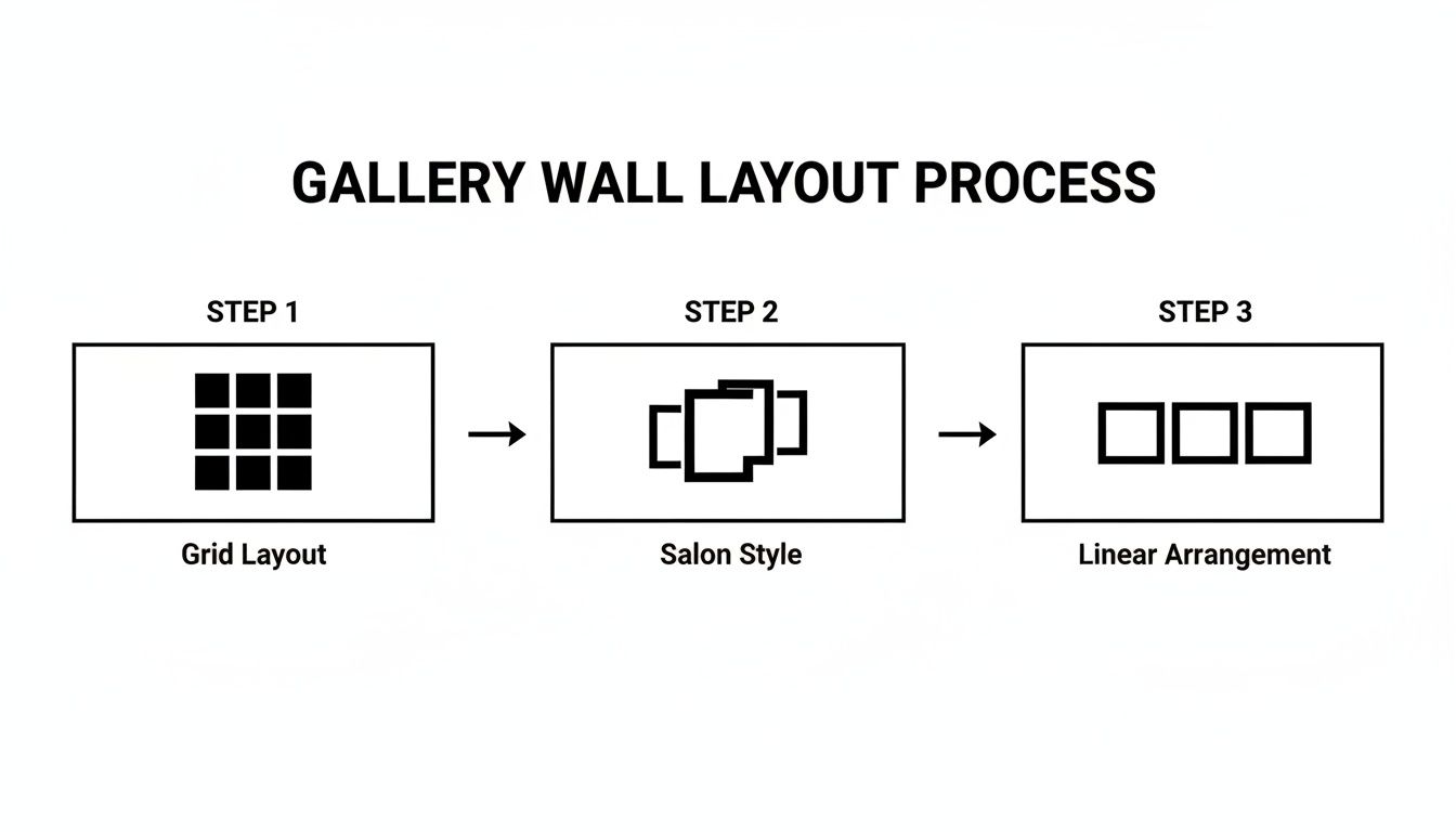
Whether you’ve settled on a rigid Grid or a more free-flowing Salon style, having a clear visual plan makes the final hanging stage go so much more smoothly.
Pro-Level Life Hacks
Over the years, I’ve picked up a few tricks that save a world of hassle. Want to mark your nail spots without covering your wall in pencil? Put a tiny dab of toothpaste on the hook on the back of the frame. Press it gently against the wall, and voilà—a perfect, easily wipeable marker. Genius, right?
Top Tip: For heavier frames, especially that massive Oasis poster you cherish, use two hooks instead of one. Spacing them a few inches apart stops the frame from tilting every time a door slams or your neighbour’s bassline kicks in.
For a really detailed look at the practical side of things, check out this fantastic step-by-step guide to hanging your picture with precision. And if you're still on the fence about the best hardware for the job, you might find our deep dive on how to hang a picture so it doesn't end up on the floor helpful. Now, grab those tools and let's get this masterpiece on the wall.
Avoiding The Own Goals In Wall Design
We’ve all seen them: gallery walls that just feel… off. It’s the home decor equivalent of a terrible cover song or a last-minute defensive blunder that costs you the title. These are the own goals of interior design, and with a bit of savvy, they are completely avoidable.
Think of this section as advice from a brutally honest mate who’s here to make sure your wall gets a standing ovation, not just polite, awkward applause. Let’s run through the most common slip-ups so you can swerve them with the grace of a prime Zidane.
The High Hanger Crime
This is, without a doubt, the number one foul in the book. It’s a classic rookie error to hang your art so high it’s practically flirting with the ceiling. It throws the whole room off balance, like a band with a drummer who’s completely out of time.
Remember the golden rule we covered earlier: the centre of your main piece or entire arrangement should be at eye level, which is roughly 145cm from the floor. Sticking to this prevents your guests from getting neck strain and makes your collection feel grounded and intentional.
The Clashing Kit Catastrophe
You wouldn't wear a Man United top with Liverpool shorts, would you? The same logic applies to your frames and prints. When a frame clashes with the artwork inside, it can kill the vibe instantly.
For instance, a sleek, modern black frame might not be the best home for a vintage-style, sepia-toned concert poster. The frame should be the supportive roadie, not the lead singer trying to steal the show. For a deeper dive into this, our guide on how to frame posters can help you find the perfect match.
Key Takeaway: The goal is harmony. Your frame should complement your print, making it pop off the wall. If the frame is the first and only thing people notice, you might have scored for the other team.
Poor Spacing and Lighting Blunders
Another common own goal is getting the spacing all wrong. Too cluttered and your wall looks like a messy scrapbook; too sparse and it feels disjointed and lost. That consistent 5-8cm gap between frames is your best tactical instruction.
Finally, don’t let bad lighting relegate your masterpiece to the shadows. A poorly placed lamp can cast a weird glare or leave your favourite Joy Division print in perpetual darkness. Make sure your lighting illuminates the art without creating a reflective mess.
Getting the details right is what separates a good design from a great one. The market for framed designs on walls is booming in the UK, with projections showing massive growth in the coming years. This surge highlights how much we value getting our homes just right. To see the numbers behind this trend, you can discover more insights about the European wall decor market on technavio.com.
Your Top Questions Answered
Alright, you’ve got your game plan sorted, the prints are ready, and you’re itching to get started. But maybe there are a few lingering questions bouncing around your head, like a classic indie bassline you can't quite place. No worries. I’ve gathered the most common queries I hear about creating the perfect gallery wall to clear up any final doubts.
Consider this your final pre-match pep talk. Here are the quick-fire answers you need to nail your gallery wall design and create something truly special.
Can I Mix Different Frame Styles And Colours?
Absolutely! In fact, you definitely should. Mixing up frame styles and colours is what gives a gallery wall its unique character and stops it from looking like a bland catalogue photo. It adds texture and personality, turning your wall into a proper conversation starter.
The trick is to find a common thread that ties everything together. A few ideas from experience:
- Go for all wooden frames but in a variety of different finishes, from dark oak to light pine.
- Stick to one colour, like black, but play around with different frame thicknesses, profiles, and textures.
- Pick two or three complementary colours (like black, white, and a metallic gold) and distribute them evenly across the arrangement.
This approach creates a look that’s eclectic but still feels curated and intentional, not just a random jumble you threw at the wall.
How Do I Arrange A Gallery Wall Around A TV?
Ah, the dreaded black box. It can be a real passion killer in an otherwise stylish room. My advice? Don't fight it—make it part of the team. Treat your TV as the largest, boldest "art piece" in your collection and build your gallery wall around it.
Think of the TV as your anchor point, your lead singer. Arrange your smaller frames around it, making sure to leave a consistent gap of about 5-10cm between the edge of the TV and the nearest frames. That little bit of breathing room is crucial; it stops the area from feeling cluttered and distracting when you're trying to watch the match. Symmetrical or grid-based layouts often work best here, as they bring a sense of order to the whole setup.
What's The Best Way To Hang Frames Without Damaging Walls?
If you're renting or just get the fear at the thought of drilling holes, adhesive strips are your best mate. Brands like Command Strips are brilliant for this. Just make absolutely sure you check the weight limit on the packet—don’t try hanging a massive, heavy frame with a strip designed for a tea towel.
For a flawless result, always clean the wall surface with a bit of rubbing alcohol first to get rid of any dust or grease. This simple step makes a huge difference in how well the strips stick. For anything genuinely heavy, though, it’s worth considering proper picture hooks. They usually only leave a tiny pinhole that's a doddle to fill later.
Ready to turn that blank wall into your personal hall of fame? Find the perfect music and football prints to tell your story at Striped Circle. https://www.stripedcircle.com
