

Hallway Wall Art Ideas That'll Actually Make You Smile
Your hallway is the perfect place to make a statement. Forget boring beige walls; think of it as a gallery dedicated to your passions, whether that’s Oasis B-sides, your football club's finest hour, or a witty quote that nails your personality. Your hallway is the opening act for your home, so let's make it a memorable one.
Your Hallway Isn't a Corridor; It's a Canvas
Let’s be honest, most hallways are criminally neglected. They’re the M6 Toll of home design—functional, but utterly devoid of joy. We rush through them, desperately trying not to trip over a stray trainer or a forgotten Amazon parcel. It's a place for keys, post, and maybe a sad-looking plant.
But it doesn't have to be this way.
That narrow strip of wall is prime real estate. It's the first thing guests see and the last thing you see before you head out to conquer the world (or, you know, pop to Tesco). Seeing it as a blank canvas is the first step in turning it from a simple thoroughfare into a real personal statement.
Make a First Impression That Lasts
Think of your hallway as the album cover for your home—it should hint at the brilliance inside. Does your living room pay homage to nineties Britpop? Let your hallway kick things off with an iconic lyric print. Is your office a shrine to your favourite football team? Start the stadium tour right at the front door.
This space isn't just about getting from A to B; it's an opportunity to inject personality, humour, and style where it's least expected. A well-curated hallway can make your entire home feel more considered and uniquely 'you'.
Setting the Stage for Your Style
Before you grab the hammer, take a moment to think about the story you want to tell. This is where you can start gathering brilliant ideas for hallway wall art that really reflect who you are. The goal is to create a display that makes you and others smile, turning a forgotten space into a talking point.
To get the ball rolling, you might find some useful starting points in your guide to choosing decorative wall art. It covers the basics before we dive into the specifics of curating a collection that’s less ‘generic hotel art’ and more ‘legendary headline act’.
Prepare to make your postman linger just a little bit longer, admiring your impeccable taste.
Planning Your Gallery Wall Like a Pro
Right, let's talk tactics. Before you even think about hammering nails into the wall, we need a game plan. Measuring up might sound a bit dull, but trust me, it’s the secret to a finish that looks less like a random jumble sale and more like a curated masterpiece.
This is the part that ensures your art looks deliberate and brilliant. It all starts with really understanding the space you're working with.
Measure Twice, Hang Once
First thing's first: grab a tape measure. Get the exact height and width of the wall space you plan to fill. This isn’t just about the total area; it's about seeing the pitch you're playing on. A long, narrow hallway presents a completely different challenge to a short, wide one.
Once you have your dimensions, a great trick is to map out the space on your floor using masking tape. This creates a real-world template where you can play around with your prints without turning your actual wall into Swiss cheese.
Top Tip: The golden rule is to hang the centre of your main piece (or the middle of the entire gallery) at eye level, which is roughly 57 inches (or 145 cm) from the floor. But hey, rules are made to be broken. If your ceilings are on the lower side, you might want to hang your art a bit lower to create an illusion of height.
Paper Templates Are Your Best Mates
This is probably the single best piece of advice you'll get for planning a gallery wall. Trace each of your frames onto paper—wrapping paper, newspaper, anything will do—and cut them out. It’s a good idea to label them so you know which is which: 'Oasis Lyrics', 'Anfield Main Stand', you get the idea.
Next, use a bit of Blu-Tack to stick these paper templates onto your wall. This lets you move them around, swap them out, and live with the layout for a day or two. You can check the sightlines from different rooms and see how the arrangement feels. It’s a completely commitment-free way to find the perfect formation.
It's no secret the UK has a passion for sprucing up our homes. The home decor market here was valued at a massive £20.2 billion in 2024 and it's still growing. While many people still like to see art in person, online platforms offering unique, curated collections are making it easier than ever to find prints that perfectly match your passions.
This simple infographic breaks down the core process of turning a boring corridor into a personal art gallery.
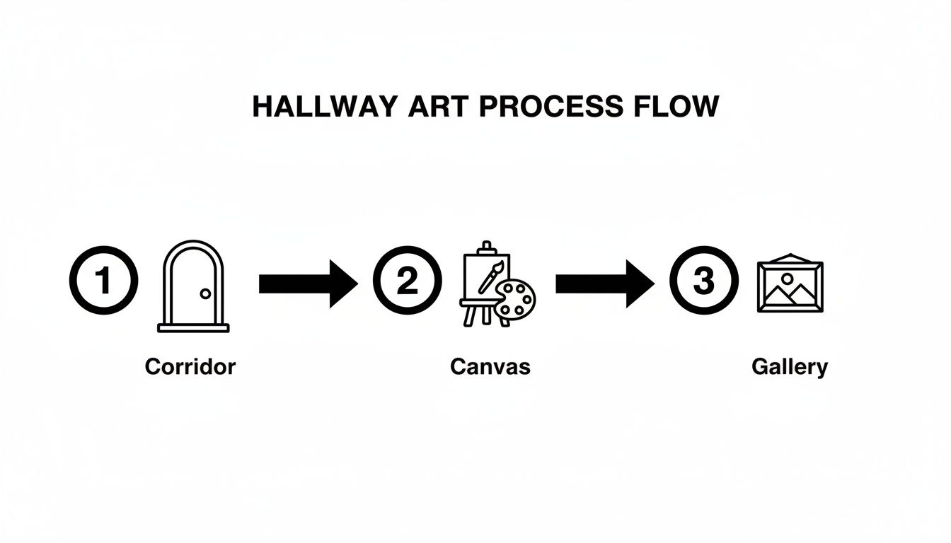
As you can see, the journey begins by seeing the potential in your space and ends with a curated display that truly reflects your style.
Choosing the Right Scale
Getting the scale right is absolutely crucial. A tiny print on a massive wall looks lost and awkward, like a lone fan in an empty stadium. On the flip side, a huge piece in a narrow corridor can feel overwhelming, like it’s about to fall on you.
Here's a quick rundown on how to approach it:
- For large hallways, you can afford to go big. A single, massive statement piece or a large, structured grid of smaller prints works wonders here.
- In narrow hallways, think about creating width. A horizontal line of smaller, uniformly framed prints can make the space feel much wider than it is.
- If you have a short hallway, a vertical arrangement is your friend. It draws the eye upwards, creating a clever illusion of height.
To help you get it just right, here's a little cheat sheet.
Quick Guide to Print Sizing for Hallways
| Hallway Type | Best Print Size (Approx.) | Pro Tip |
|---|---|---|
| Long & Narrow | A4 to A3 | Hang a series in a horizontal line to lead the eye along the corridor. |
| Short & Wide | A3 to A2 | A vertical stack or a tight, symmetrical grid can add a sense of height. |
| Large & Open | A2 to A1 | Go for a large statement piece or a gallery wall with a mix of sizes. |
| Stairway Wall | Mix of A4 & A3 | Follow the diagonal line of the stairs for a natural, flowing look. |
This table is a great starting point, but remember to trust your eye—what matters most is that it looks right to you.
Getting the frame size perfect can feel a bit tricky, but don't worry, we've got your back. For a more detailed breakdown, check out our guide on what size poster frame you might need. It’s got all the info to help you make the perfect choice.
Curating Your All-Star Lineup of Prints
Right, the planning is done and the tactics are set. Now for the fun part: picking your team. This is where you assemble the all-star lineup of prints that’ll make you grin every time you walk past. Your hallway wall art should be a direct reflection of you, not something lifted from a bland catalogue.
Think of it like putting together the perfect mixtape or a dream festival lineup. You're the curator, the DJ, the gaffer. The goal is a collection that tells a story and feels completely authentic.
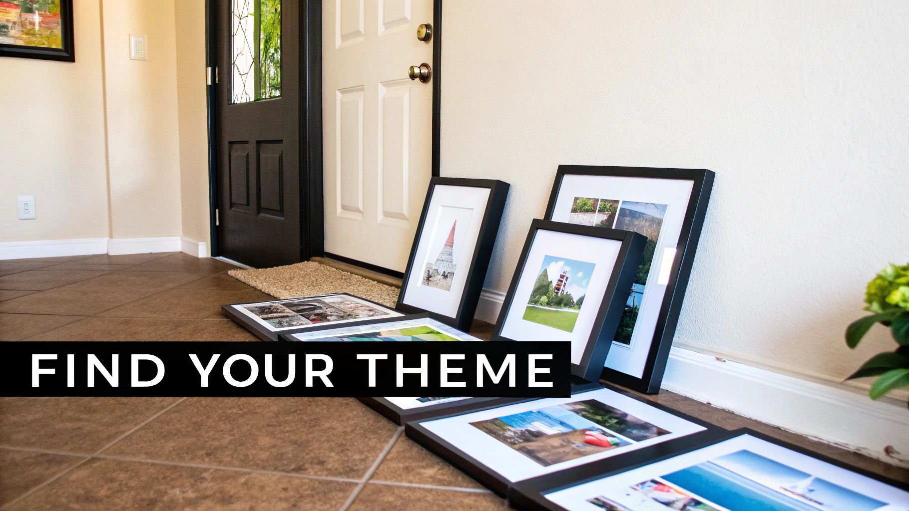
Find Your Theme (or Your Mash-Up)
First things first, what's your vibe? Are you a die-hard indie kid still buzzing from the 90s? A devoted follower of The Beautiful Game? Or, like many of us, a glorious combination of both? Your theme is the glue that holds the gallery together, but that doesn't mean everything has to match perfectly.
A cohesive theme isn't a boring one. In fact, some of the most compelling gallery walls are a brilliant mash-up of different passions.
- The Football Fanatic: Celebrate your club's glory days with prints of legendary stadiums, iconic goal celebrations, or retro kits. Think of it as a season ticket for your wall.
- The Music Aficionado: Showcase your impeccable taste with artful nods to your favourite band’s most cryptic lyrics, classic album artwork, or a stylised soundwave from that one song that changed everything.
- The Pop Culture Connoisseur: Mix in witty quotes from films, memorable TV show moments, or anything that makes you chuckle. This adds a layer of humour and personality that’s hard to beat.
There's a massive appetite for this kind of unique, passion-driven art. The UK wall art market hit a staggering £2.9 billion in 2022 and is projected to climb past £4.4 billion by 2030. This surge shows just how much we all value having homes that truly reflect who we are, especially after staring at the same four walls for so long. You can read more about the growth of the UK wall art market.
Creating a Narrative With Your Prints
The real magic happens when you combine these elements to tell a story. Don't just hang pictures; build a narrative. This is how you craft a display of hallway art that feels deeply personal and endlessly interesting.
For instance, imagine pairing a stark, minimalist print of your team’s stadium with an abstract piece inspired by a classic album from your city. Suddenly, you’re not just displaying a love for football and music; you’re telling a story about place, identity, and personal history.
A great gallery wall is more than the sum of its parts. It's a visual autobiography, a collection of inside jokes, cherished memories, and declarations of love for the things that make you, you. It should spark conversations and bring a smile to your face.
Another fantastic combination could be a witty lyric print from your favourite songwriter hung next to a portrait of a maverick footballer known for their outspoken personality. The connection is clever, subtle, and says something about your appreciation for rebels and wordsmiths.
The key is to think about the connections between the pieces. What do they say when they're placed side-by-side? How do their colours, moods, and subjects interact? This is your chance to be playful and creative, building a collection that’s as unique as your own record collection.
Getting Your Art on the Wall: The Final Whistle
Right, you’ve scouted the talent and assembled your dream squad of prints. Now it’s time for the final, crucial step—getting them on the wall. This is about more than just whacking a nail in and hoping for the best; it’s about creating a rhythm and flow that turns a collection of pictures into a proper, cohesive gallery.
Think of it as setting your team’s formation before a big match. You wouldn't just send 11 players out onto the pitch at random, would you? The same logic applies to your art. This is your chance to create a display that feels both effortlessly cool and perfectly balanced.
Picking Your Formation: Gallery Wall Layouts
When it comes to gallery walls, there are a few classic formations, each with its own vibe. The one you choose will likely depend on your hallway’s shape and the overall look you’re going for.
-
The Classic Grid: Think of this as your disciplined, 4-4-2 formation. All the frames are the same size and spaced perfectly evenly, which creates a really clean, symmetrical look. This approach is spot-on for a collection of prints from the same series—like our football stadium illustrations—and works a treat in more formal or minimalist spaces.
-
The Salon Style: This is the rock ‘n’ roll, all-out-attack approach. It involves a mix of sizes, frame styles, and orientations arranged in a sprawling, organic cluster. It’s a brilliant way to showcase a diverse collection and injects a massive dose of personality, but it definitely requires a good eye to stop it from looking like a car boot sale.
Creating That All-Important Visual Balance
The real secret to a great gallery wall, especially a salon-style one, is balance. You don't want all your big, heavy-hitting pieces lumped together on one side, weighing the whole thing down.
A good way to start is by placing your largest piece slightly off-centre. This will be your star player, the anchor for the whole display.
Then, place your second-largest piece diagonally from the first one. This creates a kind of visual see-saw, balancing the weight across the wall. From there, you can start filling in the gaps with your smaller and medium-sized prints. Try to keep the spacing between frames relatively consistent—around 2-3 inches is a good rule of thumb to follow.
Don’t be afraid to mix and match frame styles. A combination of black, white, and natural wood frames can look fantastic together. The key is to have at least one unifying element, whether it's the colour palette of the prints or the style of the art itself, to tie it all together.
This trend of personalising our homes is bigger than ever. In fact, the European wall decor market is predicted to grow by a massive USD 16.42 billion by 2029. This is largely thanks to online shopping and digital printing tech making it so much easier to get unique, made-to-order art. It means you can find prints that perfectly capture your passions—a movement our unique football and music artwork is proud to be part of. You can learn more about the European wall decor market trends and see just how big the demand for unique art has become.
For a deeper dive into arranging your prints for maximum impact, our guide on how to arrange wall art offers even more pro tips. Consider it your tactical handbook for achieving a Champions League-worthy display.
Adding the Finishing Touches to Your Display
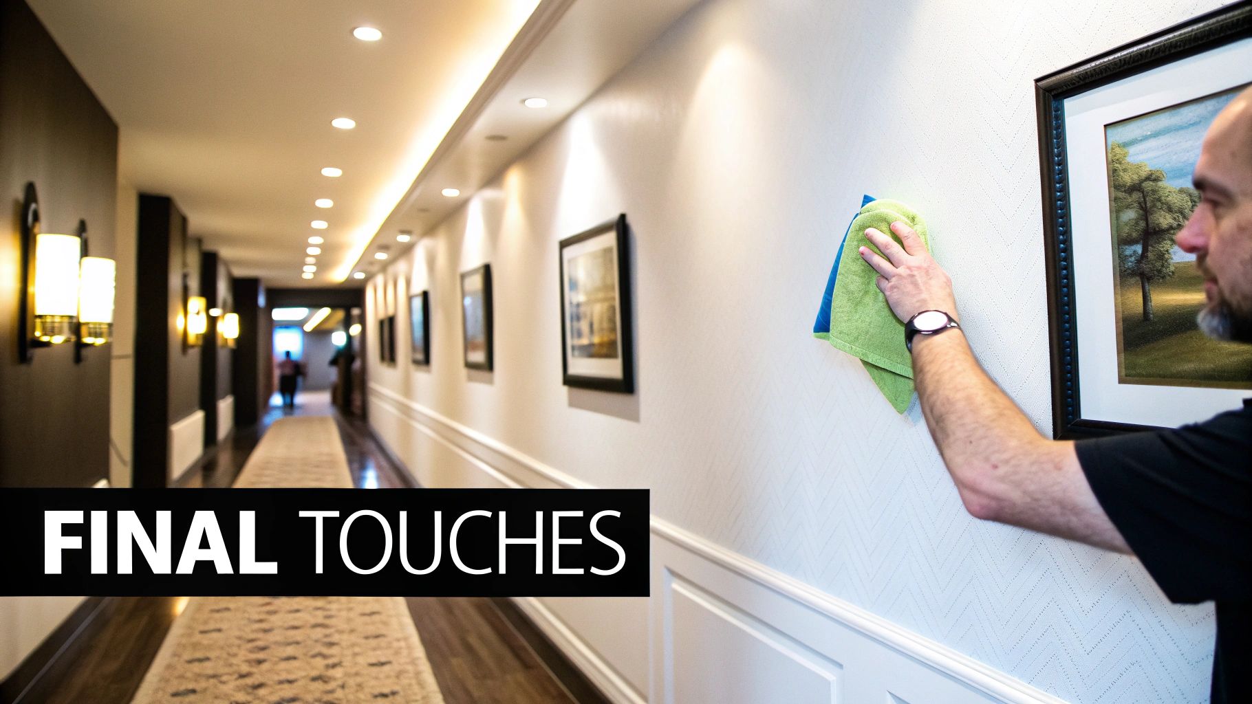
Right, the prints are up, the arrangement looks sharper than a fresh haircut, and you’re feeling pretty chuffed with yourself. But the job’s not quite done. Think of it like a killer guitar solo in a great track—the finishing touches can elevate your hallway display from ‘pretty good’ to a proper headline act.
Let’s talk lighting. Getting this right is the difference between your art looking like a masterpiece and it looking like it’s waiting for a bus in the dark. Bad lighting can kill the mood faster than a dodgy support band.
Let There Be (the Right) Light
You don't need to call in an electrician and start knocking holes in the wall. Simple, clever lighting can make your prints the heroes of the hallway.
- Picture Lights: These are the classic choice for a reason. A small, battery-powered LED picture light mounted above a key print adds a touch of gallery-level class. It’s perfect for highlighting your star player, like that print of your team lifting the cup.
- Smart Bulbs: Got an existing ceiling light? Swapping the bulb for a smart one is a game-changer. You can change the colour and intensity from your phone, setting the mood for a pre-match build-up or a chilled-out evening listening to your favourite album.
- Floor Lamps: A slim floor lamp angled towards your gallery wall can cast a lovely, warm glow, creating atmosphere and drawing attention to your collection.
Think of lighting as the final mix on a record. It brings out the best bits, adds depth, and ensures every element gets the attention it deserves. Your carefully chosen art deserves to be seen properly.
Keeping Your Legends in Mint Condition
Once your display is looking glorious, you’ll want to keep it that way. Think of it as protecting your star players—a little care goes a long way in preserving their legacy on your wall.
First off, dusting. A quick wipe with a soft, dry microfibre cloth every week or so will keep the glass and frames looking sharp. For a deeper clean on the glass, a tiny bit of glass cleaner on the cloth (never spray directly onto the frame!) will do the trick. A well-maintained collection starts with the basics, and for more tips on presentation, our guide on the essentials of framed wall art has you covered.
Sunlight is the silent assassin of prints, causing colours to fade over time like a forgotten 80s pop star. If your hallway gets a lot of direct sun, consider UV-protective glass for your frames. It’s a small investment to ensure your prints stay vibrant for years.
For truly unique finishing touches that extend beyond traditional frames, you could even incorporate tillandsia air plants into your display, bringing in living, sculptural elements that won’t mind a bit of indirect light.
Answering Your Lingering Hallway Art Questions
Right, you’ve got a plan, a stack of prints, and your head is buzzing with ideas. But even with the best game plan, a few last-minute questions can crop up. Not to worry. I’ve heard them all over the years, so let's tackle those nagging doubts right now.
Think of this as your final pep talk before you start hammering. We'll clear up those last few uncertainties so you can hang your art with total confidence.
How Can Art Make a Narrow Hallway Look Wider?
This is the classic hallway challenge, isn't it? When your corridor feels more like a tunnel, the last thing you want is to make it feel even more enclosed. The secret is to play a few visual tricks to create an illusion of space.
Your best move is to hang a series of smaller, uniformly framed prints in a horizontal line along one wall. This naturally draws the eye along the length of the hall, which cleverly makes it feel longer and therefore wider. It's the same effect as a panoramic photo – it just opens everything up. Also, sticking with light-coloured frames and mounts will help keep the whole vibe feeling bright and airy.
My Two Cents: Steer clear of huge, dark, or overpowering pieces in a narrow space. They tend to dominate and can make the walls feel like they're closing in, which is the exact opposite of what you’re trying to do. A horizontal arrangement is almost always the answer.
What's the Best Way to Hang Art Without Damaging Walls?
Ah, the renter's dilemma – and a common headache for anyone who, like me, loves to switch things up regularly. The fear of leaving your wall looking like a block of Swiss cheese can be a real creativity killer. Thankfully, there are some brilliant solutions.
Adhesive picture-hanging strips are your new best friend. For lighter frames, they are an absolute game-changer, holding art securely and then peeling off without a trace when you're ready for a change. For your heavier, statement pieces, have you considered a picture rail? It's a thin strip of moulding that runs near the ceiling, letting you hang art from adjustable wires. It’s a timeless, elegant look that gives you complete freedom to move things around without a single nail hole.
Should All the Frames in My Gallery Wall Match?
Definitely not! In fact, I'd say it’s better if they don’t. A thoughtful mix of frame styles, materials, and colours can inject so much more personality and visual texture into your display. It stops the whole arrangement from looking too sterile or 'straight out of a catalogue'.
The trick to making a mix-and-match collection look cohesive rather than just chaotic is to establish a common thread that ties it all together. This could be anything from:
- A consistent colour family: For instance, you could stick to a simple palette of black, white, and natural wood frames.
- A similar style: Maybe all your frames are sleek and modern, or perhaps they're all ornate and vintage-inspired.
- Uniform matting: Using the same colour mount inside every frame is a subtle but incredibly effective way to create a unified look.
Ready to transform your hallway into a gallery that’s uniquely you? Have a look through the full collection of music and football prints at Striped Circle and find the perfect pieces to kickstart your story. https://www.stripedcircle.com
