
Large Wall Art Guide: Size, Place and Style Big Prints
You've bought a print you love, held it above the sofa and discovered it looks like a postage stamp awaiting collection. The design's right, but the room still feels unfinished. Before you order something enormous in retaliation, put the wall measurements aside.
Choosing large wall art starts with the furniture beneath it, the height at which you'll see it and the light falling across it. Get those right and a football reference, favourite lyric or gloriously silly line can look deliberately chosen, rather than temporarily parked.
Table of Contents
- Large Wall Art Sizes at a Glance
- How to Work Out the Right Size and Check Before You Hang
- Where to Hang Large Prints in Every Room
- Matching Big Prints to Your Style and Personality
- Protecting Large Prints From Light and Wear
- Large Art for Offices and Shared Spaces
Large Wall Art Sizes at a Glance
Say you're staring at a half-empty stretch of wall 120 cm wide above a compact sofa. Your newly purchased print looks lonely, despite appearing perfectly substantial on your phone. That's the trouble with shopping on a screen: everything's roughly thumb-sized, including the sofa.
The standard print range runs from A5 up to A0, with dimensions given in millimetres. A smaller A-number means a bigger sheet, which feels backwards until you remember that football league positions work much the same way.
Standard print sizes and where they work best
| Size | Dimensions (mm) | Where it works best |
|---|---|---|
| A5 | 148 x 210 | Downstairs loo, small hallway, gift wall |
| A4 | 210 x 297 | Bedside wall, gallery wall group, office shelf wall |
| A3 | 297 x 420 | Single feature by a desk or doorway |
| A2 | 420 x 594 | Clear focal point in a living room or dining room |
| A1 | 594 x 841 | Statement piece above a sofa or sideboard |
| A0 | 841 x 1189 | Full-wall hero piece in a lounge, stairwell or office reception |
These are useful starting points, not promises that every A1 will suit every sofa. A print's orientation, frame and surrounding furniture all change how substantial it looks.
Our Sorry about the Mess print is available across all six sizes shown, so you can choose the scale without changing the joke. A5 and A0 prints are only available unframed, which means allowing for a separately chosen frame when planning their final footprint.
Check which way round it goes
The table lists the shorter dimension first. In portrait orientation, that's the width; horizontal orientation swaps width and height. Check that the design is offered in your intended orientation rather than assuming you can rotate text without consequences.
For a hypothetical 120 cm sofa, portrait A0 at approximately 84 cm wide is the closest standard portrait width to the proportional target. A1 in the horizontal orientation has a similar width, demonstrating why the letter alone doesn't settle the question.
Quick scale test: If the artwork looks clearly narrower than about two-thirds of the furniture beneath it, test a larger paper template before buying.
A small print isn't a bad print. It may be better suited to a bedside wall while you're asking it to headline the lounge.
How to Work Out the Right Size and Check Before You Hang
Size the artwork to the furniture, not the entire wall. The sofa, console, sideboard or bed gives your eye an anchor; the wall merely provides the available space.
The English Home's picture-hanging guidance recommends artwork approximately two-thirds of the furniture's width, with the centre of a single picture around 145–152 cm above the floor. Treat those as starting positions to test, not grounds for an argument with someone holding a spirit level.
Measure before making holes
- Measure the furniture's full width. Use a tape measure across the sofa, console, sideboard or bed, rather than estimating from cushions. Furniture provides the visual weight the artwork needs to balance.
- Multiply that width by two-thirds. This gives you a target artwork width, not a compulsory exact size. Choose a nearby size and test it rather than abandoning a favourite design over a small difference.
- Find the frame's outer dimensions. The printed image isn't the finished object. A mount and frame can make the overall piece noticeably wider and taller, so use the complete framed measurements for your template.
- Mark the picture's centre at the eye-level starting height. Measure from the floor to the centre, not to the top edge or hanging hook. Otherwise, a tall picture can end up hovering near the ceiling like it's avoiding the conversation.
- Tape up a full-size paper template. Join sheets of plain paper or use packing paper, then attach it with low-tack decorator's tape suitable for your wall finish. Mark the centre so you can compare positions easily.
- Adjust the template, not your expectations. Walk to the doorway, sit on the sofa and look from the opposite side of the room. Move the paper until the artwork feels connected to the furniture without crowding it.
Furniture width and matching artwork width
These are worked examples using the proportional rule, rounded to straightforward measuring targets.
| Furniture width (cm) | Artwork width, about two-thirds (cm) |
|---|---|
| 120 | 80 |
| 150 | 100 |
| 180 | 120 |
| 210 | 140 |
The measuring sequence is easier to follow when you can see the whole process together.
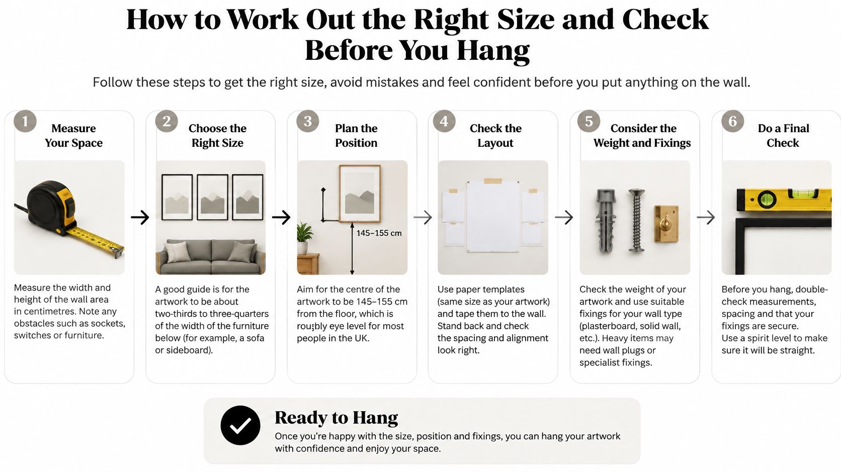
Make the final checks before buying
Confirm that the outer frame clears nearby switches, shelving, curtains and door swings. Check the position at different times of day too, because an apparently sheltered wall may receive direct afternoon sunlight.
If you're rearranging possessions after moving into a smaller home, Stahl Home Center's picture hanging advice for downsizers offers a useful companion to the template test. Deciding which pieces deserve the clearest sightlines is more productive than trying to squeeze everything onto the nearest wall.
Match the fixings to the wall and the framed weight. Masonry, timber studs and plasterboard need appropriate fixing methods; a plasterboard cavity needs suitable anchors rather than a hopeful nail. Our guide to picture wall hooks helps you think through the hardware before lifting anything.
Our frames are ready to hang and include a hanging kit. You'll still need a pencil, tape measure and level, plus any wall-specific fixings and tools required for your installation.
A good fit has breathing room around the frame, a comfortable relationship with the furniture and a centre you can view without lifting your chin.
Keep the paper in place until that view feels right. Filling an unwanted hole is considerably less entertaining than moving a piece of tape.
Where to Hang Large Prints in Every Room
A hallway print has seconds to register while you juggle shopping bags. A dining-room piece has to hold attention across a whole meal, ideally while your relatives relitigate last season's relegation battle at unnecessary volume. Each room sets its own brief, and the width and eye-level measurements you worked out earlier land differently in each one.
Think of the gap between furniture and frame as the margin on a page: too tight and everything looks crowded, too wide and the print floats away from the room.
Placement rules by room
| Room | Where to hang | Main rule |
|---|---|---|
| Living room | Above the sofa or sideboard | Leave roughly 15 to 25 cm between the sofa back and the bottom edge |
| Dining room | Above the sideboard | Aim the centre at seated eye level, around 110 to 120 cm from the floor |
| Bedroom | Above the headboard | Keep at least 20 cm clear so pillows and Sunday-morning elbows stay well away |
| Hallway or stairwell | Long wall where the eye lands on entry | Step the hanging height up with the stairs and keep the lowest edge clear of the handrail line |
| Office | Behind or beside the main desk or in reception | Position it visible from the doorway rather than hidden behind an open door |
Let the room decide the emphasis
In a dining room, consider what already attracts attention. A decorative pendant, patterned chairs and an elaborate table setting leave less room for a densely detailed print, while a plain sideboard can support something more expressive. Leave about 20 to 30 cm between the sideboard top and the frame so lamps and serving dishes never crowd it.
Above a headboard, check the view from the doorway and from the bed itself, since you will see it from both. A bold gig-inspired graphic can work in a bedroom, provided the colours suit the room's wind-down job.
For a hallway or stairwell, try a tall format on the wall you naturally face when entering or reaching a landing. Keep the main detail above the handrail line, which typically sits around 90 cm above the stairs, and check whether window light reflects off the glass as you walk past.
Placement check: Too high looks disconnected; too low disappears behind furniture. Find the position where the whole composition remains visible during ordinary use.
A single large print usually creates a clearer focal point than scattered small frames with no shared alignment. If you prefer a group, give it a deliberate boundary and a common thread through colour, subject or framing.
Size changes the handling too. An A0 print measures 841 x 1189 mm, which is a lot of paper to keep flat while you mark a wall. On a stairwell, work from a stable step or small platform level with the hanging point instead of leaning over the banister, and have a second person support a framed piece while you check the line from below.
Matching Big Prints to Your Style and Personality
A big print is likely to be the most noticeable object in the room, so choose something you're happy to encounter every day. A joke that works once on your phone might become less charming beside your morning coffee.
There are several ways to give a room personality without turning it into a merchandise stall outside a stadium.
Choose your style route
- The statement route. Put a bold, colourful lyric or band-inspired design against a plain wall, with quieter furniture around it. Think of the big print as the lead singer and the furniture as the band: everyone contributes, but they shouldn't all demand the microphone.
- The fan route. A football crest or terrace-style design belongs naturally in a snug, den or games room. Choose a reference you enjoy, rather than something selected solely to provoke your brother-in-law during derby weekend.
- The calm-with-a-twist route. Use a muted background and a witty line of text for a room that feels composed without becoming humourless. Guests can appreciate the colours first and discover the punchline when they get closer.
Music imagery can carry more meaning than simple decoration. UK Music's This Is Music 2025 report states that the UK music sector generated £8.0 billion in gross value added in 2024 and supported 220,000 jobs, making a favourite lyric or band print a small tribute to a substantial creative force.
Make colour feel intentional
Repeat the print's dominant colour in an existing accent, such as a cushion, lampshade or desk accessory. You don't need matching everything; a visible connection is enough to make the piece look chosen rather than dropped off during a delivery mix-up.
Our Icons Range, described as simple, colourful and cool prints, suits this approach. For more help choosing the atmosphere you want, explore our guide to colour psychology in interior design.
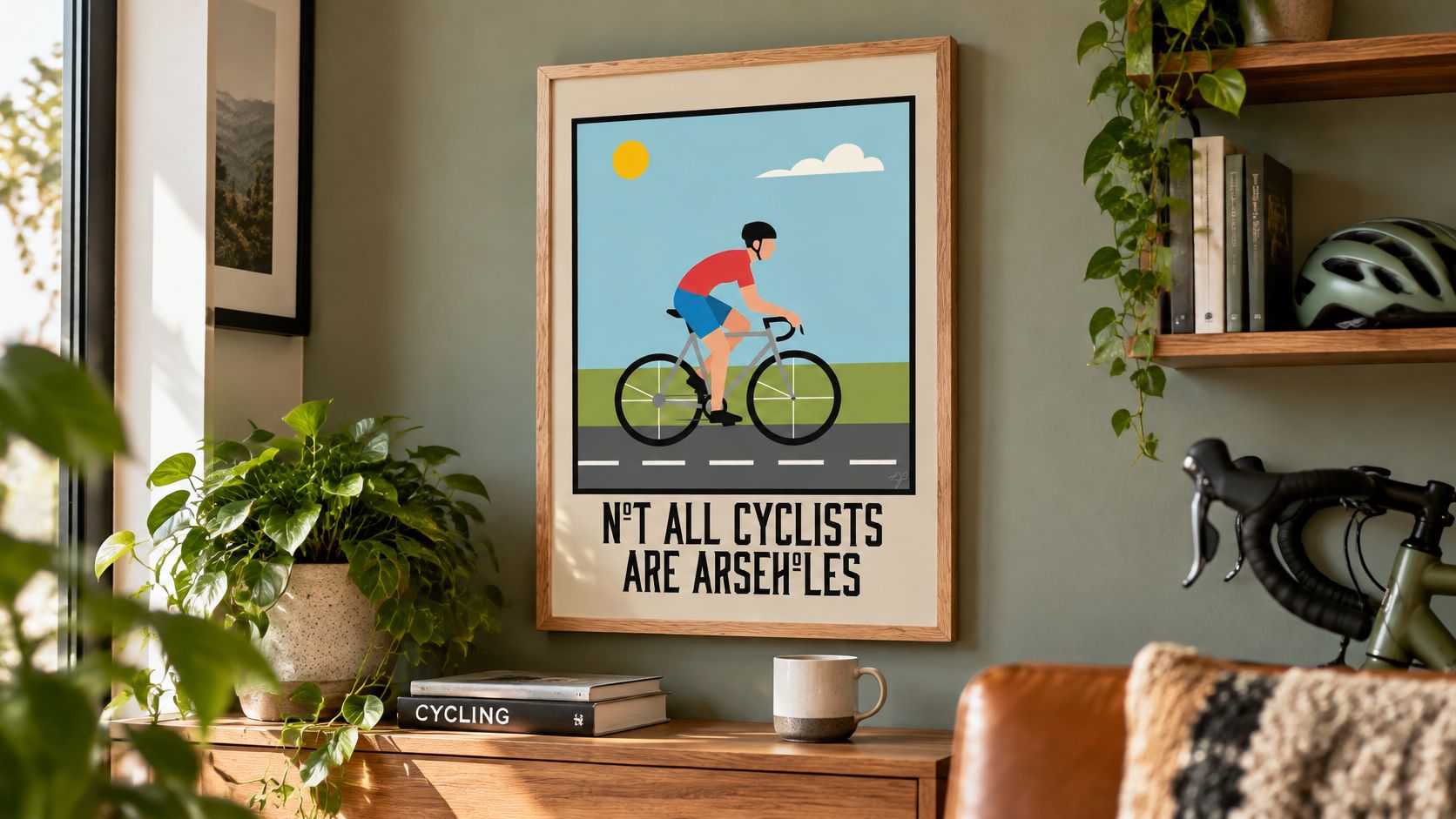
Humour-led artwork offers another route, provided the language suits the people sharing the space. The Not all Cyclists are Arseholes - Wall Art Print (Wholesale) uses colourful, sarcastic humour about hobby stereotypes, illustrating the difference between a personal statement and anonymous decoration.
Personality matters at work too. A survey of more than 3,000 office workers across 11 UK cities, reported by ArtsProfessional, found that 39% felt inspired by their job in offices enriched with art, compared with 24% overall.
That's an association, not proof that a poster fixes an uninspiring role. It does support making the space feel considered rather than treating every office wall as spare storage for beige.
Protecting Large Prints From Light and Wear
Fading depends on accumulated light exposure, not just whether a room looks dazzling at lunchtime. Paper-based prints can gradually lose colour while sitting somewhere that feels pleasantly bright.
Museums Galleries Scotland's conservation and lighting guidance classifies paper materials as highly light-sensitive and generally recommends 50 lux, with a maximum annual exposure of 100,000 lux-hours for very sensitive objects, equivalent to approximately 2,000 hours at 50 lux. Those are conservation benchmarks, not a demand to turn your lounge into a museum.
Reduce exposure without hiding the artwork
- Keep it out of direct sunlight. Check how sunlight travels across the room, particularly in a south-facing space. Choose a sheltered wall instead of relying on how the room looks during an evening viewing.
- Use blinds or UV-filtering glazing where feasible. Close blinds when strong sunlight reaches the artwork. UV-filtering glazing can help, but it doesn't make unlimited exposure harmless because visible light also contributes to fading.
- Switch display lighting off when nobody's there. A picture light doesn't need to perform an overnight stadium shift. Use it while you're enjoying the room, rather than leaving it running by habit.
- Avoid radiators and fires. Keep paper and frames away from concentrated heat and changing conditions. A convenient empty patch above a heat source isn't automatically a sensible display spot.
A light meter can help you understand how bright a proposed position really is.
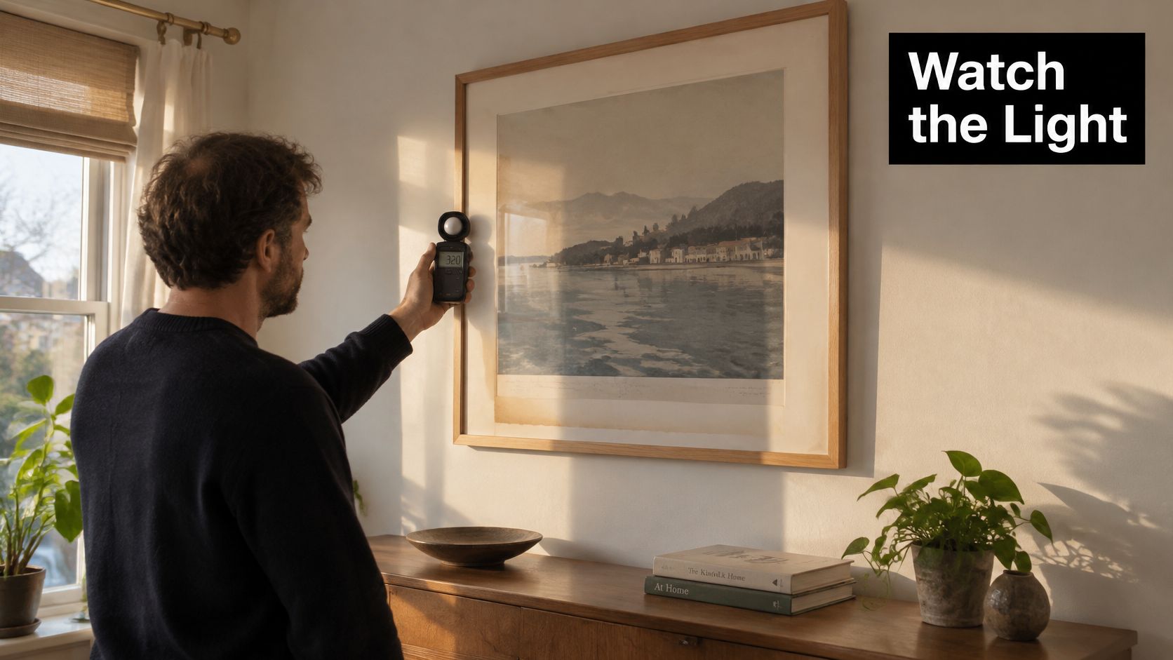
Separate frame style from protection
Fading can be especially noticeable in saturated colours, dark backgrounds and bold graphics, where a change in contrast affects lettering and recognisable details. That matters when the appeal rests on a striking lyric or sharply defined football motif.
Our CUSTOM MADE Company Artwork comes in natural wood, black wood and white wood frame styles. Natural wood gives a warmer look, black defines the edges strongly and white provides a lighter boundary.
The frame colour doesn't determine light protection. Glazing specification and display conditions do, so distinguish the look you want from the protection the finished frame provides.
Dust the frame gently with a soft, dry cloth and apply any suitable glazing cleaner to the cloth rather than spraying towards the artwork. Sensible placement and modest care help preserve the design you chose, instead of leaving you with a sun-faded tribute to its former colours.
Large Art for Offices and Shared Spaces
There's a bare wall, a grey carpet and a meeting room with a name that sounds suspiciously like a spreadsheet tab. A distinctive print won't repair the booking system, but it can make the place feel less anonymous.
Reception areas, meeting rooms and break spaces deserve artwork selected for the people using them. Visitors form an impression as they enter; staff have to live with the choice long after the welcome coffee has gone cold.
Research cited by the British Council for Offices found that 90% of surveyed companies displayed art on their premises, while 93% agreed that artwork made the workplace more welcoming to staff and visitors. That supports a practical case for thoughtful decoration, without pretending a poster can compensate for a bad job.
Give shared spaces a clear identity
- Use the arrival sightline. Put the reception piece where visitors naturally look after entering, rather than behind an open door or beyond a tall plant.
- Choose conversation over confrontation. Music and football references can make a workplace feel human, but save divisive language and pointed rivalries for spaces where everyone's comfortable with them.
- Check the everyday view. Keep the design readable from normal standing and seated positions, and avoid a window reflection that obscures it during meetings.
A specific cultural reference can be more memorable than a generic scene chosen because nobody objected. The communal printer can finally lose its position as the office's most discussed object.
Keep the arrangement deliberate
Use our guide to artwork for an office to think about reception, desks and shared rooms as different viewing situations. A break area can accommodate more playfulness than a formal client-facing meeting room.
Start with one strong reception piece, then add selectively in shared rooms. A considered arrangement is usually more effective than filling every available patch with unrelated small frames.
Striped Circle offers music, football and popular-culture prints to give home and office walls a personality beyond magnolia. Measure your furniture, test a paper template and visit Striped Circle to find a design that fits the space and makes you smile.
