
Music Note Wall Art: A Buyer's Guide for 2026
Vinyl generated £174.7 million in UK physical recorded-music revenue in 2025, according to the BPI's physical music sales figures. Not bad for something you can't fit in your pocket. We might listen through phones, but we still like an object that says something about our taste. Music note wall art does that without requiring a turntable, another subscription or a heated discussion about speaker cables.
The trick is choosing a print that means something beyond I appear to enjoy sound. Pick a shared memory, give it enough wall space and hang it properly. Nobody wants their favourite chorus leaning like a defender appealing for offside.
Table of Contents
- What Music Note Wall Art Is For
- Sizes and Frames That Fit the Wall
- Styles for the Room and the Household
- Print Quality and Light That Lasts
- How to Hang the Print Straight
- Personal Displays for Mixed Ages and Tastes
- Choose a Print Worth Smiling At
What Music Note Wall Art Is For
Say your favourite song lives on a playlist. You play it while cooking, someone else sings the wrong words, and suddenly it belongs to the household rather than just your headphones. A print gives that small ritual a physical home.
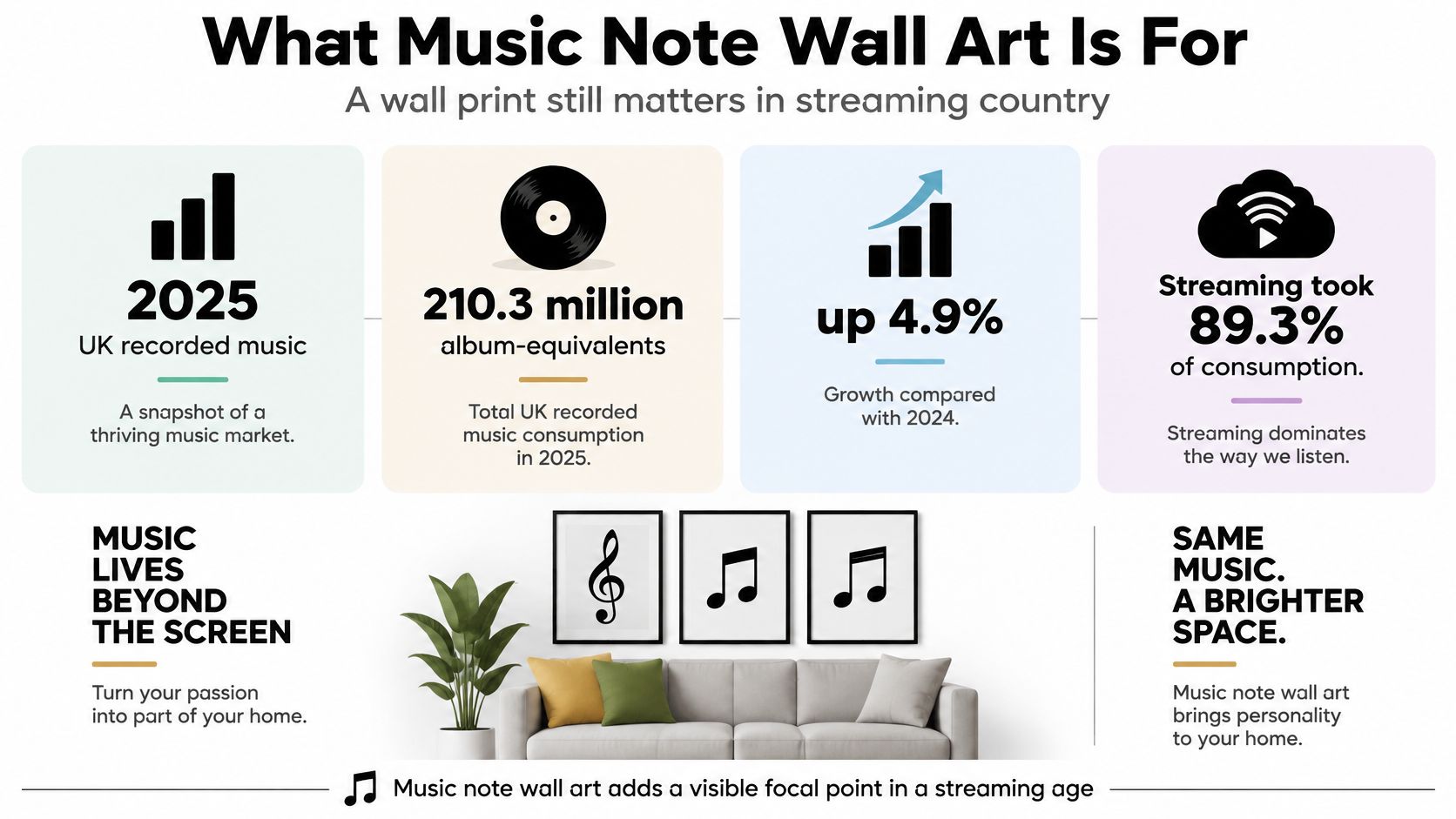
That's a sensible role in a country where streaming represented 89.3% of recorded-music consumption in 2025, while vinyl LP sales still rose 13.3% to 7.6 million units, according to the BPI's annual consumption report. Listening digitally and wanting something tangible aren't competing loyalties. You can enjoy both without handing in your music-fan membership card.
Music note wall art is a print using staves, note shapes, instruments, a lyric line or a gig memory, sold unframed or ready to hang. It's decoration with a chorus, not homework you're meant to sight-read.
The streaming-versus-object split makes the appeal clear.
Buy for the person, not their musical qualifications
Gift shoppers, home decorators, ordinary listeners and people furnishing a match-day office all belong in the audience. You don't need grade-eight piano to enjoy a good lyric joke. Nor must your office resemble a recording studio to acknowledge that everyone works better when the décor isn't exclusively filing cabinets.
Use a practical buying order:
- Fit first. Match the print and frame to the actual gap.
- Household second. Choose a style people can live with.
- Materials next. Check paper, glazing and likely light exposure.
- Finish properly. Hang it straight, then let its personality do the talking.
The useful measurements are in millimetres, not optimistic guesses made from a shop thumbnail.
Sizes and Frames That Fit the Wall
UK paper sizes for music note wall art
| Size | Dimensions | Best spot | View from |
|---|---|---|---|
| A5 | 148 × 210 mm | Shelf, desk or tight cluster | Arm's length |
| A4 | 210 × 297 mm | Hallway or a pair | Arm's length |
| A3 | 297 × 420 mm | Above a sideboard | About 1–2 metres, an editorial estimate |
| A2 | 420 × 594 mm | Feature wall or music corner | About 2–3 metres |
| A1 | 594 × 841 mm | One hero on a long wall | About 2–3 metres |
| A0 | 841 × 1189 mm | Tall stair or large office | Across the room |
Treat the viewing distances as planning suggestions, not eyesight tests. A chunky note shape reads differently from a delicate lyric printed in hairline type. Measure the empty plaster before falling for the thumbnail.
UK printers use ISO A sizes, but paper dimensions aren't finished frame dimensions. A mount and frame add width around the sheet. Buying an A3 print for an A3-sized gap is how you end up negotiating with a light switch.
Make a paper template before buying
Use scrap paper or cardboard to mark the intended outer frame size. Position it with low-tack tape suitable for your wall finish, then look from the doorway and wherever you'll normally sit. Don't judge it with your nose practically touching the plaster.
A5 is useful where you'll walk right up to the artwork. A4 works well in a modest pairing, while A3 is my sensible starting point for a single print above a sideboard. A2 and A1 need room to make their shapes legible without crowding the furniture.
A0 needs restraint. A large office or tall stair can take it; a box room may feel as though a treble clef has moved in and started charging rent.
Practical rule: Choose the row that fits the gap, not the row that looks impressive on your phone.
Choose the frame after the size
Unframed makes sense if you already own a suitable frame or prefer a poster hanger. A clip arrangement can look relaxed, but it leaves the sheet more exposed and won't suit every room. Don't buy unframed merely because the first price looks smaller, then forget to budget for the rest.
Natural wood suits warm rooms and softer colours. Black wood gives graphic artwork a firm edge. White wood sits against pale walls, especially when you want the image rather than the border to attract attention.
Leave roughly 5–8 cm of visual breathing room inside the width of the furniture below, as a layout starting point rather than an architectural law. Check the whole outer frame against that space, not just the printed sheet.
If the mount opening and frame size are causing confusion, our poster frame size guide helps separate the measurements before you order. That's a considerably better time to discover the difference than when you're kneeling beside an opened parcel.
Styles for the Room and the Household
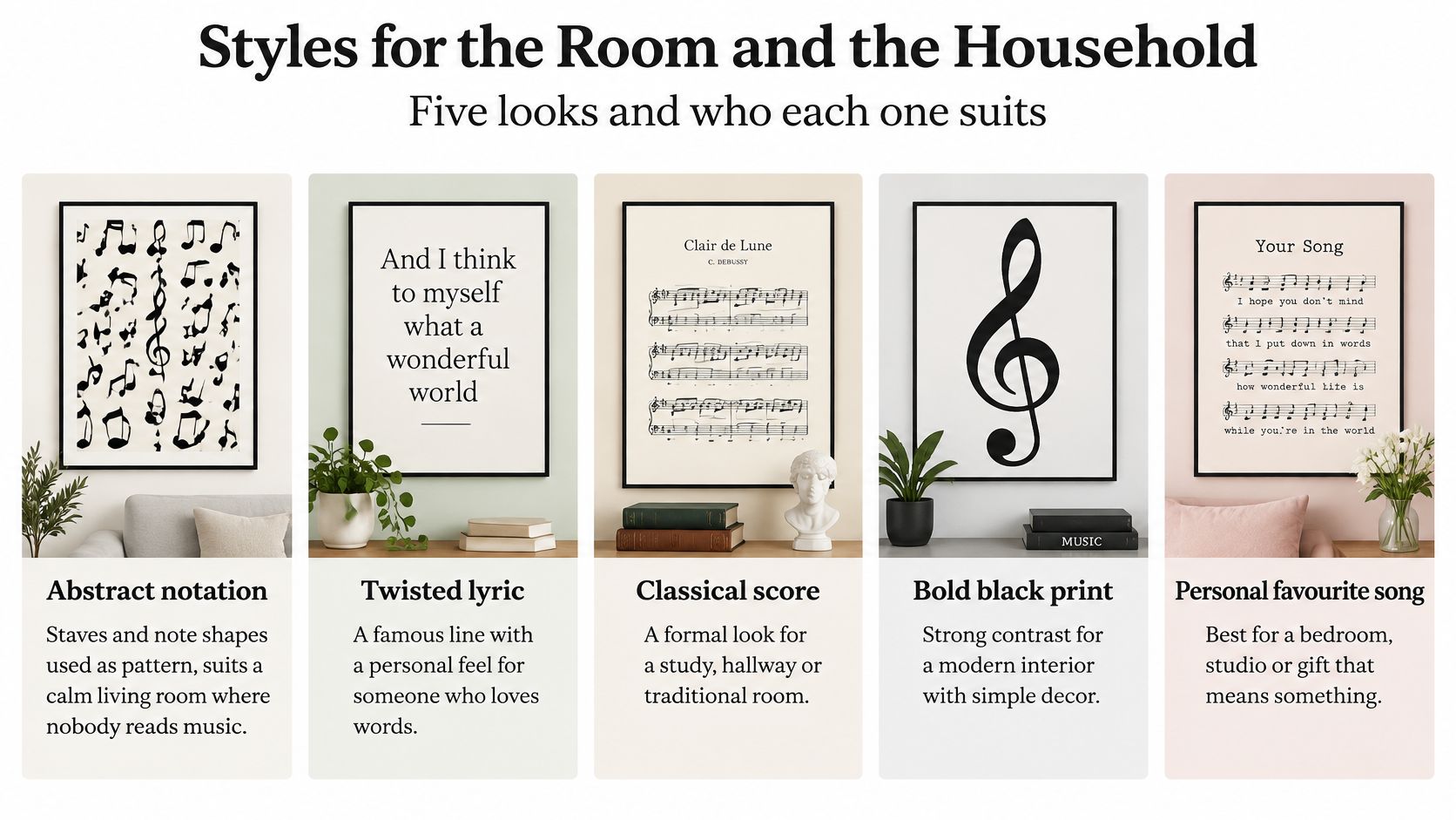
Choose a look the room can support, not a genre you feel obliged to advertise. Loving loud guitars doesn't mean every wall needs to look like the back room of a venue. Sometimes a restrained print says more than a greatest-hits compilation of everything you've ever enjoyed.
Use the visual guide to compare the mood of different treatments.
Music note styles by room
| Look | Best room | Choose it when | Avoid it when |
|---|---|---|---|
| Abstract notation | Living room or office | Nobody reads music | You wanted a punchline |
| Twisted lyric | Kitchen, hall or gift wall | The line should land instantly | The joke is too inside |
| Band or gig memory | Studio or teen room | One era is the point | The whole house must stay calm |
| Instrument or vinyl cue | Listening corner | It sits beside real records | It is a stock guitar photo |
| Music and football wit | Home office or den | The room already has terrace energy | The bedroom needs quiet |
Pick the right kind of personality
Abstract notation is the easiest choice when you want musical character without a shrine. Treat the staves and note shapes as pattern. Look for deliberate spacing and a clear focal point rather than a page full of symbols scattered like confetti after a cup final.
A twisted lyric works when the joke lands at a glance. It's particularly useful for a gift, provided the recipient will understand the reference without you standing nearby delivering programme notes. If you need to explain the punchline every time, choose another line.
Band and gig references can be more specific. A concert memory gives a studio or teenager's room a proper point of view, but decorating the entire house around your favourite era requires unusually patient housemates. Keep the nostalgia concentrated.
Instrument and vinyl imagery belongs beside things you use or love. Avoid anonymous stock guitar photographs unless anonymous stock guitars are, somehow, your passion. Music and football wit can give a work space terrace energy without making every video call look like a post-match interview.
Keep the room quieter than the print
In a 2025 UK survey of more than 1,750 music consumers, over 80% valued human-made music more than AI-generated music, according to the BPI's account of the survey, a useful reminder to choose a print with an identifiable joke or memory rather than anonymous decoration.
That finding concerns music, not wall-art buying, so don't turn it into a claim about what all print shoppers want. The practical advice is simpler: look for intention. A considered composition beats a generic stave with an inspirational word pasted over it.
For another visual reference, watch the video below before deciding how much detail your own wall needs.
A bold print works best when nearby objects don't all demand equal attention. Let the artwork take the chorus; the lampshade doesn't need a solo.
Print Quality and Light That Lasts
Read the material specification before paying. A handsome mock-up tells you about the styling, not the sheet that will arrive. Look for named paper, ink, glazing and frame materials rather than a heroic amount of the word premium.
Print specs to check on a listing
| Spec | What to look for | Why it matters |
|---|---|---|
| Paper weight | Around 300 gsm or above, with heavyweight fine-art stock near 312 gsm as an example | Stiffer paper is easier to handle and can resist curling in a frame |
| Finish | Matte or gloss | Matte cuts glare; gloss makes colour louder but mirrors the room |
| Ink | Pigment rather than unspecified dye | A useful durability preference, though the complete paper-and-ink system matters |
| Glazing | UV-filter glass or acrylic | Cuts UV; glass resists scratches, while acrylic is lighter and preferable above a child's bed |
| Listing details | Paper weight and frame timber named | Missing specifications make quality harder to judge |
Judge the whole print, not a buzzword
Paper weight is a buying preference, not a certificate of excellence. Heavy stock can still carry a muddy image, and thin paper isn't automatically worthless. Check whether fine stave lines look crisp and whether dark areas retain detail rather than merging into a black puddle.
Matte is my default for text-heavy music artwork, especially opposite a window or television. Gloss can suit saturated colour, but reflected furniture shouldn't become an accidental backing band. Pigment ink is worth looking for, although ink chemistry alone won't tell you how long a print will last.
Our guide to print quality offers more help with the terminology. If a listing won't name its paper or frame timber, judge it as a basic poster rather than paying extra for unspecified craftsmanship.
Turn conservation advice into home habits
The South West Museums, Libraries and Archives Council's preventive conservation guidance gives approximately 50 lux for light-sensitive paper and a conservative annual benchmark of 100,000 lux-hours, equivalent to 50 lux for 2,000 hours, while also addressing exclusion of ultraviolet wavelengths below 400 nm. These are conservation benchmarks, not a promise that a domestic print will remain unchanged.
The useful principle is that exposure combines brightness and time. A better sheet still needs sensible treatment.
- Keep direct sun off it. A south-facing kitchen wall isn't a kindness to coloured ink.
- Avoid the scorching spotlight. Use low-UV LED illumination where needed, and switch it off when nobody's there.
- Treat UV filtering as extra protection. It doesn't cancel visible-light exposure or justify a sunny position.
Glass is heavier and generally harder to scratch; acrylic reduces weight but needs gentler cleaning. Neither makes a badly secured frame safe. Rotate especially colourful or valuable prints if their usual position receives substantial daylight, and keep cleaning spray away from the frame edges.
How to Hang the Print Straight
Gather a tape measure, pencil, suitable wall fixings and a spirit level before lifting the frame. Check for concealed services before drilling, and inspect the hanging hardware on the back. A fixing should suit both the wall and the loaded frame, not merely whatever's left in the kitchen drawer.
Make the marks before making the holes
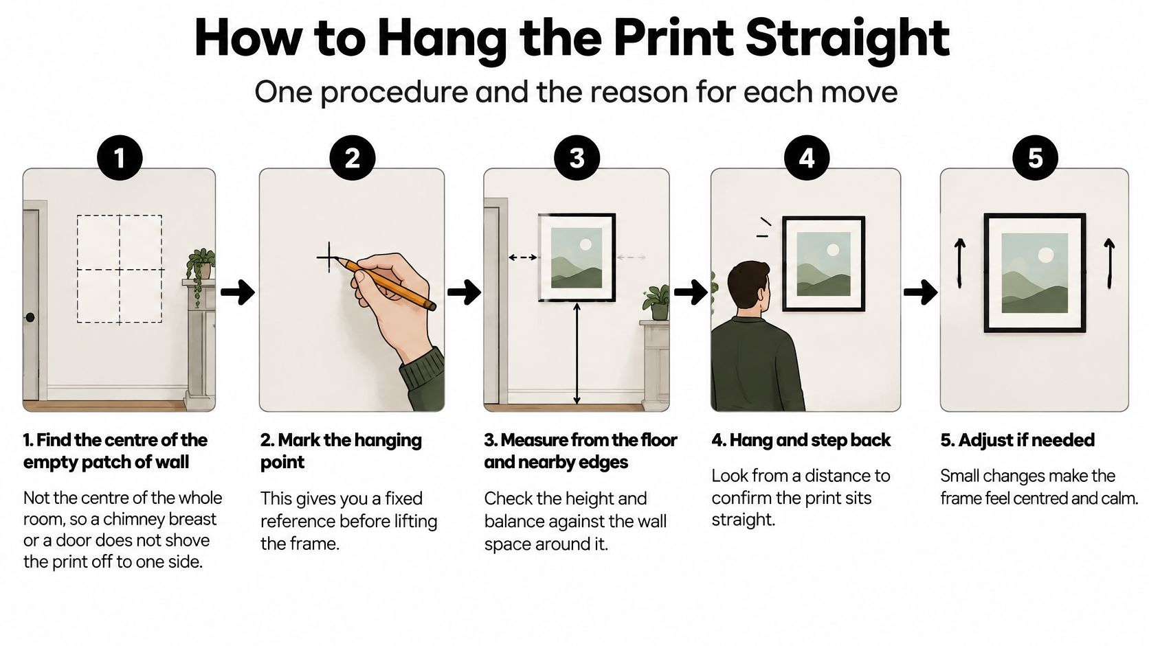
- Find the centre of the empty patch of wall. Work between the actual boundaries, such as a doorway and chimney breast, rather than using the centre of the entire room. This prevents a balanced-looking measurement producing an oddly shoved-aside picture.
- Set a comfortable viewing height. Use an artwork centre around 145–150 cm from the floor as a practical starting point, then lower it if people will mainly view it seated. Measure from the frame centre to its hanging hardware before marking the fixing position, or the result will sit too high.
- Leave space above furniture. Try roughly 15–25 cm between the furniture top and the bottom of the frame. Test with your paper template so it doesn't look perched on the sideboard like a substitute waiting to come on.
- Keep wide frames level at their supports. Where the frame hardware allows, mark a pair of level hook positions rather than relying on a lone central nail. Check the rear fittings first; don't improvise attachment points that the frame wasn't built to use.
- Match the fixing to the load and wall. Choose a picture hook, anchor or plug rated above the complete frame's weight. Plasterboard needs an appropriate fixing, and an adhesive hanger needs a compatible surface and load rating. This is the step that prevents glass meeting floor.
- Hang, level and inspect from the doorway. Use a spirit level or phone level to check the top edge, then step back. If the frame keeps tilting, inspect the hardware rather than repeatedly nudging it and hoping for a different result.
The visual sequence below is useful while you're marking and checking.
Keep a group organised
For a small group, an odd number of frames is an easy starting arrangement. Try gaps of about 5–8 cm, and organise the group around a shared centre line instead of letting the frames creep uphill.
Neasden Hardware's advice on planning a gallery wall layout is useful when you're arranging several pieces before committing to holes. Renters can use an existing picture rail, or choose a poster hanger supported by a permitted fixing.
If it wobbles, inspect the fixing and hardware. The song isn't responsible.
Personal Displays for Mixed Ages and Tastes
What does the whole household recognise before anyone reaches for a phone? The youngest person discovers songs through streaming, a parent remembers the radio introduction, and a grandparent knows the chorus from somewhere entirely different. Matching listening habits are optional; a shared memory is the prize.
The difference in habits is real: Ofcom's 2025 UK audio report found weekly online music-service use of 85% among 16–34-year-olds, compared with 39% among people aged 55 and over. Treat that as a warning against assuming everyone meets a song through the same screen, rather than an excuse to assign musical personalities by birthday.
Find the reference people share
Ask what everyone remembers, rather than who has the most impressive music knowledge. It might be a wedding song, a radio programme heard during school runs or a chant associated with travelling to matches. The print should make that connection visible without requiring access to somebody else's playlist.
A lyric-led design can do this without behaving like a framed examination paper. A familiar title such as the "All You Need is Love..." - Wall Art Print gives the room a line people can place, whether they stream daily or last bought music on a format with a hinge.
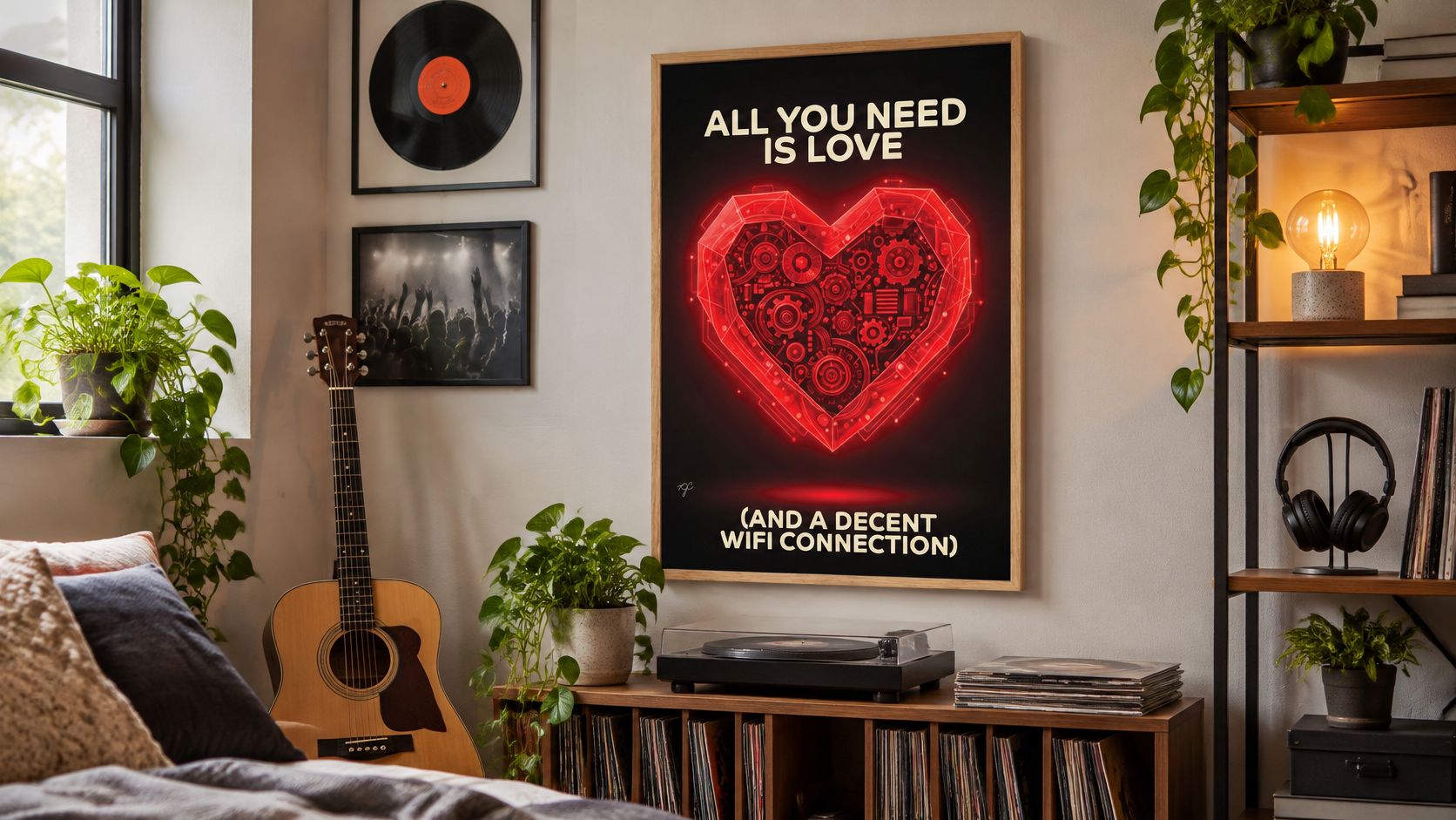
Personal still needs to work in company. A reference can belong to your household while giving visitors something to enjoy, like a good away-end song: specific, welcoming and slightly daft. Our family wall art guide is useful for thinking about a display that represents several people rather than whoever reached the checkout first.
Make the meaning accessible
- Choose readable type. Test a lyric from the doorway, not just close up. Decorative lettering should earn its keep before it starts showing off.
- Keep strong contrast. Dark ink on a pale ground is a straightforward choice when subtle grey text would disappear in the room's lighting.
- Consider seated viewers. Check the display from a sofa or wheelchair position, not only while standing with referee-assistant confidence.
- Make listening optional. A QR code can accompany a playlist or recording, but the physical picture should still make sense without scanning it.
- Let notation be pattern. Children and non-readers can enjoy rhythm, shape and a joke without naming the clef.
If you add a listening extra, label what it opens and offer readable words alongside it. A guest should get the joke, the chorus or the memory without negotiating a phone, an app and a login.
The guest test: Someone asks what the line means, and your answer is a memory rather than a lecture.
Technical accuracy matters if you're displaying an actual score. For a shared household print, recognisable meaning matters more than proving who can read it.
Choose a Print Worth Smiling At
Make a shortlist with a measured size, a frame finish and a meaningful reference. Reject anything that fails those tests, even if it looks magnificent in a staged photograph above a sofa nobody has ever sat on. A music print is a physical ticket stub for listening that mostly lives in a phone: pick the shared memory, not the stave-reading exam.
Put the choice together
Striped Circle's framed music prints are ready to hang, with unframed prints available too. The Sorry about the Mess print runs from A5 up to A0 and can be bought unframed or in natural wood, black wood or white wood, so use the sizes table for the wall rather than memorising millimetres. Alternative Lyrics music prints take classic songs and give them Striped Circle's own lyric twists, a more personal route than picking notation because it looks musical.
The shop is family-run, launched during lockdown, with music and football at the centre of the range. That is the sensibility to hunt for: a recognisable point of view, chosen like a favourite chant rather than selected by the visual equivalent of shuffle.
Before paying, compare the complete framed and unframed costs, including delivery and any separate frame. Free delivery starts over £40, but check the basket before assuming the offer saves the day.
Then use the least technical test available. Does the line make you grin, and can you think of someone else who'll grin when they see it? Choose the print that still lands on an ordinary Tuesday.
Striped Circle makes music, alternative lyric and football prints for walls that could use a bit more character. Visit Striped Circle with your wall measurements and a favourite song or match-day memory, then choose a print that makes you and your visitors smile.
