
Poster Design Music For Walls That Rock (And Roll)
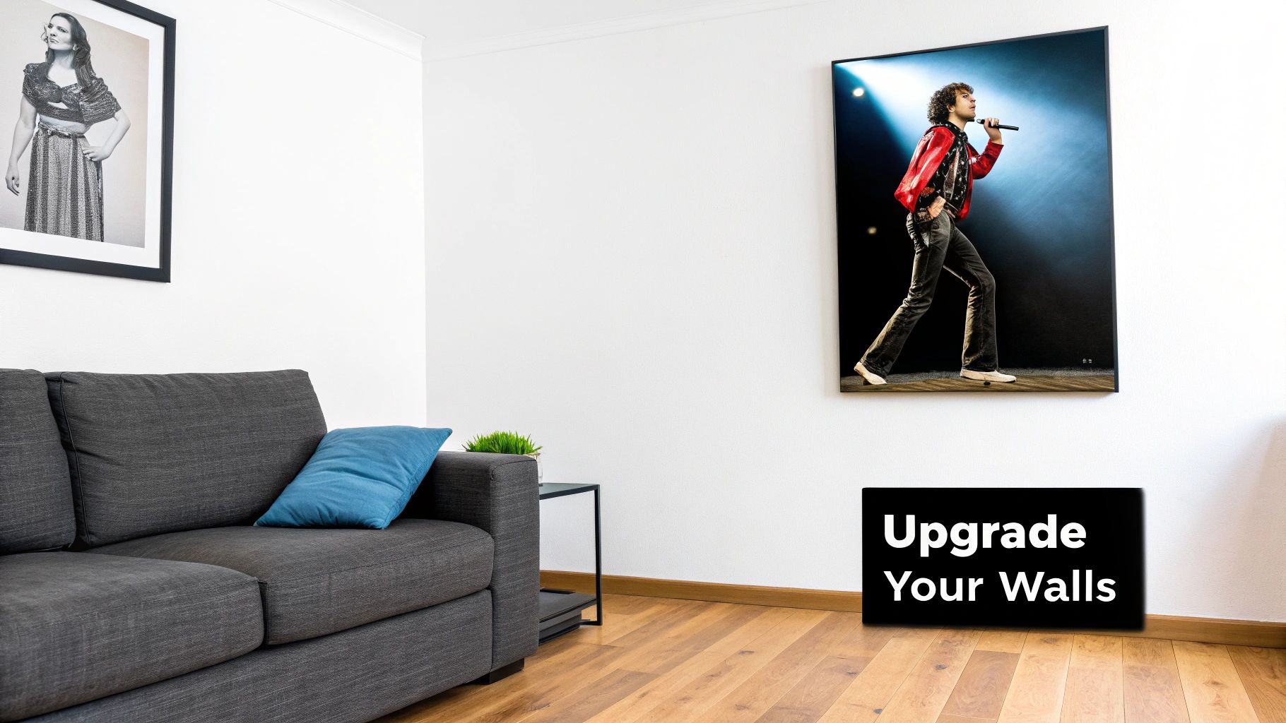
Let's be real for a moment: a blank wall is a criminal waste of space. It’s the visual equivalent of a silent stadium, a sad, empty stage just begging for a headliner. This is precisely where the god-tier power of a great music poster comes in, turning a dull room into something that truly sings. It’s not just about filling space; it's about curating a vibe that screams you and your impeccable, top-of-the-league taste in music.
Why Your Walls Deserve More Than Beige
Right, step away from the generic, mass-produced "art" you find in those giant home stores. That stuff says nothing about you, other than you once had a spare twenty quid. A well-chosen music poster, on the other hand, is the ultimate accessory for anyone whose life has a soundtrack. We’re talking about prints that get people talking, that tell a story, and that give you that little buzz of joy every time you clock it.
Whether it’s a bold tribute to a gig that changed your life (Oasis at Knebworth, anyone?) or a clever graphic that perfectly captures your favourite genre, the right poster transforms any room into your own personal hall of fame. Think of it as a statement piece, a slice of cultural history hanging right there above your sofa, making you and everyone else smile.
The Art of Capturing a Vibe
A truly great music poster does so much more than just look good; it distils an entire feeling into a single image. It can capture the raw, chaotic energy of a punk show or the laid-back groove of a lo-fi playlist. This visual translation of sound is incredibly powerful, giving your space a character that a tin of magnolia paint just can't match. It's the difference between listening to a classic on vinyl versus through a tinny phone speaker.
The UK's design scene has had a huge hand in this, with studios creating pieces that are practically historical documents. Just look at the 'Acid House Love Blueprint' poster from Dorothy. It's a masterpiece that maps the sprawling history of UK club culture, connecting over 900 clubs, musicians, and DJs in one stunningly intricate design. It's a perfect example of how visual art can chart the beautifully tangled history of a music scene.
A blank wall is a story not yet told. A music poster isn't just decoration; it's the opening line of a conversation about who you are and what moves you. Like a good pub debate, but with less arguing about VAR.
From Bare Walls to a Brilliant Display
Of course, picking out the perfect prints is only half the battle. How you hang them is what really brings the look together. Arranging your collection is a bit like crafting the perfect playlist—it’s all about creating a flow and setting the right mood. If you're looking for some solid ideas, our guide on how to decorate walls has some brilliant tips to get you started.
Ultimately, surrounding yourself with amazing prints is an easy win. It’s a simple way to make your home or office a place that genuinely reflects you and celebrates the music that defines your life—one awesome poster at a time. Trust me, your walls will thank you for it.
The Unwritten Rules Of Cool Poster Design
So, what separates a legendary gig poster from something your cousin knocked up on their iPad? It’s not black magic. It's about nailing the core elements of visual harmony—a sort of secret handshake that all great designers know.
This is your backstage pass to what makes a design truly pop. It’s about creating a visual experience that pulls you in like a hypnotic bassline, making you stop and stare. Think of it as learning the chords to a classic anthem; once you know the fundamentals, you can spot a masterpiece from a mile off.
Typography That Shouts Or Sings
The font on a music poster is more than just text; it's the lead singer. It sets the entire tone. A jagged, messy font screams punk rock, while a clean, minimalist typeface might whisper indie folk. The right typography communicates the genre and attitude before you’ve even read the band's name.
A common rookie error is using a dozen different fonts. It's the design equivalent of every band member playing a different song at the same time—just pure chaos. Stick to two or three that complement each other.
- Headline Font: This is your showstopper, your frontman. It should be bold and grab attention.
- Body Font: Used for details like dates and venues, this needs to be crystal clear and readable, like a decent stadium announcer.
- Accent Font: A third, more decorative font can be used sparingly for a bit of extra flair, like a guest appearance from a rock legend.
The Power Of Imagery And Layout
Next up is imagery. This could be an iconic photo of the artist, a mind-bending abstract pattern, or a clever graphic that sums up an album's theme. Whatever it is, the image needs to connect with the music and tell a story. It’s the visual hook that makes someone look twice.
Layout is how all these elements—typography, imagery, and information—are arranged on the page. A good layout guides your eye effortlessly through the design. This is where visual hierarchy comes into play. It’s all about making the most important information (like the band name) the most prominent.
A great poster doesn’t just give you information; it gives you a feeling. It’s the art of capturing sound and emotion in a static image, creating something that resonates long after the gig is over.
Getting the balance and flow right is crucial, not just on the poster itself but in how you display it. A jumbled collection on your wall can easily look chaotic. For some top-tier advice on creating a display that looks intentional and cool, check out our insights on how to arrange wall art. Mastering these unwritten rules is the key to creating—or choosing—a poster that truly rocks.
Decoding The Look Of Your Favourite Genres
Ever seen a poster and just known what the band sounds like? It’s not a sixth sense; it’s a carefully crafted visual language, as unique and telling as a guitar riff. A gritty punk flyer and a sleek electronic music print feel worlds apart for a reason—every single design choice is telling a story about the music.
Different genres don't just sound different; they look different. It’s tribal. Think about the chaotic, cut-and-paste anarchy of punk versus the minimalist cool of indie or the futuristic gloss of synth-pop. The visual identity is completely baked into the genre’s DNA. The goal is always to match the look to the vibe, like pairing the right pint with a Sunday roast.
Genre Vibe Check
Getting the colour palette and typography right is absolutely crucial for creating an authentic music poster. A thrash metal band using pastel pink and a curly script font would look as out of place as a tuxedo in the mosh pit. The design has to feel like it belongs to the sound.
This deep connection between art and music isn't anything new, especially here in the UK, where pop art and music have been gloriously tangled since the 1960s. Artists like Peter Blake, with his legendary design for The Beatles’ 'Sgt. Pepper’s Lonely Hearts Club Band' album, really set the stage. This was followed by the raw, rebellious aesthetic of Jamie Reid for the Sex Pistols and Peter Saville’s iconic, moody designs for Joy Division, which cemented the poster as a vital piece of the musical puzzle.
Think of a genre's visual style as its kit. It instantly tells you which team they play for, whether it's the DIY rebels, the introspective poets, or the dancefloor evangelists.
To make this a bit clearer, we’ve put together a quick guide. It’ll help you either nail the look for your own design or find a print that genuinely represents the tunes you live by. And hey, sometimes you just want a classic. There's a certain charm in a design that feels like it’s been pulled straight from the past, and if you’re a fan of that timeless appeal, our collection of retro music posters will be right up your alley.
Genre Vibe Check A Visual Style Guide
Here’s a quick-reference table breaking down the typical visual elements you’ll see across different music genres. Think of it as a cheat sheet for decoding poster design.
| Music Genre | Common Colour Palette | Typical Typography Style | Overall Vibe |
|---|---|---|---|
| Punk Rock | Black, white, red, and neon highlights | Ransom note, stencilled, distressed | Anarchic, raw, anti-establishment |
| Indie / Alternative | Muted, earthy tones or minimalist black & white | Clean sans-serif or vintage typewriter | Introspective, cool, understated |
| Electronic / Synth-Pop | Neon, metallics, and dark, moody blues | Geometric, futuristic, digital-inspired | Sleek, futuristic, energetic |
| Hip Hop | Bold primary colours, gold, black | Graffiti, bold slab-serifs, custom scripts | Confident, streetwise, larger-than-life |
| Psychedelic Rock | Trippy, vibrant, and clashing rainbow colours | Fluid, distorted, hand-drawn lettering | Mind-bending, free-spirited, experimental |
As you can see, a few simple choices in colour and font can immediately signal a specific sound and attitude. It’s a powerful shorthand that connects fans to the music before they’ve even heard a note.
From Punk Flyers To Psychedelic Art
Music posters weren't always the high-quality art prints we now frame and hang on our walls. Their origin story is much grittier. Picture scrappy, functional flyers stapled to telephone poles and slapped on city walls, all with one simple goal: to get people to a gig.
This is our trip down memory lane, exploring how poster design music has evolved right alongside our musical tastes and technology. We'll revisit the raw, photocopied look of the 70s punk scene and the mind-bending, swirling colours of 60s psychedelic art—a time when the visuals were every bit as trippy as the music.
From Adverts to Artefacts
The leap from disposable advert to cherished artefact wasn't an accident. Printing technology played a massive part, transforming simple announcements into collectible works of art. In the UK, you can trace this journey perfectly. Early 20th-century printing advances allowed for more vibrant designs, but things got a bit more typographical by mid-century.
It wasn't until the 1960s Pop Art explosion that imaginative poster art truly found its feet again. It became an essential tool for promoting gigs and, more importantly, capturing the very soul of the music. You can dive deeper into this fascinating history over on the V&A Museum's website.
This visual concept map shows just how distinct genres carved out their own iconic identities.
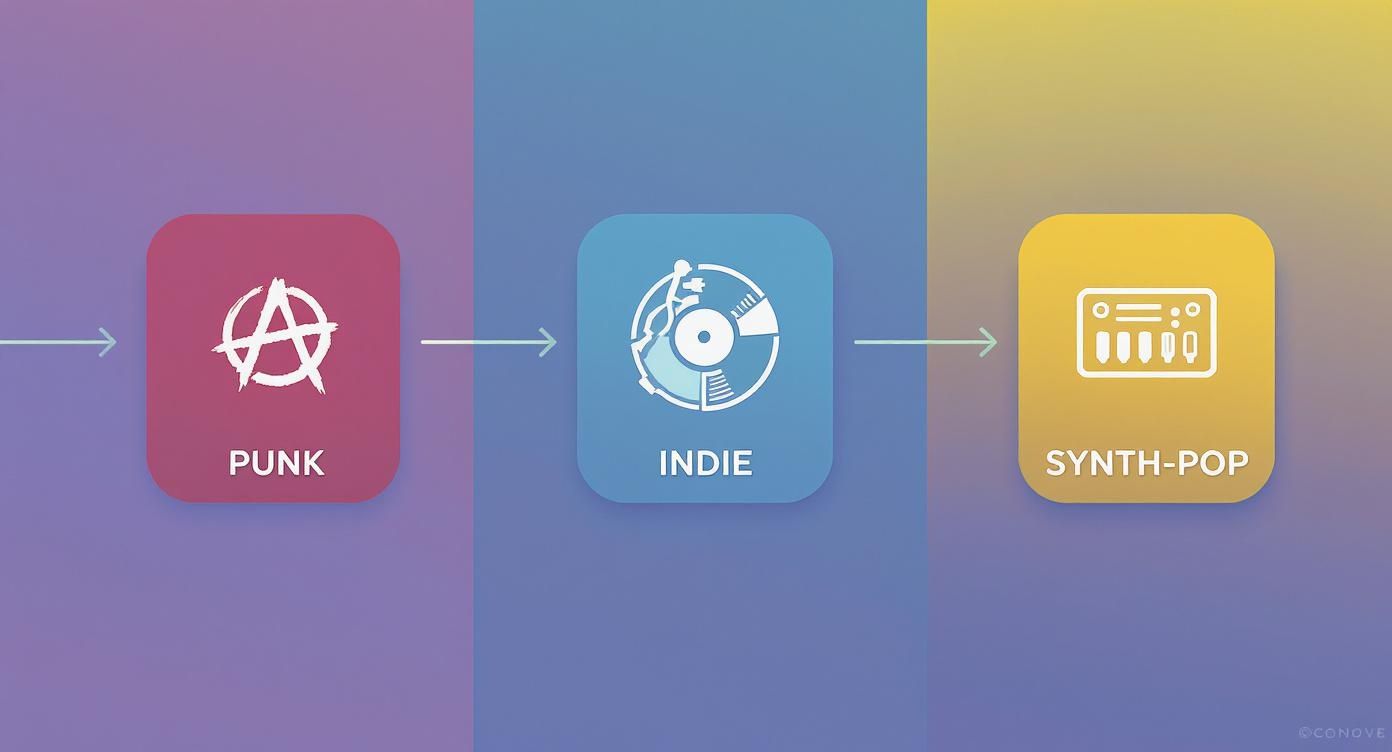
As you can see, genres like Punk, Indie, and Synth-Pop each created a unique visual language that fans can spot from a mile off.
The Look of Rebellion and Revolution
Take the punk movement. It championed a DIY, anti-establishment ethos that bled directly into its poster design. Think ransom-note lettering cut from newspapers, stark black-and-white images, and a general sense of beautiful chaos. It was cheap, it was fast, and it perfectly mirrored the raw energy of the three-chord anthems it promoted.
Then you have the psychedelic posters of the 60s, which were a completely different beast—a kaleidoscopic explosion of colour and fluid, almost illegible typography.
These posters weren't just advertising a concert; they were advertising an experience. They were a visual invitation to tune in, turn on, and drop out, capturing the free-spirited, experimental nature of the era.
Understanding this journey adds a whole new layer of appreciation for the prints on your wall. They stop being just decorations and become what they truly are: tiny, perfectly framed pieces of cultural history. Each one tells a story not just of a band, but of a time, a place, and a feeling.
How to Choose a Poster That Doesn't Suck
Right, you’ve decided your walls need a personality transplant. You're ready to move beyond blu-tack and invest in some proper wall art. But a quick search for poster design music online unleashes a tidal wave of options. So, how do you pick a print that truly sings, rather than one that screams 'first-year student halls'?
This is your guide to becoming a savvy collector. First things first, let's talk about quality. Nothing kills the vibe faster than a blurry, pixelated mess that looks like it was printed on a piece of kitchen roll.
Always check you're buying from a reputable seller who actually cares about paper stock and ink. A high-quality Giclée print, for example, will have rich, deep colours and crisp lines that will look brilliant for years to come. It’s the difference between watching the match in glorious HD and a dodgy stream that keeps buffering.
Official Merch vs. Inspired Art
Next up, you’ll find yourself navigating two main camps: official tour posters and creative, artist-inspired designs. Both are fantastic, but they scratch different itches. An official tour poster is a piece of history, a tangible souvenir from a specific night. It’s pure memorabilia, a ticket stub you can actually frame.
An artist-inspired print, like the ones we love to create, is a different beast altogether. These designs take a song, an album, or an artist's whole vibe and interpret it visually. Think minimalist lyric prints, abstract illustrations of a soundwave, or a clever graphic that only true fans will get. These pieces are less about a single event and more about celebrating your connection to the music in a creative, often more subtle, way.
Choosing a poster is like picking a song for a mixtape. It has to fit the mood, tell a story, and be something you'll want to come back to again and again.
Finding Your Perfect Print
So, where do you start? How do you find something unique that feels like you? Begin by thinking about what you love most about an artist. Is it a specific lyric that hits you right in the gut every time you hear it? The raw, chaotic energy of their live shows? Or the entire aesthetic they’ve carefully built around their music?
Let that be your guide.
- For the Minimalist: Look for prints with clean, elegant typography focusing on a single powerful lyric, or simple, iconic symbols associated with the band.
- For the Storyteller: Go for designs that illustrate a concept from an album or a piece of band lore. Something that tells a story at a glance.
- For the Bold: Choose vibrant, graphic-heavy designs that make an immediate statement, much like a killer guitar solo that grabs you from the first note.
Ultimately, the goal is to curate a collection you'll love for years, not just a random assortment of pictures. By thinking about quality, style, and your own personal connection to the music, you'll build a gallery wall that's the perfect tribute to your life's soundtrack.
DIY Poster Tips For Your Band Or Dream Project
So, you’ve got the tunes and the ambition. Now you just need to get the word out. Whether you’re plastering the local pub walls for your band’s first gig or just designing a fantasy poster for an album you love, diving into DIY design is a proper buzz.
Don't sweat it if you're not a design guru. Think of this as your friendly cheat sheet to creating something that looks genuinely cool, even if your artistic skills are usually reserved for doodling on notebooks during a boring meeting.
Avoiding The Classic Blunders
The first rule of DIY poster club? Less is more. I know it’s tempting to throw every font and colour your laptop has to offer at the page, but that usually ends in a visual mess that looks like a fire in a paint factory.
- Stick to two fonts, three at a push. Seriously. One for the big headline, one for the details. That’s all you need to keep things clean.
- Pick a simple colour scheme. A couple of colours that work well together is the way to go. You want to avoid combinations that clash harder than Liam and Noel Gallagher in the mid-90s.
- Give your text some breathing room. Don't cram everything together. White space is your best mate here—it makes everything easier to read from across a crowded pub.
Making It Look The Business
You don’t need to splash out on fancy, expensive software to get started. There are tons of brilliant, user-friendly tools online like Canva that offer templates and simple drag-and-drop features.
The real trick is to start with a single, strong idea. What’s the one image or feeling you want people to get from a glance? Focus on nailing that.
A great DIY poster doesn’t try to do everything. It does one thing brilliantly. It grabs attention, delivers the key info, and gets out of the way. It’s the design equivalent of a perfect three-minute pop song.
Once you’ve poured your heart into the design, the next step is making sure it prints properly. Getting your file ready can feel a bit technical, but it’s a crucial last hurdle. For some solid advice on getting your design print-ready, check out these artwork submission tips for beginners.
At the end of the day, it's all about having fun and making something that’s pure you—something that’ll make people stop and look.
Got Questions About Music Posters? We've Got Answers.
Still got a few things you're wondering about? Good. That's what this section is for. Let's tackle some of the most common questions we hear, from nailing the perfect wall display to figuring out what makes a design truly legendary.
What Makes a Music Poster Design Iconic?
An iconic design manages to bottle the entire spirit of an artist, an album, or even a whole musical movement into a single, powerful image. It’s rarely about being complicated; it's about a bold, unforgettable idea that gets stuck in your head just like a killer chorus.
Think of the Sex Pistols' 'God Save The Queen' poster. It's defiant, instantly recognisable, and screams punk attitude with a few clever, simple twists. A design earns its iconic status when it becomes so deeply connected to the music that you can't separate the two. It’s the visual equivalent of a timeless guitar riff.
What’s the Best Way to Hang Multiple Music Posters?
If you've got a growing collection, the gallery wall is your best bet. The real secret is to mix things up – play with different frame sizes, styles, and even colours to create a look that feels intentionally curated rather than just cluttered. Think of it as mixing a DJ set for your wall; it all needs to flow together.
The golden rule for a great gallery wall? Always lay your posters out on the floor first. Arrange, rearrange, and then rearrange again until you find a layout that clicks before you even think about picking up a hammer.
A great starting point is to place your largest piece slightly off-centre and then build the smaller frames out from there. To get that professional, balanced feel, try to keep the centre of the entire arrangement at eye level. It just feels right.
Are Limited Edition Prints Worth the Extra Cash?
For a serious fan or a dedicated collector, absolutely. A limited edition, screen-printed gig poster is more than just a picture; it’s a genuine piece of history. These are often signed and numbered by the artist, giving you a tangible connection to a specific night that can even go up in value over time. It’s the difference between owning the match-worn shirt and just buying a replica from the club shop.
That said, if you're simply after some brilliant art to liven up a room and show off your great taste, a high-quality reproduction can look just as fantastic on your wall for a fraction of the cost. It really just depends on whether you see it as a piece of art or as a piece of memorabilia.
Ready to find the perfect print that tells your story? At Striped Circle, we’ve got a massive collection of music and football-inspired art that’s designed to make you smile. Check out our latest prints and give your walls the personality they deserve.
