

How to Print Pop Art That Doesn't Suck
Let's be honest, your walls are probably crying out for a bit of personality. A killer print pop art piece is the perfect antidote to boring beige, acting as the headline act for your home or office. It’s about ditching generic landscapes for something bold, vibrant, and full of character that actually means something to you – like your favourite band or the team you’d die for.
Your Guide to Legendary Pop Art Prints
Blank walls are a crime against good vibes. Filling them isn't just for posh people; it's about surrounding yourself with things that spark joy and tell your story. That's where pop art prints come roaring in, turning any room into a celebration of the things you truly love – be it music, football, or just pure, unadulterated cool.
We're talking iconic images of music legends and football heroes, all captured with an electrifying splash of colour that’ll make you smile every time you walk past.
Think of your home as your personal festival main stage, and the art you hang is the headliner. You wouldn't book a bland acoustic act, would you? Of course not. You want the swagger of Liam Gallagher, the genius of Bowie, or the roar of the crowd after a last-minute winner. Pop art channels that exact energy directly onto your wall.
What Makes Pop Art So Special?
Pop art first exploded onto the scene back in the 1950s, taking its cues from everyday culture—adverts, comic books, and celebrity photos. Trailblazers like Andy Warhol and Roy Lichtenstein made art accessible and fun, proving it didn't just belong in stuffy, silent galleries where you're afraid to cough.
The core principles are simple but incredibly effective:
- Bold Colours: We're talking bright, unapologetic shades that instantly grab your attention. No magnolia here, thank you very much.
- Iconic Imagery: It celebrates the familiar, from rock stars to legendary footballers.
- A Sense of Humour: There's often a playful, witty edge to the work, because art shouldn't take itself too seriously.
This guide is your all-access pass to understanding the world of print pop art. We’ll demystify the jargon (what on earth is a 'giclée' print?), show you how to spot a quality piece, and help you choose art that genuinely reflects your passions. For a contemporary twist on legendary art that often parallels pop art's themes, you could even explore Banksy wall decals as another bold statement piece.
Pop art is about liking things. It's an enthusiastic art form that connects directly with popular culture, whether that's the chart-topping hits of today or the legendary goals of yesterday. It’s art for everyone.
So, whether you live for match day or have a vinyl collection that's the envy of your mates, we'll help you turn any room into a testament to what makes you tick. Get ready to create a space that's unapologetically you.
Understanding Print Quality Giclée vs Screenprints
Right, let's get into the slightly techy bit, but don't worry, we'll keep it simple. Not all prints are created equal. Think of it like a dodgy bootleg recording of a classic gig versus the pristine studio master—one sounds like it was recorded in a bin, the other is crystal clear.
When it comes to your print pop art, you want the studio master experience every single time. That’s where knowing the difference between printing methods comes in. It ensures you’re not just buying a poster, but investing in a piece of art that’ll make you smile for years to come.
Deciding what your blank walls need can be a tough call, but this flowchart makes it dead simple.
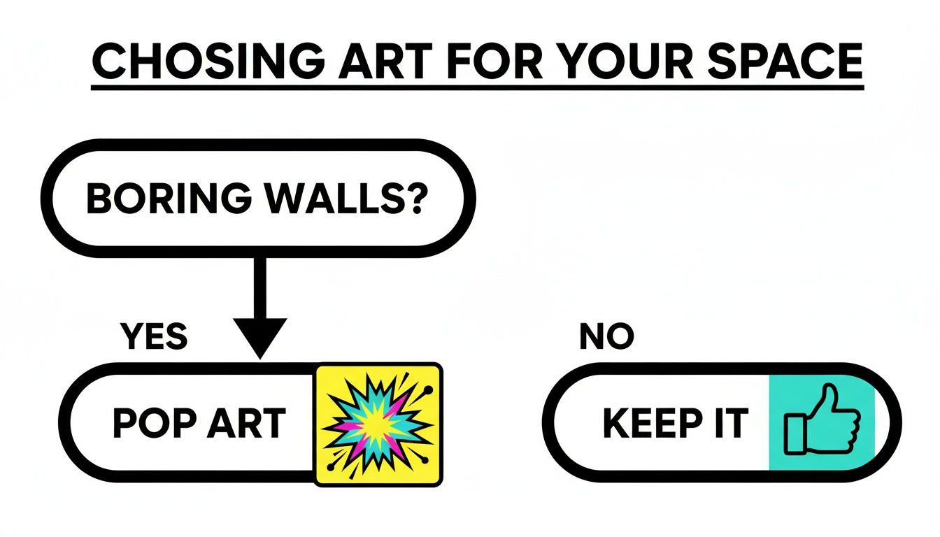
As you can see, if your walls are feeling a bit boring, the only logical answer is a burst of pop art. Problem solved.
The Giclée Print The Studio Master
First up is the giclée (pronounced 'zhee-clay', for anyone wanting to sound fancy). This is the high-fidelity, top-of-the-range method. It uses sophisticated inkjet printers with archival, pigment-based inks on premium, acid-free paper.
What does that actually mean? It means you get incredible colour accuracy and detail. A giclée print of a detailed portrait, like a moody shot of Liam Gallagher, will capture every nuance perfectly. Crucially, these prints are built to last; they can resist fading for 100 years or more, so they’ll look just as sharp when your grandkids are arguing about some terrible future music.
The Screenprint The Indie Band Method
On the other side, you have screenprinting. This is a classic, hands-on technique, like an indie band pressing their own vinyl. It involves pushing ink through a fine mesh screen with a stencil, applying one colour at a time to build up the final image.
Screenprints are known for their bold, vibrant, and tactile layers of ink. This method is perfect for graphic designs, like a stylised club crest or a minimalist gig poster, where flat, punchy colours make the biggest impact. While not as detailed as a giclée, a screenprint has a unique, handcrafted character that many people love. For more details on the craft, you can learn all about limited edition printing methods in our other guide.
Here's a simple breakdown of the two main methods for creating high-quality pop art prints, helping you choose the right style for your walls.
Giclée vs Screenprint A Quick Comparison
| Feature | Giclée Print | Screenprint |
|---|---|---|
| Best For | High detail, photography, complex illustrations | Bold graphics, simple logos, flat colour blocks |
| Colour | Rich, continuous tones with millions of colours | Vibrant, solid blocks of colour, applied one at a time |
| Feel | Smooth, flat finish on the paper surface | Slightly raised, tactile layers of ink you can feel |
| Longevity | Excellent; can last 100+ years without fading | Very good, but longevity depends on ink quality |
So, there you have it. Choosing the right type of print really comes down to the artwork itself. A highly detailed piece shines as a giclée, whereas a bold, graphic design benefits from the punch of a screenprint. Understanding this difference ensures your chosen print pop art looks its absolute best, whether it's hanging in your office or taking pride of place above the sofa.
How to Spot a Quality Art Print
You wouldn't buy a band t-shirt that fades into a grey smudge after one wash, would you? So why settle for a pop art print that does the same on your wall? Let's turn you into a print-spotting expert, so you can tell the festival headliners from the dodgy tribute acts.
The secret isn't complicated; it really just boils down to two things: the paper and the ink.
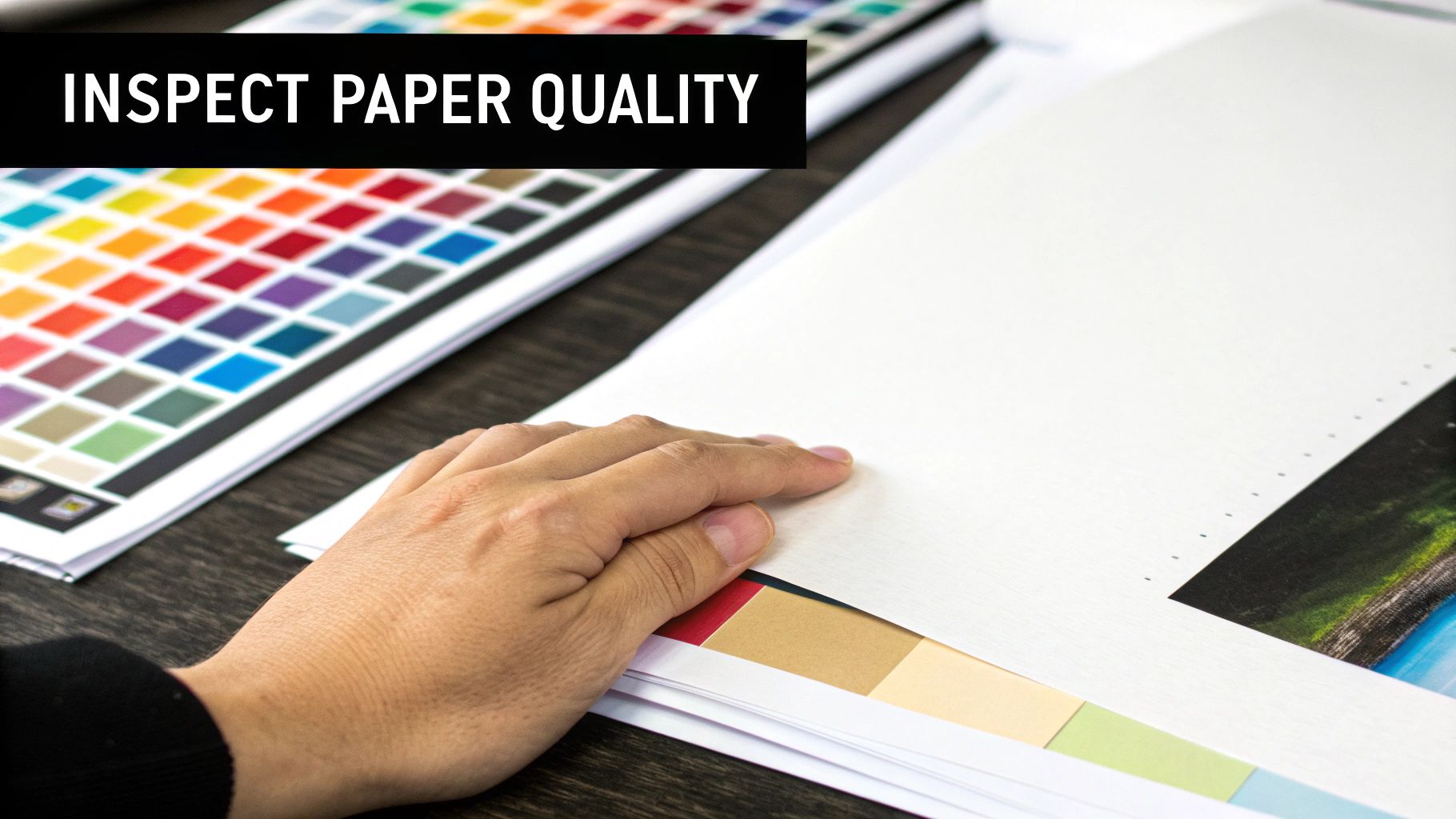
Think of it like a classic album. The music (the artwork) is obviously vital, but the quality of the vinyl pressing (the paper and ink) is what makes it sound crisp and clear, rather than like it was recorded in a skip.
Feel the Weight of Quality
First up, let's talk paper. You’ve got your standard flimsy poster paper, which is fine for a teenage bedroom wall, but we’re aiming for something more substantial—something that feels like a proper piece of art in your hands.
The key term you need to know is GSM, which stands for 'grams per square metre'. It’s just a simple way of measuring paper thickness and density.
- Low GSM (around 90-120): This is your typical office printer paper. Thin. Flimsy. Avoid.
- Mid-range GSM (170-200): A step up, often used for decent posters. It holds colour reasonably well but lacks that premium, weighty feel.
- High GSM (230-310+): Now we're talking. This is the good stuff. It's heavy, durable, and feels significant. It also absorbs ink beautifully without buckling, making the colours truly pop.
A higher GSM isn’t just about feeling fancy; it's a practical sign of durability. Heavier paper provides a more stable base for the ink, ensuring your print stays flat and vibrant for years, not just weeks.
This heavier stock also comes in different finishes. A smooth matte finish, for example, delivers rich, vibrant colours without any of that annoying glare, making it perfect for hanging opposite a window. On the other hand, a textured fine art paper can add a subtle depth and a tactile quality, giving the print an almost gallery-like presence.
The Secret Sauce is in the Ink
Now for the other half of this dynamic duo: the ink. A quality print will always use archival, pigment-based inks. This is the kind of stuff museums trust for their collections. Unlike the standard dye-based inks in your home printer, which can fade faster than a one-hit wonder's career, archival inks are engineered to resist UV light and airborne pollutants.
What does that mean for you? It means your print of Eric Cantona's iconic celebration will look just as sharp and defiant in a decade as it does the day you hang it. The colours will stay true, avoiding that washed-out, yellowish tint that plagues cheaper prints over time.
So, when you’re hunting for your next piece, keep an eye out for mentions of high GSM paper and archival inks. These two things are the bedrock of a quality print, ensuring your art can outlast trends, house moves, and even a few questionable redecorating phases. It’s the difference between a fleeting hit and a timeless classic.
Curating Your Collection of Prints
Right, this is where the real fun begins. Forget everything you think you know about stuffy art curation. Choosing a print pop art collection is personal, like crafting the perfect playlist or picking your all-time starting eleven. It’s all about showcasing what you love and telling your own story.
This isn’t just decoration; it’s a personal tribute to the music, moments, and matches that define you. It’s about creating a space that feels unapologetically yours, a place that makes you and anyone who visits crack a smile.
For the Music Obsessives
Are you a die-hard music fan? Brilliant. Think of your wall as a festival line-up that you get to curate yourself. You can go deep on a specific era or genre—imagine a gallery wall dedicated to the glorious chaos of ‘90s Britpop, for instance.
You could mix things up with:
- Lyrical genius: A bold, typographic print featuring a classic line from The Smiths or Oasis.
- Iconic portraits: A vibrant pop art graphic of David Bowie in his Ziggy Stardust prime.
- Minimalist vibes: A stylised, simple gig poster from a legendary venue or tour.
The key is finding a common thread. It could be a consistent colour scheme (like black, white, and one accent colour), a genre (hello, indie sleaze revival), or a specific decade that holds a special place in your heart. This is how you create a look that feels deliberate and cool, not just a random collection of posters Blu-Tacked to the wall.
Think of it like this: your collection should have a rhythm. Each piece is a different instrument, but together they create a perfectly harmonised track. It’s your visual anthem.
This approach transforms your wall from a simple display into a conversation starter, a visual journey through your musical tastes.
For the Football Faithful
If your weekend happiness is dictated by 22 people chasing a ball, then your walls should reflect that passion. Celebrating your club's legacy through art is a brilliant way to show your colours without resorting to a tatty old flag you won at the fair.
Consider pairing different styles to tell your club’s story:
- Hallowed Ground: A print of your team's historic stadium, capturing the soul of your home turf.
- Club Legends: A pop art portrait of a true icon—think Cantona’s swagger or Gerrard’s heroics.
- Kit Classics: A stylised design of a retro kit, reminding everyone of a golden era.
By mixing different types of prints, you build a collection that’s rich with history and personality. Our guide to what is a pop art print can give you even more ideas on how to blend these themes. This is more than just fandom; it's a testament to the loyalty, the heartbreak, and the sheer joy of the beautiful game.
How to Frame and Hang Your Art
Right, you’ve found the perfect print. Now, whatever you do, don't let it become one of those forgotten relics, languishing in a cardboard tube under the bed, collecting dust and regret. Nailing the framing and hanging is what elevates a great piece of art into a stunning centrepiece that makes your mates jealous.
Honestly, this final step is the difference between your place looking effortlessly cool and, well, a bit like a student digs.
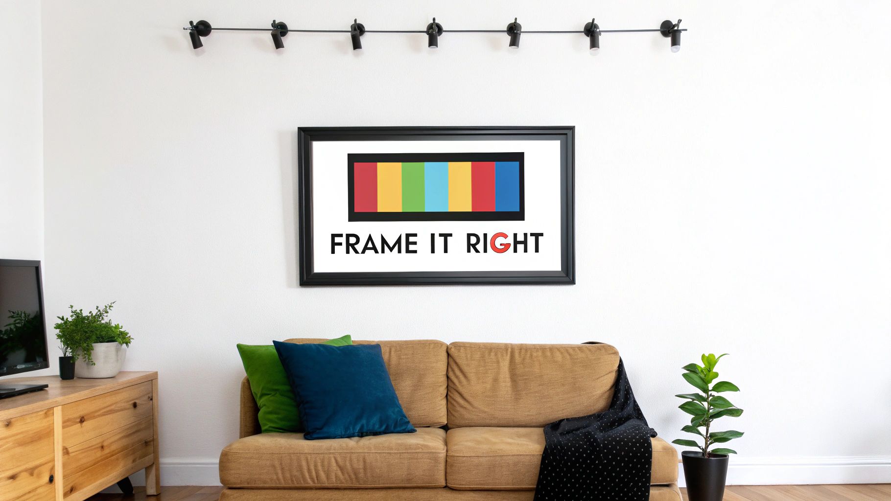
Choosing the Right Frame
First things first, let's talk about the frame itself. Think of it as the print's outfit—it needs to complement the main event without stealing the show. With something as bold as print pop art, you can rarely go wrong with a simple, classic frame.
- Black or White Frames: These are the reliable roadies of the art world. They’re clean, sharp, and let the vibrant colours of your print do all the talking. No distractions, just pure impact.
- Natural Wood Frames: If you're aiming for a bit of warmth and a slightly more relaxed vibe, a natural wood frame is a brilliant choice. This look works especially well against darker wall colours, creating a really nice contrast.
Then you've got the great debate: to mount or not to mount? (We're talking about that white border between the frame and the print). Our verdict? Absolutely use one. A mount gives the artwork breathing room, stops it from looking squashed against the glass, and instantly makes the whole setup feel more professional and considered.
If you need a bit more guidance on this, we've got you covered. Check out our deep-dive on how to frame posters for some extra tips.
Getting It on the Wall
Now for the part that often fills people with a certain kind of DIY dread: hanging it up. But fear not. You don’t need an engineering degree to get it right. Once your prints are all framed up and ready to go, you can ensure they're displayed perfectly with this step-by-step guide to hanging your picture with precision. It’s much easier than you think to get your art perfectly level, whether you're hanging a single statement piece over the sofa or creating an ambitious gallery wall.
Investing in good art is becoming more common, as people look for pieces that bring joy and personality to their homes. The art market is reflecting this shift, making cool, accessible prints a fantastic choice.
The UK print market has seen some pretty remarkable growth. In a single year, 54,602 print lots were sold at auction globally—the highest figure in a decade. It really shows a huge shift towards accessible pieces, with the UK standing out as a major hub. By following these simple steps, you can confidently get your art on the wall and make your home look brilliant.
Got Questions About Pop Art Prints? We've Got Answers
Still have a few things you're wondering about? No problem at all. We get asked a lot about the nuts and bolts of buying and looking after print pop art, so we’ve put together the most common queries right here.
Think of it as the encore after a great gig—just a few more hits to make sure you leave feeling completely satisfied and ready to go.
What’s the Best Way to Look After My Prints?
The biggest enemy of any print is direct sunlight. It's the number one cause of fading colours, so keep your art well away from any windows that get a lot of sun. Your best line of defence is framing it behind UV-protective glass—it’s like putting factor 50 on your artwork.
It’s also a good idea to avoid hanging prints in really humid places, like a bathroom. All that moisture in the air can cause the paper to warp and ripple over time. When it comes to cleaning, a gentle wipe with a soft, dry cloth is all it needs. Definitely no cleaning sprays! This isn't your kitchen counter.
Are Giclée Prints Really Worth the Extra Money?
In a word: yes. Think of it like this: you can buy a dodgy knock-off shirt outside the stadium, or you can get the official kit. A cheap poster might look okay from a distance, but the colours will fade faster than a one-season wonder.
A giclée print is an investment. You’re paying for archival-quality inks and paper, which means the colours will stay as bold and vibrant as the day you bought it, for a lifetime. It truly does justice to the artist's original vision.
It's about buying something you love once and having it look amazing forever.
How Do I Create a Gallery Wall That Doesn't Look a Mess?
A little bit of planning goes a long way here. The best trick is to lay all your framed prints out on the floor first. You can shuffle them around and play with the layout until it feels right, before you start banging nails into the wall. It’ll save your plaster from looking like Swiss cheese.
To get that cool, curated vibe, try picking one thing to tie it all together. This could be:
- A consistent frame colour: Sticking to all-black or all-white frames always looks sharp.
- A common theme: Grouping prints like ‘90s Britpop icons or your club’s legendary players creates a strong narrative.
- Uniform spacing: Keeping the gap between each frame the same gives the whole arrangement a clean, organised feel.
Ready to find that perfect headliner for your walls? At Striped Circle, our whole vibe is about creating unique music and football-inspired prints that will make you smile. Take a look at our collection and find the piece that tells your story at https://www.stripedcircle.com.
