

Retro Style Wall Art: Give Your Walls a Proper Backstage Pass
Let's be honest, your walls are probably a bit boring. It's okay, we've all been there. But what if they could be a time machine? A visual encore of the music, footy, and pop culture that actually means something? That's where retro style wall art comes in. It's the visual equivalent of the opening riff to Oasis's 'Live Forever' or the sheer, beautiful arrogance of a Cantona collar pop. It’s a shot of pure nostalgia that’ll make you, and anyone who visits, crack a smile.
What Exactly Is Retro Style Wall Art Anyway?
Right, let's get into it. Retro style wall art isn't about slapping up your nan's dusty old posters. It's about capturing the unmistakable vibe of a specific era, usually from the swinging 60s right through to the glorious, baggy-jeaned 90s. It’s not about being old; it’s about having a personality that screams "the good old days were better".
Think of it less like an antique and more like a classic vinyl record – it sounds just as good today, but it’s got a history and a story that some soulless streaming playlist just can't match. It's the art of looking back with a modern twist. This isn’t about slavishly copying the past but bottling its essence. The cool thing is, you don’t need a Delorean to bring this vibe home. A simple print can inject that energy into a room, making it a talking point when your mates are over.
The DNA of a Retro Print
So, what gives a piece of art its retro credentials? It usually boils down to a few key ingredients that create that signature feel.
- Bold Typography: Think chunky, groovy fonts from the 70s or the sharp, geometric lettering of the 80s. The words are as much a part of the art as the images themselves. Proper in-your-face stuff.
- Iconic Imagery: This is where the magic happens. It could be a silhouette of your favourite frontman, a stylised graphic of a legendary football stadium, or patterns that instantly transport you to a different time.
- Distinct Colour Palettes: Each decade had its own look. The 60s had psychedelic brights, the 70s brought earthy tones like mustard and brown (we've forgiven them), while the 80s were all about neon and pastels.
Retro art taps into a shared cultural memory. It's the reason a print of a classic album cover or a vintage football programme feels so personal—it connects us to moments that meant something, whether we were there or just wish we had been.
Understanding the evolution of this style often means looking at popular art forms from those periods, from the flowing lines explored in our guide to Art Nouveau posters to the bold graphics of classic pin-up art. It's all part of the same rich tapestry.
The demand for this kind of decor is massive. In the UK, the wall art market hit a robust USD 3,597.2 million in revenue back in 2022, with experts projecting it to climb to USD 5,500.4 million by 2030. Wallpapers and stickers dominated with a huge 34.59% share, proving that people love an easy way to slap up a retro lyric print or a vintage-inspired poster without any fuss.
How to Choose the Perfect Retro Print
Right then, you’ve decided your walls need a dose of nostalgia, but now you’re staring at a screen full of options, paralysed by the fear of picking the wrong one. Don't panic. Choosing the perfect retro print is less like sitting a final exam and more like making a killer mixtape; it’s all about what gives you the feels.
Think about the moments that give you that buzz. Is it the lyrics from a song that defined your university days, blasted from a mate's dodgy speakers? Or maybe it's a tribute to your football club's glory years, a reminder of a last-minute winner that had you leaping off the sofa. That feeling is your starting point. The best retro style wall art is personal.
Finding Your Perfect Match
Before you even think about size or materials, you need to narrow down your theme. What story do you want your wall to tell?
- The Music Head: Are you all about the swagger of Britpop, the raw energy of punk, or the groovy basslines of 70s funk? Look for prints celebrating iconic albums, legendary gigs, or lyrics that hit you right in the feels.
- The Football Fanatic: It could be a minimalist design of your club’s stadium, a vintage-style programme cover, or a print immortalising a cult hero. This is your chance to show your colours with a bit of class.
- The Film Buff: Think stylised posters of classic films or memorable quotes that have become part of your everyday banter.
Getting the Size and Material Spot On
Once you’ve got your theme, it’s time for the practical stuff – think of it as the tactics board for your decor. You wouldn't hang a tiny A4 print on a massive living room wall any more than you'd play a 5'5" striker up front on his own.
Choosing art shouldn't feel permanent or daunting. A common mistake is getting so worried about what a piece says about you that you end up with blank walls. Just hang what you love – it’s as simple as that.
The key is scale. A smaller print can be perfect for a home office or a narrow hallway, while a massive statement piece can anchor an entire living room. For a bit of inspiration on how different sizes and styles work in a space, you can explore diverse framed prints and see what catches your eye.
Then there’s the material. A standard poster is fine, but a high-quality giclée print on archival paper is the equivalent of watching the match in HD. The colours are richer, the details are sharper, and it’s built to last, ensuring your art stays looking top-notch for years.
The UK's wall art market is booming, with a forecasted 6.3% growth rate through 2035. While online shopping is convenient, offline stores still hold over 60% of the revenue, letting shoppers feel the quality of a proper print before committing. This is more than just decoration; it's an investment in your home's personality.
Finding the Right Frame for Your Art
So, you’ve picked out a print that’s an absolute worldie – a proper top-corner finish for your wall. But hold on, the job’s not done. A brilliant piece of retro style wall art without the right frame is like a lead singer without a rhythm section. It just doesn’t feel complete. The frame is the unsung hero that pulls the whole look together.
Get it wrong, and you can kill the vibe of even the coolest artwork. A cheap, flimsy frame on a print celebrating your club's glory days? It's the equivalent of serving lukewarm Bovril on a cold Tuesday night at Stoke. We can do better.
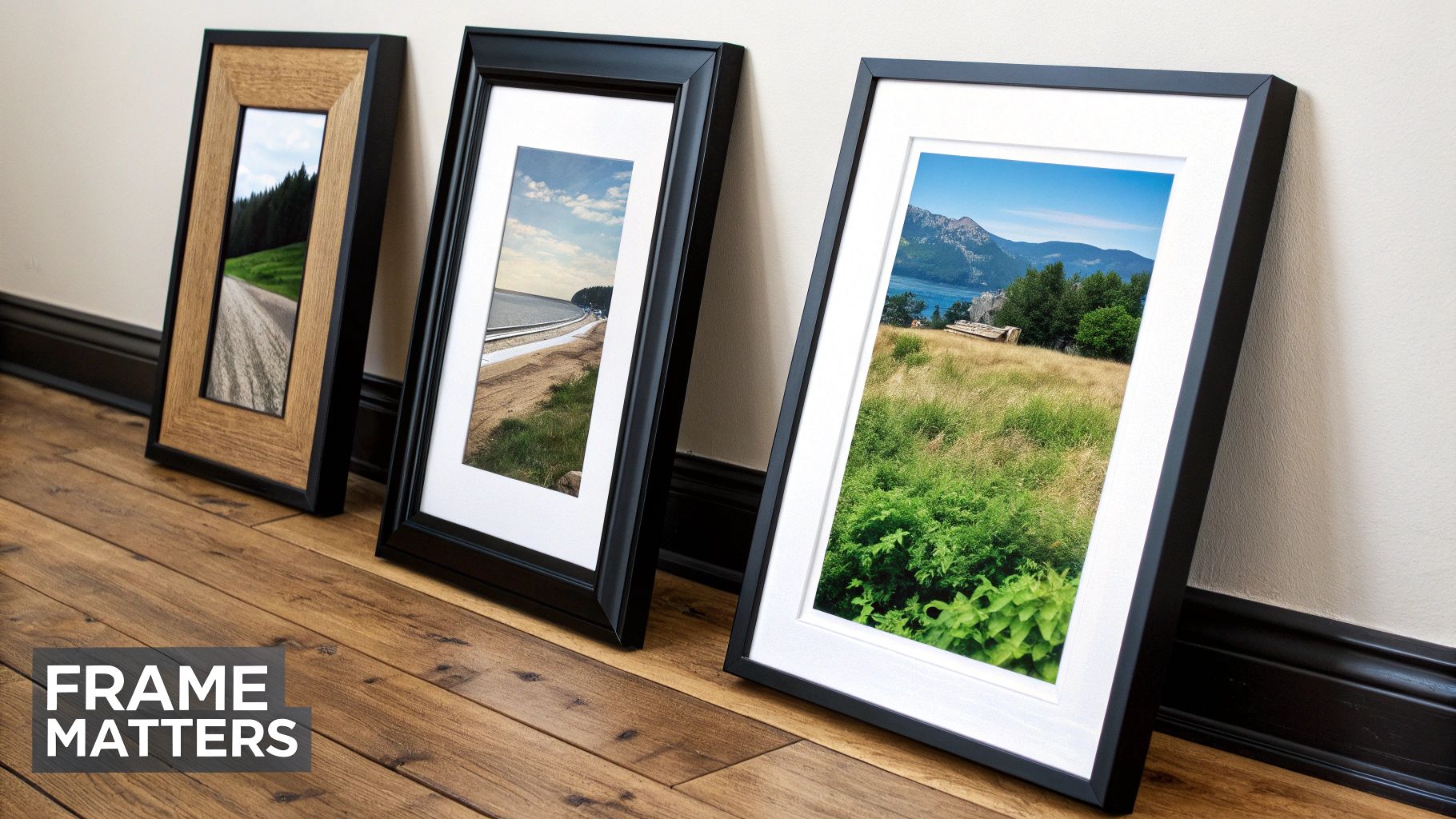
Matching the Frame to the Vibe
The style of your frame can completely change the personality of your print. A sleek, modern black frame, for instance, gives a sharp, gallery-style finish that makes bold colours and typography really pop. It's the perfect choice for a punchy 80s or 90s piece.
On the other hand, a natural wood frame adds warmth and a rustic touch, which works brilliantly with the earthy tones you might find in a 70s-inspired design. Think of the frame as the backing track to your print’s lead vocal; it needs to complement it, not compete with it.
To Mount or Not to Mount
That little white border around a print, known as a mount (or mat), isn't just there for show. It gives the artwork some breathing space, drawing your eye towards the centre and making the whole piece feel more premium.
- Use a Mount When: You want to add a touch of sophistication or make a smaller print appear larger and more significant. It’s a classic look that rarely fails.
- Go Borderless When: You're after a bolder, more direct statement. A full-bleed print in a simple frame feels modern and impactful, letting the artwork do all the talking.
Don't overthink it. A good rule of thumb is to match the frame colour to a secondary colour in the print. When in doubt, you just can't go wrong with classic black or white.
Deciding on the perfect dimensions can sometimes feel like a tricky puzzle, but getting it right ensures your art looks polished and professional. If you're scratching your head about sizes, check out our guide on what size poster frame you need for some straightforward advice. Ultimately, the goal is to make sure your new art looks like it was always destined to be there, proving you’ve got an eye for the details.
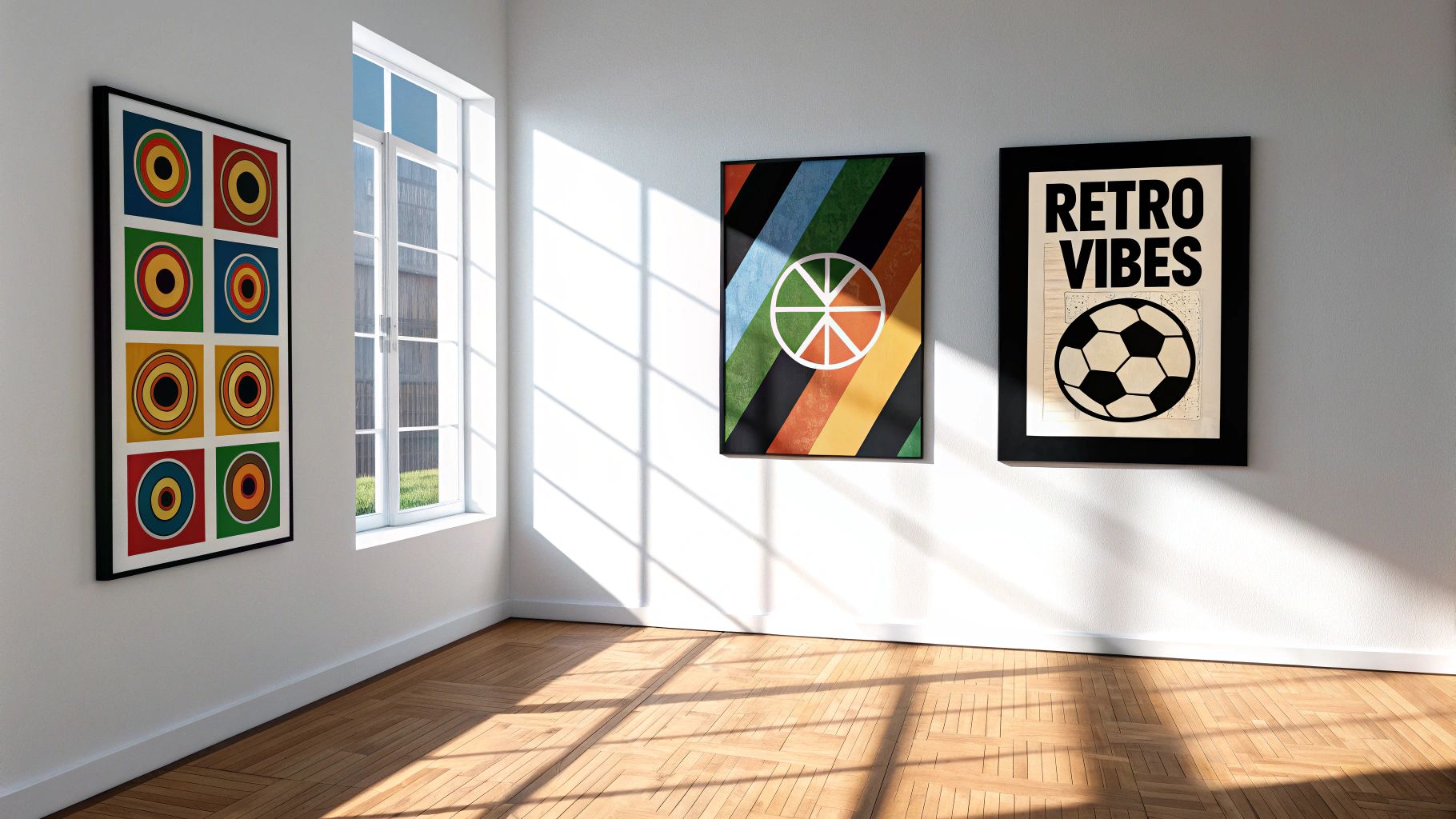
Where to Hang Your Retro Wall Art
Alright, your brilliant new retro print has arrived, and it looks the business. But where's it going to live? Don't just bang it up on the first available nail and call it a day. Think of your home as a stadium, where each room is a different stand with its own unique atmosphere. It’s time to take your retro style wall art on a proper tour of the house.
Letting your prints take pride of place across your home is a move that's catching on. The UK's wall art scene is definitely on the up, with experts predicting the Europe-wide market will grow by a massive USD 16.42 billion between 2024-2029. And with online art sales reaching $10.2 billion back in 2021, it’s never been easier to find those perfect retro gems without even leaving your sofa. You can read more about the booming British art market and see what all the fuss is about.
The Living Room Command Centre
Your living room is the headline act, the main stage. This is where you make your biggest statement, usually right above the sofa. A brilliantly curated gallery wall here can tell the story of your life’s soundtrack—maybe a Stone Roses lyric print hanging proudly next to a tribute to your football club’s treble-winning season. It becomes a natural conversation starter, a visual autobiography that says infinitely more about you than any generic high-street canvas ever could.
A Personal Sanctuary in the Bedroom
The bedroom is a different beast altogether. This is your personal dressing room, your backstage area. The vibe in here should be more intimate and subtle. Think less about a wall of sound and more about a quiet, acoustic set.
A single, meaningful lyric print from a song that means the world to you can create a calming, deeply personal sanctuary. It's the last thing you see at night and the first thing you see in the morning—a quiet reminder of a moment, a feeling, or a cherished memory.
Your home is a collection of spaces, each with its own job. The living room is for showing off your personality to guests, while the bedroom is purely for you. Tailor your art to match the room's purpose.
Making Mondays Bearable in the Home Office
Let’s be honest, the home office can be a bit of a drag. It’s the place where dreams of watching midweek European football go to die under a mountain of spreadsheets. But it doesn’t have to be a soulless corporate box.
A splash of retro cool can make those Monday mornings feel a lot more bearable. A bold, graphic print of a 90s band or a minimalist design of your favourite stadium could be just the ticket. It’s a small act of rebellion, a nod to the fact that you’re much more than just your job title.
The Ultimate Fan Cave
For the truly dedicated, there's the fan cave or music corner. This isn't just a room; it's a shrine. Here, the rule is simple: more is more. Layer those prints, mix in memorabilia like ticket stubs and old programmes, and get the lighting just right. This is your space to go all out, creating an immersive tribute to the teams and tunes that shaped you. It's time to make your home’s soundtrack visible.
Creating an Unforgettable Gallery Wall
Right, one print is great, but a whole wall of them? That’s legendary, Glastonbury headline status for your gaff. Building a gallery wall can feel as intimidating as trying to agree on the best Oasis album with your mates (it’s Definitely Maybe, obviously), but it’s much easier than you think. Forget blank spaces and beige anxiety; it’s time to make your wall the main event.
The first rule of gallery wall club? There are no rules. Well, maybe a few guidelines to stop it from looking like a dog's dinner. Start by picking a theme. It doesn’t have to be rigid – think of it more like a vibe. Maybe it's a glorious tribute to Britpop, a celebration of 90s football heroes, or just a glorious mash-up of everything that makes you, you.
Planning Your Layout Like a Pro
Before you start hammering nails into the wall with the enthusiasm of a roadie setting up for a gig, take a breath. The pro move is to plan your layout on the floor first.
- Paper Cutouts Are Your Best Mate: Trace each frame onto paper, cut them out, and use a bit of Blu-Tack to arrange them on the wall. You can move them around as much as you like without committing to a single hole.
- Start with the Big Guns: Place your largest, boldest print first, usually slightly off-centre. Then, build everything else around it. This anchors the whole collection and stops it from looking chaotic.
- Mix It Up: A good gallery wall has rhythm. Mix different print sizes and frame styles to create a dynamic, curated look. A massive A2 print next to a couple of smaller A4s keeps the eye moving.
Think of your gallery wall as a visual mixtape. You need the big hitters, the quiet acoustic numbers, and a few unexpected B-sides to keep things interesting. It’s all about balance.
Blending Old with New
Don’t be afraid to mix your new retro style wall art prints with existing photos or more modern pieces. A print of Ian Brown can absolutely hang next to a family photo from your last holiday. The key is finding a common thread, like a consistent frame colour (you can’t go wrong with black) or a similar colour palette. This process makes the wall uniquely personal.
For a deeper dive into the tactics of arranging your collection, our guide on how to arrange wall art is packed with top tips to get you started.
This process flow shows some simple ideas for styling retro art in different rooms of your home.
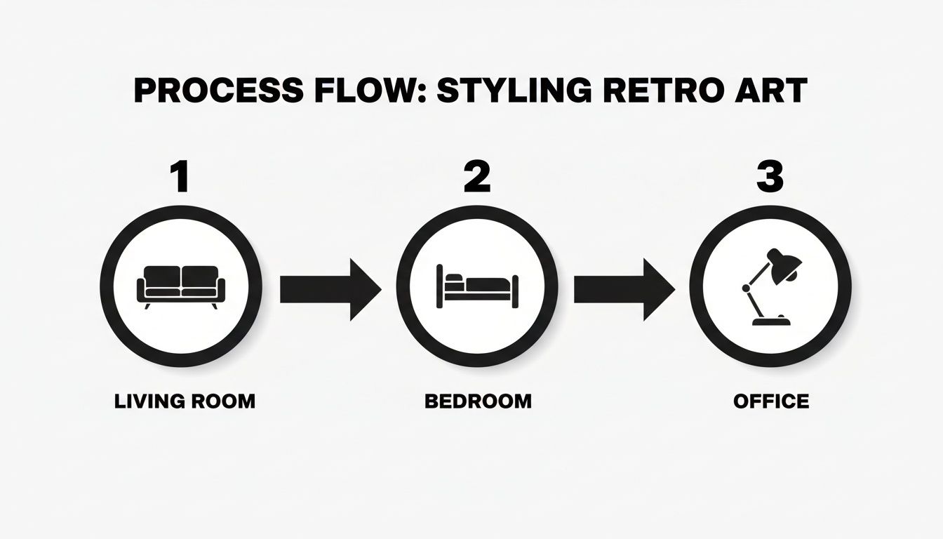
As the infographic highlights, adapting your retro art to the function of each space—from a bold statement in the living room to a more personal touch in the office—is key to a cohesive home.
Keeping Your Prints in Pristine Condition
So, you’ve picked out the perfect piece of retro wall art. Great stuff. Now, let’s make sure it doesn't end up looking as faded and sad as a forgotten B-side. This might not be the most glamorous part of owning art, but protecting your prints is the only way to keep those memories looking sharp. A legendary lyric print deserves better than a slow, tragic decline, after all.
The main villains in this story? Sunlight, dust, and humidity. Think of them as the persistent hecklers trying to ruin the show.
Defeating the Elements
Sunlight is public enemy number one. Its UV rays will bleach the colour from your art faster than you can say "one-hit wonder."
- UV-Protective Glass: If your print is a real treasure, framing it behind UV-protective glass is a game-changer. It’s basically like putting factor 50 on your favourite band poster.
- Smart Placement: Try to avoid hanging your art in direct, harsh sunlight. A wall that gets gentle, indirect light is a much safer bet for long-term vibrancy.
When it comes to cleaning, a light touch is all you need. A gentle dusting of the frame with a soft, dry cloth will usually do the trick. Whatever you do, never spray cleaner directly onto the glass—it can easily seep under the frame and cause irreversible damage to the print itself.
Treat your art like a classic vinyl record. You wouldn't leave it out in the sun or handle it with greasy fingers. Give your prints that same level of respect, and they’ll stay classics for years to come.
Frequently Asked Questions
Got a few questions still spinning in your head? It happens. Here are the straight answers to some of the most common queries we get about decking out your space with proper retro wall art.
Can I Mix Different Retro Eras on the Same Wall?
You absolutely can. In fact, you probably should! Think of your wall like a personal playlist; a mix of different genres and decades tells a much better story. Pairing a vibrant 70s rock poster with a sharp 80s football print and a 90s indie lyric piece creates a collection that's uniquely you.
The trick is to find a common thread that pulls it all together. A simple way to do this is by sticking to one frame colour, like all black or all natural wood. This little detail makes the collection look intentionally curated, rather than just a random assortment of pictures you've thrown at the wall.
What Is the Best Height to Hang Wall Art?
There's a simple rule of thumb that designers swear by, and it works every time: hang your art at eye level. For most people, this means the dead centre of the artwork should be about 145-152cm (or 57-60 inches) from the floor. This stops the piece from feeling like it's awkwardly floating too high or sinking too low.
When hanging art above furniture like a sofa or a console table, aim for about 15-20cm (6-8 inches) of space between the top of the furniture and the bottom of the frame. It just creates that perfect visual balance.
Is It Okay to Use Unframed Retro Posters?
While we're massive fans of a good frame, going frameless can definitely work if you're chasing that relaxed, student-digs kind of atmosphere. It's a great look, but just be aware that an unframed poster is vulnerable to its biggest enemies: dust, moisture, and the odd accidental tear.
If you decide to go frameless, try using poster putty or magnetic hangers to avoid poking holes in the print. For any piece you really love and want to see on your wall for years to come, though, framing is always the best way to protect your investment.
Ready to turn those blank walls into a tribute to your passions? Dive into the Striped Circle collection and find that perfect print that hits all the right notes. Check out our full range of music and football-inspired art here.
