
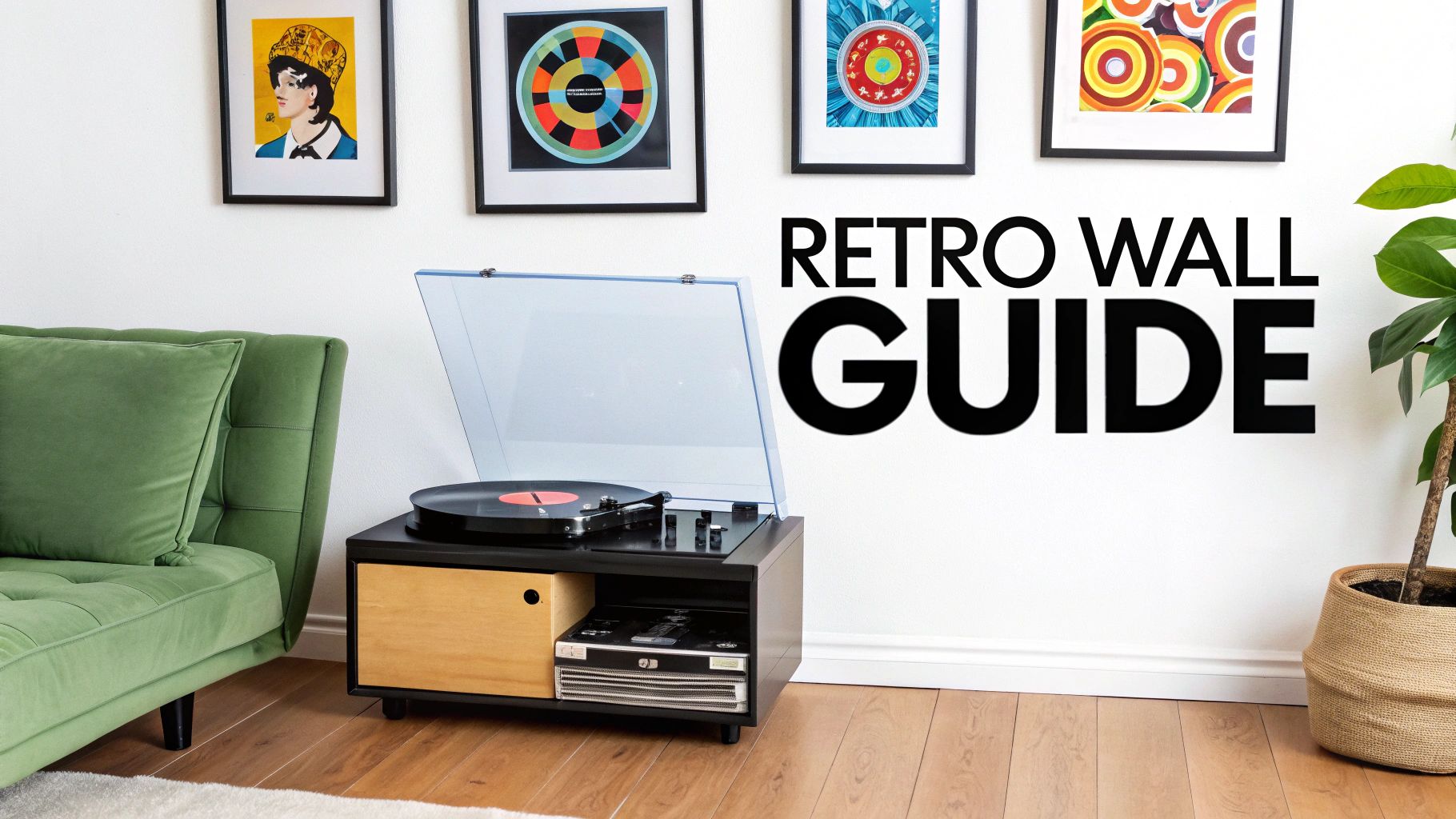
A Guide to Nailing Retro Wall art. Because Beige is Criminal.
Retro wall art is your secret weapon for injecting some much-needed personality and proper nostalgia into a space. We're talking about designs that give a massive nod to the iconic styles of the 1970s, 80s, and 90s. It’s your chance to ditch the bland, mass-produced tat and hang something that actually says a bit about you—whether that’s your passion for Madchester bands, a legendary football era, or just a film you can quote backwards. The beauty of it is finding a print that feels like it was made just for you.
Your Walls Are Boring. Let's Fix That.
Let’s be honest for a second. Your walls are probably a bit beige, a bit empty, a bit… forgettable. You’ve got the sofa, the telly, maybe a lonely-looking plant you forgot to water, but those walls are screaming out for something more. This is exactly where retro wall art steps in, acting as a cultural defibrillator for your home or office.
It's about so much more than just filling a gap. It’s about curating a vibe. A carefully chosen print can do some serious heavy lifting, instantly turning a generic box of a room into a personal hall of fame. Think of it as a game-changing tactical substitution that scores the winner in the 90th minute.
Why Retro Is Back In a Big Way
If you're thinking a throwback print is the way to go, you're not on your own. The UK wall art market is absolutely booming, with a massive surge in demand for vintage-inspired pieces. The market hit a staggering USD 3.32 billion in 2024 and is projected to nearly double by 2033. Turns out, we all want a slice of the past hanging on our walls.
This isn't just a flash in the pan; it's a full-blown comeback tour with a bigger pyro budget. And why wouldn't it be? These styles have a timeless cool that modern trends just can't replicate. They tap into a shared nostalgia for a time when album art was an event and football kits were truly legendary (and not just another template).
Choosing retro wall art is about:
- Telling Your Story: Every print is a nod to a song, a match, or a moment that means something personal to you.
- Making a Statement: It’s an easy way to wear your influences on your sleeve—or, in this case, your wall.
- Creating a Mood: Whether you want the chilled-out groove of the 70s or the electric energy of the 80s, the right art sets the tone immediately.
Your walls are the biggest canvas you own. Using them to showcase your passions isn't just decorating; it's a declaration of who you are and what makes you tick. It’s the difference between a house and a home.
In this guide, we're giving you the ultimate masterclass in picking and styling prints that hit the back of the net every time. We'll dive into different eras and help you find the perfect retro posters to make your space uniquely yours. It’s time to give those walls the character they've been begging for and turn your home into a place that genuinely makes you smile.
Finding Your Perfect Retro Vibe
Choosing a retro style is like picking your all-time favourite album or that one football season you’ll never shut up about. It has to feel right, deep down. This isn’t just about what looks good on a wall; it’s about finding a visual that captures a feeling and brings a massive grin to your face every time you see it.
Forget chasing trends. This is about pinpointing the era that speaks your language. Are you all about the analogue warmth and laid-back grooves of the 70s, or does the buzzing, neon-drenched energy of the 80s feel more like your speed? Maybe you’re a 90s kid at heart, forever loyal to Britpop and ridiculously baggy jeans.
Each decade had its own distinct personality, a unique flavour you can tap into. Finding your vibe is the first, most crucial step in turning a blank wall into a proper statement.
Choosing Your Retro Style By Era
Not sure where to start? This little guide should help you pinpoint the decade that matches your own personal style. It’s a quick rundown of the key feelings, colours, and cultural moments that defined each era's look.
| Decade | Key Vibe | Typical Colours | Think Of... |
|---|---|---|---|
| The 70s | Analogue, earthy, psychedelic, and free-flowing. | Mustard yellow, burnt orange, avocado green, and deep browns. | Vinyl records, shag carpets, Led Zeppelin album art, Holland's '74 kit. |
| The 80s | Electric, bold, geometric, and loud. | Hot pink, neon green, electric blue, and sharp contrasts. | Synth-pop, early video games, blockbuster movie posters, big hair rock. |
| The 90s | Gritty, understated, minimalist, and full of attitude. | Muted tones, black and white, simple primary colours. | Britpop, grunge bands, iconic Premier League kits, dial-up internet sounds. |
Ultimately, it’s about which column makes you nod your head and say, “Yeah, that’s me.”
The Laid-Back Cool of the 70s
Think of the 70s and you can almost smell the vinyl and hear the fuzzy guitar riffs. This era was all about earthy tones, psychedelic swirls, and a general sense of doing your own thing. The colour palette was a masterclass in muted cool: mustard yellow, avocado green, and burnt orange were the undisputed champions.
For your wall art, this translates to designs with flowing, organic shapes and a handmade feel. It's the visual equivalent of a classic rock B-side or the iconic orange of the Netherlands’ Total Football kit. A 70s-inspired print is perfect for creating a chilled-out music den or a relaxed living space where the record player is always spinning.
The Electric Buzz of the 80s
If the 70s was a chilled-out jam session, the 80s turned the volume up to eleven. Everything was bigger, bolder, and probably sprayed with an entire can of hairspray. This decade was defined by neon colours, sharp geometric patterns, and the dawn of digital culture. The vibe was pure synth-pop energy, like the cover of a Duran Duran album or the pixelated magic of early video games.
Look for prints with bold typography, clashing colours like hot pink and electric blue, and angular shapes. This is the era of iconic movie posters and bombastic stadium rock. An 80s print is a shot of adrenaline for any room, ideal for a home office that needs a creative kick or a space that screams fun.
The Understated Swagger of the 90s
After the flamboyance of the 80s, the 90s brought a different kind of cool. It was more understated, a bit moody, and packed with attitude. This was the decade of grunge, Britpop, and a more minimalist aesthetic. Think of the Gallagher brothers' swagger, the gritty photography of Nirvana, or the simple, iconic football kits of the early Premier League.
The 90s vibe leans towards a more stripped-back look with a focus on strong typography, black-and-white photography, and a raw, unfiltered feel. This style is perfect for anyone who appreciates a bit of grit with their nostalgia.
Picking your decade is less about interior design rules and more about gut feeling. It’s a personal choice that reflects your history and your heroes. It’s your story, told through colour and ink.
If you want more inspiration on where to place your newfound art, check out our guide on how to decorate walls. For some more professional pointers, there's also a great article explaining how to choose wall art like an interior designer that can help you match your passion to your space. Go on, find your decade. Your walls are waiting.
Hanging Your Art Without Making a Complete Mess
Right, you’ve picked out the perfect print. It’s a beauty – a proper tribute to your favourite band or a legendary season. But hold on a minute. Before you reach for a hammer and start swinging like a frustrated centre-back who’s just missed a sitter, let’s talk strategy.
How you hang that piece of retro wall art is the difference between it looking like a deliberate, stylish statement and, well, something you’ve just randomly thrown at the wall.
Don't just guess. Nailing the placement and sizing is what elevates your space from student digs to a curated personal gallery. It’s a simple skill, but one that makes a massive impact. This is your playbook for making that new print look like it was always meant to be there.
The Eye-Level Rule (and When to Break It)
Here's the one rule you really need to remember: hang your art so the centre of the piece is at eye level. For most of us, that's somewhere around 57-60 inches (145-152 cm) up from the floor. This isn't just a random number; it's the standard used by galleries everywhere because it places the art directly in your line of sight. It just feels right.
Think about walking into a room and having to crane your neck to see a print of your favourite album cover—it’s just plain awkward. Hitting that eye-level sweet spot makes all the difference.
Of course, rules are sometimes made to be bent, if not completely broken. A couple of scenarios where you might want to mix it up:
-
Above the Sofa: When hanging art above your sofa or a sideboard, the classic eye-level rule goes out the window. Instead, aim for the bottom of the frame to be about 6-8 inches (15-20 cm) above the furniture. This little trick creates a visual connection, making the art and the furniture below it look like a single, cohesive unit.
-
High Ceilings: Blessed with ceilings that seem to go on forever? You’ve got a bit more creative license. You can afford to hang your art a touch higher to fill that vertical space and draw the eye upwards. Just don't go mad and stick it halfway to the light fitting.
Sizing Up Your Space
Choosing the right size print is absolutely crucial. A tiny A4 print swimming on a massive, empty wall will look lost and lonely, like a solo fan in the away end. On the flip side, a giant print crammed into a small hallway can feel totally overwhelming.
Think of it like this: your art should take up about two-thirds of the width of the furniture it’s hanging over. For a 90-inch sofa, you'd be looking for a print (or a group of them) that spans roughly 60 inches wide.
This simple guideline helps create balance and ensures your art feels proportional to the room. It's a small detail that has a huge impact on the overall look. With the UK wall art market growing and expected to hit USD 5,500.4 million by 2030, getting these details right is what makes a space feel truly considered. You can read more about the trends in the UK wall art market if you fancy a deeper dive.
How to Build a Legendary Gallery Wall
Right, let’s talk about the big one: the gallery wall. This is your chance to make a proper personal statement, a private exhibition dedicated to everything you love. But we all know there's a fine line between a curated masterpiece and a cluttered mess that looks like a jumble sale exploded on your wall.
Getting it right is all about telling a story. It's your opportunity to create a visual tribute to your football club's glory days, a timeline of Britpop's finest moments, or a mixed tape of your favourite album art. A legendary gallery wall isn't just a collection of pictures; it's a conversation starter.
Finding Your Unifying Theme
The secret to a brilliant gallery wall is a common thread that ties everything together. Without one, it just looks chaotic. The theme doesn't have to be glaringly obvious, but it needs to give the whole arrangement a sense of cohesion.
So, what story do you want your wall to tell? Are you a die-hard fan of a specific music scene? You could easily build a wall around iconic band photography, lyric prints, and retro concert posters from that era.
Here are a few ideas to get the ball rolling:
- A Single Fandom: Go all-in on your team. Mix up prints of the stadium, iconic kits through the years, and portraits of club legends.
- A Decade Deep-Dive: Pick your favourite era—say, the 80s—and pull together prints that scream its essence, from synth-pop album art to classic film posters.
- A Colour Story: This is a fantastic trick. Pick two or three key colours and choose prints that feature them. A 70s psychedelic print can absolutely sit next to a 90s football shirt design if they both share a splash of the same bold red.
A great gallery wall is more than the sum of its parts. It's a snapshot of your personality. The goal is to find that common ground—whether it's a colour, an era, or just a shared feeling—that makes the collection feel intentional and uniquely yours.
Laying It All Out
Once you have your prints, whatever you do, don't pick up a hammer just yet. The planning stage is everything. Lay all your pieces out on the floor first and play around with different arrangements. This is your no-risk way to see how different sizes, shapes, and orientations work together before you commit to putting holes in the wall.
This simple visual breaks down the practical side of things.
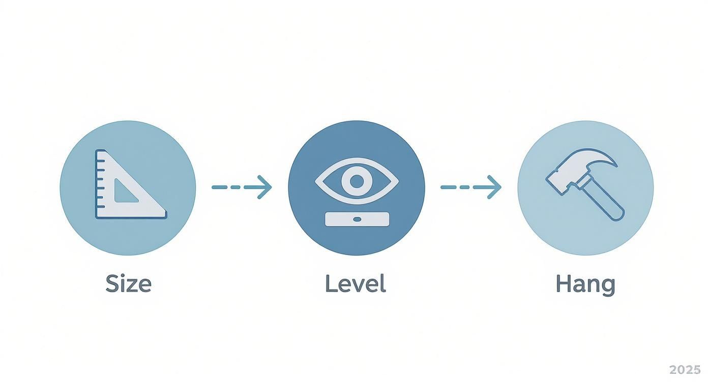
This guide simplifies the hanging process into three core steps—size, level, and hang—making sure your retro wall art is perfectly placed.
Remember to mix it up! Don't just stick to one size. Combine a large 'hero' print with several smaller pieces to create a focal point and add some visual rhythm. For a bit more character, you can even weave in other objects. Think ticket stubs from a memorable gig, a vintage football scarf, or even a classic vinyl record. To really make your display stand out, you can find some fresh ideas for displaying collectibles that go way beyond simple hanging.
For more detailed guidance on placement and spacing, we have a complete walkthrough on how to arrange wall art that will turn you into a pro. This is how you transform that blank wall into the most talked-about feature in your gaff.
Keeping Your Art Looking Sharp
Right, you've found the perfect prints, and they look brilliant on your wall. The last thing you want is for them to fade away like a one-hit wonder from the 90s. The good news is, keeping your art in top-notch condition is actually pretty straightforward.
Think of it as being a good roadie for your art; a little care goes a seriously long way. This isn't about needing museum-level conservation skills, just some simple, common-sense habits that will keep your retro prints looking sharp for years.
Sunlight: Your Art’s Arch-Nemesis
The number one enemy of any print is direct sunlight. It’s pure kryptonite for ink, causing vibrant colours to fade faster than your team’s hopes during a penalty shootout. That bright, sunny spot next to the window might seem like the perfect place to hang something, but it’s a death sentence for your art's longevity.
The fix is simple: just hang your prints on a wall that doesn't get hammered by direct sun all day. A wall opposite the window or a slightly shadier corner of the room is perfect. Honestly, this one change will do more to preserve your art than anything else you can do.
Cleaning Without Creating a Calamity
Dust happens. It’s an unavoidable fact of life, a bit like conceding a last-minute equaliser. When your framed print needs a bit of a wipe-down, whatever you do, don't spray cleaner directly onto the glass. The liquid can easily seep under the edge and damage the print itself—a total own goal.
Instead, a gentler approach is needed:
- For the frame: A quick wipe with a soft, dry microfibre cloth is all it takes to get rid of dust.
- For the glass: Lightly spray a tiny bit of glass cleaner onto your cloth first—never directly on the glass—and then give it a gentle wipe.
This two-minute job keeps everything looking pristine without risking any moisture damage. This kind of mindful care is becoming more common everywhere. The resurgence of retro art is part of a bigger move toward sustainable decorating, with 83% of UK consumers saying they prefer brands with solid green credentials. You can read more about eco-friendly wall art trends in the UK if you fancy a deeper dive.
A little TLC goes a long way. Think of your prints like a classic vinyl record—you wouldn't leave it out in the sun or clean it with a brillo pad. Treat your art with the same respect, and it'll keep bringing you joy for a long, long time.
Got a Few Lingering Questions?
It happens. You've got the vision, you've measured the space, but a few last-minute doubts are creeping in. Before you start hanging, let's tackle some of the common queries we hear from fellow fans of football, music, and all things retro.
Don't worry, these are the questions everyone asks. Here’s some straightforward, no-nonsense advice to get you over the finish line.
Can I Really Mix Different Retro Decades in One Room?
Absolutely! In fact, when done right, it adds a ton of character. The trick is to find a common thread that ties everything together, so it feels curated rather than chaotic.
This could be a consistent colour palette – think a splash of orange that connects a 70s rock poster with a 90s football print. Or, you could use the same style of frame for every piece to create a sense of unity. It’s like putting together a great compilation tape; you mix artists and genres, but they all share a certain vibe. So go ahead, hang that psychedelic 70s design next to a minimalist 90s piece. It’s your wall, your story.
How Do I Choose Art My Partner Won't Secretly Despise?
Ah, the classic negotiation. This is all about finding that sweet spot – the common ground. Instead of a giant, in-your-face club crest that might dominate the living room, why not look for a more stylised, artistic print of your team’s stadium or a legendary retro kit? It’s still a nod to your passion, just with a bit more subtlety.
The same logic works for music fans. If a particular album cover isn't going to fly, search for minimalist lyric prints or abstract art inspired by the band.
The goal is to find retro wall art that means the world to you but also works as a brilliant piece of design that you can both genuinely appreciate. Think of it as teamwork, like a rock-solid centre-back pairing.
What's the Best Way to Hang Prints Without Wrecking the Walls?
If you're renting or just terrified of polyfilla, adhesive strips are your new best friend. For lightweight framed prints, they're surprisingly strong and, most importantly, they peel off cleanly when you're ready for a change. Your walls will thank you.
For a more flexible and stylish approach, think about installing a picture ledge. You only have to fix one shelf to the wall, and then you can lean multiple frames against it. This lets you swap prints, add new ones, and rearrange your display whenever the mood strikes, all without drilling a single extra hole. It's a fantastic, low-commitment way to build a dynamic gallery of your favourite retro art.
Ready to give those blank walls the personality they've been crying out for? At Striped Circle, we’ve got a massive range of prints inspired by the golden eras of music and football. Find the piece that tells your story and makes you smile every time you see it.
Check out our full collection at https://www.stripedcircle.com.
