
Rock Band Posters That Make Walls Sing with Style
Your wall probably knows the score by now. It's been sitting there in polite magnolia silence, doing absolutely nothing for the room, while your shelves try heroically to provide personality with one plant, two books, and a candle that smells vaguely of “Nordic optimism”.
A good rock band poster fixes that nonsense fast. Not in a fussy, velvet-rope memorabilia way. In a lived-in, grin-inducing, “someone interesting clearly lives here” way. The right print can turn a bland corner into a tiny shrine to your music taste, your era, your sense of humour, or that one band you still defend like it's a family member.
Rock band posters also do something generic wall art rarely manages. They start conversations. A print says, “I enjoy hills.” A gig-style poster says, “I have opinions about Bowie, Sabbath, Britpop, or whether the best album was obviously the difficult second one.” Much better.
That's why they work so well in homes and offices. They soften serious spaces, sharpen plain ones, and make video-call backgrounds look less like you've been held hostage by interior minimalism. For musicians and people building things around music, tools like the OohYeah music monetization platform are useful because they show how music culture now lives across art, audience, and digital identity, not just on a stage or in a record sleeve.
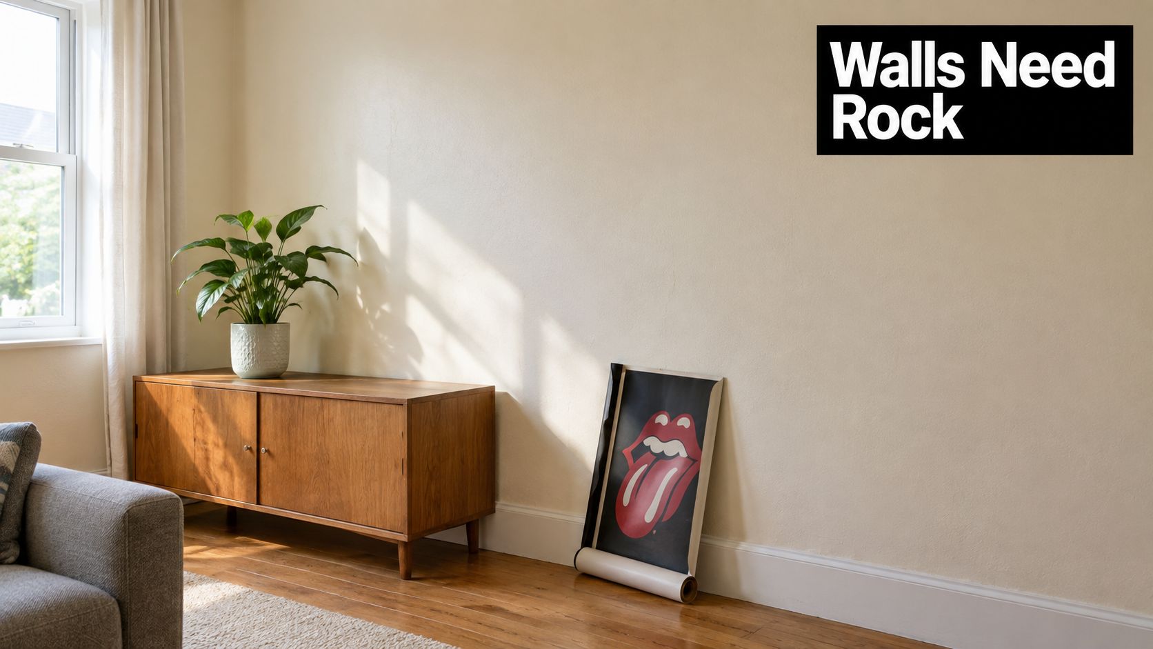
Some people buy posters because they collect. Some buy them because they want their home office to stop looking like a temporary tax clinic. Both are valid. What matters is choosing a print that suits your wall, your room, and your taste, rather than grabbing the first glossy rectangle with a guitar on it.
Table of Contents
- Introduction Why Your Walls Are Begging for Rock Band Posters
- How Rock Band Posters Became Wall Art Legends
- Print Types Materials and What Makes a Poster Last
- Sizing and Framing That Actually Suits Your Space
- Display and Styling Ideas for Home and Office Walls
- Care Storage and Smart Buying Tips for Rock Band Posters
- Choosing the Perfect Rock Band Poster Gift and Final Inspiration
Introduction Why Your Walls Are Begging for Rock Band Posters
You tidy the room, put the mug down, swivel back in your chair, and the wall still looks like it owes you a personality.
A good rock band poster fixes that faster than almost any other kind of art. It does not just fill space. It shows your taste, your era, your sense of humour, and the particular corner of music history you happily rant about after one drink.
That difference matters. A poster of a band is memorabilia if it only says, “I bought a thing.” It becomes wall art when the print suits the room and says something about you. A faded gig poster gives off one mood. A bold album graphic gives off another. A slick modern reprint can feel sharp and clean in a home office, while a scruffier vintage-style piece can make the same wall feel lived-in and gloriously opinionated.
Walls read these signals the way an outfit does. Same person, different jacket, completely different story.
Your taste deserves better than polite filler
Generic décor is fine if your life goal is “hotel lobby, but smaller.” Rock band posters give you more to work with. They can be loud, clever, nostalgic, odd, elegant, or all five at once, which is very on-brand for rock music in general.
They also let you decorate by personality, not just by colour scheme. Maybe you love the swirling chaos of late-60s psychedelia. Maybe you want stark monochrome punk graphics. Maybe your happy place is classic arena-rock artwork that looks like it should come with dry ice and a 12-minute guitar solo. Those choices shape the room as much as the sofa does.
For work spaces, that matters even more. A well-chosen print can stop a desk area feeling sterile without making it look like a rehearsal room exploded behind your monitor. It adds life, but with intention.
The OohYeah music monetization platform is a useful reminder that music culture now lives across art, audience, and identity, not only in playlists and on stage. Posters fit that same idea. They are part décor, part self-portrait.
The right poster makes a blank wall feel like yours
This is the bit people often miss. The best rock band posters are not always the rarest or the loudest. They are the ones that make you smile every time you pass them.
Maybe that smile comes from a band you grew up with. Maybe it comes from a print style you love, even if you were born several decades too late to have seen the original tour. Either way, the wall starts doing more than sitting there. It starts talking back in a good way.
And no, your living room does not need to look like a student union corridor circa 2004. A single framed poster can feel smart, grown-up, and funny. That is the charm of music prints done well. They carry history, attitude, and design all at once.
How Rock Band Posters Became Wall Art Legends
You pin up a rock poster for the music. A week later, you realise it is also changing the whole room.
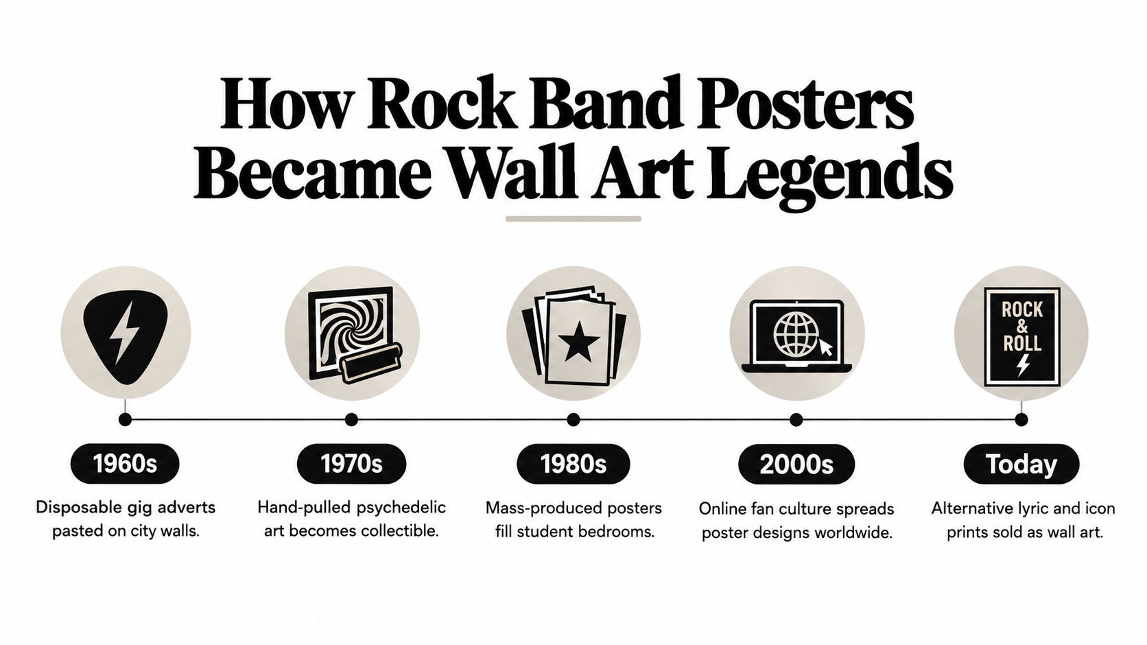
That shift is the reason these prints lasted. Rock posters began as practical street-level advertising. They shouted about a gig, a venue, a date, and then they were supposed to disappear under rain, sunlight, or the next band's poster. The funny part is that the ones made to be temporary often ended up with more personality than plenty of “serious” wall art.
From club notice to cultural artefact
A good vintage gig poster works like a snapshot with better typography. It shows who played, where they played, and what visual language a scene used before anyone involved knew they were making history.
The UK club and concert circuit of the 1960s and 1970s produced some brilliant examples. Posters from that period now survive as little records of live music life, especially for bands still on the way up. One auction report on Ewell Technical College material highlights posters tied to concerts featuring Nick Drake, Genesis, Black Sabbath, and Led Zeppelin, which is a neat reminder that a sheet of paper can capture a very specific before-they-were-huge moment, as noted by the Epsom and Ewell rock history auction report.
That history is part of the appeal on a wall. You are not only hanging a band name. You are hanging a slice of time, complete with the design habits and local energy of that moment.
Why era matters so much
Era changes everything. A psychedelic late-60s poster has a different mood from a stripped-back punk flyer or a glossy arena-rock print from the years when smoke machines were apparently a human right.
Collectors care about that because earlier material often captures a band before the image became polished. Decorators should care for the same reason. The era sets the emotional temperature of the room. Early Pink Floyd material, for example, carries a more experimental, club-scene feel than later stadium-era imagery, and one Sussex sale report pointed to rare 1966 Pink Floyd posters as notable formation-era pieces before the band's first album arrived. The same coverage also noted strong auction interest in vintage rock posters more broadly, including material from Fleetwood Mac, Deep Purple, Jimi Hendrix, and the Rolling Stones, in the Sussex vintage rock poster sale coverage.
That does not mean your wall needs museum-grade rarity.
It means a poster with a clear era usually feels more alive than a generic band photo because it brings its own design accent with it. Psychedelic lettering bends the mood one way. Monochrome punk graphics push it another. Big theatrical tour art says something else again. Your wall starts behaving less like storage for fandom and more like a room with a point of view.
Some posters survive because they were beautiful. Others survive because they caught the exact second a local act turned into a legend.
Why this still matters when you're decorating
Auction houses are one end of the story. Everyday wall styling is the useful end for the rest of us.
The same logic still applies. If you choose a poster because it reflects a distinct musical era, print style, or venue culture, it tends to read as intentional décor rather than random merch. That is the difference between “I like this band” and “this room has taste, a sense of humour, and possibly a favourite guitar solo.”
If you enjoy that older concert look, Striped Circle's approach sits closer to styled music wall art than disposable memorabilia. Their wider perspective on retro print culture comes through in this piece on music vintage posters and retro-inspired wall art.
Print Types Materials and What Makes a Poster Last
You get the poster home, hold it up to the wall, and suddenly the room goes a bit backstage. Then the lamp hits it, the paper curls like it has stage fright, and the whole thing looks more student flat than carefully chosen wall art. That is usually a print-quality problem, not a taste problem.
A great band poster works like a good pressing of a favourite album. Same song, different experience. Paper, finish, and ink decide whether the artwork feels crisp, rich, and worth framing, or like something that came free with a magazine.
Gloss versus matte in a real room
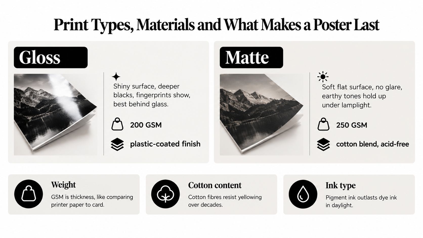
Gloss can look bold straight away. Blacks often seem deeper, colours can feel louder, and shiny finishes suit some modern tour graphics. The catch is glare. In an ordinary home office, hallway, or living room, gloss often reflects windows and lamps so aggressively that you spend more time seeing your ceiling bulb than the band.
Independent UK print guidance says gloss stock creates significant glare in domestic lighting, shows fingerprints, and can develop uneven sheen, while heavy matte or fine-art matte papers of 200gsm or above are better suited to framed wall art, according to this guide on why poster paper matters.
Matte is usually easier to live with. It gives older gig-poster designs, punk graphics, and retro tour art a more relaxed, collected feel. That matters if you want your wall to say “I chose this on purpose” rather than “I blu-tacked up some merch after a festival.”
What GSM actually means
GSM is paper weight. Higher GSM usually means the sheet feels thicker, resists creasing better, and sits flatter once framed.
The easy version is this:
| Finish or material choice | What you'll notice on the wall |
|---|---|
| Light glossy paper | More shine, more glare, more chance of fingerprints |
| Heavy matte paper | Softer look, easier viewing, more premium framed feel |
| Cotton-based stock | Better durability and a more art-print character |
| Archival pigment ink | Better long-term display performance |
If that table makes heavy matte sound like the sensible default, that is because it usually is.
The archival bit without the museum voice
UK fine-art paper suppliers commonly position 308 to 315gsm cotton-based stocks as the archival benchmark for music and art posters, because the heavier sheet handles creases and tearing better. The same guidance says acid-free, lignin-free, or ISO 9706-compliant papers are designed for long-term stability, and that 100% cotton papers with pigment inks offer high lightfastness and museum-grade display suitability under proper framing and care, as described by Wessex Pictures museum paper guidance.
You do not need museum-grade everything for every wall. A home office poster above a desk and a collectible print in the lounge are different jobs, a bit like choosing between everyday trainers and the boots you polish.
Buying shortcut: If you want a poster to hold its colour and keep looking smart, matte paper with pigment ink is usually a safer choice than thin glossy stock.
As noted earlier in the UK print guidance, archival pigment inks on quality matte paper can stay visually stable for many years if you keep them out of direct sunlight. So yes, print specs sound nerdy. They are also the reason one poster becomes part of your room's personality, while another fades into sad, curly wallpaper with a guitarist on it.
Sizing and Framing That Actually Suits Your Space
You spot a brilliant rock band poster online, order it in a burst of excellent taste, and then realise your wall had very different plans. Suddenly the print is either floating above the furniture like a lost flyer or crowding the room like a roadie dragged in a festival banner.
Size decides whether a poster feels like part of the room or a random souvenir. Get that right, then the frame can do its job.
Start with the wall's job
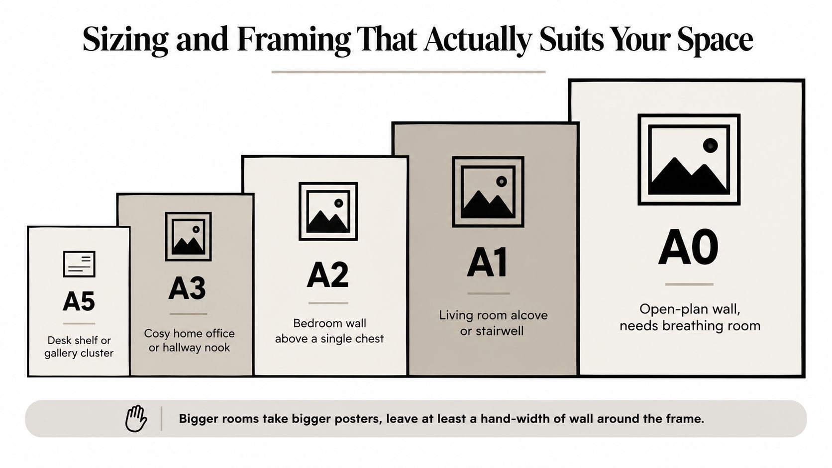
A poster above a desk behaves differently from one above a sofa. A stairwell wall can handle a tall, dramatic piece. A small alcove usually wants something tighter and more relaxed. Your first question is not “What size poster do I like?” It is “What is this wall trying to do?”
That sounds a bit grand for a rectangle of paper, but it helps. A wall can whisper, “give me one clever detail,” or shout, “I need a focal point before this room dies of politeness.”
As a rough guide, smaller prints such as A4 or A3 suit narrow spots, shelves, and compact work areas. Mid-size options feel at home above desks, sideboards, and bedroom furniture. Large formats bring the drama on broad walls with enough open space around them. If the print nearly matches the width of the furniture below it, it usually starts to feel cramped.
Leave some breathing room. The margin around the frame is what makes the choice look deliberate.
Match scale to personality, not just measurements
This is the fun bit. Rock band posters are not only memorabilia. They are mood-setters.
A vintage tour poster in a modest size can feel smart and knowing, like the person in the office who owns great records and never mentions it first. A giant psychedelic print says the opposite. It wants attention, and fair enough. Neither approach is wrong. You are choosing how loudly the wall speaks.
Era matters here too. Busy gig-poster graphics from the 1960s or 1970s often look better with enough size to let the lettering breathe. Minimal monochrome prints, lyric art, or cleaner modern designs can still punch above their weight at smaller sizes.
Frames should support the poster, not dress it for the wrong party
A frame changes the whole mood. The same print can read as cool, playful, serious, or strangely corporate depending on what goes around it.
Black frames usually sharpen bold rock graphics and darker prints. White frames lighten busy artwork and help colourful pieces feel less heavy. Natural wood works well when you want the poster to feel lived-in rather than glossy, especially with vintage-inspired designs or warmer room colours.
Mounts help too, particularly if the artwork is detailed or the print itself is on the smaller side. They create visual pause around the image, a bit like giving the headline act proper stage lighting instead of shoving them into the corner by the coats.
Try these as a starting point:
- Vintage gig posters: slim black or dark wood frames keep the energy intact without making the piece feel fussy
- Cleaner album or lyric prints: white frames with a mount can make them feel calmer and more intentional
- Large statement posters: slightly thicker frames suit bigger walls and stop the print looking flimsy
If you want a clearer breakdown before buying, this guide on how to frame posters walks through the practical choices.
A quick visual explainer helps if you're still staring at the tape measure like it's a maths exam:
Grouped posters need one clear rule
A gallery wall full of band prints can look brilliant. It can also look like a venue toilet wall after a fly-postering contest.
Consistency fixes that. Keep one element steady. Frame colour is the easiest option, but you could also unify the display through era, colour palette, or print style. That gives the eye somewhere to rest, even if the posters themselves are loud.
One more tip. Give one piece the lead singer role. Make it slightly larger, or place it centrally, so the arrangement has a clear anchor. Lay everything out on the floor first if you are mixing sizes. Your future self, standing there without extra holes in the wall, will be grateful.
Display and Styling Ideas for Home and Office Walls
You hang a killer rock band poster, stand back, and somehow the wall still looks a bit flat. Usually the poster is not the problem. The room just has not been told how to play with it yet.
That is the fun part of styling these prints. A rock poster can nod to your favourite band, sure, but it also tells people something about your taste, your humour, and whether your office has any pulse at all. The right display turns memorabilia into proper wall art.
Three display approaches that actually work
A single statement piece gives one poster room to breathe. This suits loud graphics, legendary tour art, or a print with enough attitude to carry the wall on its own. Above a sideboard, behind a desk, or at the end of a hallway, it works like a great opening riff. Clear, confident, memorable.
A curated cluster lets your personality show a bit more. If your taste jumps from classic rock to Britpop to modern indie, group those prints in a way that feels intentional rather than chaotic. The trick is to connect them with one shared feature, such as a repeated accent colour, a similar era, or the same mix of playful and moody artwork. You are building a setlist, not emptying a drawer.
An office-friendly arrangement benefits from restraint. In work spaces, posters with strong typography, vintage concert layouts, or cleaner lyric designs usually add character without hijacking every video call. The goal is a wall that starts conversations, not one that makes your spreadsheet look nervous.
Match the poster to the room's personality
A 1970s gig poster brings a different mood from a crisp album-art print, even if both feature the same band. One feels worn in, warm, and a bit gloriously scruffy. The other can look sharper, cooler, and more graphic. That difference matters because the poster is shaping the room's personality as much as reflecting yours.
If the room already has plenty going on, shelves, plants, patterned textiles, stacks of books, a simpler print often works better. If the space feels plain or slightly too sensible, a louder poster can wake it up fast. Home office walls are especially good for this. One well-placed rock print can stop the room feeling like it was designed by a tax return.
Colour does a lot of heavy lifting here. Dark posters pop on pale walls. Faded reds, mustard tones, and cream-heavy vintage prints usually sit comfortably with wood furniture and softer lighting. Black, white, and high-contrast designs feel neater in modern offices or cleaner interiors.
Placement changes the mood more than people expect
Where you hang the poster changes how it reads. At eye level near a desk, it feels personal and conversational. Higher up above a sofa or console, it becomes more of a backdrop. In a hallway, a sequence of smaller prints creates rhythm, a bit like album tracks leading to the big single.
Lighting matters too, especially if you want the artwork to feel intentional rather than accidentally parked on the wall. Avoid spots where glare bounces straight back at you, and be picky about where lamps sit in relation to glass. For office settings, these professional art installation insights are useful because they explain spacing, sightlines, and how artwork reads in a room people use.
Flexible styling for renters, rearrangers, and the commitment-shy
You do not need to attack the wall with tools every time inspiration strikes. Lightweight frames on picture ledges, adhesive strips for smaller pieces, and shelf styling all make it easier to swap posters around as your taste changes. That matters with band art because your wall might start with Bowie and somehow end up flirting with The Strokes by autumn.
Mixing posters with objects helps too. A print beside a record player, a stack of art books, or a desk lamp feels lived in rather than staged. The poster becomes part of the room's identity, not a lonely rectangle floating on paint.
If you want a practical method for spacing several pieces, this guide on how to arrange wall art makes the planning part much less guessy.
The best rooms usually have a little tension in them. A gritty punk poster in a tidy office. A dreamy lyric print in an industrial flat. A classic rock image next to sleek modern furniture. That contrast is often what makes the wall memorable, and what makes you grin every time you walk past it.
Care Storage and Smart Buying Tips for Rock Band Posters
You bring home a poster you love, prop it against the wall for “just a few days,” and three weeks later it has a curl like a stale crisp and a mystery dent in one corner. Rock posters are pretty forgiving as wall art, but they are still paper, ink, and sometimes surprisingly delicate finishes. A little care keeps them looking less student-flatshare casualty, more intentional piece of your room's personality.
Care on the wall
The two big enemies are light and moisture. Direct sun fades colour over time, especially on cheaper prints, and damp air can make paper ripple or buckle. That matters whether your poster is a rare gig print or just the one that makes your office feel less like a tax seminar.
Framing helps for a simple reason. It creates a barrier between the print and everyday life, which includes dust, fingerprints, and the friend who cannot resist pointing directly at the artwork like they are reviewing it for the NME.
A few habits make a real difference:
- Pick a stable spot: Dry rooms with even temperature are kinder to paper than steamy kitchens or damp spare rooms.
- Handle the edges: Clean, dry hands are good. Holding the corners is even better.
- Frame the good ones early: If the poster has visual impact or sentimental value, do not leave it rolled in a tube for months.
- Hang it straight: Crooked art makes the whole setup look accidental, even when the poster itself is brilliant.
Storage that keeps the drama in the design, not the paper
If a poster is waiting its turn, store it flat if you can. That is the gentlest option for most paper prints. Rolled storage is still fine, but use a clean, sturdy tube and do not cram it in so tightly that the paper fights back when you open it.
For multiple posters, add archival tissue or sleeves between them. That cuts down on rubbing, dust, and those annoying pressure marks that seem to appear out of nowhere.
Treat stored posters like records. Stack them carelessly, shove them in a bad spot, and they age badly. Give them a bit of structure, and future you gets to enjoy them properly.
Buying smart so the poster suits the room and the person
A strong buy starts with boring questions, which are often the questions that save you money. What paper stock is it on? Is it an original event poster, an authorised reprint, or modern music-inspired art? Is the finish matte, satin, or glossy? Sellers who know their stock usually say this clearly, and that clarity is a good sign.
This part matters more than people expect because a rock poster is not only a band reference. It is also a design object. A scrappy punk-style print on thin paper can still be the right choice for a relaxed workspace or record corner. A heavier art print with cleaner colour and sharper detail usually suits a living room, hallway, or gift better because it feels more finished on the wall.
If you are comparing formats for different spaces, options like canvas wall art from Jessie's Home can help you judge whether you want the crisp, paper-and-frame feel of a poster or something with more texture and presence straight out of the box.
One last filter helps. Buy for the vibe of the room, not only the name of the band. The best rock poster is the one that still makes you grin after the novelty wears off, because it looks right in your space and sounds like your taste, visually speaking.
Choosing the Perfect Rock Band Poster Gift and Final Inspiration
A rock poster makes a strong gift because it can be personal without being fussy. It says, “I know what you're into,” rather than, “I panicked and bought scented hand soap again.”
Match the poster to the moment
For a birthday, go taste-first. Think favourite band, favourite era, or the album they never stop mentioning. If they're the sort who can identify a B-side in three notes, avoid generic imagery and choose something with a sharper reference.
For a housewarming, think about the room as much as the music. Softer colour palettes, lyric-style prints, or graphic icon pieces tend to fit more homes than loud collage-style designs. They still feel musical, just less like a stage-dived into the paintwork.
For an office upgrade, choose something that adds edge without causing visual traffic. Clean composition wins here. Strong typography. Monochrome graphics. Smart nods rather than wall-to-wall chaos.
The easiest decision framework
If you're stuck, use this:
- Pick the era: Classic rock, punk, indie, Britpop, alternative.
- Pick the visual style: Vintage gig feel, lyric print, album-inspired art, icon tribute.
- Pick the room mood: Bold centrepiece, subtle accent, or gallery mix.
That little filter clears the fog quickly. It stops you buying “music-themed” art for someone who wants “1970s Stones energy but make it stylish enough for the hallway”.
Buy what feels like a smile, not a souvenir
The best rock band posters don't just prove fandom. They improve the room. They make a blank wall feel more human. They add wit, nostalgia, identity, and just enough swagger to keep a space from becoming painfully sensible.
That's true whether you're buying for a collector, a gig addict, a football-and-music obsessive, or yourself after finally admitting the office wall deserves better.
Striped Circle offers music and football wall art with a strong eye for alternative lyrics, iconic band references, and prints that suit real homes and offices. If you want rock band posters that feel personal, sharp, and a bit more original than generic merch, have a rummage through Striped Circle.
