

How to Find The Cure Poster That Your Wall is Begging For - the cure poster
A Cure poster isn't just a bit of paper you lob on the wall; it’s a statement. It’s the very soul of the band's iconic gothic cool and their massive musical legacy, all rolled into one. For any fan, it's a direct portal back to specific eras—from the spiky, post-punk minimalism of their early days to the sprawling, beautiful gloom of an album like Disintegration. Finding the right print is about sticking a proper piece of music history in your gaff, a genuine conversation starter that’s infinitely better than a generic "Live, Laugh, Love" disaster.
Why Your Wall Deserves a Dose of Robert Smith
Let’s be honest. That huge, blank wall in your living room isn’t really pulling off the "minimalist chic" look you were hoping for. It’s just… empty. It's crying out for something with a bit more substance, something with character. It needs a splash of smudged eyeliner, a tangle of legendary hair, and the kind of glorious melancholy that only Robert Smith and company can provide.
Think of this guide as your backstage pass to rescuing your walls from terminal blandness. We’re about to dive headfirst into the glorious world of The Cure posters, exploring why they’re so much more than just ink on paper. They are time capsules, teleporting you back to legendary gigs, iconic album eras, and that specific brand of miserable cool that has shaped music and fashion for over four decades.
This simple diagram shows the journey from a sad, bare wall to proudly hanging your perfect poster.
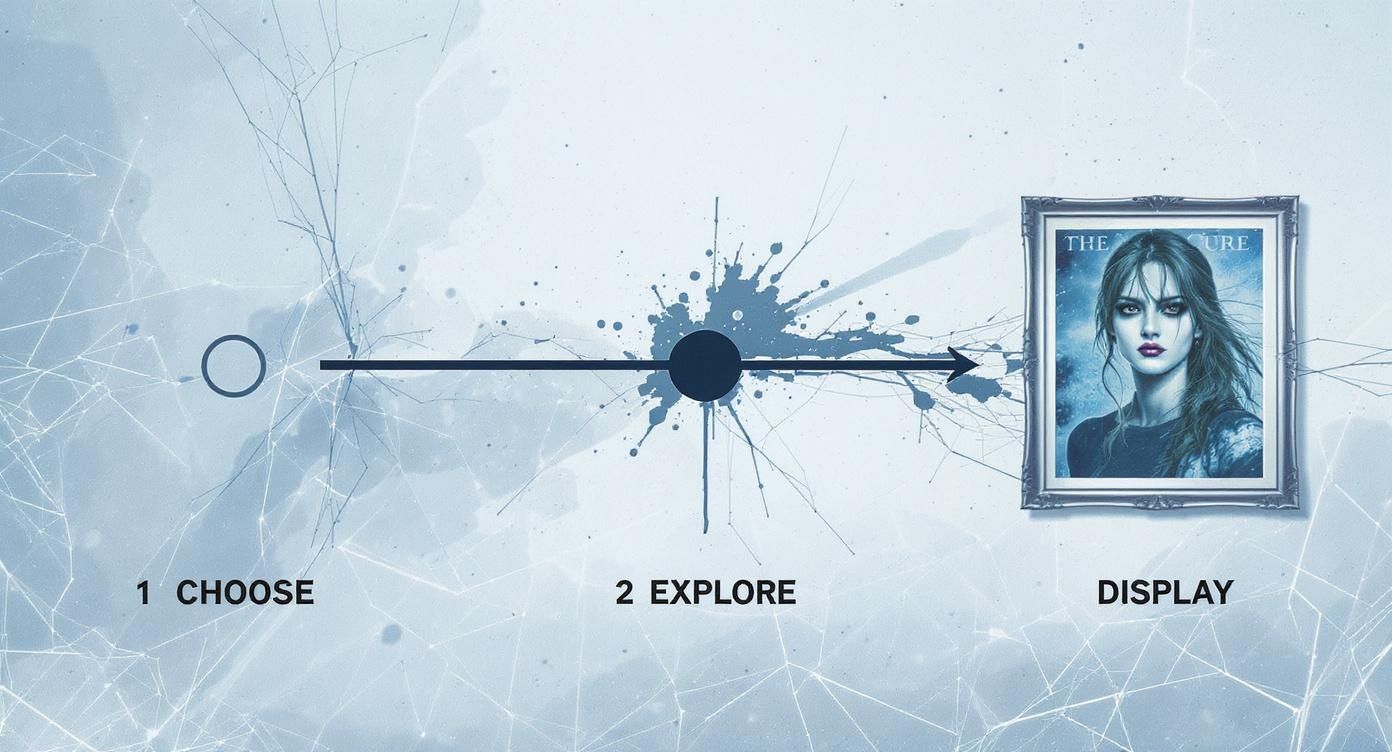
As you can see, the process is pretty straightforward. It’s all about picking your space, exploring the incredible variety out there, and finally displaying your piece of rock history like a proud parent showing off a particularly brilliant school photo.
More Than Just a Pretty Picture
So, what is it that makes a Cure poster so special? Unlike the generic, mass-produced tat you see everywhere, a piece of Cure memorabilia carries genuine weight and history. It connects you to a tribe, a feeling, a specific moment in time.
A well-chosen band poster does more than fill a frame; it reflects your personality, your taste, and your story. It’s an instant signifier to anyone who walks into the room that you appreciate the finer things in life—like reverb-drenched guitars, existential lyrics, and probably a decent pint.
It doesn’t matter if you’re a die-hard fan who bought Seventeen Seconds on vinyl the week it came out or a newer convert who discovered their timeless sound on a film soundtrack. There's a poster waiting to make your wall infinitely cooler.
- For the Office: A subtle, art-focused print can inject a bit of personality without screaming, "I'd rather be at a gig than in this pointless meeting."
- For the Living Room: A large, striking tour poster can become the central focus, anchoring the entire vibe of the room and showing your guests you have impeccable taste.
- For the Music Room: Why not create a gallery wall that tells a story? Mix classic album art with live shots and typographic prints. Go on, show off a bit.
This guide is here to help you find that perfect piece to make your space a true point of interest. Right then, let's get that wall sorted.
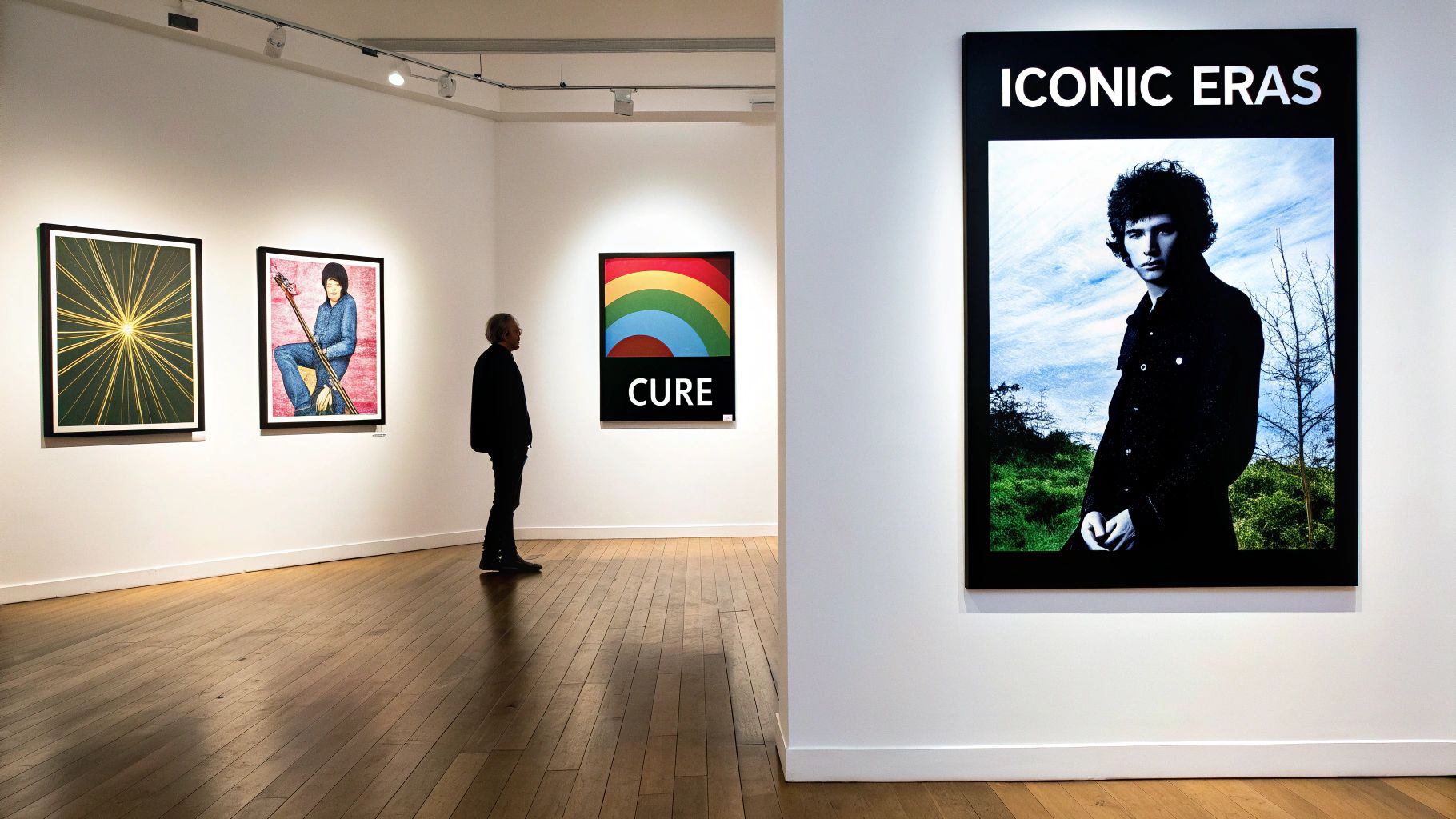
A Visual Journey Through The Cure’s Iconic Eras
When you're looking for a Cure poster, you’re not just choosing a piece of art—you're choosing a moment in time. The band’s visual identity is as iconic as their sound, and their posters act like a brilliant roadmap through their evolution from post-punk upstarts to undisputed gothic rock titans. Knowing the look and feel of each era is the real secret to finding a print that hits all the right notes for you.
Let's start at the beginning. The late 70s and early 80s were defined by a stark, minimalist cool. Think about posters for albums like Boys Don't Cry or Seventeen Seconds. They were all about bold, simple typography, grainy black-and-white photography, and a confident use of empty space. It was a look that mirrored their sound perfectly: moody, direct, and impossibly stylish. Like a perfectly tailored black suit.
From Post-Punk Starkness to Psychedelic Chaos
Just when everyone thought they had The Cure figured out, things took a turn for the brilliantly bizarre. The mid-80s, heralded by albums like The Top and The Head on the Door, brought an absolute explosion of colour and glorious, controlled chaos. The artwork morphed into a psychedelic wonderland of smudged paints, abstract scribbles, and surreal imagery. This was the band letting their eccentric flag fly, and the posters from this period are a vibrant, dizzying delight.
Then came the grand, imperial phase. The late 80s and the arrival of Disintegration cemented their place as the undisputed kings of gothic splendour.
The visuals shifted to become deeply atmospheric, drenched in swirling fog, blurred figures, and dramatic, cinematic compositions. A Disintegration tour poster isn't just a bit of memorabilia; it's a profound statement of beautiful, epic melancholy that defined a whole subculture. It’s the visual equivalent of a perfect pint of Guinness.
The Modern Era and Enduring Legacy
Even in more recent years, the band’s visual identity has kept evolving without ever losing its core DNA. Modern tour posters are often slick and artistically refined, sometimes featuring stunning commissioned artwork that cleverly reinterprets classic motifs. They still feel unmistakably 'Cure', but with a contemporary polish that proves they are far from being just a nostalgia act.
Their lasting appeal is impossible to ignore. Incredibly, The Cure’s 2022-2023 'Shows of a Lost World' tour became the highest-grossing of their entire career, pulling in a staggering £29 million from just 35 shows. Even with Robert Smith famously battling ticket giants to keep prices fair for the fans (what a legend), their devoted fanbase turned out in force, proving their cultural relevance is as potent as ever. You can read more about The Cure's record-breaking tour and their commitment to the cause.
To help you navigate these distinct periods, here’s a quick-and-dirty guide to their poster styles.
The Cure's Poster Styles by Era
| Era | Key Albums | Dominant Style | Colour Palette | Typical Imagery |
|---|---|---|---|---|
| Post-Punk (1979-1982) | Three Imaginary Boys, Seventeen Seconds, Pornography | Stark, minimalist, DIY aesthetic | Black, white, grey, occasional red splashes | Grainy photos, bold typography, empty space |
| Psychedelic Pop (1983-1987) | The Top, The Head on the Door, Kiss Me, Kiss Me, Kiss Me | Chaotic, vibrant, abstract | Bright, clashing colours, psychedelic swirls | Smudged paint, scribbles, surreal collages |
| Gothic Majesty (1989-1992) | Disintegration, Wish | Atmospheric, moody, cinematic | Deep blues, purples, black, muted tones | Fog, blurred figures, rain, grand architecture |
| Modern Refinement (2000s-Present) | Bloodflowers, 4:13 Dream, Recent Tours | Polished, artistic, diverse | Varies, often reinterpreting past palettes | Commissioned art, refined typography, symbolism |
Thinking about these visual periods really helps you narrow down the exact vibe you want for your space. Are you drawn to the raw, understated cool of their early days, the joyful chaos of their pop peak, or the majestic gloom of their most celebrated work? Each era offers a unique slice of The Cure’s story, turning your choice of poster into a genuinely personal statement.
How to Spot a Gem and Avoid a Dud
https://www.youtube.com/embed/5Hd2EezrdDU
Right, so you've decided a Cure poster is exactly what your wall needs. Excellent choice. But before you dive in wallet-first, let’s talk turkey. Not all prints are created equal, and the difference between a wall-worthy treasure and a flimsy bit of paper that’ll look sadder than Robert Smith in the rain is huge. This is your crash course in telling them apart.
First up, the big one: original vintage versus a modern reprint. An original tour poster is a genuine piece of history, printed back in the day to promote a gig. It’s rare, it has a story, and it might even have some authentic scuffs from being stapled to a lamp post in 1989. A modern reprint, on the other hand, is a high-quality reproduction, perfect for getting that iconic look without having to sell a kidney. Both are great, but you absolutely need to know which one you're buying.
Paper and Print Quality Matter
Think of the paper as the bassline of your poster – it’s the foundation holding everything together. You’ll see the term GSM (Grams per Square Metre) thrown around a lot. What you want is a higher GSM, ideally 200 GSM or more. This gives you a thick, durable paper that feels substantial and won't wrinkle just by looking at it funny.
Then there’s the finish. Glossy can look sharp but often creates a distracting glare under lights, like trying to watch the telly with the sun in your eyes. A matte or satin finish, however, gives a more refined, gallery-like feel that’s usually much better once the poster is behind glass.
The printing technique itself is a massive tell. A cheap digital print can look flat and lifeless, with colours that might fade faster than your team's title hopes. In contrast, a professional giclée or lithograph print delivers rich, deep colours and sharp details that truly do justice to the original artwork.
To really get this right, knowing where to source your posters is half the battle. If you're looking for trustworthy vendors, a guide to the best online home decor stores is a good place to start your search.
Avoiding the Low-Quality Knock-Offs
So, how do you actually dodge a dud? The most glaring red flags are pixelation and blurry text. If the image looks like it was saved from a dodgy 90s website and blown up, walk away immediately. A quality print, whether it's a fresh reproduction or a limited edition, should always be crisp and clear.
Here’s a quick checklist to keep in your back pocket:
- Check the Details: Can you clearly read all the small text, like the tour dates or venue names? If it’s a fuzzy mess, it’s a definite no-go.
- Feel the Weight: Does the paper feel flimsy, like something from an office printer? A proper art print has a noticeable heft to it.
- Look at the Colours: They should be vibrant and true to the original, not washed out or weirdly tinted.
At the end of the day, you’re investing in a piece of art that’s going to bring you joy for years. Taking a few extra seconds to check these details ensures you’re getting a bona fide gem, not something destined for the recycling bin. If you want to dive deeper into what makes a print special, you can learn more about our limited edition prints and see what sets them apart.
Framing and Sizing Your Poster Like a Pro
Right, you’ve finally got your hands on the perfect Cure poster. It’s a thing of beauty. Now, for the love of all that is gothic and glorious, please step away from the Blu-Tack. Sticking a masterpiece to the wall with a gooey blob is a crime against music, interior design, and frankly, Robert Smith’s magnificent hair. It’s time to give that print the respect it deserves.
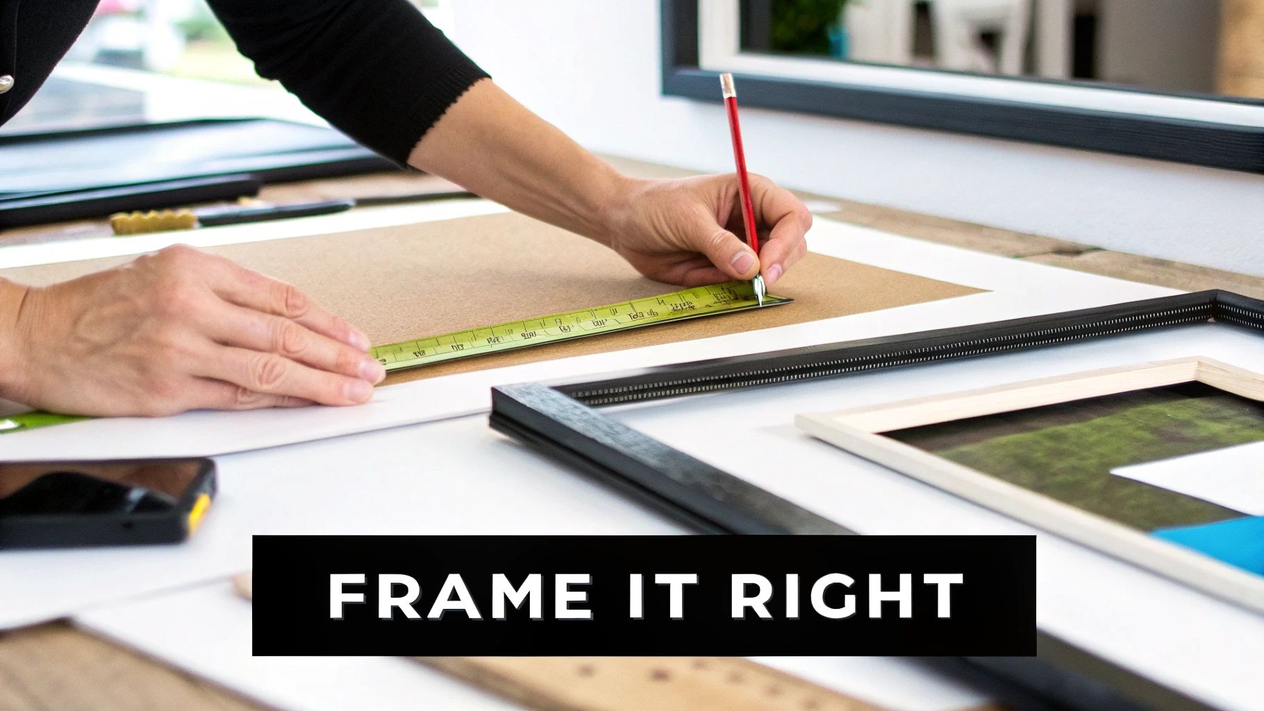
This is all about presentation. We’re going to turn that cool print into a proper piece of art that makes your mates genuinely jealous. Let's start with the basics of getting it looking its absolute best.
Getting the Size Right
First things first: what kind of statement are you trying to make? The size of your Cure poster really dictates its impact. Is this a subtle nod to the kings of gloom in your home office, or are you building a massive, wall-dominating shrine in your living room?
- Go Big for Bold Statements: A large-format poster—we’re talking A1 or bigger—is perfect as a focal point above a sofa or bed. It’s confident, it’s loud, and it instantly sets the tone for the entire room. Go big or go home.
- Mix and Match for Gallery Walls: Smaller prints, like A3 or A4, are brilliant for creating a curated gallery wall. You can mix your Cure poster with other band prints, framed ticket stubs, and even vinyl sleeves for a look that's totally unique to you.
- Consider the Space: Always measure your wall first. It sounds ridiculously obvious, but you’d be amazed how many people buy a massive poster only to find it completely dwarfs their furniture and makes the room feel cramped.
Choosing the Perfect Frame
Once you've got the size sorted, it's time to talk frames. The right frame doesn't just protect your poster; it elevates it. Think of it as the sharp suit that finishes the look. A simple, thin black frame is a classic for a reason—it’s sleek, modern, and lets the artwork do all the talking. It’s the little black dress of the framing world.
Don't be afraid to experiment, though. A more ornate, vintage-style frame can add a touch of gothic grandeur that works beautifully with a moody Disintegration-era print.
A crucial decision is whether to use a mount—that white cardboard border between the poster and the frame. A mount gives the artwork breathing space, making it look more professional and drawing the eye inward. It’s a small touch that makes a massive difference. Like a perfectly weighted pass in football, it just makes everything better.
When it comes to the "glass," you have two main options: actual glass or acrylic (often called Perspex). Glass is cheaper and resists scratches, but it's heavy and can shatter into a million pieces if you look at it wrong. Acrylic is lightweight, shatterproof, and usually offers better UV protection to stop your poster from fading. For a treasured print, acrylic is almost always the smarter bet.
For a deeper dive, you can learn more about how to frame posters in our comprehensive guide. It's packed with tips to get it just right.
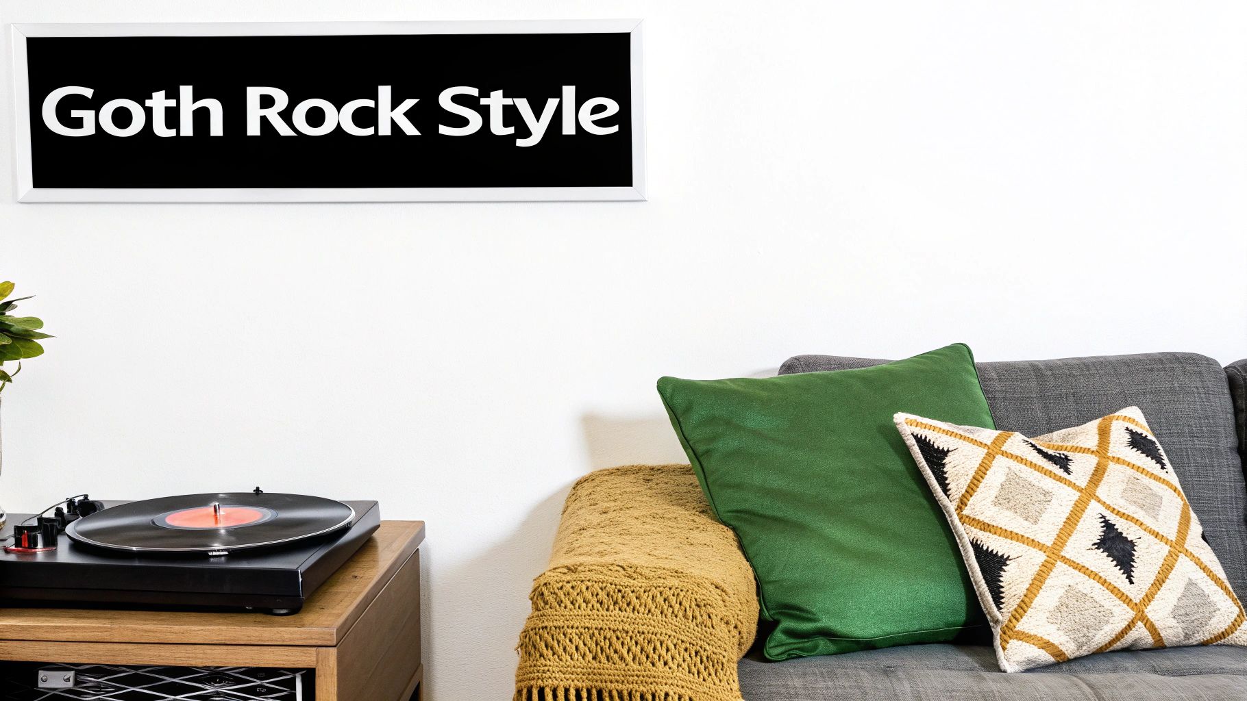
Styling Your Space with Goth Rock Grandeur
A Cure poster is so much more than just a piece of paper. It’s a mood. It's a vibe. It’s a quiet nod to fellow fans that you've got impeccable taste and probably have some great stories to tell. So, where do you hang this slice of goth rock history? Let's be honest, putting it in the wrong spot would be a bigger tragedy than the lyrics to 'Pictures of You'.
In the living room, a bold Cure poster makes a fantastic conversation starter, hanging proudly above the sofa. For a home office, it’s the perfect, brooding backdrop for creative thinking—or, more realistically, for surviving another soul-crushing spreadsheet. Think of it as a silent reminder that there's more to life than pivot tables.
Building Your Own Wall of Sound
One of the best ways to show off your poster is by creating a music-themed gallery wall. This isn't just about hanging a few pictures; it’s about telling your story. You’re essentially creating a visual representation of your personal soundtrack.
The key to a great gallery wall is personality. It should feel less like a museum and more like a carefully curated glimpse into your own head. Mix textures, sizes, and eras for a look that's effortlessly cool and completely you. It's your wall, your rules.
Start with your Cure print as the anchor piece—your star striker—and build the rest of the team around it. Here are a few ideas to get the ball rolling:
- Mix in Other Bands: Pair your Cure poster with prints from other favourites. Think Joy Division for that monochrome cool or Siouxsie and the Banshees for some post-punk edge.
- Add Personal Mementos: Frame old ticket stubs, festival wristbands, or even the sleeve of a beloved vinyl record. These little touches are what make the wall truly yours.
- Play with Typography: Drop in some alternative lyric prints or bold typographic pieces. This adds fantastic visual variety and breaks up all the imagery.
Matching the Mood
The specific poster you choose can completely dictate the feel of a room. A dark, atmospheric print from the Pornography era can lend a touch of sophisticated gloom to a minimalist, modern space, providing a perfect moody contrast.
On the other hand, the vibrant, chaotic splash of a Kiss Me, Kiss Me, Kiss Me poster can inject a shot of pure energy into a more eclectic room. It's all about making your space feel like an extension of yourself, with a little help from Robert and the boys.
For more inspiration, you can find some excellent general wall art décor guidance that really champions personal expression. And if you're looking for detailed advice on composition, our guide on https://stripedcircle.com/blogs/posts/how-to-arrange-wall-art has you covered.
Finding the Perfect Gift for a Cure Fan
Trying to find a gift for a die-hard music fan can feel like navigating a festival crowd blindfolded. You want to get them something thoughtful, something cool, and definitely something that doesn’t scream, “I panicked and bought the first thing I saw on Amazon.” Relax. You really can’t go wrong with a classic band poster.
The secret to absolutely nailing it lies in a bit of light detective work. Think of yourself as the Sherlock Holmes of rock memorabilia. Is your mate an old-school fan who’d get misty-eyed over a stark, moody print from the Faith era? Or maybe they have fonder memories of a more recent tour, which would make a modern, artistic poster the perfect fit.
Tailoring the Perfect Print
A little thought goes a long way. Think about their personality and their connection to the band. A poster from a legendary UK performance, for example, is a brilliant choice because it’s a nod to the band’s roots and their incredible bond with their home crowd.
A specific tour poster isn’t just a picture; it’s a time machine. It transports them back to a specific night, a specific feeling, or an era they wish they’d been a part of. It’s a gift that says, “I get you.” It’s like buying a football fan a retro shirt from their team's glory years – an instant winner.
This is especially true given The Cure's legendary status in the UK. Their concerts are marathon events, often clocking in at around 2.75 hours and packed with deep cuts that true fans adore. With some performances attracting crowds of up to 70,000 people, a poster from one of those monumental gigs is a piece of genuine British music history. You can dive deeper into The Cure's incredible live show history on Tableau.
Ultimately, picking a poster based on their favourite album, a gig they actually went to, or an era they just love ensures your gift will be a chart-topping hit, not a forgotten B-side. It’s a guaranteed way to make them smile.
Got Questions? We've Got Answers
Right, you’re almost there. You’ve picked your favourite era, you’ve got a frame in mind, and you've already started mentally shifting furniture around to make space. But maybe a few last-minute questions are still swirling around your head like the haunting synth line from 'A Forest'.
Let’s tackle those lingering queries so you can pull the trigger with complete confidence.
Originals vs Reprints: What’s the Real Difference?
This is the big one, isn't it? The main distinction is pretty simple: an original poster is a genuine promotional item printed back in the day for a specific tour or album release. These are the real deal – they’re rarer, carry more historical weight, and often show little signs of age that tell a story.
A reprint, on the other hand, is a modern reproduction. While it doesn't have the same vintage pedigree, a high-quality reprint is a brilliant and affordable way to get that iconic artwork on your wall. It'll be crisp, clean, and absolutely perfect for decorating without breaking the bank.
Is a Vintage Cure Poster a Smart Investment?
It certainly can be. A genuine, well-preserved poster from a landmark tour like Disintegration could definitely go up in value over the years. That said, most of us aren't buying these as part of a retirement portfolio. We're buying them because we love the band and the art.
My advice? First and foremost, buy something you'll genuinely enjoy looking at every day. If it happens to appreciate in value, think of it as a happy bonus.
How Can I Stop My Poster from Fading?
Sunlight is the arch-nemesis of any print. The golden rule is to keep your poster well away from direct sunlight, as those UV rays will suck the life and colour out of the ink faster than you can say “Friday I'm in Love.”
The best defence is a good offence. Framing your poster behind UV-protective glass or acrylic is hands down the most effective thing you can do. Also, try to avoid hanging it anywhere damp like a bathroom—unless, of course, you're going for a mouldy, wrinkled vibe that might actually suit a Pornography-era piece.
Ready to turn that blank wall into a proper tribute to gothic rock royalty? Have a look through the full collection of music prints over at Striped Circle and find the perfect piece to make your space sing. https://www.stripedcircle.com
