

Cool Prints for the Office That Don't Suck
Choosing the right prints for the office can completely transform a sterile workspace into a hub of creativity and morale. It’s about much more than just filling a blank space; it’s an opportunity to inject personality and build an environment that reflects your team's culture, making the office a place people actually want to be.
Why Your Office Walls Deserve More Than Beige
Let's be brutally honest for a moment. Most office décor looks like it was chosen by someone whose favourite colour is beige and whose favourite song is the dial-up tone from 1998. It’s a corporate landscape of grey, tired motivational posters featuring eagles, and maybe a sad-looking pot plant in the corner that's seen more despair than a goalkeeper in a penalty shootout.
But those walls are prime real estate—a massive blank canvas crying out for something better.
Think of your office walls as the ultimate team playlist. You wouldn't subject everyone to whale sounds on repeat (unless you work at a spa, perhaps), so why settle for a generic print of a lone, melancholic tree? The art you choose makes a powerful statement about your company's culture. Not the one written in the HR handbook, but the real one forged in deadline-induced panic and Friday afternoon banter.
More Than Just Decoration
The right prints do more than just look pretty; they serve a real purpose in the daily grind. A clever print can be a brilliant icebreaker when clients visit, sparking a conversation about a shared love for a band or a legendary football goal. It can be a source of daily inspiration or just something that brings a smile during a particularly stressful afternoon video call where Brenda from accounts has forgotten to mute herself again.
A workspace that reflects personality is a workspace that fosters it. Moving beyond generic art is one of the simplest, most effective ways to boost morale and create a sense of shared identity among a team.
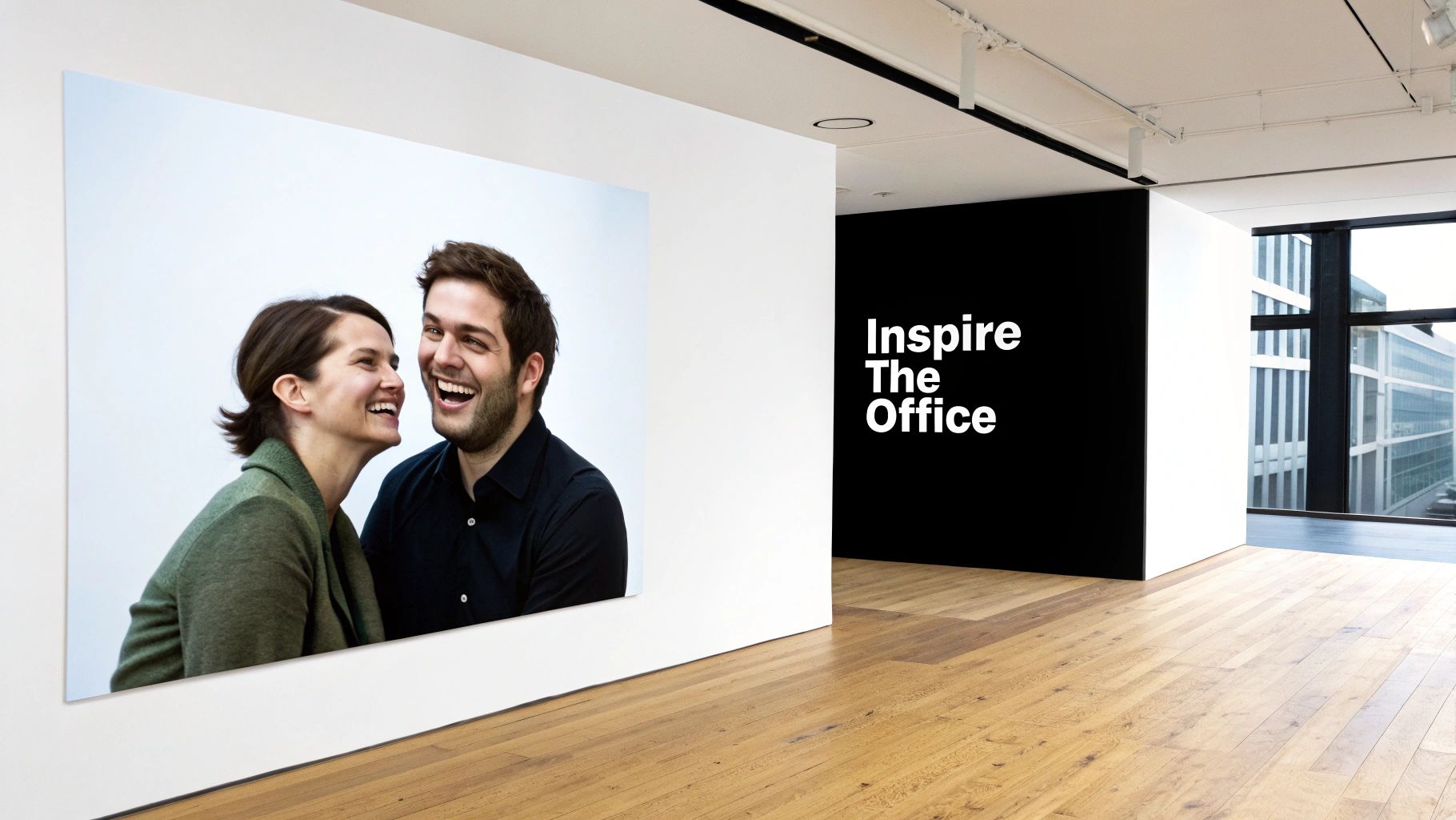
It’s all about creating an atmosphere that resonates. Imagine walking into an office and seeing a bold lyric print from The Smiths or a stylised depiction of Maradona's 'Hand of God' goal. You instantly know you're not in a soulless corporate holding pen. You're in a place with a pulse, a sense of humour, and a story to tell. For a deeper dive, our guide on selecting artwork for an office has some great starting points.
And don't stop at prints. Consider how other elements can boost your workspace. Exploring the best indoor plants for offices can add another layer of life to the room. The goal is to build a space that feels curated and authentic, not assembled from a catalogue of "approved office art." Ditching the beige is the first step toward building an office your team is genuinely proud of.
2. Choosing Your Vibe: Football Anthems or Britpop Classics?
Right, let's get into the fun part. Picking a theme for your office art is the first, and honestly, most important decision you'll make. It’s like choosing the walk-on music for your team or the first track for a road trip playlist – it sets the tone for everything. Are you going for the raw energy of a 90th-minute winner or the effortless cool of an Oasis B-side?
This isn’t about just grabbing a generic landscape picture from a stock library. It's about capturing your office's personality and putting it up on the walls. The right theme can transform a boring corridor into a genuine talking point and make the break room a place people actually want to be.
Reading the Room Without a Crystal Ball
Before you do anything else, you need to get a feel for the collective personality of your team. I’m not talking about sending out a formal survey – that's way too corporate. Just listen. What’s the chatter around the coffee machine? Is it all about last night's VAR shocker, a gig someone went to at the weekend, or a film everyone’s quoting?
These little conversations are gold. They’ll quickly tell you whether your office is more aligned with the roar of a stadium or the feedback from a guitar amp. Your mission is to find that common ground, a shared cultural touchstone that gets a knowing nod from everyone. Think of it as finding the one album everyone can agree on for the office stereo; it might be a challenge, but it's rarely impossible.
Choosing prints for the office that truly connect means finding a theme that feels authentic to the people who see it every single day.
Uniting the Tribes: Football vs. Music
So, what are the big hitters? Let's break down two of the main contenders that always get people talking.
- Football Fever: Nothing builds local pride like celebrating a legendary player, an iconic goal, or a historic win for the local team. It's an instant unifier and a brilliant conversation starter.
- Music Mavericks: Is your office secretly full of indie kids who remember life before Spotify? A curated collection of prints celebrating classic albums, unforgettable lyrics, or legendary festival line-ups is a fantastic way to tap into a powerful sense of nostalgia and cool.
- Pop Culture Pundits: Sometimes the perfect middle ground is found in classic film posters, witty quotes from beloved TV shows, or minimalist designs that reference shared cultural moments.
The trick is to pick a lane and really commit to it. A jumble of different themes can just look messy. A focused collection, on the other hand, looks intentional, stylish, and tells a story about who you are as a company.
Don’t be afraid to get specific. A generic "sports" theme is forgettable. A tribute to your local club's '99 season? That’s a story. That has soul.
But what if your team is a proper mix of tastes? Don't panic and reach for those posters of eagles with motivational quotes just yet. This is where the 'safe but not boring' option comes in. You could go for clever typographic prints featuring office in-jokes, stylish abstract designs in your brand colours, or even beautifully stylised maps of your local area.
It's all about finding a visual language that everyone can appreciate, even if they don't know the B-sides from (What's the Story) Morning Glory?.
To help you decide, think about your team's collective "walk-on music." What song would play as you all walk into the office on a Monday morning?
Office Vibe Selector: What's Your Team's Walk-On Music?
| Office Vibe | Print Theme Suggestion | Example Print Idea |
|---|---|---|
| The Local Heroes | Football & Local Pride | A stylised print of your local team's most famous goal. |
| The Indie Crew | Music & Nostalgia | A minimalist graphic of a legendary album cover. |
| The Creative Thinkers | Abstract & Typographic | Bold, abstract art in your company’s colours or a clever typographic piece. |
| The Film Buffs | Pop Culture & Quotes | An iconic quote from a film everyone in the office loves. |
Ultimately, your office has its own unique personality. It’s time to give it a voice – and put it on the wall.
Getting the Scale Right Without a Meltdown
Nothing screams 'we didn't think this through' quite like a tiny print lost on a massive wall. It’s the visual equivalent of sending your keeper up for a corner in the first ten minutes – confusing, slightly desperate, and it never ends well. Getting the size and placement of your prints for the office right is the difference between looking like a tactical genius and looking like you picked your art blindfolded after three pints.
Let’s stick with the football analogies because, frankly, they just work. Think of a single, massive print as your star striker. It's the focal point, the talisman, the piece that draws all the attention. It’s your Alan Shearer, your Thierry Henry – an undeniable presence that defines the space. You place it somewhere prominent, like behind the reception desk or in the boardroom, and just let it command the room.
Your Midfield Engine Room: The Gallery Wall
On the other hand, a gallery wall of smaller prints is your midfield. It's your Scholes, Gerrard, and Lampard (if they could ever play together properly). Individually they're brilliant, but together they create a dynamic, energetic, and cohesive look. No single piece dominates; instead, they work together to control the visual flow of the room, creating interest and telling a more complex story.
This approach is perfect for mixing and matching themes – a bit of music, a splash of football, maybe a clever quote. It's all about teamwork. For some practical guidance on creating a setup that flows, our guide on how to arrange wall art is a great place to kick off.
The biggest mistake people make is treating every print like a solo artist. Sometimes you need a supergroup. A great gallery wall has rhythm and balance, turning a boring wall into the main stage.
To avoid any costly errors, grab some paper or old newspaper and cut out templates the same size as the prints you’re considering. Stick them to the wall with a bit of masking tape. Live with it for a day or two. Does it feel right? Is your 'star striker' print big enough to own the space, or does it look more like a lonely substitute warming the bench? This simple trick saves a world of pain and misplaced picture hooks.
This simple process flow helps visualise the key steps to finding the perfect office prints.
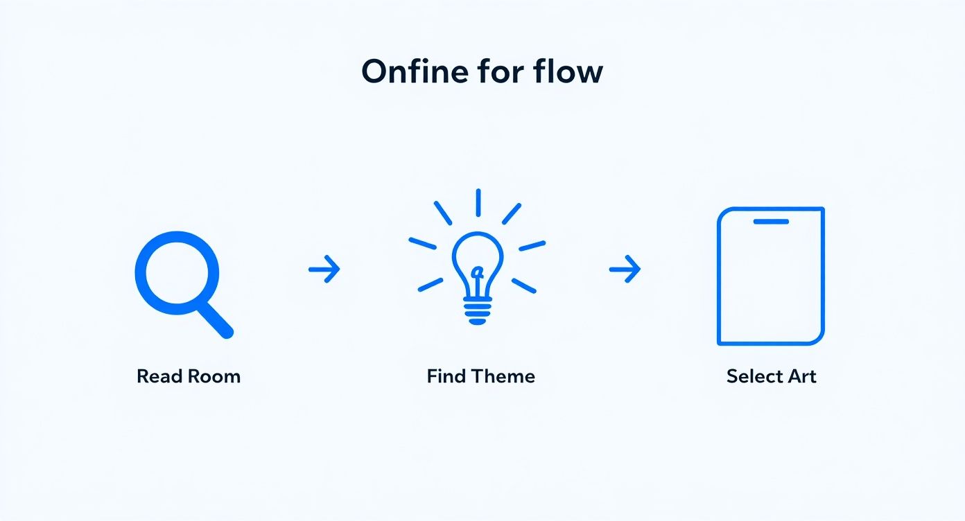
It shows that selecting the right art isn’t just a random choice, but a thoughtful process of understanding your space and theme first.
Also, pay close attention to aspect ratio. That's the relationship between the width and height of an image. You don’t want your favourite Stone Roses album art getting stretched into a weird panoramic that makes Ian Brown look like he’s had a run-in with a funhouse mirror. Stick to the original dimensions to keep the artist's vision intact.
Getting your prints sorted is a massive part of the UK's surprisingly large printing industry. The sector's turnover was recently reported at £13.7 billion, with around 75% of the 6,800 companies being small firms employing fewer than 10 people – much like us! It's a testament to the power of print in our spaces.
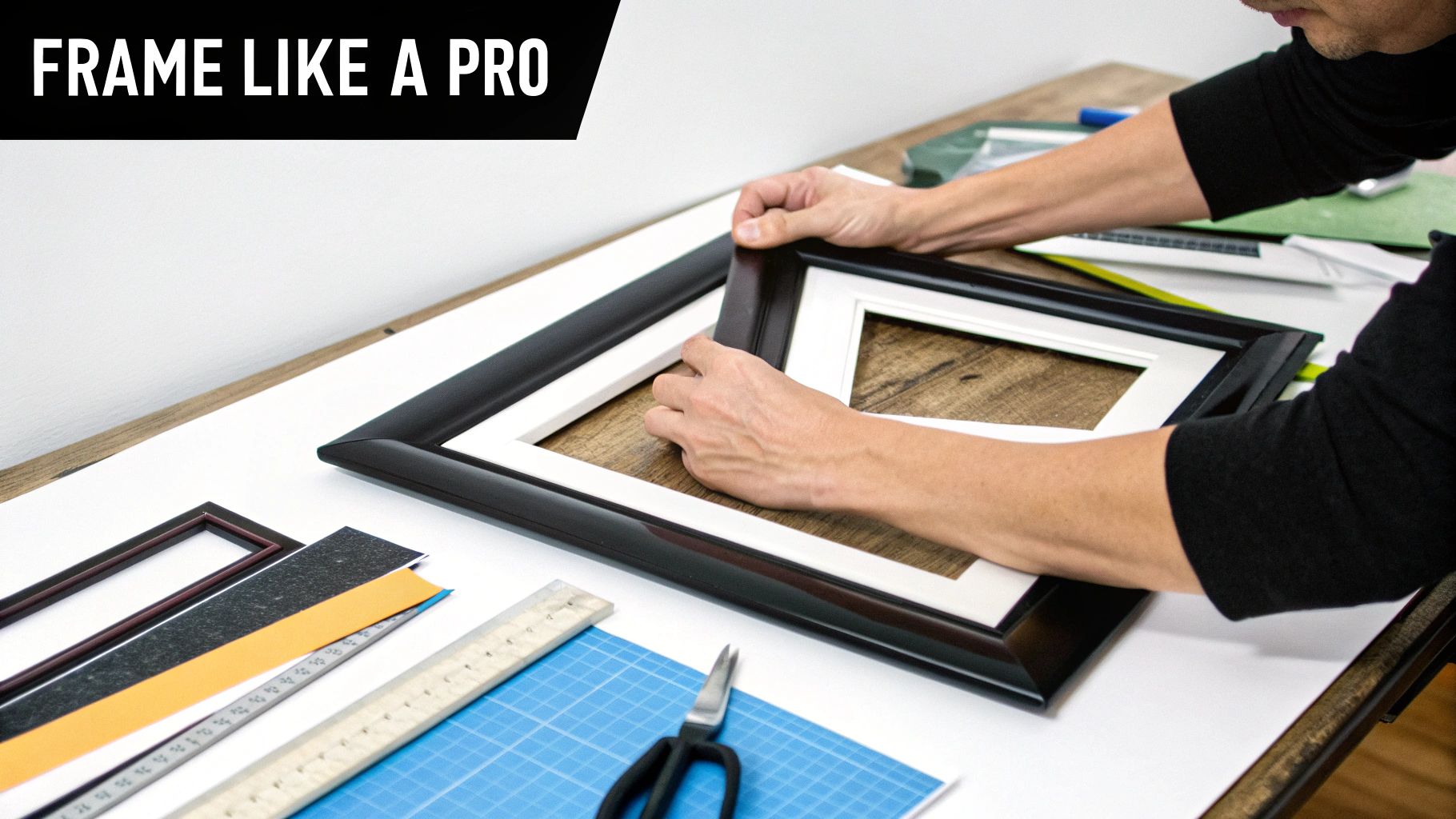
How to Frame Your Prints Like a Pro
Alright, you’ve picked your print. You’ve gone for that iconic Stone Roses lemon, or maybe a tribute to Cantona’s glorious chip. Choosing the artwork is only half the battle, though. The frame? That's what turns a great print into a genuine masterpiece.
Think of it this way: putting a brilliant piece of art in a cheap, flimsy frame is like serving a Michelin-star meal on a paper plate. It’s just wrong. A quality frame elevates your chosen art from 'something to cover a crack in the wall' to a real statement piece that makes the office look ridiculously cool.
From Poster to Masterpiece
Before we even get to the frame, let's talk about print quality. Not all paper is created equal, and this is where many people slip up. A standard poster is fine, but a high-quality Giclée print is on another level entirely. It's the difference between watching a match on a dodgy stream versus being right there in the stadium—the colours are richer, the details are sharper, and it’s made to last.
This choice is critical for your prints for the office. Giclée prints use archival-grade inks that won't fade when the afternoon sun hits them, ensuring your art looks as fresh in five years as it did on day one. It’s the professional choice for a professional space.
Even with screens everywhere, high-quality physical prints are more important than ever. The UK printing market is a testament to this, with a projected size of £9.2 billion for 2025. It just goes to show that a tangible, well-presented print holds a unique appeal a screen can’t replicate.
Choosing the Right Frame
Now for the main event: the frame itself. Your choice here can completely change the vibe of the print, so don't rush it.
- Sleek Black Frames: These are the reliable centre-backs of the framing world. They’re classic, make bold colours pop, and lend any print a sharp, modern edge. Perfect for vibrant, graphic designs.
- Natural Wood Frames: If you’re aiming for a warmer, more relaxed atmosphere, oak or other natural woods are your go-to. They add a bit of texture and a less corporate feel, great for prints with softer, more muted tones.
- Minimalist White Frames: These are brilliant for making the artwork the undisputed star of the show. They create a clean, gallery-style look that feels sophisticated and uncluttered.
The frame should complement the art, not compete with it. A simple rule I always follow is to match the frame's style to the print's mood. An energetic football print might suit a bold black frame, while a more understated lyric print could look fantastic in natural wood.
Finishes That Make a Difference
Finally, let’s consider the finish of the glass or acrylic. The main choice is between matte and gloss, and it’s a practical one.
If your office has a lot of bright, direct lighting, a matte finish is a lifesaver, as it cuts down on distracting glare. A gloss finish, on the other hand, can make colours appear more vibrant but will reflect every overhead light, so you need to place it thoughtfully.
Getting this right is crucial, so for a complete rundown on nailing the details, check out our in-depth guide on how to frame posters like a pro.
Bringing Your Vision to Life
You’ve done the hard yards. You’ve settled the eternal debate of The Smiths vs. The Stone Roses, picked a frame that even the fussiest designer would approve of, and measured the walls meticulously. Now it’s time to get those prints from the shopping cart to their rightful place on the wall, without any last-minute faff.
This is the final whistle, the part where all your careful planning pays off. Before you smash that ‘buy now’ button, triple-check the details. I’m talking dimensions, quantities, and frame colours. There’s nothing more soul-crushing than waiting a week for your epic print of Wembley, only to open the tube and realise you’ve ordered something the size of a beer mat.
More Than Just Wall Dressing
While you're finalising your order, it's worth thinking a bit bigger. These prints aren't just for you and the current team. Got a new starter joining? A framed print on their desk is a million times better than another branded mug. It says, ‘Welcome, we’ve actually got taste’.
They also make brilliant client gifts. Instead of a generic bottle of wine, imagine giving a client a slick print celebrating their local football club. That’s a gift that gets remembered and, crucially, displayed. It shows you’ve paid attention to who they are.
A well-chosen print as a gift isn't just a nice gesture; it's a statement. It tells clients and new team members that you value personality and connection over bland corporate fluff.
This is all part of a larger trend. The UK commercial printing market, which includes all these fantastic prints for the office, is projected to grow by 2.8% annually between 2025 and 2030. It just goes to show that quality, tangible products still have a massive impact in a digital world.
Hanging Them Straight: No Excuses
Once your prints arrive, the final hurdle is getting them on the wall without them looking like they were hung after a particularly long Friday lunch. My top tip? Don't just eyeball it. Use a spirit level—your phone probably has one built-in. A wonky frame can completely ruin the look of even the most incredible artwork.
Here’s a simple checklist to get it right every time:
- Measure twice, drill once: It’s the oldest rule in the book for a reason. It works.
- Use the right hardware: Please don't hang a heavy framed print on a single tiny nail. Use proper wall plugs and screws for a secure fit.
- Keep it clean: A damp microfibre cloth is your best friend for wiping away dust and fingerprints from the frame and glazing. Avoid spraying cleaners directly onto the print itself.
- Sunlight is the enemy: Try to keep your prints out of direct, harsh sunlight to prevent the colours from fading over time.
For a deeper dive into space planning and making everything look cohesive, it’s worth exploring modern interior design practices. Following these simple steps ensures your investment pays off, transforming your office from a place people have to be into a place they want to be.
Got a Few Lingering Questions?
Alright, you're nearly there. You've mentally rearranged the furniture, had a lively debate over whether Oasis or Blur deserves the prime spot, and you've probably got a tape measure permanently attached to your belt. But there are always a few last-minute questions that pop up, like that nagging earworm of a song you just can't place.
This is the quick-fire round. The penalty shootout, if you will. Let's tackle those final queries so you can get your order in with the confidence of a prime Alex Ferguson picking his starting eleven.
"But How Do I Pick Prints Everyone Will Actually Like?"
Here’s the big secret: you can’t. And honestly, that’s perfectly fine. The goal isn’t to find a single, universally approved print—that’s a one-way ticket to beige walls and those dreadful motivational posters with eagles on them. The real aim is to reflect your company’s unique culture, personality and all.
A brilliant way to get the ball rolling is to run a fun, informal poll. Pit two cultural heavyweights against each other: '90s Britpop vs. '80s Movie Quotes, or Iconic Football Moments vs. Legendary Album Covers. It gets people involved, sparks a bit of banter, and makes the whole process feel less like a corporate mandate and more like a bit of a laugh.
Another top-tier strategy is to theme different zones. The high-energy sales floor? Perfect for prints of last-minute winners and roaring stadium celebrations. Over in the creative department, they might appreciate more abstract music or film art that gets the ideas flowing. And the break room? That’s the spot for something genuinely funny and light-hearted that everyone can share a chuckle over. By diversifying your prints for the office, you create a space that has something for everyone without ever being bland.
"Are Art Prints a Worthwhile Expense for a Small Business?"
Without a doubt. You need to stop thinking of it as an 'expense' and start seeing it as an investment—an investment in your team’s environment and your brand’s identity. A workspace with personality has a tangible, positive impact on morale and creativity. We're not just saying that; a well-decorated space makes people feel valued.
It also makes a massive first impression on clients. Walking into an office with cool, curated art instantly tells them what your company is all about, long before you’ve even shaken hands. Compared to the eye-watering cost of new desks or other fit-out expenses, a few high-quality, well-chosen prints deliver an incredible amount of personality for a relatively tiny outlay. It’s one of the most cost-effective ways to transform a generic box into a place with a real soul.
"What Are the Biggest Mistakes to Avoid?"
There are two classic, rookie errors that we see all the time. The first is playing it too safe and going generic. That stock photo of a handshake or a lightbulb is instantly forgettable and says precisely nothing about your unique culture. Avoid it like the plague.
The second massive blunder is getting the scale all wrong. A tiny print floating in the middle of a huge wall just looks awkward and unintentional.
My golden rule is simple: if in doubt, go bigger. A print that’s slightly too large looks bold and deliberate. One that’s slightly too small just looks like a mistake. Always, always measure your wall and use masking tape to block out the size before you buy.
A final pitfall to watch out for is forgetting the frame. A cheap, plastic frame can make even the most incredible artwork look tacky. Invest in a decent frame; it gives your art the professional, polished finish it deserves and shows you’re serious about creating a great space.
Ready to banish the beige and inject some proper personality into your workspace? The team at Striped Circle has a massive range of music and football-inspired prints that are perfect for making your office a place people actually want to be. Find your new favourite wall art at https://www.stripedcircle.com.
